


Selecting the perfect wallpaper is an artful balance of refinement, intention, and technical precision, where every element contributes to a cohesive interior narrative. When approached thoughtfully, wallcoverings have the ability to transform ordinary surfaces into immersive design statements that elevate both atmosphere and spatial perception. From understanding how to choose wallpaper that matches your interior style to identifying the best wallpaper materials for long-lasting performance, each decision plays a defining role in shaping the overall environment.
Texture, pattern, and color also interact seamlessly with light and architectural details, resulting in a layered composition that feels both curated and timeless. With a considered and informed approach, wallpaper evolves beyond decoration into a defining feature of sophisticated interior design.

Defining Interior Style and Establishing Visual Cohesion
A well-defined interior style establishes a clear design direction, allowing wallpaper to integrate naturally within the overall composition. As visual elements align in scale, texture, and rhythm, the wallcovering becomes an extension of the space rather than a separate statement.
Identifying Core Design Characteristics
A nuanced understanding of interior design styles forms the foundation for selecting wallpaper that feels both intentional and cohesive. Modern minimalist spaces, for instance, tend to favor restrained palettes and subtle textures, allowing surfaces to remain visually calm and uncluttered. In contrast, traditional interiors often embrace ornate motifs such as damask, toile, or botanical prints, where symmetry and detail play a central role.
Scandinavian interiors also introduce a softer approach through light-toned palettes and organic textures that emphasize simplicity and functionality. Meanwhile, industrial-style spaces benefit from wallpapers that replicate raw materials like concrete or oxidized metal, reinforcing their utilitarian character. By recognizing these stylistic distinctions, selecting wallpaper that aligns with the intended aesthetic becomes a more deliberate and refined process.
Maintaining Pattern Language Consistency
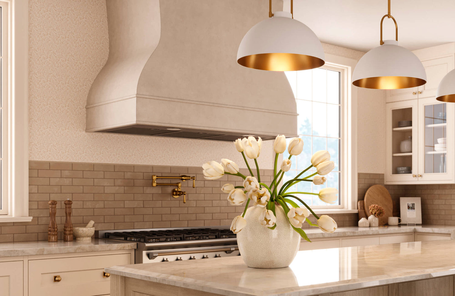
Once a style direction is established, maintaining consistency in pattern language ensures visual continuity throughout the space. When furnishings feature clean lines and geometric forms, wallpapers with linear or abstract motifs tend to reinforce a cohesive aesthetic. Conversely, introducing ornate patterns into minimalist environments can create visual tension unless balanced with intention. As pattern repetition and rhythm interact with architectural details such as moldings or paneling, a more unified composition also begins to emerge. This alignment becomes especially important in open-plan layouts, where visual transitions between zones must feel seamless. For example, Edward Martin’s Bower Wallpaper in Taupe I, 52" x 132", as shown in the photo above, features a soft, nature-inspired motif that integrates effortlessly with warm neutrals, classic fixtures, and layered textures, reinforcing a refined and cohesive design language.
Harmonizing Finishes and Textural Elements
Beyond pattern, the interplay between wallpaper texture and surrounding finishes plays a defining role in shaping the overall atmosphere. Smooth, matte wallpapers pair naturally with polished materials like glass or lacquer, creating a refined and contemporary aesthetic. In contrast, textured surfaces such as grasscloth or linen introduce depth and tactile richness, enhancing layered interiors with a more organic quality.
As these textures interact with flooring, upholstery, and hardware finishes, a sense of material continuity begins to take shape. For instance, pairing warm-toned wallpaper with brass accents creates a cohesive visual warmth that feels intentional rather than incidental. Through this careful coordination, each element contributes to a balanced and immersive interior experience.

Selecting Wallpaper Materials Based on Performance and Texture
Material selection extends beyond aesthetics, influencing how wallpaper performs under varying environmental conditions while shaping its visual presence. By understanding both composition and surface behavior, it becomes possible to choose wallpaper that supports durability without compromising design intent.
Comparing Wallpaper Types for Functional Use
Selecting the right wallpaper type goes beyond aesthetics, requiring a clear understanding of material composition, durability, maintenance requirements, and environmental suitability. Each wallpaper category is engineered with distinct structural properties that determine its performance across different interior conditions, such as humidity levels, surface irregularities, and movement exposure.
Vinyl wallpaper, including solid vinyl, vinyl-coated, and fabric-backed vinyl, is one of the most durable and moisture-resistant options, making it ideal for high-humidity areas like kitchens and bathrooms. Its non-porous surface also allows for easy cleaning and resistance to stains, grease, and mildew, making it suitable for both residential and commercial applications.
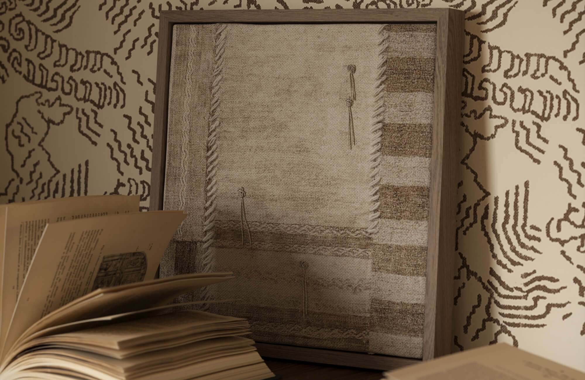
Non-woven wallpaper, on the other hand, offers breathability and dimensional stability, allowing for easier installation and removal without compromising structural integrity. This makes it particularly suitable for large-scale applications, such as the Windsor Wallpaper in Olive I, 52" x 132" (shown in the picture above), which is digitally printed on lightly textured DreamScape Terralon and designed in an extra-wide, full-height format to reduce seams and streamline installation. Set on an olive green base with crisp white linework arranged in a tile-inspired pattern, it introduces a structured yet inviting visual rhythm. This wallpaper is also rated for commercial interiors and full bathrooms, reinforcing its performance in both residential and high-use environments. By carefully evaluating these material characteristics, selecting the best wallpaper material for different rooms becomes a more precise and informed decision.
Paper-based wallpaper, while less durable, provides a smooth finish and excellent print clarity, making it ideal for low-use areas such as bedrooms and formal living rooms. However, it is more susceptible to moisture damage and requires careful maintenance.
Grasscloth and natural fiber wallpapers, made from materials like jute, sisal, or hemp, introduce organic texture and visual depth. Due to their handwoven construction, they exhibit natural variations and seams, but are less resistant to stains and moisture, making them best suited for dry, low-contact spaces.
Textile and fabric wallcoverings, often backed with paper or non-woven substrates, add softness and acoustic benefits to interiors. These are commonly used in luxury or hospitality settings but require professional installation and maintenance due to their sensitivity to moisture and staining.
Peel-and-stick (self-adhesive) wallpaper also provides a removable and user-friendly solution, ideal for temporary applications or DIY projects. While convenient, it may have lower adhesion strength and durability compared to traditional pasted wallpapers, especially in high-humidity conditions.
Foil and metallic wallpapers feature reflective surfaces that enhance light distribution and create a high-impact visual effect. However, they require perfectly smooth walls, as imperfections are easily highlighted.
Embossed and textured wallpapers, including anaglypta and blown vinyl, are designed to conceal wall imperfections while adding dimensional interest. These are often paintable and suitable for busy areas where durability and surface coverage are essential.
Understanding these technical distinctions ensures that wallpaper selection aligns not only with design intent but also with the functional demands of each space, resulting in a more durable and performance-driven interior solution.
Evaluating Surface Finish and Light Interaction
In addition to material composition, surface finish plays a critical role in how wallpaper interacts with light throughout the day. Matte finishes, for example, tend to absorb light, resulting in a softer and more understated visual effect that suits minimalist interiors. Conversely, metallic or reflective finishes enhance brightness by dispersing light across the surface, making them particularly effective in smaller or dimly lit spaces.
Embossed wallpapers introduce dimension through subtle shadowing, adding depth without relying heavily on color variation. As lighting conditions shift between natural daylight and artificial sources, these finishes respond dynamically, altering the perception of the space. Evaluating these interactions allows for more intentional design choices that enhance both ambiance and functionality.
Assessing Durability and Maintenance Requirements
Equally important is understanding how wallpaper will perform over time, particularly in spaces subject to frequent use. Scrubbable wallpapers, in particular, are designed to withstand regular cleaning, making them ideal for family homes or busy areas. Meanwhile, moisture-resistant options help prevent issues such as peeling or mold growth, especially in humid environments.
In addition, lightfastness ratings provide insight into how well a wallpaper resists fading when exposed to sunlight, which is essential for rooms with large windows. In certain settings, fire resistance classifications may also be considered to meet safety standards. By taking these technical specifications into account, selecting wallpaper that balances durability and maintenance becomes a more strategic process.

Optimizing Pattern Scale, Repeat, and Spatial Impact
Pattern scale and repetition influence not only visual appeal but also how a space is perceived in terms of proportion and balance. When thoughtfully applied, these elements allow wallpaper to enhance spatial dynamics while maintaining a sense of harmony.
Matching Pattern Scale to Room Dimensions
The relationship between pattern scale and room size plays a significant role in achieving visual balance. For example, large-scale designs naturally draw attention and are best suited for expansive walls where they can unfold without overwhelming the space. In more compact rooms, however, oversized motifs may feel disproportionate, making smaller-scale patterns a more appropriate choice. As ceiling height is introduced into the equation, vertical patterns can also subtly elongate walls, while horizontal designs can visually widen narrower spaces. Through this careful consideration, wallpaper becomes a tool for shaping perception rather than simply decorating surfaces. Selecting the right scale ensures that the design enhances the room’s proportions in a refined and intentional way.
Understanding Pattern Repeat and Alignment
Closely tied to pattern scale is the concept of pattern repeat, which affects both visual rhythm and installation efficiency. Straight match patterns, for instance, align evenly across the wall, offering a more straightforward installation process with minimal material waste. On the other hand, drop match patterns introduce a staggered alignment that creates visual movement, though they require greater precision and additional wallpaper rolls.
Random match patterns, by comparison, provide flexibility and ease, particularly in less formal settings. As these repeat types influence both aesthetics and logistics, understanding their implications becomes essential. This knowledge aksi allows for accurate planning while ensuring the final installation maintains visual integrity.
Using Wallpaper to Influence Spatial Perception
Beyond aesthetics, wallpaper can actively shape how a space is experienced. Vertical stripes, in particular, create the illusion of height, subtly enhancing rooms with lower ceilings. Horizontal patterns, in contrast, expand the perceived width of narrower areas, contributing to a more balanced layout.
Darker wallpapers introduce depth and intimacy, making larger spaces feel more grounded and inviting, while lighter tones reflect light more effectively, opening up smaller rooms and enhancing brightness. When used strategically, accent walls can establish focal points without disrupting the overall composition. Through these techniques, wallpaper becomes an integral element in spatial design rather than a purely decorative feature.

Coordinating Color Palettes with Lighting Conditions
Color selection in wallpaper must be approached with both aesthetic sensitivity and environmental awareness. As hues interact with light and surrounding finishes, they shape the mood and cohesion of the interior.
Applying Interior Color Theory Principles
A well-informed application of color theory allows wallpaper to integrate seamlessly with existing design elements. Warm tones such as terracotta, ochre, and gold introduce a sense of warmth and intimacy, making them well-suited for social spaces. Cooler hues like blue, green, and gray evoke calmness, often enhancing bedrooms or work areas. Neutral palettes also offer versatility, providing a balanced backdrop that supports layered styling. As complementary and analogous color schemes are introduced, visual harmony becomes more pronounced. By grounding wallpaper selection in color theory, achieving a cohesive and balanced interior becomes more attainable.
Evaluating Natural and Artificial Lighting Effects
Lighting conditions play a pivotal role in how wallpaper colors are ultimately perceived. Natural daylight reveals the most accurate representation of color, highlighting both hue and texture while enhancing subtle tonal variations. Artificial lighting, however, can shift tones depending on its temperature, with warm lighting softening colors and cool lighting sharpening them. LED fixtures may further emphasize certain undertones, subtly altering the intended palette throughout the day.
This interplay is evident in our Botanique Wallpaper in Winter, 52" x 132", as featured in the photo above, where the delicate botanical pattern appears crisp and airy under natural window light, yet becomes warmer and more intimate when paired with soft, ambient sconces. Testing wallpaper samples under varying lighting conditions also helps ensure consistency and visual comfort, allowing the design to maintain its intended character from day to night.
Balancing Contrast and Visual Comfort
As color choices are refined, achieving the right balance of contrast becomes essential for both aesthetics and comfort. For example, high-contrast designs can create striking visual interest, though they may feel overwhelming if not carefully moderated. Softer, low-contrast patterns, on the other hand, offer a more calm and enduring visual experience, particularly in spaces designed for relaxation. By coordinating contrast levels with surrounding furnishings and finishes, a cohesive flow begins to emerge. Gradual tonal transitions further enhance this continuity, preventing abrupt visual shifts. In this way, balancing contrast ensures that wallpaper contributes to both visual appeal and everyday comfort.

Integrating Wallpaper with Architectural Elements and Functionality
Wallpaper reaches its full potential when it responds thoughtfully to architectural features while supporting the functional needs of the space. Through strategic placement and material selection, it becomes both a design enhancement and a practical solution.
Enhancing Architectural Features with Placement
Wallpaper placement should be guided by the existing architectural framework to create a sense of cohesion. In traditional interiors, applying wallpaper above wainscoting reinforces proportion and highlights vertical structure. Contemporary spaces also often benefit from full-height applications, where wallpaper creates a seamless and immersive effect. Accentuating niches, alcoves, or feature walls draws attention to architectural focal points while adding visual interest.
This approach also helps define zones within open-plan layouts without the need for physical partitions. When thoughtfully positioned, wallpaper enhances rather than competes with architectural elements. It further reinforces the architectural rhythm of a room, allowing structural details to feel more intentional and visually anchored. As a result, wallpaper placement becomes a key strategy in elevating both form and function within the interior.
Choosing Wallpaper for Functional Zones
As different areas of the home serve distinct purposes, wallpaper selection should reflect these functional requirements. Kitchens and bathrooms, in particular, demand moisture-resistant and washable wallpaper that can withstand humidity and frequent cleaning. Living areas, by contrast, allow for more expressive materials such as fabric or grasscloth, where aesthetics take precedence.
Entryways and hallways benefit from durable, scuff-resistant options designed to handle heavy use. Bedrooms often call for softer textures and calming patterns that support relaxation. By aligning wallpaper choices with functional zones, both performance and comfort are enhanced. This approach also ensures that each space maintains its visual integrity while meeting practical demands. In doing so, selecting wallpaper for different rooms becomes a balance of durability, usability, and refined design.
Considering Installation Techniques and Longevity
The longevity of wallpaper is closely tied to proper installation techniques and surface preparation. Ensuring that walls are clean, smooth, and properly primed creates a strong foundation for adhesion. Different wallpaper types also require specific installation methods, whether paste-the-wall or paste-the-paper, each influencing efficiency and finish. Precise seam alignment and pattern matching are essential for maintaining visual continuity across the surface.
In more complex applications, professional installation may be advisable to achieve optimal results. Through careful attention to these technical details, wallpaper retains its integrity and appearance over time. Proper installation also minimizes issues such as bubbling, lifting, or misalignment, which can compromise the final look. Ultimately, investing in correct wallpaper installation techniques supports long-term durability and a polished, high-quality finish.
Creating Timeless Interiors Through Thoughtful Wallpaper Selection
When selected with care, wallpaper becomes a defining element that brings together style, function, and spatial harmony. Understanding how to choose wallpaper that matches your interior style allows each design decision to contribute to a cohesive and elevated environment. As wallpaper color coordination with lighting conditions is thoughtfully considered, spaces gain depth, balance, and visual comfort throughout the day. At the same time, selecting the best wallpaper materials for durability and long-term performance also ensures that beauty is matched by practicality. Through this integrated approach, wallpaper transforms interiors into refined, enduring spaces that reflect both intention and sophistication.
For a more tailored approach, Edward Martin’s design services offer expert guidance in selecting wallpaper that aligns seamlessly with your vision. Contact us to explore bespoke solutions and bring your interior concept to life with precision and elegance!
