


Selecting wall art that harmonizes with your interior space is both an art and an essential component of refined interior styling. Understanding how to choose wall art that matches your room allows you to create a cohesive environment that feels intentional, balanced, and visually compelling. From aligning with interior design styles to coordinating with color palettes, every decision contributes to a unified aesthetic. Factors such as scale, proportion, material, and lighting further influence how wall decor integrates within a space. By applying expert design principles and long-term strategies, such as how to match wall art with furniture and color schemes, you can transform wall surfaces into purposeful design elements.

Interior Design Style Alignment for Cohesive Wall Art Selection
A well-designed space relies on stylistic continuity, where each element, including wall art, supports the room’s established aesthetic direction. By aligning artwork with the overarching interior design style, visual harmony is maintained, allowing decorative elements and architectural features to coexist seamlessly.
Recognizing Dominant Design Styles and Visual Language
Establishing the dominant interior design style provides a clear and essential framework for selecting appropriate wall art. In modern minimalist interiors, abstract compositions with restrained palettes and clean geometry naturally reinforce simplicity and order. By contrast, traditional spaces tend to benefit from classical artwork, layered detailing, and richer visual narratives that echo heritage influences.
Scandinavian interiors, with their emphasis on light and functionality, are complemented by nature-inspired imagery and soft tonal palettes. Meanwhile, industrial environments often call for monochromatic photography and raw textures that reflect their utilitarian roots. As these stylistic cues become more defined, selecting wall art that aligns with spatial identity becomes both intuitive and precise.
Matching Subject Matter and Artistic Medium
Once the style is established, the subject matter of wall art should naturally echo the room’s thematic direction while reinforcing its visual tone. For instance, botanical prints seamlessly integrate into organic interiors by extending natural elements already present in the space. Similarly, architectural photography enhances contemporary or industrial environments through structured lines and controlled contrast. Abstract art, in turn, offers flexibility by introducing movement and color without disrupting overall cohesion.
Beyond subject matter, the chosen medium, whether canvas, metal, or paper, affects how the artwork interacts with both light and surrounding textures. As these elements come together, the artwork begins to feel embedded within the space rather than applied to it, aligning with searches like how to match wall art with modern minimalist interiors and best artwork styles for cohesive home design.
Maintaining Stylistic Consistency Through Framing
Framing further refines how wall art integrates into a space, subtly reinforcing the overall design language. In minimalist interiors, the focal point is without visual competition. Conversely, traditional settings often benefit from ornate frames with carved detailing that enhance depth and richness. The choice of material, such as metal or wood, should also correspond with existing furniture and hardware finishes to maintain cohesion. Additionally, frame color can echo accent tones within the room, creating a sense of continuity across surfaces. When applied consistently across multiple pieces, framing establishes a unified visual rhythm that supports interior design consistency.

Applying Color Theory to Match Wall Art with Room Palette
Color coordination plays a pivotal role in ensuring that wall art feels integrated rather than incidental within a room’s visual composition. Through the application of color theory, artwork can either harmonize with the existing palette or introduce contrast in a controlled and intentional way.
Using Color Schemes for Visual Harmony
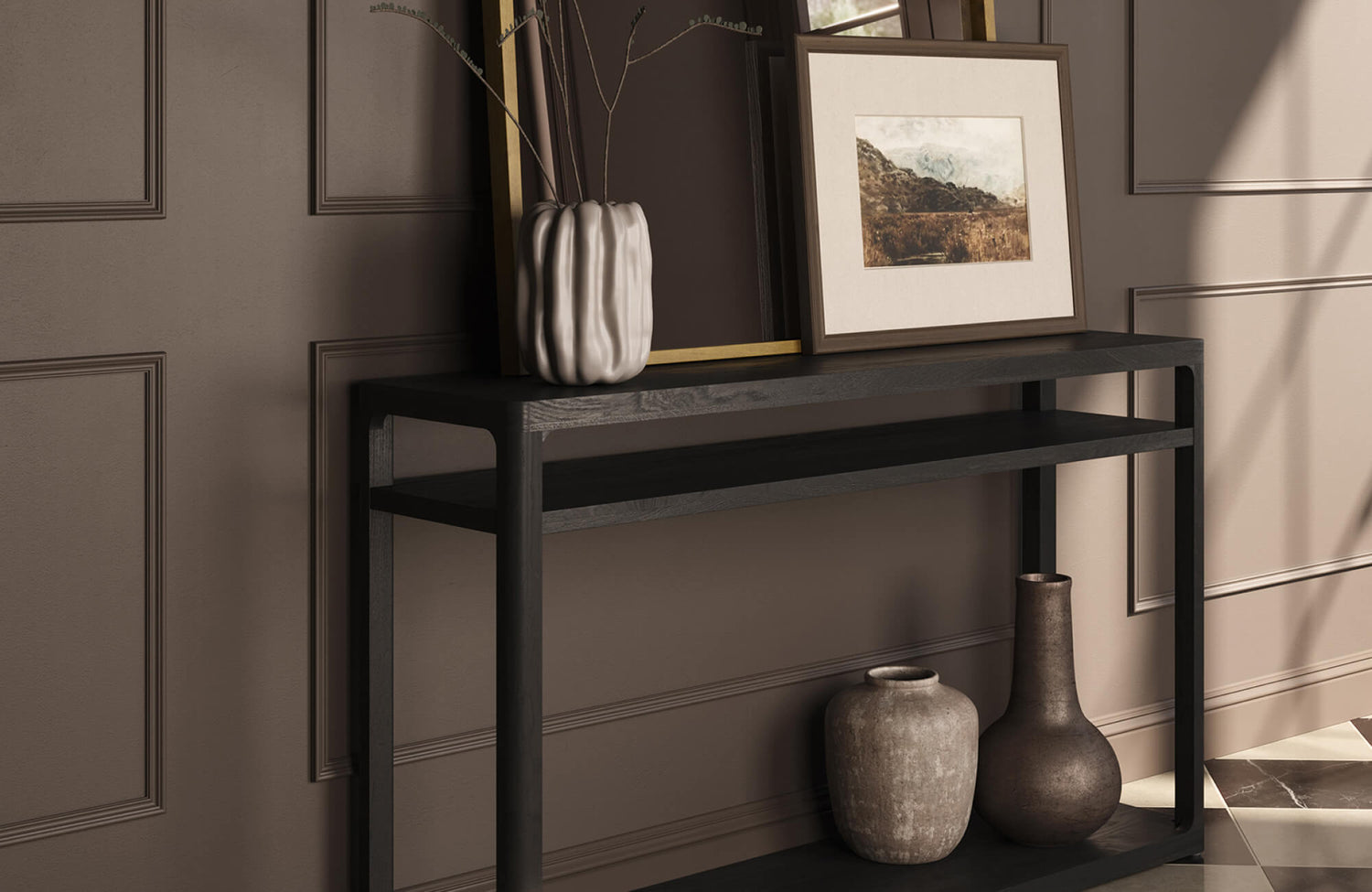
A structured approach to color selection begins with established color schemes that guide visual harmony. Analogous palettes, which draw from adjacent hues on the color wheel, create smooth transitions that feel cohesive and calming. In contrast, complementary color schemes introduce measured contrast, allowing artwork to stand out without overwhelming the space. Monochromatic palettes, defined by tonal variation within a single hue, also offer a refined and understated aesthetic.
Pieces like Edward Martin’s Quiet Study Wall Art, as displayed in the photo above, illustrate this approach effectively, using muted, layered neutrals to echo surrounding materials and create a seamless visual connection with the room’s palette. As these frameworks are applied, they help prevent mismatched combinations and maintain continuity across design elements. Over time, this method allows wall art to contribute to a more balanced and cohesive interior composition. Incorporating accent tones through artwork can further unify textiles, upholstery, and surrounding decor. This approach is especially effective when coordinating wall art with an existing color palette to achieve a cohesive interior look.
Extracting Colors from Existing Furnishings
To further reinforce cohesion, color selection can be derived directly from existing furnishings and decor. Elements such as upholstery, rugs, and accent pieces often provide a reliable palette that can be echoed in wall art. By incorporating similar undertones, the artwork visually connects disparate elements, creating a unified look. This approach also ensures that wall art feels intentional rather than an afterthought within the design. At the same time, subtle repetition of color strengthens the overall composition without appearing forced. As a result, the space develops a layered and curated quality, especially when matching wall art with furniture colors and surrounding decor. Extending these tones across multiple surfaces further enhances cohesion while maintaining a natural, well-balanced interior.
Balancing Saturation and Visual Intensity
Beyond hue selection, managing color saturation is essential for achieving a balanced interior design. Highly saturated wall art can dominate neutral spaces, creating visual tension and disrupting cohesion. Conversely, overly muted artwork may recede in rooms with bold palettes or layered textures. Adjusting color intensity also ensures the artwork holds the right visual weight within the overall composition. This requires evaluating both saturation and tonal value so the piece remains present without overwhelming the space.
Thoughtful contrast can then define focal points while maintaining harmony, especially when selecting wall art that complements both modern and traditional interiors. Introducing controlled accents of bold color through artwork can further enhance depth and visual interest. This approach is especially effective when choosing statement wall art for living rooms or curated gallery wall designs.

Optimizing Scale, Proportion, and Placement for Visual Balance
The relationship between scale, proportion, and placement determines how wall art interacts with both furniture and architectural boundaries. When these elements are carefully considered, artwork enhances the room’s structure rather than competing with it.
Applying the 2/3 Rule for Furniture Alignment
A reliable guideline for achieving proportional balance is the 2/3 rule, which anchors wall art to surrounding furniture. Ideally, artwork should span approximately two-thirds the width of the piece beneath it, such as a sofa or console table. This proportion creates visual alignment and prevents the artwork from appearing either too small or overly dominant. As a result, a clear relationship is established between furniture and wall decor, enhancing overall cohesion.
Consistent application of this principle also brings structure and visual order to the space. Over time, it supports well-proportioned layouts, especially when determining the proper wall art size above a sofa or console. Taking wall dimensions and surrounding negative space into account further refines placement, ensuring the artwork feels intentional and balanced. This approach is key when choosing the right wall art size for living rooms and achieving cohesive furniture-to-art alignment.
Establishing Correct Hanging Height and Sightlines
Equally important is the height at which the artwork is installed, as it directly affects visual comfort and perception. Positioning the center of the artwork at approximately 57 to 60 inches from the floor aligns with standard eye level, making it easy to view without strain. However, this height may need to be adjusted depending on ceiling proportions or furniture placement. In seated areas, aligning artwork with the seated eye line often creates a more natural and comfortable viewing experience. Maintaining consistent sightlines throughout the space also helps improve overall visual flow and cohesion. Factoring in ceiling height and architectural details such as molding or paneling further refines placement accuracy. This approach is especially useful when determining the ideal wall art height for high ceilings or achieving a balanced interior layout.
Structuring Gallery Walls with Consistent Spacing
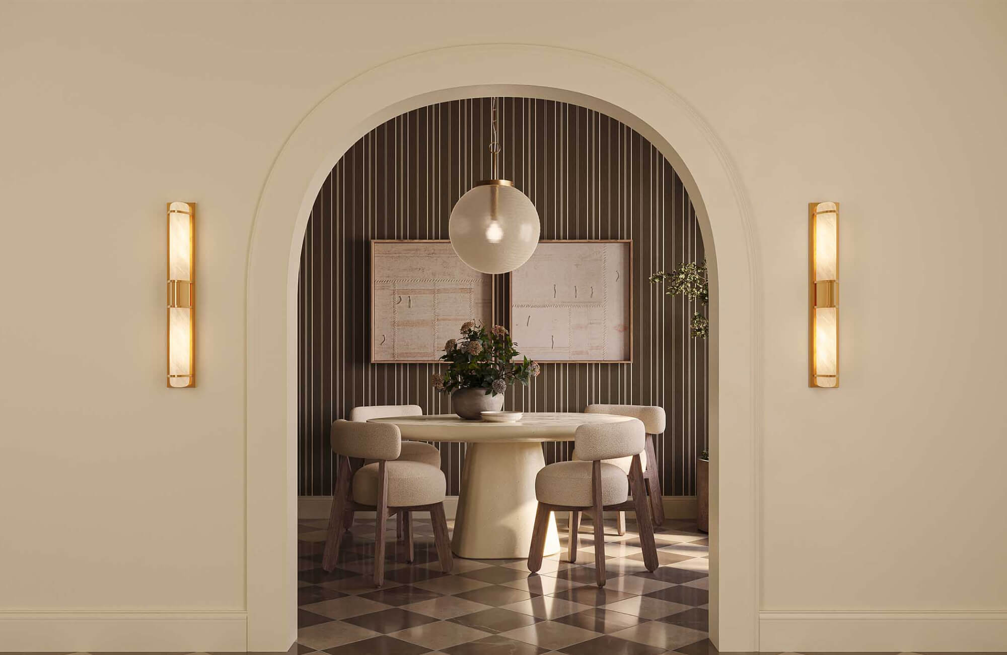
When arranging multiple pieces, consistency in spacing becomes essential for maintaining cohesion. Typically, a gap of 2 to 3 inches between frames creates a balanced and intentional layout that allows each piece to breathe visually. Grid arrangements also offer structure and symmetry, while salon-style layouts introduce a more dynamic and layered composition. Even within varied arrangements, maintaining alignment along a central axis helps anchor the overall display and prevents visual drift.
Pieces like the Meadowline Wall Art, as shown in the photo above, work particularly well in these settings, as their textural, neutral composition integrates seamlessly into both structured grids and more organic gallery arrangements. Thoughtful spacing and placement ultimately prevent clutter while enhancing clarity, making it easier to achieve a cohesive gallery wall layout that feels intentional and well-proportioned.

Enhancing Depth Through Texture, Material, and Framing Choices
Introducing variation in material and texture adds dimension, allowing wall art to contribute more fully to the room’s tactile and visual experience. Through careful layering, surfaces gain depth, preventing the space from feeling flat or one-dimensional.
Selecting Materials Based on Interior Context
Material selection should always reflect the broader design context of the room. For instance, canvas offers a soft, matte finish that integrates well into contemporary and relaxed interiors, while metal wall art introduces reflectivity and an industrial edge suited for modern spaces. In addition, glass-covered prints enhance clarity but require thoughtful placement to minimize glare, whereas wood elements bring warmth and organic texture into the composition.
As each material interacts differently with light, it directly influences how the artwork is perceived within the space. Selecting the right material ensures both visual harmony and functional performance. Incorporating durable, high-quality wall art materials also enhances longevity, especially in frequently used areas. This approach is particularly effective when choosing the best wall art materials for modern interiors or designing long-lasting, cohesive wall decor.
Creating Layered Visual Interest with Mixed Media
To further enhance depth, combining different materials introduces contrast and visual complexity. Integrating elements such as wood, metal, and textiles creates a layered effect that feels intentional and curated. Mixed-media artwork can also serve as a focal point while simultaneously adding dimensionality. This approach reduces visual monotony and encourages tactile engagement. Moreover, it provides flexibility, allowing multiple design influences to coexist within one space.
As a result, the overall composition feels more refined, especially when incorporating mixed media wall art for a layered interior design. Introducing sculptural or three-dimensional elements can further amplify depth, making the wall composition feel more immersive and architecturally integrated. Carefully balancing these materials ensures the space remains cohesive while still offering visual interest and depth.
Choosing Frame Construction and Finish
Frame construction subtly influences both scale perception and overall aesthetic impact. Thin frames, for example, allow the artwork to remain dominant, making them especially suitable for minimalist interiors. In contrast, thicker or more detailed frames introduce visual weight and presence, complementing traditional or layered spaces. The choice of finish, whether matte, gloss, or metallic, also affects how light interacts with the frame and the artwork itself.
Coordinating these finishes with nearby hardware and fixtures helps maintain visual continuity throughout the room. Frame depth can further enhance dimensionality by creating soft shadow lines that add depth to the display. In addition, custom framing options provide greater control over proportion, material, and finish, allowing each piece to align more precisely with its setting. This approach is particularly effective when designing a cohesive wall art display or selecting framing styles that complement the overall interior design.

Integrating Wall Art with Lighting and Functional Intent
Lighting conditions and room function collectively shape how wall art is perceived and experienced. When these factors are thoughtfully integrated, artwork remains both visually impactful and contextually appropriate.
Evaluating Natural and Artificial Light Exposure
Light plays a defining role in how artwork is perceived throughout the day. Natural light, for instance, enhances color vibrancy, though prolonged exposure may lead to fading over time. Artificial lighting, including track and picture lights, provides controlled illumination and allows for targeted emphasis on key pieces. When positioned carefully, these light sources can highlight artwork without overwhelming the surrounding space.
At the same time, balancing intensity helps prevent harsh shadows and uneven contrast, ensuring a more refined presentation. Understanding how lighting affects wall art's appearance is essential for achieving both clarity and visual balance. Incorporating UV-protective glazing and placing artwork away from direct sunlight further preserves color accuracy and longevity. This approach is especially effective when protecting wall art from sun damage while optimizing lighting for a well-lit, cohesive interior display.
Controlling Glare, Shadow, and Contrast
Managing glare and shadow is essential for preserving clarity and visual comfort. Glass-covered artwork should be placed away from direct light to minimize reflections. Diffused lighting also helps distribute illumination evenly, enhancing visibility. Adjusting fixture angles can further reduce unwanted glare. At the same time, maintaining balanced contrast ensures that details remain legible without overpowering the viewer. Meanwhile, anti-reflective glass and museum-grade acrylic can significantly improve visibility in brightly lit environments. These solutions are particularly effective for high-end interiors where optimal viewing conditions and visual clarity are essential.
Matching Artwork to Room Function and Mood
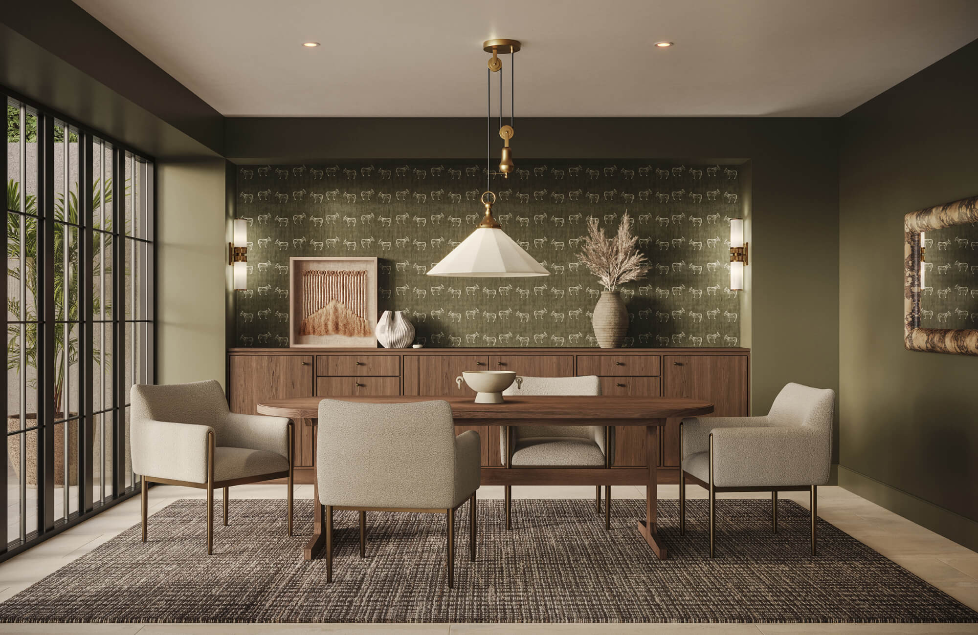
Finally, the intended function of a room should guide both the tone and subject of wall art, ensuring visual alignment with how the space is used. Bedrooms benefit from calming imagery that promotes relaxation and restfulness, while living areas can accommodate more expressive pieces that establish a focal interest. In transitional or ambient spaces, such as dining or bar areas, artwork with warm tones and subtle texture can enhance the atmosphere without overwhelming the setting.
Pieces like our Silent Orchard Wall Art, as featured in the picture above, exemplify this balance, offering a grounded, organic composition that pairs seamlessly with rich materials and ambient lighting. In workspaces, artwork that supports clarity and focus helps reinforce both productivity and visual order. When wall art is selected based on function and mood, the space feels cohesive, intentional, and thoughtfully designed.
Creating a Unified and Visually Balanced Interior Space
A thoughtful approach to choosing wall art ensures that each piece contributes meaningfully to a cohesive and visually balanced interior. By integrating interior design style alignment, color coordination, proper scaling, and lighting considerations, wall art becomes a defining element of spatial composition. Careful material selection and placement further enhance depth, allowing the space to feel layered and intentionally curated. When these elements are applied with precision, it becomes easier to create a cohesive interior with well-matched wall art and decor.
For a more tailored approach, Edward Martin’s design services provide expert guidance in curating wall art and cohesive interiors. Our team works closely with you to align style, scale, and material with your space. Contact us to create a refined, visually balanced home that feels intentional and complete!