


Choosing the right checkerboard tile scale is more than an aesthetic choice as it directly affects spatial perception, layout balance, and visual flow. To start, tile size should align with room dimensions, ceiling height, and design intent, with smaller patterns enhancing compact spaces and larger ones adding structure to open areas.
Just as importantly, scale influences how the checkerboard pattern interacts with architectural features, flooring transitions, and furnishings. Whether you're aiming for subtle tonal grids or bold contrasts, selecting the right proportion ensures your checkerboard floor complements the space rather than competing with it. As you read ahead, we’ll explore how to choose the ideal scale for your room based on size, style, and technical considerations.

Understanding the Impact of Checkerboard Scale on Room Aesthetics
The scale of your checkerboard tile does more than fill floor space, as it shapes how the room is perceived and experienced. From adding intricate detail to opening up expansive layouts, each size choice brings its own unique visual and spatial impact.
Small-Scale Patterns
Small-scale checkerboard patterns, typically using tile sizes between 4 to 8 inches, introduce a refined sense of detail and movement that can enrich intimate or narrow spaces. Because of their size, these tighter grid arrangements create more frequent intersections and grout lines, which naturally enhance visual texture and rhythm. In practical terms, this makes them particularly effective in powder rooms, foyers, or galley kitchens, where small-scale patterns can inject energy and definition without overwhelming the architecture. Visually, the pattern appears more intricate, adding depth and dimension, especially when rendered in high-contrast combinations like black and white or navy and cream.
Technically, small-scale layouts work best when grout lines are consistent and the substrate is perfectly level, as any minor irregularity becomes more noticeable due to the increased joint frequency. Design-wise, they also complement traditional, vintage, or eclectic interiors by evoking a sense of artisanal craftsmanship. That said, in larger spaces, small-scale checkerboards may risk appearing overly busy or disproportionate unless carefully balanced with simple furnishings and a restrained color palette.
Medium-Scale Patterns
Medium-scale checkerboard tiles, generally 10 to 14 inches square, offer a versatile middle ground between intricacy and expansiveness. Because of this balanced sizing, the scale is ideal for creating visual harmony, as it delivers enough pattern to make an impact while maintaining a clean and uncluttered appearance. In particular, rooms such as dining areas, bedrooms, or standard-size bathrooms benefit from this layout, as medium-scale patterns can unify the space while keeping proportions aligned with surrounding features like baseboards, cabinetry, or furniture legs.
From a technical standpoint, this tile size introduces fewer grout lines than smaller patterns, making the surface easier to clean and visually less segmented. At the same time, it avoids the expansive feel of large format tiles, which can sometimes overwhelm more compact interiors. Design-wise, medium-scale checkerboards adapt well to both classic and contemporary aesthetics, especially when paired with tone-on-tone color combinations that reduce visual contrast for a more polished look. Ultimately, this versatility makes them a top choice in transitional designs, where the goal is to merge old-world charm with clean, modern sensibilities.
Large-Scale Patterns
Large-scale checkerboard patterns, featuring tile sizes from 16 inches and up, are increasingly favored in open-plan layouts and modern interiors for their ability to visually expand a space. Because of their scale, these oversized patterns feature fewer intersections and broader color blocks, which helps reduce visual noise while lending a sense of calm and spaciousness. As a result, in great rooms, large kitchens, or open hallways, the generous tile format creates long sightlines and seamless flow, making the entire space feel more cohesive and expansive.
This effect is enhanced when using rectified porcelain or stone look tiles, which allow for minimal grout lines and contribute to a more continuous appearance. Aesthetically, the large checkerboard format aligns well with contemporary design principles, emphasizing clean geometry, and bold contrasts. When executed properly, large-scale checkerboards make a bold yet sophisticated statement, perfect for those seeking modern impact without compromising on changing trends.

Considering Room Size and Layout for Optimal Checkerboard Scale
Choosing the right checkerboard scale starts with understanding how your room’s physical layout influences visual balance. From square footage to ceiling height and furniture placement, these architectural details help determine which tile size will feel naturally proportioned and visually cohesive.
Matching Tile Size to Room Dimensions
The square footage of a room helps in determining the most suitable checkerboard tile scale. In smaller spaces, such as powder rooms, closets, or compact foyers, tiles sized between 4 to 8 inches tend to maintain proportion while enhancing visual detail. Because of their tighter repetition, these finer grids help break up the limited floor plane and create an illusion of depth and complexity.
Conversely, medium to large rooms, such as living rooms, open kitchens, or dining areas, benefit from large format tiles, typically 16 inches and up. These larger scales reduce grout line density, allowing the floor to "breathe" and reinforcing a sense of openness and continuity. To maintain balance, industry guidelines suggest using tiles that span at least 1/5 to 1/8 of the room’s shortest dimension. By following this ratio, the checkerboard layout retains architectural coherence, preventing the pattern from feeling either oversized or visually fragmented.
Choosing Scale for Vertical Harmony
Ceiling height significantly affects how the checkerboard pattern is perceived in relation to the entire room envelope. In rooms with standard 8-foot ceilings, a medium-scale pattern (10–14 inches) often strikes the best balance, as it anchors the space without drawing attention away from the vertical boundaries. However, using larger tiles in these settings can make the ceiling feel lower, as the eye is pulled horizontally by expansive, uninterrupted tile surfaces, compressing the perceived height.
In contrast, high-ceilinged environments, such as vaulted rooms, lofts, or double-height foyers, benefit from larger-scale checkerboards. In these spacious settings, oversized tiles complement the vertical volume by reinforcing a sense of grandeur and minimizing visual fragmentation. Maintaining this vertical-horizontal balance is essential for preserving proportional integrity across all visual planes. Additionally, lighting in high ceilings combined with large tiles can influence how shadows fall and how reflections shift, depending on the source and direction of natural or artificial light.
Integrating the Pattern with Room Elements
The presence and placement of furniture, cabinetry, and fixtures should also influence the scale of your checkerboard tiles. In rooms with denser layouts, smaller-scale patterns work especially well, as they can weave well between legs, pedestals, and built-ins without visual disruption. For instance, a small checkerboard in a bathroom complements tight vanity bases and compact fixtures, maintaining consistent pattern visibility without abrupt truncation.
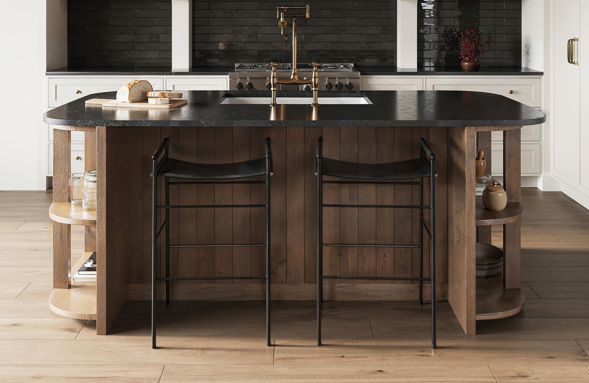
For more open but moderately furnished spaces, medium-scale patterns offer greater flexibility. They allow the checkerboard design to remain legible while still creating a cohesive floor field beneath sofas, tables, and beds. As displayed in the photo above, the Leona 12x12 Checkerboard Matte Porcelain Tile in Calacatta and Amani Grey exemplifies how this scale maintains visual clarity around freestanding tubs and vanities, preserving design consistency through transitional zones and around key elements.
On the other end of the spectrum, large-scale checkerboards are ideal for minimal or open layouts, where uninterrupted expanses of flooring can emphasize bold geometry without distraction. That said, large tiles should be placed thoughtfully to avoid awkward cuts around island bases, floor vents, or built-ins.

Exploring Design Styles and Checkerboard Scale Compatibility
Checkerboard tile isn't just about contrast, it’s about how scale supports your design style and brings your aesthetic to life. Depending on the look you're after, the size of each tile can either ground the space with charm, amplify bold modernity, or add playful variety to more eclectic interiors.
Classic and Traditional Designs
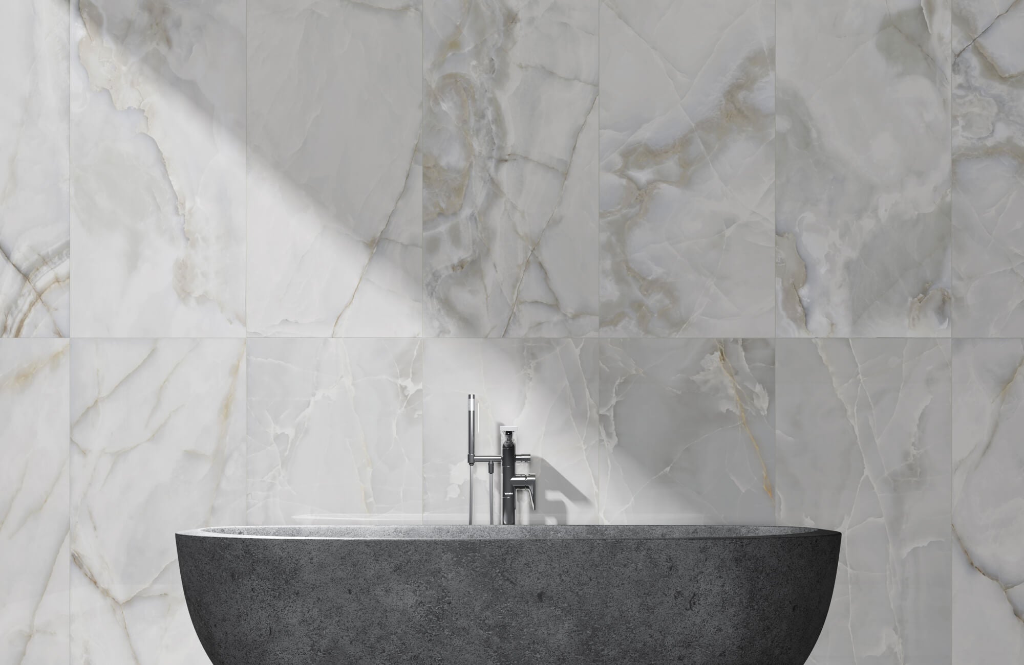
Classic interiors, ranging from colonial to Victorian to Parisian-inspired styles, thrive on symmetry, proportion, and detailing. In these settings, medium-scale checkerboard tiles, typically 10 to 14 inches square, are particularly compatible with traditional aesthetics. This tile size reinforces the elegance of balanced layouts without overpowering the architectural framework or detracting from ornate millwork, crown moldings, or vintage furnishings. When paired with soft contrasts like cream and taupe or marble-inspired textures, the checkerboard pattern reads as refined and heritage-rich rather than visually aggressive.
This sense of balance is especially evident in designs like Edward Martin’s Palmer 12x12 Checkerboard Matte Porcelain Tile in White and Grey (as shown in the picture above), which features a muted contrast and matte finish, ideal for traditional kitchens or utility spaces. Thanks to its proportion, the scale works effortlessly within cabinet-lined layouts, providing structure without visual clutter and supporting the restrained elegance that defines period-inspired interiors.
Moreover, many historic homes feature smaller, compartmentalized rooms with clearly defined thresholds. In these cases, a medium-scale pattern offers just enough rhythm and variation to define each area while preserving visual continuity between adjoining spaces. For historically sensitive renovations, materials like encaustic tiles or natural stone in matte finishes can further reinforce period authenticity while maintaining the integrity of the checkerboard layout.
Modern and Contemporary Designs
Contemporary and modern spaces prioritize simplicity, spatial clarity, and clean geometric lines, qualities that are significantly amplified by large-scale checkerboard patterns. By using tiles 16 inches or larger, especially in high-contrast palettes like black and white or charcoal and ivory, you can introduce a bold visual structure that aligns well with the minimalist ethos of modern design. In addition, the generous tile scale minimizes grout joints, contributing to the sleek, uninterrupted floor plans often desired in open-concept living areas and streamlined kitchens.
This approach pairs especially well with architectural features such as floating cabinetry, frameless windows, and monochromatic walls, all of which benefit from the added definition and order that a large format checkerboard provides. In settings like loft-style interiors or minimalist homes, the pattern becomes a grounding element, delivering character and depth without relying on excess décor or ornamentation. From a technical perspective, large rectified tiles with tight grout lines enhance precision and surface uniformity, reinforcing the crisp, grid-like aesthetic that defines contemporary styling.
Eclectic and Bohemian Designs
Eclectic and bohemian interiors thrive on visual layering, material contrast, and unexpected combinations, making them ideal candidates for creative experimentation with a checkerboard scale. Unlike more structured design styles, these aesthetics embrace flexibility, allowing for the mixing of tile sizes, even within the same installation zone, to achieve an intentionally asymmetrical or artisanal look. For example, pairing medium-scale checkerboard tiles in one area with smaller-scale patterns in an adjacent niche or hallway can create playful, organic transitions that reflect the eclectic ethos.
In particular, smaller tiles with hand-glazed finishes or noticeable textural variance contribute a handcrafted, one-of-a-kind feel that aligns with bohemian sensibilities. At the same time, irregular checkerboard arrangements or muted tonal contrasts, such as soft greens with terra cotta, steer away from traditional formality and toward a more relaxed, personalized aesthetic. However, because bohemian and eclectic spaces often feature an abundance of varied furnishings, textiles, and wall treatments, the checkerboard scale must be chosen thoughtfully. To maintain visual balance, opt for quieter color combinations or more restrained proportions when the surrounding décor is already layered and visually rich.

Practical Considerations for Checkerboard Tile Selection
While checkerboard tiles make a strong visual impression, the practical side of scale, like cost, installation demands, and upkeep, can shape your decision just as much. By weighing these behind-the-scenes factors early on, you’ll avoid surprises and choose a tile size that fits both your vision and your project scope.
Budget Implications
Tile scale has a significant impact on overall project cost, influencing both material and labor expenses. While it may seem economical at first, smaller tiles, though often less expensive per square foot, typically require more individual pieces to cover the same area. As a result, this increases the number of grout lines and extends installation time, ultimately raising labor costs. Additionally, specialty or hand-finished small-format tiles can carry a premium due to the intricacy involved in their manufacturing.
On the flip side, large format tiles may come with a higher price tag per piece but often reduce total installation time due to their broader surface coverage. Because fewer tiles are needed, the layout process becomes more efficient, and in some cases, bulk pricing is available, particularly with materials like porcelain or natural stone. However, it’s important to note that larger tiles demand a more stable, perfectly leveled subfloor to prevent lippage, potentially increasing prep costs. Therefore, when budgeting, it’s essential to consider more than just the tile price, factor in underlayment, trim pieces, and a waste allowance of 10–15% to ensure a comprehensive and realistic estimate.
Installation Complexity
The scale of your checkerboard pattern directly affects the technical complexity of the installation. Smaller-format tiles, in particular, require meticulous alignment to ensure even spacing and pattern continuity, especially in checkerboard layouts where even slight misalignments are immediately noticeable. Because of the increased quantity, the higher number of tiles raises the margin for cumulative error across the floor. To avoid these issues, installers must frequently check for square alignment, maintain consistent joints, and use leveling systems or spacers to ensure precision throughout the layout.
In contrast, medium-scale tiles are generally the most straightforward to install, striking a balance between pattern control and overall efficiency. For example, Edward Martin’s Leona 12x12 Checkerboard Matte Porcelain Tile in Marfil and Amani Bronze exemplifies this ease of use, it offers a manageable size for tight or curved bathroom layouts while still delivering a polished checkerboard effect.
At the other end of the spectrum, large format tiles offer a clean, modern look with minimal grout lines, making them ideal for expansive floors. To achieve their full visual impact, these tiles require careful handling, expert installation, and tools like large format cutters and suction lifters. Back-buttering is also key to ensuring proper bonding and long-term durability. In checkerboard layouts, they create a bold, seamless pattern, especially when paired with precise measurements and thoughtful layout planning. For a dramatic, high-end finish, porcelain large format tiles offer exceptional visual continuity when installed with precision.
Grout Line Impact
Grout lines not only contribute to the overall aesthetic but also affect daily maintenance and long-term durability. In layouts using smaller checkerboard tiles, the high frequency of grout joints introduces additional surface texture and visually breaks up the floor plane. While this added detail can enhance the charm of vintage or traditional spaces, it also increases the surface area vulnerable to staining and grime buildup. As a result, smaller grout lines typically require more frequent sealing and ongoing cleaning, especially in moisture-prone areas such as bathrooms or kitchens.
By comparison, larger tiles significantly reduce the number of grout joints, creating a smoother, more continuous appearance that’s generally easier to maintain. When combined with rectified edges and tight grout spacing (typically around 1/16 inch), large-scale checkerboards convey a clean, contemporary aesthetic with minimal visual interruption. That said, wide grout joints, whether intentional for stylistic effect or a result of tile irregularity, can alter the perceived scale of the pattern and shift the balance between color blocks. To manage this visually, choosing a grout color that closely matches one of the tile tones helps minimize joint visibility, while a contrasting grout highlights the grid structure and brings a sharper definition to the layout.

Visualizing Your Choice Testing and Sampling Checkerboard Scales
Before settling on a checkerboard scale, it’s important to see how it actually plays out in your space, what looks balanced on paper can feel very different underfoot. Fortunately, between hands-on sampling and digital tools, there are smart ways to test your options and avoid second-guessing later.
Experiencing Scale and Color In-Person
Ordering physical tile samples is one of the most effective ways to evaluate checkerboard scale and color contrast in your actual environment. By placing sample tiles directly on your floor, even in a limited section, you gain valuable firsthand insight into how the size interacts with nearby architectural elements, lighting conditions, and furniture arrangements. This hands-on approach reveals subtle but important characteristics that digital renderings often miss, such as surface texture, sheen, and grout line width.
To make this process even more accessible, Edward Martin offers a convenient tile samples service that allows you to explore our selections before committing to a full order. Once you’ve found a design you like, just visit the product page and click “order sample.” A physical sample will be delivered straight to your door, offering an easy way to test it in different lighting conditions and room layouts. Whether you’re comparing tones or validating surface finishes, sampling empowers you to make confident, informed decisions that align with your space and vision.
To better visualize scale and flow, use painter’s tape or chalk lines to mock up a section of the checkerboard grid. This helps you see how tile size affects proportions and movement, especially in narrow or high-visibility spaces. It also lets you assess color accuracy, which can shift under different lighting conditions, an important factor for tonal checkerboards. For the best results, view your sample area at various times of day to observe changes in light and shadow.
Simulating Different Patterns
Digital visualization platforms have become increasingly sophisticated, allowing you to simulate checkerboard tile installations before purchasing. Today’s tools make it easier than ever to experiment with scale and pattern before any tile is laid. Many manufacturers and tile retailers now offer online platforms that let you upload a photo of your room or use preset templates to overlay checkerboard patterns in various scales, orientations, and color combinations. As a result, you can quickly compare design options and gain a realistic sense of proportion, without the need for manual mock-ups.
To elevate this experience, Edward Martin offers an intuitive Augmented Reality (AR) Visualization Tool that lets you see how your selected tile will look in your actual space before making a commitment. Using your mobile device, point to any floor surface, and the AR feature will project the checkerboard pattern directly onto it, enabling you to assess the scale, layout orientation, and color tone in real time. This functionality is especially valuable for previewing how large format tiles interact with surrounding finishes or how a diagonal layout will align with your room’s angles and flow.
For instance, this tool is particularly helpful when evaluating bold, large-scale designs like the Blair 24x24 Checkerboard Polished Porcelain Tile in Marmo Black and Volakas White. Given the tile’s large format and dramatic veining, careful placement is essential to ensure that the pattern enhances rather than dominates the room. While digital tools can’t replicate the tactile feedback of physical samples, they offer an excellent way to visualize layout possibilities and narrow your options with confidence. When used together, digital simulations and physical samples provide a well-rounded, comprehensive approach to selecting a checkerboard scale that feels both balanced and visually successful in your space.
Perfectly Proportioned Checkerboards Matters
Achieving the ideal checkerboard aesthetic hinges on a clear understanding of how tile dimensions interact with spatial volume, architectural features, and design intent. As outlined earlier, selecting between small, medium, or large format tiles depends on room size, ceiling height, and how the pattern integrates with existing furnishings and style. By thoughtfully considering these factors, you can choose a checkerboard scale that enhances your space with balance and purpose. For tailored guidance, explore Edward Martin’s range of tile sizes and connect with our design experts to bring your vision to life.