


Choosing the perfect color palette for your bathroom renovation is a foundational design decision that influences everything from perceived space to material compatibility and long-term maintenance. Because bathrooms combine architectural finishes, lighting variables, plumbing fixtures, and moisture-resistant materials, color selection must account for both aesthetics and functional performance.
This article explores how color theory, spatial analysis, finish selection, lighting engineering, and trend forecasting interact to shape a cohesive bathroom design. By breaking the process into distinct stages, you can make strategic choices that enhance visual flow, increase resale value, and support durability. Ultimately, understanding these principles ensures your bathroom color palette feels intentional, balanced, and tailored to the way you use the space.

Establishing a Foundational Color Strategy
A strong foundation for your bathroom color palette begins with understanding how color behaves within architectural boundaries and moisture-rich environments. By grounding your palette in technical principles, you create a design that feels cohesive, intentional, and visually stable.
Assessing Light Reflectance Values (LRVs)
Light Reflectance Values shape how a surface interacts with illumination, and this interaction ultimately determines how spacious or compact your bathroom feels. As higher LRVs reflect more ambient light, they naturally expand visual boundaries and create a brighter, more open impression. Lower LRVs, by comparison, absorb light in a way that adds depth and controlled contrast, giving larger rooms a sense of grounded refinement. When these values are evaluated across tile, stone, and paint samples, they reveal how each surface contributes to the overall lighting profile. This awareness also allows you to prevent imbalances such as overly bright upper walls or unexpectedly dark corners. As the palette comes together, LRVs ensure every color supports a unified visual and functional outcome.
Identifying Dominant Architectural Elements
Every bathroom has one or two architectural elements that quietly shape the room’s visual hierarchy, and recognizing them early helps streamline color decisions. Because these prominent surfaces, often the vanity, flooring field, or shower surround, carry the strongest undertones, they naturally influence how surrounding colors are perceived. When their chromatic cues are acknowledged, secondary selections fall into place more easily and with far fewer conflicts. This also creates a rhythm in which each layer of color feels like a deliberate extension of the previous one. As a result, the palette reads as a unified composition rather than a series of unrelated choices. This harmonized structure establishes a steady baseline from which accents and metal finishes can confidently evolve.
Mapping Warm vs. Cool Undertones
Undertones quietly dictate whether a bathroom feels cohesive or unintentionally mismatched, making their identification a crucial step in color development. For instance, warm undertones introduce notes of beige, cream, and soft gold that blend effortlessly with brass or champagne hardware. On the other hand, cool undertones, ranging from blue-gray to crisp white, naturally align with chrome, polished nickel, and stainless steel finishes. When these subtleties are evaluated across tile, stone, paint, and cabinetry, they also reveal a chromatic pattern that guides the rest of the palette. This clarity prevents situations where metals or paints appear “off” despite being attractive individually. Through this calibrated approach, undertones form the structural backbone of a palette that feels both technically precise and visually serene.

Using Lighting Analysis to Ensure True Color Accuracy
Because lighting changes the appearance of every surface, analyzing natural and artificial illumination ensures your colors remain consistent at all times. This careful evaluation allows your palette to perform reliably from early morning light to evening task lighting.
Studying Natural Light Direction and Intensity
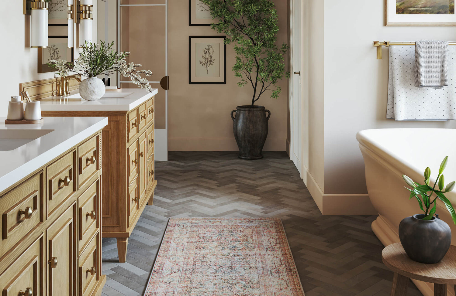
Natural light introduces its own temperature variations, and each directional exposure influences how colors settle into the space. North-facing bathrooms, for example, often develop cooler shadows, prompting warmer neutrals to balance out the blue-leaning daylight. Conversely, south-facing rooms receive generous sunlight that heightens warmth, allowing cool palettes to maintain clarity without appearing sterile. Meanwhile, in east-facing spaces, morning brightness gradually softens, requiring tones that remain stable through daily shifts. West-facing rooms, in turn, receive late-day illumination, so it's important to select hues that retain accuracy under more amber-toned light. By tracing these cycles, your palette evolves into one that feels steady, predictable, and visually true throughout the day.
In the bathroom photo shown above, this interaction between daylight and surface material becomes even more apparent through Edward Martin’s Esmeralda Round Mirror in Polished Brass, which amplifies incoming natural light and redistributes it softly across the room. The mirror’s polished brass frame catches warm highlights throughout the day, subtly warming adjacent surfaces and preventing the space from feeling flat during cooler morning light. As sunlight shifts, its reflective edge also brightens the surrounding tile and fixtures, enhancing depth and clarity without creating glare. This gentle diffusion helps balance the cooler undertones of materials like the Aniston 24x48 Matte Porcelain Tile in Calacatta Top, allowing the palette to remain cohesive as light temperatures fluctuate. Through this interplay of reflection, warmth, and controlled brightness, this Esmeralda mirror becomes an essential element in stabilizing the room’s natural-light rhythm and supporting a consistently harmonious atmosphere.
Selecting High-CRI LED Fixtures
Artificial lighting must support accurate color perception, and LEDs with a CRI of 90+ ensure undertones appear clean and undistorted. Because high-CRI light reveals subtle chromatic nuances, it prevents colors from taking on unwanted yellow, blue, or gray shifts. This accuracy also becomes essential in bathrooms where grooming tasks rely on true rendering of skin tone and fabric color. Neutral 4000K LEDs further reinforce this clarity by offering a balanced warmth-to-cool ratio that illuminates the space without introducing harshness. As this lighting interacts with tile, paint, and stone, it enhances the palette’s richness rather than muting it. Through this controlled illumination, every finish retains its intended color identity.
Testing Color Samples Under Multiple Light Temperatures
Color samples behave differently under warm, neutral, and cool lighting, so evaluating them under all three conditions helps prevent costly surprises. Warm 2700K lighting, in particular, casts an amber glow that can soften or distort cooler palettes, while slightly higher 3000K temperatures create a gentler, more moderate shift. As the light moves toward neutral territory around 3500K–4000K, undertones become clearer, revealing any hidden complexity in tile or stone surfaces. Pushing past 4000K introduces cooler illumination that enhances precision, though it can feel clinical if not balanced by supportive materials. Observing these shifts makes it easier to identify a color’s most authentic state, and with this multidirectional testing, the palette maintains its integrity no matter how the lighting changes.

Coordinating With Fixed Materials and Architectural Finishes
Because fixed materials form the permanent foundation of your bathroom design, coordinating your palette with these elements strengthens visual consistency. When hues and undertones align across tile, stone, cabinetry, and metal finishes, the entire space reads as refined and cohesive. If you're evaluating tile tones as part of this process, our guide on Which Color Is Best For Bathroom Tiles? provides clarity on how different tile colors perform in real spaces.
Analyzing Tile Veining, Pattern Movement, and Texture
Tile often serves as the most visually expressive surface, and its veining or patterning naturally guides the surrounding color story. These tonal variations, whether in marble, travertine, or stone-look porcelain, reveal undertones that influence how paint and cabinetry should be selected. When these patterns carry strong visual movement, surrounding colors must quiet the palette to avoid unnecessary complexity. Conversely, tiles with minimal patterning can support bolder or more saturated accents without overwhelming the room. As textures shift from matte ceramic to polished porcelain, light also interacts differently with each finish, shaping the perceived brightness of adjacent surfaces. Through this lens, tile becomes the chromatic compass for the entire bathroom.
The picture displayed above illustrates this concept especially well with Edward Martin’s Isabel 11x11 Matte Porcelain Tile Star in Charcoal and Cross in Rosewood, whose bold geometric pattern instantly becomes a controlling visual rhythm for the entire space. Its matte finish softens the tile’s high-contrast motif, allowing the dark gray and reddish brown tones to read as warm, grounded neutrals rather than overwhelming focal points. Because the pattern carries a steady, repeating movement, it also anchors the room against the more subtle vertical texture of the shower tiles, creating a balance between boldness and refinement.
The interplay between these two tile styles demonstrates how pattern direction and scale can shape a bathroom’s atmosphere, guiding the eye from floor to accent wall without visual fatigue. As natural and artificial light shift across the surface, this Isabel tile maintains its rich contrast while still harmonizing with brass fixtures, dark cabinetry, and soft taupe walls. This synergy shows how strategic pattern selection can unify a complex palette, turning a highly decorative tile into a stabilizing design element.
Determining Countertop and Vanity Color Relationships
Countertops act as a bridge between horizontal and vertical surfaces, so their undertones play an integral role in maintaining harmony. As those subtle flecks or veins in quartz and natural stone lean warm or cool, they naturally guide cabinetry choices in the same direction. When the vanity responds to these cues, the transition between materials feels smooth and deliberate. This alignment also stabilizes the visual flow across the room, preventing abrupt shifts that break the sense of cohesion. As colors begin to layer, these relationships help determine which accents or wall hues will complement the broader palette. Ultimately, the countertop-to-vanity relationship becomes a quiet but powerful anchor in the design.
This balance between horizontal and vertical surfaces is clearly illustrated in the photo above featuring Edward Martin’s Sasha 72" Double Vanity in Carbon Oak with 3 cm White Zeus Quartz Top, where the vanity becomes the chromatic bridge that ties the room’s bold tilework to its warmer architectural finishes. The deep gray-brown base introduces a grounding undertone that offsets the graphic pattern of this Isabel tile, preventing the strong motif from overwhelming the room’s lower visual plane.
Above it, the White Zeus quartz-based top provides a clean, controlled surface with uniform coloration, reflecting light softly and creating a refined transition between the dark vanity and the surrounding clay- and charcoal-toned tile. Its low-variation, engineered consistency also stabilizes the palette by offering a quiet counterpoint to the movement in both the patterned floor and the vertically stacked shower tile. Together, the vanity and quartz-based top demonstrate how pairing warm wood textures with smooth, predictable surfaces can harmonize even the most expressive tile compositions. As a result, the space feels cohesive, intentional, and visually balanced despite its bold material contrasts.
Matching Metal Finishes to Hue Temperature
Metal fixtures introduce reflective accents that can either strengthen or undermine your chosen palette. Warm metals, for example, like brushed brass and champagne bronze, reinforce palettes rooted in beige, cream, or earthy neutrals. On the other hand, cool metals such as chrome and polished nickel naturally elevate crisp whites, misty blues, and soft grays. Matte black also provides a flexible counterpoint that enhances modern, high-contrast environments without overpowering nearby materials. When the metal finish aligns with the underlying undertone, the entire composition feels more polished and intentionally layered. This synergy ensures that each metallic detail enhances, rather than competes with, the surrounding color scheme.
To further refine the process of coordinating fixed materials, especially when evaluating tile undertones, patterns, and surface finishes, Edward Martin’s augmented reality (AR) tool offers a seamless way to visualize options before making final selections. By simulating these combinations in real time, the AR platform supports more confident decision-making, ensuring the tile you choose harmonizes with the rest of your architectural finishes.

Applying Design Psychology and Functional Color Behavior
Because color influences mood, perception, and daily experiences, selecting hues with psychological intent enhances both comfort and functionality. A thoughtful palette supports a bathroom that not only looks refined but also feels aligned with the way you live.
Crafting Spa-Inspired, Restorative Palettes
Spa-inspired palettes thrive on soft, desaturated hues that soothe the senses and reduce visual tension. Colors like eucalyptus green, misty blue, and warm ivory create an atmosphere that encourages slow, restorative moments. These tones pair beautifully with natural stone and textured ceramics, allowing organic materials to reinforce the calm aesthetic. As light moves across these surfaces, the palette also softens further, deepening its sense of serenity. This natural rhythm cultivates a retreat-like environment within the home. Over time, the palette becomes an anchor for wellness, comfort, and quiet luxury.
This spa-inspired calm is beautifully expressed in the picture shown above, where several elements collectively shape the room’s restorative atmosphere. Edward Martin’s Colton 72" Double Vanity in Coastal Driftwood with 3 cm White Zeus Quartz Top introduces a soft, organic warmth that grounds the palette, allowing the room to feel both natural and effortlessly balanced. Layered above it, the Isadora Wall Sconce in Polished Nickel adds a crisp, diffused glow that enhances clarity without harshness—an essential quality in spa-driven lighting.
Along the walls, our Maisie 2.5x16 Glossy Ceramic Tile in Pistachio provides a gentle wash of color, offering just enough botanical freshness to echo the serenity of water and nature without overpowering the space. Its glossy surface captures light in soft, fluid reflections, reinforcing the sense of openness and airiness that defines spa-focused design. Together, these elements create a harmonious interplay of tone, light, and texture, forming a bathroom retreat that feels soothing, cohesive, and deeply restorative.
Developing High-Contrast, Contemporary Themes
Contemporary bathrooms often rely on assertive contrast to emphasize architectural lines and sculptural forms. Deep charcoals, navies, and matte blacks introduce visual weight that heightens the impact of lighter tile or metallic accents. When these darker hues ground the space, they create a dramatic backdrop for streamlined fixtures and geometric layouts. Layered lighting also enhances this contrast, revealing tonal depth and subtle surface details. As the eye moves between light and dark elements, the room gains a sense of precision and clarity. This interplay transforms color into a tool for architectural expression.
Balancing Aesthetic Impact With Maintenance Practicality
The functional behavior of color shapes how the bathroom looks after daily use, making maintenance an integral part of palette selection. Light tones, in particular, reveal residue more readily, yet they also brighten spaces that receive little natural light. Conversely, darker hues conceal certain imperfections but can highlight soap film and mineral deposits, especially on matte finishes. Mid-tone palettes strike a practical balance by minimizing both extremes, allowing the bathroom to retain its polished appearance with less effort. When undertones are calibrated carefully, even hardworking areas maintain visual consistency. This balance ensures the palette remains beautiful without demanding excessive upkeep.

Building a Multi-Layered Palette for Longevity and Flexibility
A successful bathroom palette benefits from a multi-layered structure that maintains long-term relevance while accommodating evolving style preferences. By distributing color across foundational layers and flexible accents, the space remains both stable and adaptable.
Defining the Five Core Palette Layers
A well-composed palette draws from five strategic layers: primary color, secondary color, accent tone, neutral anchor, and metallic finish. The primary color sets a consistent backdrop that unifies the space, while the secondary color supports and enhances architectural surfaces such as tile or cabinetry. Carefully chosen accent tones then introduce subtle variation, adding depth and interest without disrupting the overall stability of the design. The neutral anchor ties together undertones from flooring, countertops, and fixed materials, creating unity across spatial planes. Metallic finishes then add a curated layer of reflectivity, enhancing the palette’s dimensionality. Together, these layers form a system that supports long-term coherence and design resilience.
This layered approach is clearly demonstrated in the photo shown above, where each product plays a specific role in shaping the visual hierarchy. The vanity wall features Edward Martin’s Makenna 6x6 Glossy Porcelain Tile in Ice, whose soft, watery tonality and handcrafted variation create a serene chromatic backdrop that naturally reads as the room’s secondary color, anchoring the upper palette with calming coolness. Just beyond it, the left-side wall transitions into our Miley 4.5x9.1 Glossy Porcelain Tile in Ice, a complementary tone that uses its elongated proportions and subtle sheen to lift the eye, reinforcing vertical movement while maintaining palette cohesion.
Beneath these cooler surfaces, the floor shifts into the Tatum 24x48 Matte Porcelain Tile in Cross-Cut Straw, acting as the neutral anchor through its warm, sand-toned base and low-reflectance finish, grounding the room with earthy stability. Together, these tiles provide a clear demonstration of how primary hues, secondary tones, and the neutral anchor interact, especially when paired with brushed brass fixtures and warm wood cabinetry as the metallic and material accents. As each layer supports the next, the palette becomes a seamless composition where color, finish, and proportion work in harmony to create a balanced and enduring design.
Integrating Gloss Levels for Dimensional Contrast
Surface sheen influences how light interacts with color, giving gloss levels a critical role in creating visual dimension. Matte finishes, for example, absorb light softly, grounding the palette with a calm, understated presence. Satin and semi-gloss finishes, on the other hand, reflect light more gently, adding a sense of depth without overwhelming other textures. In addition, high-gloss surfaces introduce crisp highlights that enhance architectural edges and brighten darker tones. When these sheens are layered intentionally, they produce a nuanced interplay between light and shadow. This dimensional variation enriches the palette as a whole, elevating its sophistication.
Using Easily Swappable Accent Elements
Accent elements provide an opportunity to refresh the bathroom’s character without altering permanent finishes. Towels, accessories, framed art, and niche décor offer color flexibility that adapts easily to seasonal changes or new design trends. Because these items hold less visual weight than tile or cabinetry, they introduce personality without disrupting structural harmony. As your preferences evolve, these accents can also shift from muted neutrals to bolder hues with minimal effort. Their adaptability keeps the room feeling current while preserving the integrity of the core palette. Over time, this strategy ensures both longevity and ongoing creative freedom.
Elevating Your Bathroom With a Cohesive Color Strategy
A well-planned bathroom color palette strengthens both the design’s visual impact and its long-term functionality, creating a space that feels balanced and thoughtfully engineered. When foundational principles like undertones, light behavior, and material harmony are prioritized, every surface works together to create a sense of intentional cohesion. This integrated approach allows the room to feel timeless even as accents or décor evolve with changing styles. Ultimately, a strategic palette transforms the bathroom into a refined, enduring environment tailored to your daily experience.
Edward Martin’s professional design services strengthen this process by helping you translate your preferred palettes into fully resolved concepts that work harmoniously across tile, paint, fixtures, and lighting. Through personalized consultations and material curation, the design team offers clarity where choices may feel overwhelming, ensuring your bathroom reflects both aesthetic precision and functional intention!