Checkerboard tile can quietly change the way a room feels in ways most people do not immediately connect to the floor itself. A narrow hallway can feel less tunnel-like, a compact bathroom can seem more dimensional, and an open layout can suddenly feel better organized simply because of how the pattern directs your eye. That is why checkerboard tile has remained so effective far beyond its visual charm alone. In this article, we’ll look at how layout direction, tile scale, contrast, and finish can all influence the way your space is perceived, and how to use that to your advantage.

Checkerboard Patterns And Their Role In Spatial Illusions
If you have ever walked into a room with checkerboard flooring and felt like the space looked bigger, busier, more dramatic, or somehow more structured, that reaction is not accidental. Checkerboard patterns naturally influence how your eye moves through a room, which is exactly why they can shift your perception of space so effectively. Before choosing layouts or tile sizes, it helps to understand what this pattern is actually doing visually.
A Brief Historical Perspective
Archaeological evidence suggests that checkerboard patterns were used as early as ancient Mesopotamia and Egypt. These civilizations used geometric floor mosaics in palaces and temples, often using alternating stone or ceramic tiles to create intricate visual effects. The Greeks and Romans further refined the concept, embedding checkerboard motifs into their decorative mosaics, villas, and public spaces.
The pattern’s resemblance to a chessboard is also no coincidence. Chess dates back over a thousand years, with the checkerboard playing as its visual identity. The grid-based layout helped define movement within the game, much like how checkerboard flooring structures a space.
The pattern also holds a special place in Masonic lodges, where checkerboard flooring is often used as a symbolic representation of duality and balance. The Renaissance era saw a grand resurgence of checkerboard flooring, particularly in European estates and palaces. The famous "Queen’s Staircase" in the Palace of Versailles, decorated by the 17th-century French painter Charles Le Brun, is a prime example of how the pattern was embraced for architectural grandeur.
The style gained mainstream popularity in the 1920s and 1950s, and ceramic tile faced competition from vinyl and plastic laminates due to cost-effectiveness and easier installation during the postwar housing boom. However, the checkerboard pattern did not fade away; instead, it transitioned into commercial spaces, particularly diners, where black-and-white vinyl floors became an iconic feature of mid-century American design.
The Psychology Of Patterns
The stark contrast between alternating light and dark tiles creates an immediate focal point. Unlike solid-colored floors, which can appear static, checkerboard tiles naturally draw the eye across a space, making the room feel more dynamic. The stronger the contrast between colors, the more pronounced the effect. A classic black-and-white checkerboard creates maximum visual impact, whereas softer variations (like beige and cream) generate a subtler, more understated effect.
Checkerboard tiles can also manipulate the way we perceive depth. Depending on the color combination and tile size, they can create the illusion of a longer, wider, or taller space. Diagonally laid checkerboard tiles, in particular, trick the eye into seeing a room as more expansive than it actually is. This is because diagonal lines lead the gaze outward, elongating the perceived dimensions of the space.
Unlike monochromatic flooring, which often feels static, checkerboard patterns introduce a sense of rhythm and movement. The repetitive alternation of colors gives the impression of motion, making a space feel more engaging and visually active. This effect can be especially useful in busy areas like entryways, kitchens, and hallways, where a bit of visual energy can enhance the overall ambiance.
Contrast In Depth Perception
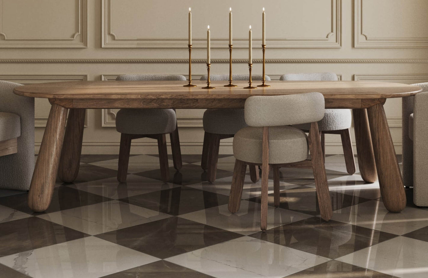
If you are trying to make a room feel more dimensional, checkerboard contrast can work surprisingly well because of the way your brain reads light and dark surfaces. Darker tiles tend to feel like they recede, while lighter ones feel closer, which creates a subtle sense of depth even though the floor itself is completely flat. That push-and-pull effect is one of the reasons checkerboard flooring can make a room feel more layered than a solid-colored surface.
The stronger the contrast, the more obvious that illusion becomes. A bold checkerboard creates much more visual drama because your eye clearly registers the separation between each tile, while softer pairings create a gentler version of that same depth. If your room already has a lot happening visually, lower contrast may feel easier to live with. If you want the floor to play a much bigger role in shaping how spacious or dramatic the room feels, a stronger contrast tends to do the heavy lifting.
Tile Size On Perceived Depth
Even if you keep the exact same checkerboard colors, changing the tile size can completely shift how the room feels. Larger checkerboard tiles usually make the floor feel less visually interrupted because there are fewer grout lines breaking up the pattern, which can help the space feel broader and more open. If you are hoping to make a smaller room feel less cramped, that cleaner visual flow can make a real difference.
| Large Tiles (e.g., 18x18 inches or larger) | Smaller Tiles (e.g., 6x6 or 8x8 inches) |
|---|---|
|
Creates a sense of openness, making the room appear more expansive. With fewer grout lines, the pattern feels less busy, giving the illusion of a more continuous floor. |
Adds intricate detail and enhances the checkerboard effect, but they can also make a room feel visually busier, which may create a more enclosed sensation in tight spaces. |

Optimizing Space With Checkerboard Tile Layouts And Finishes
Checkerboard tile is not just about the pattern itself, but about how you choose to install and finish it. The same checkerboard design can make a room feel larger, more structured, softer, or far more dramatic, depending on the layout direction, contrast, and surface finish. If you are trying to influence how spacious or visually balanced a room feels, these choices matter just as much as the tile colors themselves.
Diagonal Layouts Expand Space
If your goal is to make a smaller room feel more expansive, a diagonal checkerboard layout is often one of the most effective approaches. Because the pattern sits at an angle rather than following the room’s natural wall lines, your eye does not stop as quickly at the edges of the space. Instead, the diagonal movement keeps your gaze traveling outward, which can subtly make the room feel wider or longer than it actually is. This is why diagonal checkerboard layouts often work especially well in tighter spaces like powder rooms, narrower hallways, or galley kitchens, where every bit of visual openness helps.
That said, diagonal layouts naturally feel more energetic because there is more directional movement happening across the floor. If you love spaces that feel lively or visually dynamic, that can be a huge advantage. If you are aiming for something calmer or more formally structured, though, the added movement may feel busier than what you want. It really comes down to whether you want the flooring to visually stretch the room or reinforce a more orderly, grounded layout.
Standard Grid Layouts Define Space
Sometimes the best choice is not the one that tries to visually manipulate the room at all. A traditional straight-set checkerboard layout keeps the pattern aligned with the room’s natural architecture, which tends to make the space feel more structured, balanced, and visually composed. Instead of redirecting the eye outward like a diagonal installation, a standard grid works with the room’s existing proportions, which can be exactly what you want if the layout already feels well-balanced.
This approach often makes more sense in larger rooms, classically styled interiors, or spaces where symmetry already plays a major design role. If your kitchen, foyer, or bathroom has strong architectural lines, a straight checkerboard grid tends to reinforce that sense of order instead of competing with it. It may not create the same dramatic sense of expansion, but if your priority is timeless structure over visual illusion, it usually feels much more natural.
Enhance Space With The Right Finish
Checkerboard tile finish affects much more than maintenance because it changes how light behaves across the entire surface. If your room gets strong natural light or you want the floor to feel brighter and more visually open, glossy or polished finishes can help bounce light around the room and make the space feel more expansive. That extra reflectivity can be especially useful if you are working with a smaller room that could benefit from more brightness.
If you want something softer or less visually active, matte finishes often create a much calmer effect because they absorb light instead of reflecting it sharply. That can make the checkerboard tile feel more grounded and easier to live with if you prefer a quieter design presence. If you are unsure how different finishes will actually look in your own space, Edward Martin’s AR Visualization Tool can make that decision much easier by letting you preview checkerboard tile options directly in your room before committing.

Using Checkerboard Tiles To Create Visual Boundaries
Not every room needs walls or furniture groupings to feel organized. Sometimes the flooring itself can do a surprising amount of that work, especially in homes where open layouts, shared-use spaces, or awkward transitions leave certain areas feeling visually unresolved. Checkerboard tile can be especially effective here because its strong pattern naturally creates separation, helping different parts of a room feel more intentional without making the overall space feel broken apart.
Visually Breaking Up A Space
Open spaces can be beautiful, but they do not always feel naturally organized once you start living in them. A checkerboard floor can help solve that by giving one area a stronger visual identity without making the overall layout feel fragmented. Think about a kitchen that flows directly into a dining area or living room. Using checkerboard tile only where cooking happens can make that zone feel intentionally grounded, almost like the flooring is quietly telling you where one function ends and another begins, without relying on walls or bulky furniture to do the work.
This approach can be surprisingly effective in smaller homes, too. In a studio apartment, for instance, checkerboard flooring in the kitchenette or entry can help those areas feel clearly defined instead of visually blending into everything else. It is a subtle design move, but one that can make a single open room feel far more thoughtfully planned. Sometimes what makes a layout feel better is not adding more separation, but simply giving the eye clearer cues about how the space is meant to function.
Zoning With Checkerboard Tiles
Not every room needs help feeling bigger. Sometimes the real issue is that a larger space feels too open-ended, making furniture placements seem disconnected or a little unresolved. Checkerboard tile can help bring structure to those moments by anchoring specific functions within the room. A checkerboard zone beneath a kitchen island, for example, can make that workspace feel more central and purposeful instead of just floating within a broader floor plan.
The same idea works well beyond kitchens. A reading corner, casual seating area, or even an entry moment inside a larger open space can feel much more deliberate when the flooring visually sets it apart. Because checkerboard already carries strong rhythm and definition, it naturally creates boundaries without making the room feel boxed in. If a larger space feels like it is missing a sense of organization, the solution is not always more furniture or partitions. Sometimes the floor can do that work far more elegantly.

Choosing The Right Checkerboard Tiles
A checkerboard floor can look beautiful in inspiration photos, but the right choice depends on much more than picking two colors you happen to like together. The contrast level, tile material, scale, and maintenance expectations all shape how the final design will actually feel in your home. If you want checkerboard tile to feel like a smart long-term decision instead of a design impulse, those practical details matter just as much as the visual appeal.
Color Combinations
Choosing the right color pairings for your checkerboard tiles can impact the ambiance of a space. Whether you prefer bold contrasts or subtle tones, the right hues can enhance visual depth, complement your decor, and create a distinct design statement.
|
Black & White |
Neutral colors that work with any style—whether you’re aiming for mid-century modern, art deco, or contemporary chic. The contrast enhances the geometric appeal of the checkerboard pattern, making it pop and adding depth to the space. |
|
White & Beige |
A soft, warm contrast that creates an inviting atmosphere. It’s a good choice for spaces aiming for a light, natural look, such as a bathroom or a coastal-inspired kitchen. |
|
White & Blue |
A sophisticated, nautical-inspired palette that brings both depth and freshness to your space. |
|
Beige & Brown |
Earthy and soothing, this combination works well in kitchens or bathrooms with natural wood elements. |
|
Beige & Grey |
A soft and subtle pairing, combining the warmth of beige with the cool neutrality of grey. This is perfect for those who want a contemporary look, ideal for spaces like living rooms, entryways, or neutral-toned bathrooms. |
|
Beige & Black |
Adds sophistication and drama to a space, whether it’s used for flooring or accent walls. It works well in larger areas like living rooms, kitchens, or Scandinavian-inspired spaces. |
|
Grey & Dark Grey |
This monochromatic pair is ideal for contemporary spaces, where subtlety and depth are the focus. It’s perfect for bathrooms, kitchens, or minimalist-themed rooms that need a touch of texture and contrast. |
|
Black & Brown |
Creates a sophisticated yet grounded feel. This works well in spaces with a rustic or industrial style, such as kitchens with metal accents or living rooms with warm, wood furniture. |
As seen in our Palmer 12x12 Checkerboard Matte Porcelain Tile in White and Grey above, subtle contrast can be especially effective when you want the checkerboard effect without making the room feel overly busy. The softer tonal difference keeps the pattern visually interesting while still allowing surrounding finishes, cabinetry, or countertops to breathe. If you love checkerboard but worry about it feeling too loud, lower contrast is often where the pattern becomes much more approachable.
Tile Materials
Two checkerboard floors may look nearly identical at first glance, but the material underneath can make a big difference in how they perform over time. Ceramic tile can be a great option if you are prioritizing affordability, easier installation, or wall applications where extreme durability is less of a concern. It is versatile and design-friendly, but generally softer than porcelain, which means it may be less forgiving in areas that see heavier wear or more impact.
Porcelain tends to make much more sense when durability is higher on your priority list. Because it is denser, more moisture-resistant, and better equipped to handle everyday wear, it is often the stronger choice for floors, bathrooms, kitchens, or other spaces where performance matters just as much as appearance. It may require a bit more investment upfront, but if your checkerboard floor is going somewhere that sees regular use, that added durability often pays off over time. The right material is not always the most premium one, but the one that realistically matches how the space will be used.
Durability And Maintenance Considerations
A checkerboard floor may look polished and timeless, but how much upkeep you are comfortable with should absolutely influence your decision. Porcelain and ceramic are both relatively easy to maintain, which is one reason checkerboard tile remains such a practical design choice, but grout lines deserve a little extra thought. A checkerboard made from smaller tiles naturally introduces more grout joints, which means more areas where dirt, residue, or moisture can gradually collect if the space sees regular use.
That does not mean a smaller-format checkerboard is a bad idea, but it does mean your maintenance tolerance matters. If you prefer something easier to clean and less detail-heavy, larger tile formats with fewer grout interruptions may feel much more practical long term. Grout color also plays a role here, since lighter grout tends to show buildup faster, while darker tones can be a little more forgiving in everyday life. The most successful checkerboard floors are usually the ones that still feel realistic to maintain once the excitement of the design decision wears off.
Mastering Space Perception With Checkerboard Patterns
Checkerboard tile can absolutely change how a room feels, but the strongest results come from using that visual power with intention rather than treating the pattern as purely decorative. The right combination of scale, contrast, layout, and finish can help a compact room feel more open, give a larger space better structure, or create clearer definition between shared zones without adding physical barriers. When those choices are thoughtfully aligned with your room’s proportions and design goals, the checkerboard becomes much more than a statement floor. It becomes a tool that actively shapes the way your home feels.
If you are narrowing down layouts, color pairings, or tile formats and want help visualizing what will actually work in your space, our Personalized Design Consultation can help you make those decisions with much more confidence. Whether you are designing around a smaller room, an open-concept layout, or a very specific aesthetic direction, our team can help you build a checkerboard look that feels intentional from every angle.