


Checkerboard tiles have a way of instantly catching the eye. The alternating squares create a bold pattern that can make floors, kitchens, and entryways feel structured, classic, and full of character. What many homeowners don’t realize, though, is how much lighting can change the way this pattern appears once it’s installed. The direction, brightness, and warmth of light can make the squares look sharper, softer, deeper, or more dimensional throughout the day. In this blog, we’ll take a closer look at how lighting shapes the appearance of checkerboard tiles and share a few practical ways to use light to bring out their full visual impact.

The Science Behind Lighting
Lighting plays a big role in how checkerboard tiles look once they’re installed in a space. The way light moves across the surface can change how strong the pattern appears, how much depth you notice, and even how the colors interact with each other. Taking a closer look at how lighting works helps explain why the same checkerboard floor can feel bold and dramatic in one room but softer and more relaxed in another.
The Role of Light and Shadow
Light and shadow shape how we see patterns, textures, and depth in any room. When light hits a checkerboard tile surface, it highlights the edges of each square while subtle shadows settle along grout lines and small surface variations. These shifts in brightness help define the structure of the pattern, making the alternating squares stand out more clearly. If light enters the room from an angle, the shadows stretch slightly across the tiles and give the pattern a bit more depth. When lighting spreads evenly across the surface, the checkerboard looks flatter and more graphic, allowing the geometry of the design to take the spotlight. Even small lighting changes can make the pattern feel either bold and dimensional or calm and balanced.
The Psychology of Perception
Our eyes notice patterns quickly, but it’s the brain that decides how we interpret them. Checkerboard layouts are especially interesting because the repeating light and dark squares create a strong visual rhythm. When lighting shifts across the surface, the brain starts interpreting those changes as depth or movement. A checkerboard floor may seem like it has slight waves or layers, even though the tiles themselves are completely flat. Small differences in brightness can make some squares appear slightly raised while others seem farther away. This is one reason checkerboard tiles feel so visually engaging in a room. The pattern stays simple, yet lighting gives it a surprising amount of character.
How Surface Finish Influences Light Reflection
The finish of the tile changes how lighting interacts with the checkerboard pattern. Glossy tiles reflect more light, which can create brighter highlights and sharper contrast between the squares. As lighting shifts or people move around the space, those reflections can introduce subtle movement across the surface. Matte finishes behave differently because they scatter light rather than reflecting it directly. This creates a softer look that feels calmer and more relaxed in a room. Many homeowners choose matte checkerboard tiles when they want the pattern to feel grounded without too much shine. Whether you choose matte or glossy, the finish plays a big part in how lively or subtle the checkerboard pattern will feel once lighting enters the space.
How Tile Color Contrast Shapes Visual Impact
The colors used in a checkerboard layout also affect how lighting changes the pattern’s appearance. High-contrast combinations like black and white respond strongly to light because the difference between the two colors is already very noticeable. When directional light hits this type of pattern, the squares can look even sharper and more defined. Softer combinations like cream and gray or beige and taupe interact with lighting in a gentler way. Instead of a strong contrast, the light reveals small tonal shifts across the surface. This creates a checkerboard pattern that still feels structured but more relaxed visually. Choosing the color pairing carefully helps determine whether the pattern feels bold and dramatic or subtle and refined in the space.
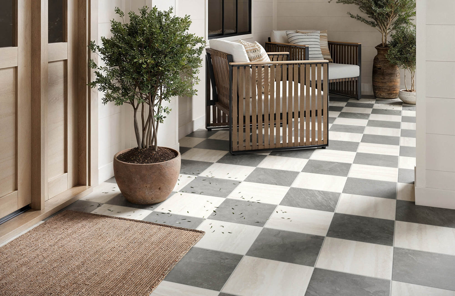
A good example of this softer contrast approach can be seen in our Palmer 12x12 Checkerboard Raw Porcelain Tile in White and Grey above. Instead of relying on stark black and white, the pairing of white and gentle gray creates a checkerboard pattern that feels balanced and easy to live with in everyday spaces. The concrete-look texture and slightly rugged surface interact naturally with light, allowing subtle shifts in tone to appear as lighting conditions change. This combination helps the pattern stay visually interesting without feeling overly bold or overwhelming in the room.

The Impact of Different Light Sources
The type of lighting in a room has a noticeable effect on how checkerboard tiles appear. Natural daylight and artificial lighting interact with surfaces in different ways, shaping how contrast, depth, and color are perceived. Understanding how each light source behaves can help homeowners bring out the best in a checkerboard design.
Natural Light
Natural daylight can completely change how checkerboard tiles look throughout the day. As sunlight moves across the room, the angle of light shifts and creates new highlights and shadows across the surface. In the early morning or late afternoon, lower sunlight produces longer shadows that emphasize the geometry of the pattern. Around midday, when light spreads more evenly, the checkerboard design tends to look cleaner and more balanced. On cloudy days, diffused daylight softens the contrast between the squares, which can make the pattern feel calmer and less dramatic. These natural changes give checkerboard tiles a subtle sense of movement and keep the space visually interesting from morning to evening.
Artificial Light
Artificial lighting gives homeowners more control over how checkerboard tiles are presented in a room. Different bulb types create slightly different visual moods depending on their color temperature and brightness. Incandescent bulbs introduce warm tones that soften the contrast between tiles and make the space feel cozy. Fluorescent lighting tends to lean cooler, which can make checkerboard patterns look sharper and more contemporary. LED lighting is especially flexible because brightness and color temperature can often be adjusted to match the style of the space. Fixture placement matters too, since overhead lighting highlights the overall pattern while accent lighting can introduce subtle depth across the tiles.
Directional Lighting and Pattern Emphasis
The direction of lighting can dramatically influence how strong the checkerboard pattern appears. Light coming from the side or at a low angle tends to stretch shadows across the surface of the tiles. This can add depth and make the pattern feel more dimensional, especially with matte or textured finishes. When lighting comes primarily from above, the surface appears more evenly illuminated, and the pattern reads as a cleaner graphic element. In kitchens or entryways, layered lighting from pendants, ceiling fixtures, and under-cabinet lights can highlight different parts of the checkerboard design. Small adjustments to lighting direction often make a noticeable difference in how lively or subtle the pattern feels.
Color Temperature and Mood
Lighting temperature also changes how the colors in checkerboard tiles appear. Warmer lighting tends to soften strong contrast and introduce a more relaxed, inviting atmosphere in the room. Cooler lighting sharpens the edges of the pattern and can give the tiles a crisp, modern appearance. For black and white checkerboard floors, cooler light often highlights the bold contrast of the design. Softer color combinations, such as gray and cream or beige and taupe, can look warmer and more blended under warmer lighting. Because of this, homeowners often choose lighting temperature based on the mood they want the room to create.

Practical Tips for Integrating Lighting into Your Checkerboard Design
Lighting can dramatically change how checkerboard tiles look once they’re installed in a space. The right combination of fixtures, placement, and brightness can highlight the pattern while shaping the overall mood of the room. With a few thoughtful choices, homeowners can make checkerboard tiles feel bold and graphic or soft and balanced, depending on the design style.
Choosing the Right Lighting
Checkerboard tiles tend to look their best when the lighting complements both the pattern and the style of the room. In modern or minimalist spaces, recessed lighting spreads evenly across the surface and keeps glossy tiles looking crisp and polished. This type of lighting allows the pattern to stay visually clean without introducing heavy shadows. In more retro or eclectic interiors, pendant lights with Edison bulbs can add warmth and character that pairs nicely with matte checkerboard tiles in softer tones like gray, cream, or pastel. Lighting temperature also makes a noticeable difference in how the pattern appears, as mentioned earlier. Cooler lighting sharpens the edges of the squares for a more contemporary feel, while warmer lighting softens the contrast and makes the room feel more relaxed and inviting.
Creating a Balanced and Comfortable Space
Checkerboard tiles naturally draw attention, so the surrounding design should support the pattern rather than compete with it. Neutral wall colors and simple furniture help keep the room feeling balanced while allowing the tiles and lighting to stand out. In smaller spaces, wall-mounted sconces or uplights can emphasize the pattern while adding depth to the room. Mirrors placed across from light sources can help bounce light around the space, making the area feel brighter and slightly larger. For a mid-century modern look, metallic pendant lights or brass accents pair nicely with checkerboard tiles in muted tones. Keeping grout lines clean also helps preserve the sharp contrast of the pattern so the design continues to look crisp over time.
The Transformative Power of Lighting
Lighting has a powerful influence on how checkerboard tiles are experienced in a space. The direction, brightness, and color temperature of light can make the pattern feel bold and graphic or soft and subtle, depending on the setting. Natural daylight introduces gentle shifts throughout the day, while artificial lighting allows you to shape the atmosphere more intentionally. When these elements work together, checkerboard tiles can become one of the most visually engaging features in the room.
Because lighting plays such a large role in the final look, planning it alongside your tile selection can make a meaningful difference. Small choices, such as fixture placement or lighting temperature, often change how the pattern reads across the floor or wall. If you’re exploring checkerboard tiles for your home and want guidance on how lighting and layout will work together, our team offers a Personalized Design Consultation to help bring your vision into focus. It’s a simple way to get expert insight and feel confident about how the finished space will come together.

