The kitchen is the heart of the home, where function and style meet, and sometimes the smallest updates make the biggest difference. While a full renovation may not be practical, a kitchen rug offers an accessible way to refresh your space with color, texture, and personality.
More than a soft landing underfoot, the right rug can energize a neutral palette, highlight architectural features, or anchor a focal point. In this guide from Edward Martin, we’ll explore how to select and style a kitchen rug that adds a bold pop of color while standing up to daily use.

Understanding Color Psychology In Your Kitchen
Before choosing a rug, it helps to understand how color influences mood, energy, and perception in a space. The right hue can make your kitchen feel lively and social or calm and orderly, setting the foundation for every design decision that follows.
Warm Colors for Energy and Coziness
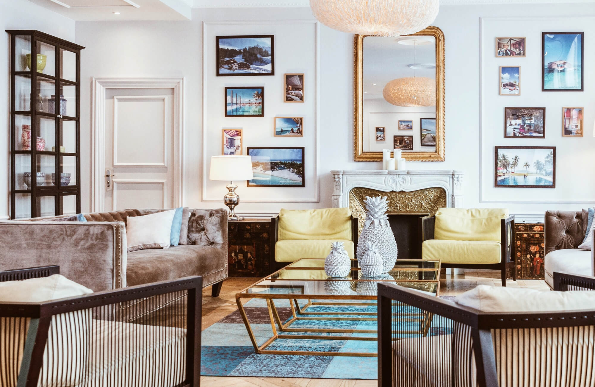
Reds, oranges, and yellows stimulate appetite and conversation, making them ideal for kitchens that serve as social hubs. A red accent wall or terracotta backsplash can evoke warmth and vibrancy, while golden undertones in cabinetry or textiles create a cozy, inviting atmosphere. These tones also work particularly well in smaller kitchens by adding depth and vibrancy without overwhelming the space. In the featured setting above, Edward Martin’s Pascal Polyester Face Rug in Burgundy / Multi brings these warm hues together, layering pattern and color to create a lively, welcoming focal point.
Cool Colors for Calm and Serenity
Blues, greens, and soft lavenders introduce balance and tranquility, often associated with freshness and cleanliness. Pale aqua or sage green cabinetry can promote a restorative environment, while navy or forest green islands provide grounding contrast. These hues are also linked to reduced stress levels, making them effective in busy kitchens where a calm, orderly feel is desirable. Pairing cool colors with reflective finishes, such as glass tile or brushed steel, enhances the perception of spaciousness.
Neutral Tones with a Bold Twist
Whites, grays, and beiges establish a timeless foundation, offering flexibility and sophistication. However, incorporating bold accents, such as a charcoal feature wall, matte black fixtures, or a patterned rug, prevents the space from feeling sterile. Layering neutrals with contrasting textures like stone, wood, and ceramic adds visual depth, while strategic pops of color through accessories maintain balance. This approach allows for long-term adaptability, as neutral kitchens can easily evolve with shifting trends and homeowner preferences.

Selecting The Perfect Shade For Your Space
Once you know the emotional impact of color, the next step is narrowing down the exact shade that works with your kitchen. From complementing existing finishes to creating bold contrasts, choosing wisely ensures your rug feels intentional and well-integrated.
Matching Your Existing Decor
A cohesive palette begins with evaluating the fixed elements already present in your space, such as cabinetry, countertops, flooring, and appliances. Designers often recommend drawing secondary shades from undertones in wood grains, veining in stone surfaces, or metallic finishes. For example, a cool gray quartz countertop pairs naturally with soft blue or charcoal accents, while warm oak cabinetry benefits from earthy tones like taupe or terracotta. Using a color wheel can help identify complementary or analogous hues that blend seamlessly with your current scheme.
Creating a Contrasting Statement
For homeowners seeking impact, contrast is an effective strategy. Bold shades, when balanced correctly, can establish a striking focal point without overwhelming the room. A navy-blue island against white cabinetry or a deep emerald backsplash beside stainless steel appliances demonstrates how high-contrast combinations create visual interest. To maintain balance, contrast should be applied selectively and offset with neutrals or transitional tones. Shown in the example above, Edward Martin’s Hutchinson Polyester Face Rug in Lake / Terracota illustrates how earthy and cool tones can work in harmony, grounding the design with a strong visual anchor.
The Power of Seasonal Color Swaps
Color need not remain static, strategic updates aligned with the seasons can keep a space feeling fresh and dynamic. Soft pastels or citrus-inspired accents in spring and summer bring lightness and energy, while jewel tones and rich burgundies in autumn and winter add warmth and depth. Incorporating these shifts through textiles, rugs, wall art, or small appliances allows for flexibility without the permanence of repainting or replacing core fixtures. This cyclical approach not only refreshes the space but also reflects the natural rhythms of the home environment.

Mastering Patterns And Textures
After settling on a color, you can bring even more personality into your kitchen by layering patterns and textures. These design elements add dimension, prevent flatness, and help your rug stand out as both a practical and aesthetic feature.
How to Style a Bold Patterned Rug
A statement rug with geometric, floral, or abstract motifs can serve as the focal point of a room. To prevent visual overload, balance is essential, pair bold patterns with solid cabinetry, neutral wall colors, or streamlined furniture. Scale also matters: a large-scale pattern anchors expansive spaces, while smaller motifs suit compact areas without overwhelming them. Professional designers often use the “60-30-10” rule, where the rug accounts for 10% of the palette, offering just enough contrast to energize the design. Featured above, Edward Martin’s Hutchinson Polyester Face Rug in Sage / Graphite demonstrates how intricate detailing can apply this rule seamlessly, elevating the entire space.
The Role of Rug Texture in Design
Texture contributes tactile richness and visual depth, influencing both comfort and style. A flatweave rug provides a sleek, low-profile look ideal for busy kitchens, while a hand-tufted wool rug introduces softness and acoustic benefits. Materials such as jute or sisal bring natural, organic texture, complementing wood cabinetry or stone surfaces. Designers frequently layer textures intentionally, juxtaposing smooth countertops with nubby rug fibers to create a balanced, sensory-rich environment.
Layering Rugs for Depth and Interest
Layering rugs is an advanced styling technique that adds complexity and depth to a space. A neutral base rug, such as a sisal or low-pile weave, creates a grounding foundation, while a smaller patterned or textured rug layered on top adds character and dimension. This approach allows flexibility, seasonal changes, trend updates, or functional zoning can be achieved without redesigning the entire room. Proper proportion is critical: the base rug should extend beyond the top rug by at least 6–12 inches to ensure the layered look feels intentional and polished.

Practical Considerations For A Colorful Kitchen
Finally, style must meet function to make your rug a lasting success. By focusing on materials, sizing, and placement, you’ll ensure your colorful choice not only looks good but also stands up to the realities of everyday kitchen life.
Choosing Washable Materials for Longevity
Kitchen rugs must withstand moisture, stains, and frequent cleaning. Synthetic fibers such as polypropylene and nylon are popular for their stain resistance, colorfastness, and durability under heavy use. Machine-washable cotton blends or performance rugs treated with protective finishes provide additional practicality for busy households. Selecting low-pile constructions minimizes debris buildup and allows for easier vacuuming, ensuring the rug maintains both its vibrancy and structural integrity over time.
Sizing and Placement for Maximum Impact
The dimensions and positioning of a rug directly influence both aesthetics and function. A runner in front of the sink provides cushioning where homeowners spend the most time standing, while a larger area rug can define an eat-in space within an open-plan kitchen. Designers recommend leaving 4–6 inches of visible flooring around the rug’s edges to create a framed look, avoiding overcrowding or disproportionate scaling. Proper placement also reduces tripping hazards and enhances workflow efficiency in the kitchen triangle.
Integrating Your Rug with Other Accessories
A colorful rug should complement, not compete with, surrounding décor. Coordinating accent colors in window treatments, barstools, or countertop appliances creates a cohesive design narrative. For instance, a rug with teal accents can be echoed through ceramic dishware or pendant lighting, reinforcing continuity without over-saturation. Layering complementary textures, such as pairing a patterned rug with matte cabinetry or brushed metal fixtures, adds dimension while ensuring the rug feels integrated into the overall design scheme. As the design above shows, Edward Martin’s Hutchinson Polyester Face Rug in Fog / Crimson brings together muted neutrals and deep crimson notes, providing a grounding element that ties accessories into a polished whole.
The Perfect Finish To Your Kitchen Design
A colorful kitchen rug is one of the easiest ways to add personality and depth to your space. By choosing shades that enhance your palette, applying principles of color psychology, and keeping everyday function in mind, you can achieve a kitchen that feels both stylish and practical.
Edward Martin rugs do more than protect your floors, they create a polished, cohesive finish. For those unsure where to begin, Edward Martin’s design consultation service provides expert, tailored guidance. And when you’re ready for personalized recommendations or product support, simply contact Edward Martin for assistance.


