


Wall art is more than just the image on display. Frame color plays a subtle yet important role in shaping how a piece is perceived, how it fits within a space, and how it connects with its surroundings. While it may seem like a minor detail, the right frame color can enhance the artwork’s presence, while the wrong choice can reduce its impact. Understanding how frame color influences perception, composition, and interior design allows you to make more thoughtful and effective decisions. In this article, you will explore how frame color affects both the artwork itself and the overall feel of a room.

How Frame Color Shapes Viewer Perception
Frame color plays an important role in how you first experience a piece of wall art. Before your focus shifts to the subject, your eyes register the frame as part of the overall visual impression, influencing how the artwork is perceived.
Emotional Signals
When you view framed art, your mind quickly forms an emotional impression based on the frame’s color. For instance, a black frame often feels grounded and serious, giving the artwork a stronger sense of importance, while a white frame appears lighter and more open, making the piece feel more approachable. Similarly, metallic tones introduce a refined quality that can elevate even a simple print.
This effect becomes clearer when looking at Edward Martin’s Meadowline Wall Art, as featured in the photo above, where the light wood frame creates a calm and inviting presence. Its soft, natural tone frame blends seamlessly with the artwork, enhancing its calm and minimal aesthetic without distracting from the overall composition.
With this in mind, you can use frame color more intentionally by considering the mood you want the artwork to convey. If the piece has a calm or minimal tone, a lighter frame helps support that feeling. On the other hand, if the artwork is bold or expressive, a darker frame can enhance its presence without overwhelming it.
Attention Direction
Frame color also influences how quickly your attention shifts toward the artwork itself. When there is a strong contrast between the frame and the image, your eyes are drawn inward almost immediately, making the piece stand out as a clear focal point. This approach is especially effective when you want the artwork to capture attention right away.
In contrast, when the frame color closely reflects tones within the artwork, the transition feels more gradual. Your gaze moves naturally across the composition, allowing you to absorb the piece as a whole. As a result, this creates a more relaxed viewing experience rather than directing attention to a single focal point.
Perceived Value
The color of a frame can subtly influence how valuable or refined a piece appears. Dark frames and metallic finishes often create a more established, gallery-like impression. In contrast, lighter or natural tones feel more relaxed and contemporary, making the artwork appear more approachable. In settings where presentation carries weight, such as a living room or office, frame color can quietly signal quality and intention. Although the artwork itself remains unchanged, the frame shapes how it is perceived, reinforcing its presence within the space.

How Frame Color Interacts With Artwork Composition
Frame color also plays a direct role in how the artwork itself is perceived. It can influence color relationships, define the structure of the piece, and affect how easily details are noticed.
Color Relationships
Every piece of art contains a mix of tones, even if it appears simple at first glance. When the frame color relates to one of these tones, the entire composition feels more unified. This does not mean matching colors exactly, but rather creating a connection that feels intentional. This approach is clearly demonstrated by Edward Martin’s Borrowed Dawn Wall Art, as shown in the photo above, where the light wood frame subtly echoes the artwork’s warm tones. This subtle alignment creates a cohesive look, allowing the piece to feel naturally integrated rather than visually separate. If you prefer a more dynamic effect, choosing a complementary frame color can introduce contrast while still maintaining overall balance.
Edge Definition
The frame acts as the boundary between the artwork and its surroundings. A darker frame creates a clear separation, helping the piece stand out against the wall. This is especially useful for complex or detailed artwork where you want to contain the visual elements. A lighter frame softens that boundary. The artwork feels less enclosed and more integrated with the space. This works well for minimal or open compositions where you want a sense of continuity rather than separation.
Detail Visibility
Frame color can either support or compete with the finer elements of an artwork. When the frame is neutral, your attention remains on the details within the image, which is especially important for pieces with intricate lines, textures, or subtle tonal variations. In contrast, a bold or highly saturated frame may draw attention away from those details. While this effect can be used intentionally, a more restrained frame is often the better choice when the goal is to highlight the craftsmanship and subtlety of the artwork.

How Frame Color Integrates With Interior Design
Once the artwork is placed in a room, the frame color becomes part of the overall visual environment. It helps connect the piece to its surroundings and plays a key role in how naturally it fits within the space.
Palette Coordination
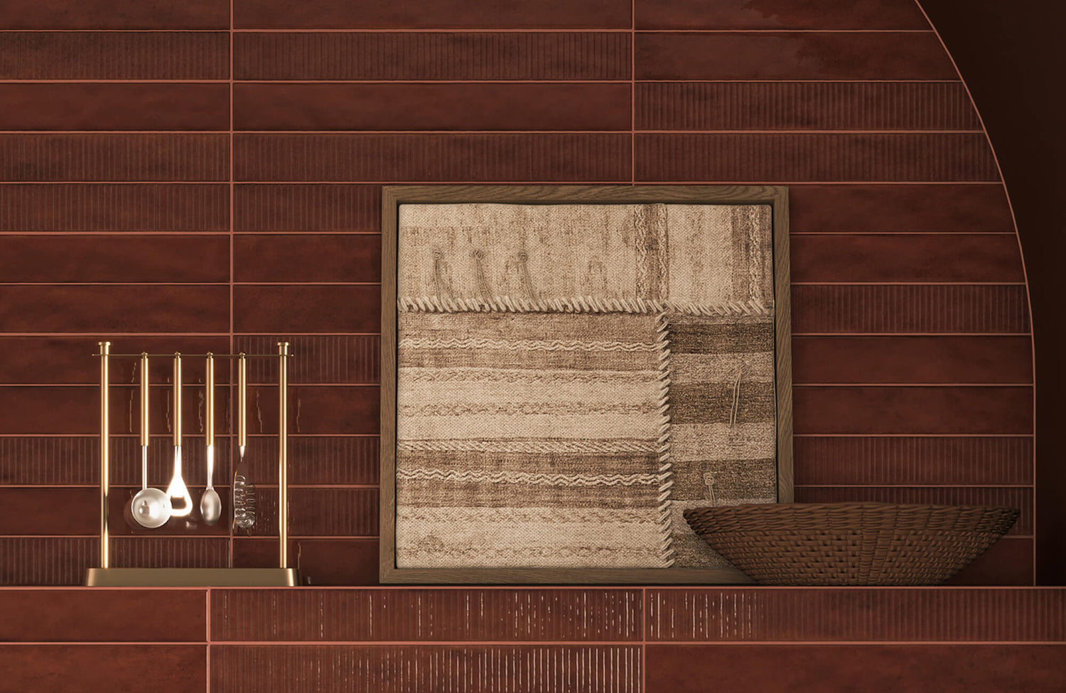
The relationship between the frame color and the room’s palette is often one of the first things you notice. When the frame reflects tones already present in the space, the artwork feels more integrated, as if it naturally belongs within the room. This creates a cohesive look without the need for exact color matching. This balance is clearly illustrated by Edward Martin’s Hollow Morning Wall Art, as shown in the photo featured above, where the darker frame contrasts softly with the light tiled wall while still tying in with the deeper tones of the fireplace and shelving. As a result, the artwork stands out without feeling disconnected, maintaining a sense of visual harmony within the space.
Alternatively, introducing contrast through the frame can add visual interest and definition. This approach works particularly well in neutral spaces, where a contrasting frame helps the artwork stand out while still maintaining overall balance.
Style Alignment
Different frame colors naturally align with specific interior styles. Dark tones and metallic finishes often complement traditional settings, while lighter tones and natural materials tend to suit modern or minimal spaces. In this way, the frame acts as a visual bridge, connecting the artwork to the room’s overall aesthetic. It also helps to think of the frame as part of the room’s furnishings rather than a separate accessory. When its color relates to existing finishes such as wood, metal, or fabric, the space feels more cohesive and thoughtfully arranged.
Visual Hierarchy
Frame color plays a key role in determining which pieces draw attention and which remain more understated. A bold frame can elevate a specific artwork, turning it into a clear focal point, while more subtle frames allow multiple pieces to coexist without competing for attention. When arranging several artworks together, using one dominant frame color can help anchor the overall display. The remaining pieces can then follow a more restrained approach, creating a balanced composition that feels cohesive without appearing overly uniform.

Practical Factors That Influence Frame Color Choice
While visual appeal is important, practical considerations also play a key role in how frame color performs over time. These factors influence not only how the frame looks in your space, but also how well it holds up and adapts to everyday use.
Lighting Effects
Lighting conditions can significantly influence how a frame color appears throughout the day. Glossy finishes tend to reflect light, which may create glare and distract from the artwork, while matte finishes provide a more consistent and subdued appearance in most settings.
This effect can be seen with Edward Martin’s Golden Drift Wall Art, as shown in the photo featured above, where the light-toned frame retains a soft, even appearance under both natural daylight and ambient lighting. Complemented by the Alena Wall Sconce in Aged Brass, the warm glow enhances the frame subtly without causing harsh reflections, keeping the artwork clear and visually balanced.
For this reason, it is important to consider how the room is lit before making a final choice. Natural light, overhead fixtures, and ambient lighting all interact with the frame differently, so a color that looks balanced in one setting may appear noticeably different in another.
Wear and Maintenance
Over time, frames are exposed to dust, handling, and environmental changes, all of which can affect their appearance. Darker frames tend to conceal minor wear more effectively, while lighter frames may show marks or discoloration more easily. This does not make one option better than the other, but it does influence how the frame ages. With this in mind, it is worth considering where the artwork will be placed. In areas of frequent use or contact, selecting a finish that maintains its appearance over time can help preserve the piece's overall look.
Long Term Flexibility
Your space is likely to change over time, whether through redecorating or moving to a new environment. In this context, neutral frame colors offer greater adaptability, as they tend to work well across a range of styles and settings. If you are considering a more distinctive frame color, it helps to think ahead about how it will fit with future changes. A frame that works well across different interiors allows you to keep the artwork relevant without the need to replace or reframe it over time.

Common Frame Color Mistakes To Avoid
Even with a clear understanding of frame color, certain choices can reduce the overall impact of your wall art. By recognizing these common mistakes, you can make more confident decisions and ensure the artwork is presented at its best.
Exact Color Matching
Matching the frame exactly to the artwork may seem like a safe choice, but it often reduces visual depth. When the colors blend too closely, the artwork can lose its sense of presence and distinction. A slight variation in tone introduces dimension and helps define the piece more clearly. The frame should support the artwork while still providing enough contrast to keep it visually engaging.
Imbalanced Frame Weight
Frame color works closely with size and thickness, and together they influence how balanced the artwork appears. A heavy, dark frame on a small piece can feel overpowering, while a thin, light frame on a larger artwork may lack the structure needed to support it visually. By balancing these elements, the frame is more likely to complement the artwork rather than compete with it. The goal is to achieve a proportion that feels stable, intentional, and visually appropriate for the piece.
Trend Driven Choices
Following trends without considering your space can lead to choices that feel out of place over time. What is popular now may not align with the artwork or the overall environment in the long run. A more dependable approach is to focus on how the frame color interacts with both the artwork and the room. By prioritizing compatibility over trends, you create a result that remains visually consistent and relevant even as styles change.

Creative Ways To Use Frame Color Intentionally
Once you understand the fundamentals, you can approach frame color with more creativity and confidence. This opens opportunities to shape the visual experience in a more personal way while still maintaining balance in the space.
Mixed Frame Styles
Using different frame colors within the same display can introduce variety and add character to the overall arrangement. This approach works best when the layout remains consistent, allowing the variation to feel intentional rather than unstructured. By maintaining a clear sense of organization in the arrangement, you can create visual interest without losing cohesion. The result is a display that feels dynamic while remaining balanced and visually cohesive.
Statement Frames
A bold frame color can significantly influence how an artwork is perceived. Even a simple piece can stand out when paired with a strong, well-chosen frame. This approach is most effective when used with restraint. A single statement frame can define a space, while using too many can create visual competition and reduce overall impact.
Contrast Pairings
Pairing unexpected frame colors with different types of artwork can create a distinctive visual effect. For example, placing a traditional image in a modern frame or a minimal piece in a bold color can subtly shift how the artwork is interpreted. To achieve the right balance, it helps to test combinations before making a final decision. This allows you to refine the look so it feels intentional and cohesive rather than uncertain or experimental.
Why Frame Color Matters For Wall Art
Frame color does matter because it directly shapes how you see, understand, and experience wall art. It influences perception, enhances the artwork itself, connects it to your space, and affects how well it adapts over time. Rather than being a finishing detail, the frame plays an active role in presentation and overall impact. When you choose frame color with intention, you define how the artwork functions within your environment.
If you are unsure which frame color works best for your space or artwork, it can help to get a second perspective. You can contact us to discuss your ideas or explore our design service, where you receive guidance in selecting artwork and frames that suit your style and space with clarity and confidence.