


Big wall art has a strong impact on how a room is perceived, but its effect on space depends on how it is used. While it may seem counterintuitive, larger artwork can actually make a room feel more open when applied with the right approach. Visual elements such as scale, placement, and color all influence how the eye interprets space, shaping whether a room feels expansive or confined. This article explains how big wall art interacts with interior design and influences spatial perception. It covers key factors such as placement, composition, and common mistakes to avoid, making it easier to use large artwork to create a more open and balanced space.

How Scale Influences Spatial Perception
The size of wall art plays a key role in how a room’s proportions are perceived. When large pieces are used thoughtfully, they reduce visual fragmentation and help create a more unified and open-looking space. This is one of the key ways big wall art can make a room look bigger, as it directly shapes how the eye interprets the space.
Visual Continuity
Using one large walla rt instead of several smaller pieces creates a more continuous visual field. This allows the eye to move smoothly across the wall without interruption, making the surface appear wider and less divided. In turn, the room feels more cohesive and less segmented. This approach simplifies what is seen within the space. With fewer visual interruptions, the eye encounters fewer stopping points, which helps the room feel more expansive without altering its physical dimensions.
Proportion Balance
The relationship between artwork and the furniture beneath it plays a crucial role in achieving balance. When the scale of the piece aligns with the width of a sofa or bed, the overall arrangement feels stable and well-integrated. This balance prevents the space from appearing either sparse or overcrowded. Artwork that is too small can feel disconnected from the wall, while pieces that are too large without adequate spacing may dominate the area. Maintaining proper proportion ensures the composition supports the room’s layout rather than disrupting it.
Ceiling Emphasis
Vertically oriented artwork offers an effective way to influence the perceived height of a room. By naturally drawing the eye upward, it creates a sense of vertical extension, making ceilings appear higher. This is especially useful in more compact spaces. However, excessively tall pieces can overwhelm the wall. A more balanced approach uses vertical orientation to suggest height while still preserving visual harmony within the space.

The Role of Placement in Expanding Space
Placement plays a crucial role in how artwork interacts with the overall layout of a room. Even a well-chosen piece can feel disconnected or disruptive if it is not positioned with care and intention. When placed strategically, large wall art can help create a more open and balanced layout, making the room appear more spacious.
Eye Level Positioning
Placing wall art at eye level allows it to sit naturally within the line of sight. This creates a sense of ease and visual order, helping the piece feel properly integrated into the space. When positioned too high or too low, the room’s overall balance can feel disrupted. Aligning wall art with natural viewing height ensures the composition feels grounded and cohesive, contributing to a more harmonious layout.
Centering Above Furniture
Positioning large wall art centrally above furniture establishes a strong visual anchor. This alignment connects the wall with the furniture below, creating a more structured and intentional arrangement. When the artwork’s center aligns with the furniture, it reinforces a sense of symmetry. This reduces visual tension and helps the room feel more organized and balanced.
A clear example of this can be seen with Edward Martin’s Dusk Fold Wall Art, as shown in the photo featured above, where the piece is precisely centered above the dining table. This placement aligns seamlessly with the table and overhead lighting, creating a cohesive visual axis. This alignment forms a well-balanced composition that strengthens the connection between the wall and furniture, enhancing both structure and spatial clarity.
Using Focal Points
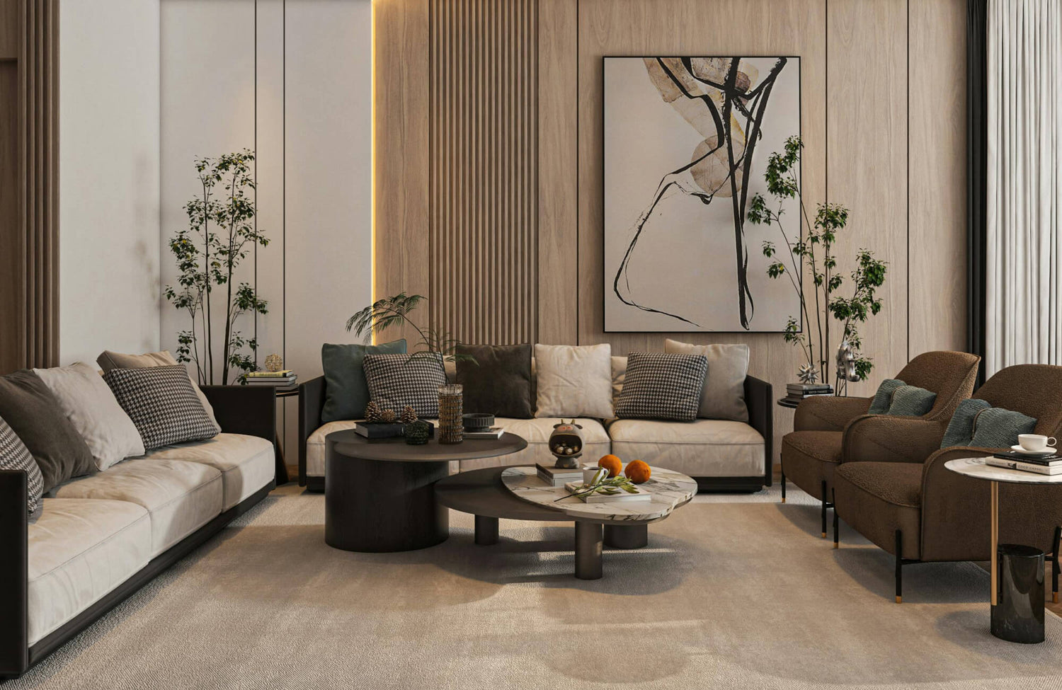
A single large wall art can define the room by serving as a focal point. Directing attention to one area shifts focus away from the room’s size and toward a key visual element. Edward Martin’s Quiet Study Wall Art serves as a strong example of this, using its scale and composition to anchor the space and draw the eye. As attention settles on the artwork, the boundaries of the room become less noticeable. This shift in focus helps the space feel more open and visually engaging.

Color and Depth Effects in Large Artwork
Color and visual depth play a key role in how near or distant a wall appears. Thoughtful artwork choices can subtly influence perception, helping a room feel more open and spacious. This is another way big wall art can make a room look bigger by visually extending the space.
Light and Neutral Palettes
Wall art with light tones helps reflect more light throughout the room, making the space feel less enclosed. This effect softens the overall atmosphere and supports a more open visual impression. Soft neutral colors also blend more easily with surrounding surfaces, reducing harsh visual edges. In effect, the wall appears to recede slightly, enhancing the sense of depth.
Perspective and Depth
Wall art that incorporates depth, such as landscapes or layered abstract compositions, introduces a sense of distance. These visuals encourage the eye to look beyond the surface, creating the impression that the wall extends further than it actually does. This visual extension helps shift focus away from the room’s physical boundaries. It is especially effective in smaller rooms, as it adds dimension without requiring additional physical space.
Contrast Control
High contrast can sharply define edges, causing walls to feel closer and more confined. Using moderate contrast allows for visual interest while maintaining a sense of openness. This balance prevents the artwork from visually compressing the space. In turn, the room retains both depth and clarity without feeling overwhelming.

Framing and Composition Choices That Matter
The way artwork is presented can either enhance openness or add visual weight to a wall. Framing and composition play a key role in determining how much space the piece appears to occupy and how it interacts with the surrounding area. When handled thoughtfully, these choices can make big wall art feel lighter and more integrated, helping the room appear more spacious.
Thin and Minimal Frames
Slim frames can reduce the visual weight surrounding the artwork, allowing the piece to feel lighter within the space. This keeps attention focused on the image rather than its borders. By avoiding bulky framing, the wall appears less crowded and more open. The overall effect supports a cleaner and more refined visual composition.
Borderless or Canvas Styles
Frameless artwork creates a smoother transition between the piece and the wall. This approach allows the artwork to feel more integrated into the space rather than set apart. Without visible borders, the wall appears less divided and more continuous. This subtle continuity helps enhance the perception of openness.
Single vs. Multi-Panel Layouts
A single large piece creates a clean and unified look that simplifies the wall. It reduces visual complexity and helps maintain a sense of order within the space. Multi-panel layouts can also be effective when spacing is carefully considered, offering a structured yet visually engaging arrangement.
This approach is well illustrated with Edward Martin’s Shaded Distance Wall Art and Lowland Path Wall Art, as featured in the photo above, where two coordinated pieces are aligned to form a balanced composition. Their placement creates a continuous visual flow across the wall, allowing the eye to move smoothly from one piece to the other. By guiding the eye horizontally, this type of arrangement can make the wall feel wider while maintaining clarity and avoiding visual clutter.

Psychological Impact of Large Art on Room Perception
Perception plays a significant role in determining whether a room feels open or confined, often shaping the overall experience more than its actual size. This is another way big wall art can make a room look bigger by altering how the space is perceived.
Reduced Visual Noise
Reducing the number of decorative elements makes a space easier to process. With fewer items competing for attention, the overall environment feels more structured and clear. This reduction in visual input allows the mind to interpret the space as more open. In turn, the room appears larger because it feels less crowded and more organized.
Sense of Intentional Design
A well-chosen large artwork conveys a sense of thoughtful arrangement. This impression of order influences how the space is perceived, making it feel more deliberate and cohesive. When each element appears purposefully placed, the room gains a sense of refinement. This clarity enhances comfort and makes the space easier to navigate visually.
Attention Redirection
Large wall art naturally draws attention to a central point within the room. By focusing on a key visual element, less emphasis is placed on the room’s physical boundaries. Edward Martin’s Northland Memory Wall Art is a strong example of this, using its scale and presence to capture attention and anchor the space. This shift in attention changes how the space is experienced. Consequently, the room feels less confined and more visually engaging.

When Big Wall Art Can Make a Room Feel Smaller
While large artwork can enhance a room, certain choices can produce the opposite effect. Recognizing these situations helps prevent common design missteps and ensures the space maintains a balanced and open feel.
Oversized for the Wall
When artwork extends too close to the edges of a wall, it can feel visually overwhelming. The lack of surrounding space limits the wall’s ability to frame the piece, making the area appear smaller. Proper spacing allows the artwork to breathe and prevents it from dominating the surface. Maintaining clear margins helps preserve balance and supports a more open visual effect.
Dark and Heavy Imagery
Artwork with deep tones tends to absorb light, which can reduce the sense of openness in a room. This visual weight can make walls appear closer than they actually are. While darker pieces can add depth and contrast, they need to be used with care. Incorporating them in moderation helps maintain balance without making the space feel enclosed.
Poor Placement Choices
Incorrect positioning can disrupt the overall flow of a room. Artwork placed off-center or at an awkward height introduces visual tension and imbalance. This misalignment can make the space feel less organized and more confined. Careful placement that aligns with the room’s structure ensures the artwork enhances rather than disrupts the design.
How to Use Big Wall Art Effectively
Big wall art can make a room look bigger when used with intention and careful consideration. Elements such as scale, placement, color, framing, and perception all shape how spacious a room appears. When these factors work together, the artwork helps create a more open and cohesive environment.
Wall art functions best when treated as part of the room’s overall structure rather than a final addition. Thoughtful selection and positioning improve balance, strengthen visual clarity, and support a more organized layout. This approach enhances how the space is experienced without changing its actual size.
For more tailored guidance, our design service can help refine these decisions based on specific layouts and design goals. Our team offers personalized recommendations that align with the room’s proportions, lighting, and style. For further assistance or specific questions, feel free to contact us for expert support and practical solutions.