


More than just a visual statement, checkerboard floors are a practical design tool that can influence how spacious a room appears. Their alternating patterns draw the eye across the floor, altering depth and perspective in subtle yet effective ways. When selected thoughtfully, these floors can open up tight spaces and accentuate architectural features. Factors like tile size, contrast, and placement all affect whether the room feels expansive or confined. For both style and spatial benefit, checkered floors offer a smart solution.

Understanding the Psychology Behind Patterns
Visual perception plays a pivotal role in how people experience interior spaces, and checkered patterns in particular influence spatial awareness through the principles of cognitive psychology. The human brain is hardwired to seek and interpret patterns as a way to organize sensory input. When presented with high-contrast geometric layouts like a checkerboard, the eyes are naturally drawn to areas of contrast, guiding movement and defining spatial boundaries. This visual interaction can shape our sense of depth and spatial orientation, making certain rooms feel either expansive or enclosed depending on how the pattern is deployed.
For instance, smaller, subtle checkered patterns promote visual fluidity by minimizing abrupt transitions between light and dark tones. This gentler contrast allows the space to feel cohesive and uninterrupted. In contrast, large, bold checks often serve as dominant visual anchors, dividing the room into segments and potentially making it feel busier or more confined.
Color theory further enhances this effect. Low-saturation or analogous color schemes within a checker pattern tend to recede visually, promoting calm and openness. On the other hand, complementary, high-contrast combinations create heightened energy and visual tension, drawing stronger attention to pattern boundaries.
Designers often harness these perceptual tools with intent—calming a bedroom, energizing a kitchen, or emphasizing direction and flow in a hallway.
Ultimately, understanding how pattern and perception interact enables more intentional use of flooring as a psychological and spatial design tool.

How Tile Size and Color Influence the Perception of Space
Tile dimensions and color pairings are among the most influential factors in how checkered floors shape the perception of space. The visual scale of the tiles, defined by their edge length, grout spacing, and orientation, directly affects how the human eye interprets the floor's continuity or segmentation.
For example, smaller tiles, especially those under 12x12 inches, tend to blend into a smoother surface, giving the impression of seamlessness and breadth. Conversely, large-format tiles (like 24x24 inches or greater) create bolder grid patterns that anchor the eye, often segmenting the space into visually separate zones. The scale must align with the room's actual dimensions to avoid distortion: oversized tiles in small rooms can feel overwhelming, while small tiles in large rooms can appear busy and cluttered if not balanced correctly.
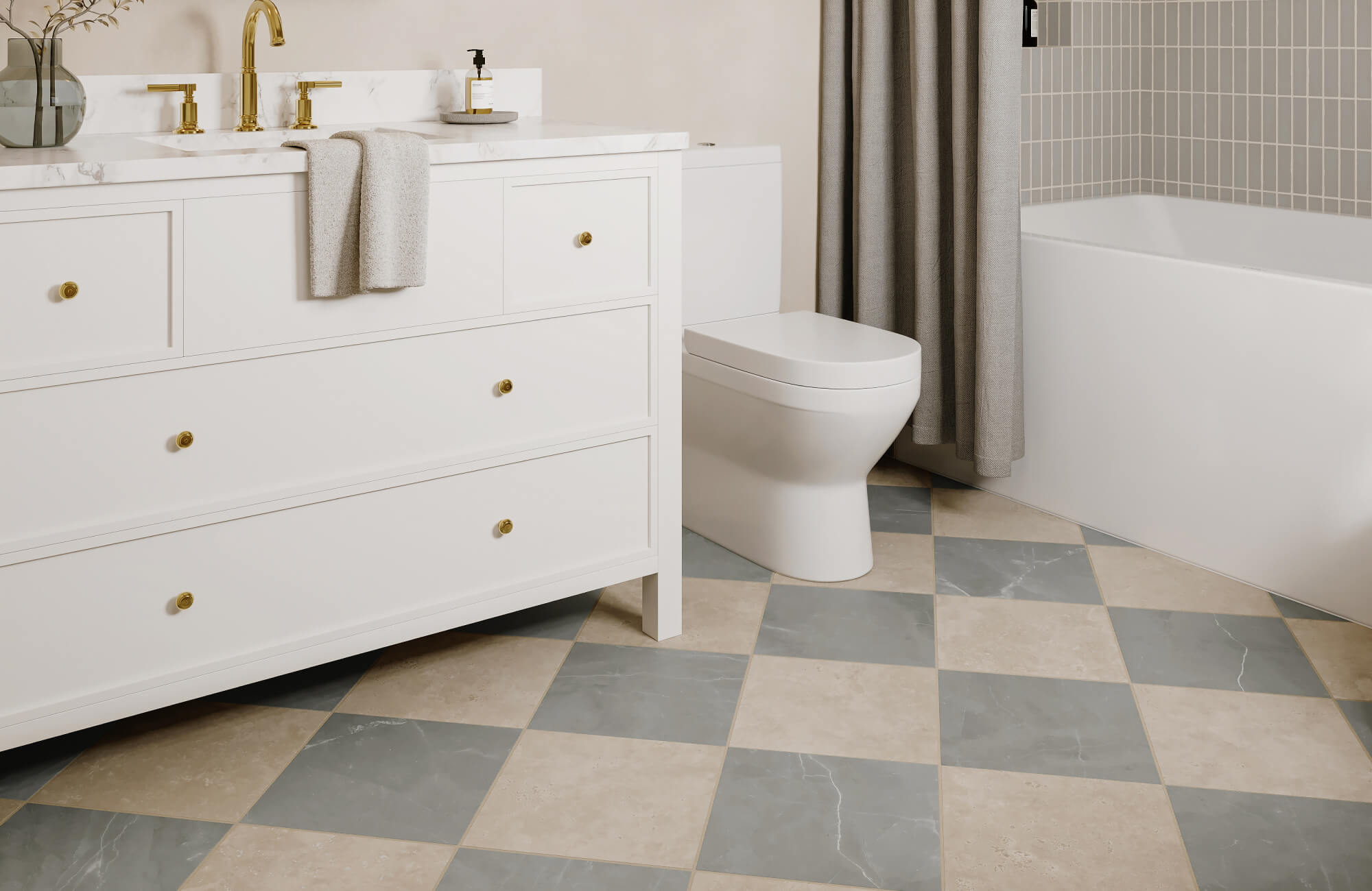
A perfect example of large-format tiles working in harmony with their surroundings is the Brody 24x24 Checkerboard Matte Porcelain Tile in Sand and Dune, as shown in the serene bathroom setting above. The subtle tonal shift between the beige and taupe shades softens the checkerboard contrast, creating a calm and spacious feel without visual clutter. The generous tile scale also enhances the openness of the room while the matte finish gently diffuses light, lending a natural, grounded quality to the space. This thoughtful combination of size, color, and finish makes the floor feel expansive, even in a relatively compact footprint. When integrated correctly, these elements ensure that the flooring becomes a seamless part of the spatial narrative rather than a separate feature.
Color dynamics also strongly influence spatial perception. For instance, high-contrast combinations such as black and white checkerboards offer a bold, classic look but can sometimes visually "shrink" a room by drawing attention to the floor’s divisions. On the other hand, lower-contrast pairings like beige and ivory or slate gray and soft white create smoother transitions between tiles, leading the eye along uninterrupted lines and making the room feel more expansive.
Lighting conditions, both natural and artificial, further affect how colors appear throughout the day. Reflective finishes on tiles also enhance brightness and depth, especially when paired with soft lighting, while matte surfaces offer a more grounded and subdued effect. Integrating tile size and color thoughtfully ensures the checkered floor supports, not competes with, the room's spatial identity.

How Room Shape and Scale Alter Floor Perception
A room’s architectural proportions dramatically affect how a checkered floor pattern is perceived and how effective it is in modifying spatial illusion. Each geometric layout interacts differently with floor dimensions, ceiling height, and wall orientation. For instance, rectangular rooms benefit from directional layout strategies. Placing checkered patterns parallel to the shorter wall can visually widen a narrow room, while aligning them with the longer axis emphasizes length. In rooms with low ceilings, vertical checker layouts or diagonal grids can help elongate the space upward or outward, guiding the eye away from confined dimensions.
Meanwhile, square rooms present a different opportunity. Their symmetrical structure pairs well with centered grid patterns that emphasize balance and cohesion. Tile alignment becomes critical here; when the grid is perfectly centered, the space feels grounded and harmonious.
For more complex layouts, irregular or asymmetrical rooms require a more strategic approach. Asymmetrically laid tiles or staggered patterns can visually correct disproportionate layouts, subtly reshaping the perceived geometry of the space. Additionally, transitional spaces like entryways or hallways often benefit from tighter checkered layouts that guide movement and create a sense of flow. These zones act as connectors, and the right tile orientation can seamlessly transition between design themes while enhancing continuity throughout the home.
One refined example of this spatial alignment is the Leona 24x24 Checkerboard Matte Porcelain Tile in Calacatta and Amani Grey, as shown in the picture above. The large-scale pattern emphasizes the generous proportions of the room while the soft marble veining adds elegance without overwhelming the architecture. By pairing neutral greys with white tones, the checkerboard subtly reinforces the geometry of the space while enhancing brightness and flow. The symmetry between the floor pattern and the room’s arched windows and clean lines also strengthens the overall sense of order and openness. This pairing is especially effective in rooms where scale and structure are central to the design experience.

Integrating Checkered Floors with Wall and Decor Schemes
A well-designed checkered floor should work in harmony with the surrounding architectural and decorative elements. When thoughtfully integrated with walls, furniture, accessories, and lighting, the floor becomes a cohesive part of the space rather than a disconnected focal point. Achieving this balance requires attention to how color and form relate across surfaces.
Wall Color Coordination
The color of your walls should work with the checkered pattern, not against it. Neutral walls, like soft white or warm beige, help keep the space balanced when the floor design is bold. On the other hand, using contrasting wall colors with subtle floor patterns adds personality without creating clutter. It’s important to consider warm or cool undertones to maintain consistency throughout the space.
Furniture Styling and Finishes
Furniture should complement the intensity and structure of the checkered floor. Clean-lined pieces support a contemporary look, while vintage furniture enhances traditional styling. To maintain design harmony, materials like leather, wood, and metal should reflect the tone and texture of the tile finish.
Upholstery choices should also align with the floor’s color theme for a unified palette. In outdoor or transitional settings, such as the patio shown in the photo above, Edward Martin's Palmer 12x12 Checkerboard Raw Porcelain Tile in White and Grey pairs beautifully with woven textures and light wood finishes, bringing a natural, tactile balance to the crisp geometry of the tile. This thoughtful pairing ensures the floor doesn’t overpower the scene but instead becomes part of a cohesive visual narrative.
Decorative Accessories and Art
Accessories bring balance and texture to spaces with checkered flooring, offering subtle contrast and softening bold geometry. To support this effect, monochrome rugs or sheer curtains can ease visual intensity while allowing the pattern to remain the focal point. Similarly, wall art should echo the floor’s structure or introduce organic shapes to break up the grid and establish visual harmony. To add further dimension, materials like metal, glass, or wood frames introduce depth and character without overwhelming the composition. With a carefully edited selection, these accessories collectively elevate the space, enhancing the floor’s impact while maintaining visual clarity.
Lighting Architecture
Lighting affects how a checkered floor is perceived throughout the day, subtly shaping both mood and emphasis. During daylight hours, natural sunlight enhances surface texture and pattern definition, especially on polished tiles, creating dynamic visual interest as light shifts. As evening sets in, ambient and task lighting take over, helping to define spatial zones while preserving visual comfort. Recessed lights, in particular, maintain clean ceiling lines and contribute to an overall uncluttered aesthetic. With thoughtful placement, lighting not only highlights the best features of the tile layout but also seamlessly supports the room’s overall function and style.
To ensure that all these elements come together harmoniously, it's incredibly helpful to preview how different tiles will interact with your room’s lighting, colors, and furnishings. Edward Martin’s augmented reality (AR) tool allows you to visualize tile options in your actual space before making a final decision, making it easier to choose a pattern, scale, and finish that works perfectly with your overall design.

Room-by-Room Design Strategies with Checkered Floors
Understanding theoretical principles is valuable, but exploring how these ideas translate across different spaces helps clarify the impact of checkered flooring. The way pattern, color, and layout are applied can be thoughtfully adapted to suit a variety of room types and design goals, from cozy entryways to expansive dining areas. By examining these applications room by room, it becomes easier to visualize how checkered floors can enhance both form and function throughout the home.
Entryways
Create a warm and stylish welcome with a checkered tile floor in soft taupe and white tones. This design choice anchors the space with timeless sophistication, setting the tone for the rest of the home. For instance, checkerboard tiles with a marble look finish add a refined touch, while their durability makes them well-suited for high-use areas like foyers and mudrooms. When paired with natural wood furnishings and woven accents, the result is a harmonious blend of rustic charm and classic luxury.
Compact Bathrooms
In small bathrooms, low-contrast checkered tiles can keep the space from feeling busy. In contrast, large tiles in dark tones may overwhelm the area and create harsh divisions. To counter this, lighter colors and smaller patterns provide a sense of softness and unity. When paired with soft grout lines, the tiles blend more seamlessly and reduce visual interruption. To further amplify light and space, reflective surfaces like glass and mirrors make excellent additions.
Open Living Areas
Spacious living rooms allow for expressive flooring choices without sacrificing balance. In these settings, subtle checkered patterns in muted colors can tie the room together without dominating the overall design. Diagonal layouts, in particular, are highly effective at increasing perceived size and adding a sense of dynamic energy. To support this effect, furniture placement should align thoughtfully with the tile layout to preserve a sense of visual flow.
Functional Kitchens
Kitchens benefit from checkered floors that unify cabinetry, appliances, and walls into a cohesive whole. Black-and-white patterns work especially well, complementing white cabinets and chrome finishes for a timeless, classic look. For those seeking a softer atmosphere, earth tones and matte textures can reduce contrast while still maintaining visual interest. Choosing tiles that are easy to clean and maintain is particularly important near prep zones and high-use surfaces.
A well-selected floor ultimately anchors the entire kitchen design with a balance of elegance and practicality.
Low-Ceiling Bedrooms
Horizontal checkered layouts in bedrooms can visually widen the space and help counteract a low ceiling. To draw the eye upward and balance the effect, pairing these layouts with vertical elements like tall headboards or curtains is highly effective. Soft tile colors further enhance the openness by preventing the pattern from feeling too dense or heavy. Keeping furniture minimal also contributes to a lighter, more breathable environment. Together, these elements help maximize usable space while making the room feel taller and more expansive.

Advanced Design Tips for Expanding Space with Checkered Floors
Beyond pattern selection, there are expert-level design tactics that can dramatically enhance the spatial effect of checkered floors. These advanced strategies incorporate lighting, color theory, furniture layout, and architectural planning to maximize visual openness and harmony.
Pattern Planning and Layout Strategies
Begin with a scaled drawing to visualize tile placement and orientation. This foundational step helps ensure that the pattern aligns gracefully with architectural elements like doors, windows, and built-ins, resulting in a clean, intentional finish. Diagonal tile layouts are especially effective as they can visually stretch both dimensions of a room and introduce a sense of dynamic movement.
Throughout the space, aim for consistency in tile sizing and spacing to maintain visual harmony. Just as important, avoid layouts that require awkward cuts or create asymmetry near room edges, as these can disrupt the pattern’s rhythm and break the overall flow.
Lighting and Reflective Enhancements
Light plays a crucial role in how both patterns and spaces are perceived. To maximize its impact, use mirrors strategically as they reflect daylight and visually extend the room’s boundaries, making any space feel larger and more open. Select lighting fixtures that complement the tone of the floor to add warmth or clarity without overpowering the overall design. For example, recessed and under-cabinet lighting provide even, unobtrusive illumination that highlights tile textures beautifully. In dimmer settings, reflective tile finishes can further enhance brightness, helping to lift the entire room and accentuate the checkered pattern.
Color Theory and Space Continuity
A unified color palette is key to maintaining visual flow between spaces that feature checkered flooring. Start by choosing one dominant hue and carry it consistently across walls, furniture, and décor for seamless integration. Soft contrasts can still define individual elements, but they do so without breaking the visual line. To enhance cohesion even further, match the undertones of your tiles with colors in adjacent rooms. This creates a subtle bridge that ties everything together. Ultimately, the goal is to allow each area to feel naturally connected, avoiding the sense of fragmentation that comes from overly compartmentalized design.
Defining Zones Without Fragmenting Space
Zoning within open-plan spaces can be thoughtfully achieved without sacrificing a sense of openness. Layering elements like rugs, lighting, and strategic furniture arrangements helps create distinct areas while maintaining spatial flow. Opting for floating furniture, rather than pushing pieces against walls, preserves flexibility and keeps sightlines uninterrupted. To reinforce a unified look, choose accessories that share similar finishes or tones. Each zone should feel purposeful and self-contained, yet still resonate with the overall aesthetic of the room for a cohesive design.
Maximizing Space with the Right Checkered Floor
Checkered flooring is both a visual feature and a practical design tool for enhancing room dimensions. With the right color palette, tile size, and layout strategy, you can manipulate how open or compact a space feels. Each choice, from lighting to furniture, impacts how the pattern is perceived. The key lies in balance, proportion, and cohesion across the entire room.
To help you feel confident in your selections, consider ordering physical samples before making your final decision. Edward Martin’s Request Samples allows you to experience the texture, tone, and quality of each tile in your own space, ensuring it complements your room’s natural light, furnishings, and overall design vision. With thoughtful planning and the right materials in hand, your checkered floor can transform any space into a beautifully balanced and visually expansive environment.
