


Checkered tiles make a statement. Their bold geometry and timeless appeal bring structure, rhythm, and personality to any space, whether you're refreshing a kitchen, redesigning a bathroom, or adding character to an entryway. But their impact depends on what you pair them with. The right pattern can highlight their charm, while the wrong one can compete or overwhelm. In this article, we’ll help you choose patterns that complement checkered tiles beautifully. You’ll learn how to balance scale, color, and style to create cohesive, polished, and personal spaces.

The Timeless Charm of Checkered Tiles
Few design elements move as effortlessly across styles and eras as checkered tiles. With roots tracing back to ancient Egypt and Renaissance-era Europe, the checkerboard has long symbolized balance, duality, and visual order. From palatial stone halls to Parisian cafés and Art Deco foyers, this pattern has persisted not only because of its visual clarity but also because of its narrative power, representing harmony between opposites and structure amid movement.
What makes them truly enduring is their ability to balance precision and personality. Each square becomes part of a broader visual system that frames furniture, defines pathways, and enhances proportion. And their influence isn’t limited to interiors; checkered motifs have become staples in graphic design, pop culture, and fashion, from racing flags to print campaigns, proving their adaptability across mediums.
With their crisp geometry and alternating tones, checkered tiles instantly add depth and direction to a space. They guide the eye, establish flow, and create visual hierarchy—all while feeling equally at home in a classical entryway or a clean-lined, modern kitchen. Whether used to ground a design or make a statement, checkered tiles continue to offer a timeless foundation with limitless potential.
Far more than just a backdrop, checkered tiles often become the focal point of a room. They frame furniture, guide movement, and create a clear sense of visual order. Their structured pattern invites thoughtful layering of color, contrast, and texture, all while maintaining a look that feels deliberate rather than overdesigned. This uncommon mix of graphic precision, symbolic depth, and stylistic versatility has carried checkered tiles through centuries of design. It's also why they remain a timeless foundation in both traditional and modern spaces.

How Checkered Tile Types Influence the Design
Before choosing complementary patterns, it's important to understand how the tile itself can shape the space’s overall look and feel. Layout, size, finish, and color all play critical roles in how checkered tiles influence spatial flow, visual energy, and design harmony.
Grid and Diamond Orientations
The orientation of your checkered tile sets the tone immediately. For instance, a traditional horizontal grid offers structure and symmetry. It brings a calm, ordered feel that works beautifully in both modern and classic interiors. On the other hand, shifting that grid into a diamond layout changes the energy entirely. Diagonal lines also introduce movement, making the space feel more dynamic and fluid. This subtle rotation can guide the eye through a narrow hallway or add dimension to a compact kitchen, enhancing flow without overpowering the room.
This technique is beautifully demonstrated with Edward Martin’s Leona 12x12 Checkerboard Polished Porcelain Tile in Calacatta and Amani Bronze, as shown in the dining space photo above. Its polished surface adds a refined touch, while the diamond orientation draws attention inward, amplifying the sense of depth and elegance. Combined with warm tones, arched architecture, and balanced furnishings, the layout helps create a space that feels both grounded and visually expansive.
Tile Size and Room Perception
Tile scale has a noticeable impact on how a space feels, whether it reads as open and expansive or compact and detailed. Generally, larger checkered tiles help stretch the perception of space, making smaller rooms feel more spacious and open. By contrast, smaller tiles introduce more visual texture, bringing energy and intricacy that work well in cozy settings or design schemes that benefit from added detail.
At the same time, it’s important to consider how tile size interacts with the room’s function. For example, in busy or moisture-prone areas like kitchens and bathrooms, larger tiles with fewer grout lines simplify the look and make cleaning easier. Ultimately, choosing the right tile size depends on both the aesthetic you’re aiming for and the practical needs of the space.
Matte and Glossy Finishes
While often considered a stylistic detail, the finish of your tile also plays a significant role in how light interacts with the space. In particular, glossy checkered tiles reflect light across surfaces, helping to brighten dim corners and amplify a room’s sense of openness. For this reason, they’re especially well-suited for bathrooms, entryways, or any area that could benefit from added brightness.
In contrast, matte checkered tiles offer a different kind of appeal. They absorb light rather than reflect it, creating a softer, more muted ambiance. Additionally, this finish reduces glare and helps hide smudges and fingerprints, making it a smart, low-maintenance option for busy spaces. When aiming for a relaxed, modern look, matte finishes can lend a grounded and sophisticated touch without overpowering the design.
Color Combos and Visual Balance
Among all the design elements at your disposal, color is one of the most expressive and impactful tools in tile selection. When you opt for high-contrast combinations like black and white, you introduce boldness and immediate visual drama. These classic pairings naturally draw the eye and often set the visual tone for the entire room.
On the other hand, if your goal is to create a softer, more adaptable atmosphere, consider muted combinations such as taupe with cream or navy with soft white. These pairings maintain the distinctive geometry of the checkered pattern while allowing other design elements to take the lead. Whether you’re looking to make a statement or set a subtle foundation, your palette will either define the room’s character or support its broader visual harmony.

Pattern Pairing Fundamentals
Pairing patterns successfully isn’t just about choosing what looks good, it’s also about how those patterns work together to create balance, rhythm, and harmony within a space. The interaction between shapes, scales, and colors plays a critical role in guiding the eye and defining the overall mood, making thoughtful coordination essential to cohesive design.
Matching Pattern Scale
When pairing patterns with checkered tiles, it’s important to begin with the scale. Larger, high-impact checkered tiles already command visual attention, so complementing them with smaller, more refined patterns can help ground the space and maintain balance. Conversely, if your tiles are smaller in scale, there’s more room to introduce bolder, medium to large-scale patterns through textiles, wallpaper, or artwork.
Choosing Color Harmony or Contrast
Color serves as a powerful connector between patterns, helping unify a space or introduce intentional contrast. When you work with a harmonious palette, where surrounding patterns echo the tones found in your checkered tiles, you can create a sense of flow and visual ease. This approach is especially effective in calm, cohesive interiors where balance is the goal.
Alternatively, if you’re looking to add vibrancy or make a bolder statement, consider using complementary colors from across the color wheel. For example, green and white checkered tiles can pair strikingly with accents in burnt orange or warm rust, creating a dynamic and visually engaging contrast. In either case, your color choices can also support the overall mood you want the space to convey.
Creating Rhythm and Breathing Room
Layering patterns can add richness and depth to a space, but it works best when there's room for each element to stand out. Rather than clustering bold patterns together, allow space between them to let the eye rest. One effective way to do this is by incorporating solid colors or materials with subtle texture between patterned pieces.
For instance, if you’re pairing checkered floor tiles with a patterned curtain or wallpaper, use a solid-toned sofa or neutral cabinetry in between to break up the visual intensity. This pause in visual complexity creates a natural rhythm, helping each pattern feel intentional rather than overwhelming. By giving every element its own space, you can maintain clarity and ensure the room feels balanced and thoughtfully composed.
Blending Materials and Textures
Pattern in design isn’t always about bold visuals, texture plays an equally important role in creating depth and interest. Materials like woven cane, brushed metal, rough linen, or rattan can introduce subtle, tactile patterns that enrich a space without clashing with the strong geometry of checkered tiles.
By incorporating these textures, you can create layers that feel warm, grounded, and approachable. This kind of contrast can add dimension while maintaining harmony, allowing the checkered tile to remain a focal point without overwhelming the overall design.

Patterns That Pair Well With Checkered Tiles
Understanding which patterns work best with checkered tiles can help you create a space that feels both cohesive and visually engaging. Each type of pattern brings a unique character to the design, complementing checkered tiles in ways that either enhance their structure or soften their boldness.
Solid Color Foundations
Solid colors play a crucial role when you want your checkered tile to stand out as the focal point. A great example is Edward Martin’s Leona 12x12 Checkerboard Matte Porcelain Tile in Calacatta and Nero Marquina, as featured in the entryway photo above. The bold black and white floor immediately draws the eye, and its crisp geometry anchors the entire space with clarity and structure.
This pairing delivers a classic contrast with the refined texture of natural stone, while the matte finish softens the graphic impact, keeping the look balanced and inviting. The surrounding design elements reinforce this effect through thoughtful restraint. Muted olive cabinetry, a soft beige bench cushion, and clean white shiplap walls create a quiet, neutral frame that lets the floor lead without distraction. Meanwhile, the natural wood door and exposed ceiling beams introduce warmth and depth, adding character without complicating the palette.
Together, these choices show how solid surfaces can act as visual resting points. They highlight the strength of the checkered pattern by offering contrast that’s complementary and not competitive. When composed with intention, solid-colored elements not only support the design; they amplify it.
Supporting Geometric Designs
When working with checkered tiles, not all geometric patterns need to mirror their structure. Introducing secondary designs like herringbone, chevron, or subtle stripes can add depth and sophistication without overpowering the space. To ensure visual harmony, it’s also important to vary the scale; smaller or more delicate patterns will complement the boldness of the checkered layout rather than compete with it.
Equally important is a restrained color palette. By keeping tones within the same family or using softened contrasts, you can create a layered look that feels intentional and cohesive. The goal is to enhance the geometry already present, not to echo it too closely or introduce unnecessary tension.
Soft Organic Motifs
Organic patterns like florals, vines, and abstract natural shapes provide a gentle contrast to the sharp geometry of checkered tiles. Although the tiles bring structure and clarity, these softer motifs introduce movement and warmth, helping to create a more inviting and balanced space. They're particularly effective when used in textiles, such as curtains, area rugs, or cushions, where their fluid lines can soften edges and add a relaxed, layered feel without overwhelming the room.
Subtle Texture and Finishes
When working with checkered tiles, introducing texture and finish is an effective way to add depth without complicating the visual field. Because checkered patterns already bring strong geometry and contrast, surrounding them with matte, honed, or brushed finishes helps create a softer, more layered environment. These finishes also gently absorb or diffuse light, balancing the boldness of the tile and preventing the space from feeling overly rigid or graphic.
For instance, pairing a matte checkered floor with washed linen upholstery, brushed metal hardware, or wire-brushed wood accents adds tactile contrast without introducing competing patterns. Similarly, using natural jute rugs or ceramics with a soft satin glaze enhances the room's material richness while letting the tile remain the focal point. These quieter textures act as visual buffers, helping the checkered pattern feel intentional, not overpowering, especially in spaces where calm and clarity are key.

Room-by-Room Design Strategies
How and where you use a pattern with checkered tiles often depends on the function of the space. Different rooms call for different approaches, not just in tile placement but in how you balance surrounding patterns.
Kitchen Pattern Layering
The kitchen is where visual and functional elements need to work hand-in-hand. Checkered floors offer structure, rhythm, and a sense of visual grounding that helps tie the entire space together. To keep the look cohesive, it’s also important to layer patterns with intention; think minimal upper cabinetry, clean-lined countertops, and accessories that add just the right amount of character.
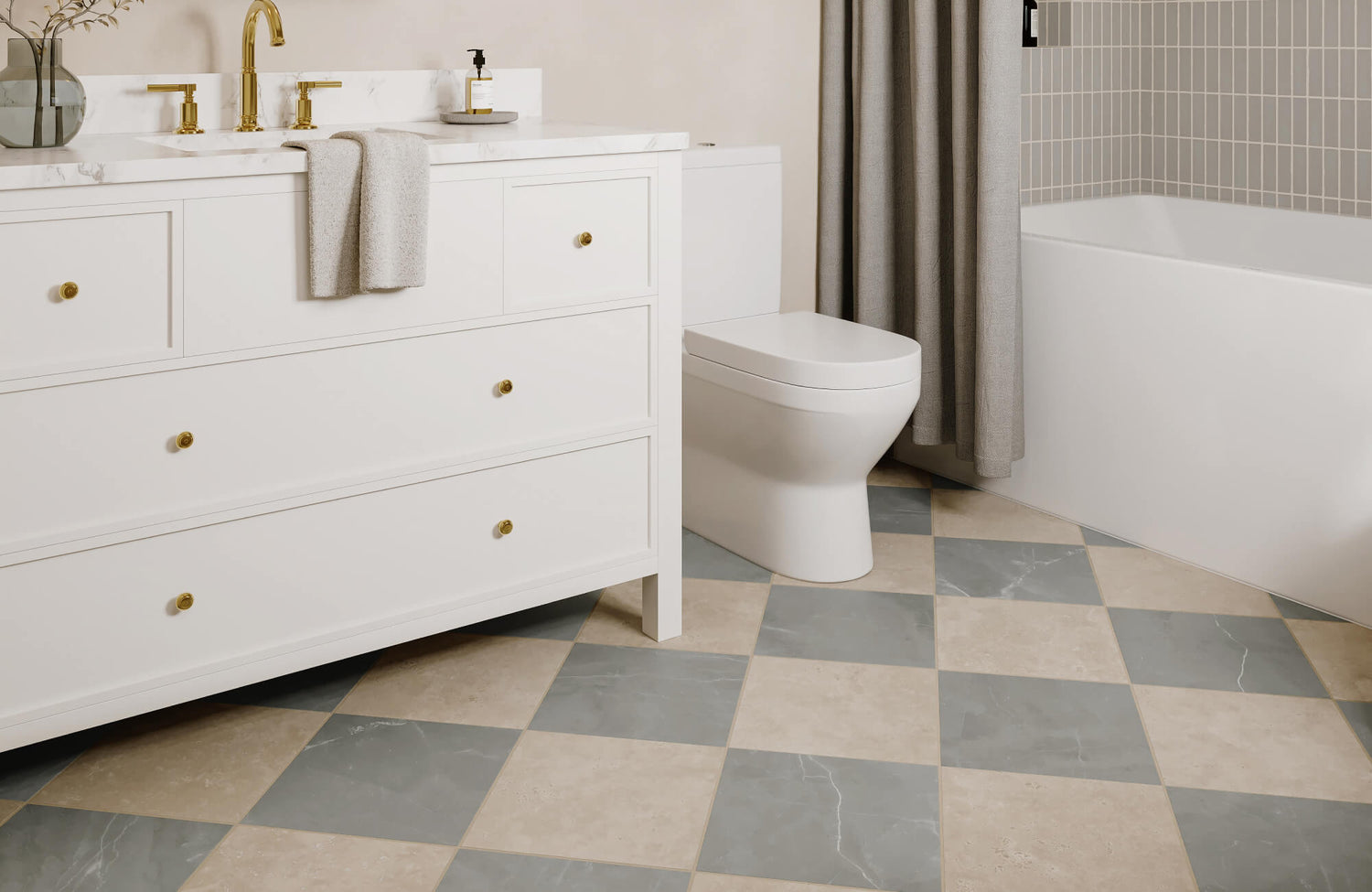
A great example of this layering is Edward Martin’s Palmer 12x12 Checkerboard Matte Porcelain Tile in White and Grey, as displayed in the photo above, which serves as the foundation in this inviting kitchen. The soft contrast between the white and grey tones brings definition to the floor without overwhelming the space, striking a thoughtful balance between boldness and subtlety.
This muted checkered base pairs effortlessly with warm beige cabinetry, natural wood accents, and simple open shelving. Together, these elements create a clean and composed visual flow, allowing the checkered tile to shine while supporting the kitchen’s overall functionality and warmth.
Bathroom Layout and Scale
In bathrooms, where tile is often used extensively, maintaining balance is essential. A checkered floor can serve as a strong foundation, adding visual interest and structure. To complement it, consider pairing it with clean vertical lines or subtle paneling on the walls.
Softly patterned towels, lightly textured shower curtains, or understated window coverings can introduce variety without competing with the floor. These gentle layers can help keep the design visually engaging while preserving a calm, uncluttered atmosphere.h
Living Room Pattern Anchoring
When used in a living space, checkered tile naturally becomes a visual anchor, establishing structure and rhythm from the ground up. Consider echoing the tile’s shape or color in key accents like cushions, area rugs, or wall art.
This subtle repetition also helps tie the room together and reinforces a sense of cohesion. Additionally, arranging your furniture to align with the tile’s grid enhances flow and harmony, allowing the geometry of the space to feel intentional rather than interrupted.
Bold Ideas for Entryways
Entryways are ideal places to take design risks, as their smaller footprint allows for high impact without overwhelming the home. Let your checkered tile serve as the focal point, setting the tone the moment someone steps through the door.
To complement its boldness, layer in simple but expressive elements, such as streamlined lighting, sculptural furniture, or a thoughtfully placed piece of framed art. Even subtle repetition of form, like a rounded mirror that echoes the curves of nearby furniture, can also enhance the presence of the tile and bring the whole space into visual harmony.

Style-Based Pattern Pairings
The way you combine patterns should reflect your design style. Whether your aesthetic leans traditional, modern, or eclectic, checkered tiles have the flexibility to complement and enhance a wide range of looks. Here’s how they can be tailored to suit different interior styles with ease and impact.
Classic and Traditional Designs
If you lean toward heritage design, checkered tiles are the perfect foundation. Pair them with symmetrical furniture arrangements, botanical prints, and a palette of muted, timeless hues. Traditional wood trims and metallic fixtures in brass or bronze help complete the look with warmth and elegance.
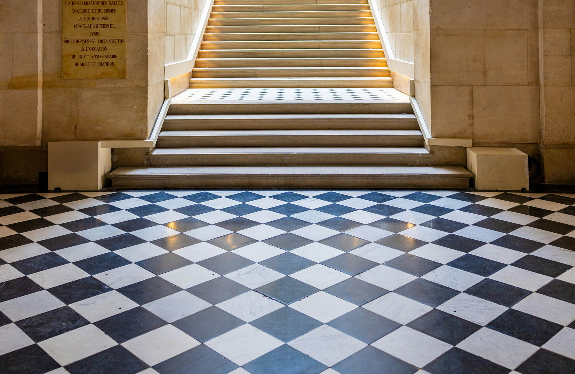
A great example of this classic pairing features Edward Martin’s Leona 24x24 Checkerboard Matte Porcelain Tile in Marfil and Amani Bronze, as displayed in the photo above, which adds a refined, stone-inspired feel to the space. The soft contrast between the two shades brings visual texture without overpowering the room’s serene palette. Combined with the curved staircase, arched architecture, and clean-lined furnishings, the tile enhances the sense of symmetry and tradition while still feeling current.
This approach blends old-world charm with subtle modern refinement, proof that checkered patterns can also be just as timeless as they are versatile.
Mid-Century and Retro Looks
Mid-century interiors strike a unique balance between playfulness and structure, making them an ideal setting for checkered tiles. To embrace this style, pair your flooring with curved furniture silhouettes, vintage-inspired color palettes, such as avocado green, mustard yellow, or burnt orange, and bold patterns in wallpaper or textiles.
In addition, the clean geometry of checkered tile complements the era’s emphasis on form and function. When layered thoughtfully, it can become a grounding element that highlights the charm and personality mid-century design is known for.
Modern and Minimal Styles
In modern and minimalist spaces, less is often more; so let your checkered tile serve as the single bold statement. Its crisp geometry brings visual interest and structure without the need for competing elements. To support this look, keep the surrounding design clean and restrained with linear forms, monochromatic palettes, and subtle textures.
Even a single stripe or an oversized piece of wall art can also introduce just enough contrast without disrupting the room’s simplicity. When styled thoughtfully, the result is a balanced and refined space where the checkered tile stands out with quiet confidence.
Eclectic and Bohemian Mixes
Eclectic and bohemian spaces thrive on contrast and creative expression, making checkered tiles an ideal starting point. Their structured geometry offers a stable foundation that allows for playful layering throughout the rest of the room.
From there, introduce patterned throws, woven textures, vintage accents, and bold artwork to build depth and personality. To keep the look cohesive rather than chaotic, stick to a consistent color palette that ties these varied elements together. With this balance, the tile anchors the design while everything around it adds movement and charm.
No matter which style speaks to you, it’s worth previewing how your tile selections will look in your own space. Our augmented reality (AR) tool allows you to visualize checkered tile layouts in real time, helping you compare finishes, placement, and scale with confidence before you commit.
The Perfect Finish to a Well-Paired Space
Checkered tiles bring inherent structure and style, but their full potential is realized through intentional pattern pairing. Whether you're designing something soft and subtle or bold and graphic, success lies in understanding your tile’s layout, finish, and tone, then selecting patterns that support and enhance those qualities. Ultimately, great design reflects your way of living. When each element works in harmony, the result feels personal, balanced, and timeless.
If you're ready to refine your vision, we're here with expert support, curated tile samples, and design guidance to help you move forward with confidence. From texture to tone, these tile samples allow you to explore your vision in real time, before making the big decisions.
