


Checkerboard tiles continue to captivate designers and homeowners with their bold contrast, classic geometry, and enduring appeal. Rooted in history and reimagined through modern technology, they are as practical as they are stylish. In this guide, we explore everything from their ancient origins and cultural symbolism to modern applications in both residential and commercial design. You'll learn about installation techniques, material innovations, and why porcelain has become the go-to choice for contemporary checkerboard looks. Whether you're creating a timeless kitchen floor or rethinking a public space, this guide is your starting point for inspiration and execution.

Tracing the Timeless Appeal of Checkerboard Tiles
The checkerboard pattern has long occupied a distinctive place in visual culture, with origins dating back over five millennia to ancient Egypt. Early examples appear on ceramic vessels and architectural surfaces, where hand-painted grids symbolized themes of duality and order. These motifs often reflected the cosmological beliefs of the time, representing a balance between opposing forces. Their geometric clarity also made them both decorative and meaningful, laying the groundwork for a visual language that would persist across civilizations.
This symbolism found renewed depth in Masonic traditions, where black and white tiled floors became central elements of ritual spaces. In Masonic temples, the pattern was never merely aesthetic—it served as a metaphorical landscape for philosophical reflection. The alternating squares, often arranged in orthogonal layouts, symbolized the constant interplay of moral opposites: light versus darkness, virtue versus vice. The proportional layout and scale of these installations were carefully calculated to evoke symmetry, discipline, and introspection within a spatial context.
The Renaissance and Baroque periods marked the checkerboard’s ascent into aristocratic interiors, most notably at the Palace of Versailles. Natural stones such as Carrara marble and Nero Marquina were meticulously cut and polished to create reflective checkerboard floors that underscored architectural symmetry and emphasized hierarchy within grand halls. These installations were not only design elements but also optical tools, drawing the eye along axes and corridors while reinforcing the luxurious materiality of the space. Their elegance and permanence positioned the checkerboard pattern as a symbol of refinement and authority.
By the Victorian era, the pattern transitioned into the middle class, aided by advancements in industrial tile manufacturing. Encaustic and glazed ceramic tiles became widely available, allowing designers to experiment with polychromatic interpretations and more intricate borders. Checkerboard flooring became a common feature in entryways, conservatories, and garden rooms, appreciated for both its visual order and practical durability. Over time, the pattern’s adaptability, across color schemes, materials, and scales, has solidified its reputation as a design classic, one capable of expressing both historical gravitas and contemporary clarity.

The Evolution of Checkerboard Tile in America
Checkerboard tiles took on a fresh identity in American homes during the early 20th century. The 1920s saw ceramic tile installations surge, especially in kitchens, as industrial tile production made materials more affordable and accessible. Paper-faced mosaics simplified the process, while manufacturers began offering bold color choices beyond the traditional black and white.
In the 1950s, vinyl checkerboard flooring became a symbol of postwar optimism. It was found in diners, soda fountains, and suburban kitchens, embodying a lively and casual charm. Its affordability and ease of installation further popularized the pattern across the country. While some trends faded, checkerboard designs remained resilient, gradually evolving with each decade.
By the 1960s and 70s, checkerboard patterns had become synonymous with mid-century American interiors, frequently realized in vinyl composition tile (VCT) or sheet flooring. These installations often utilized 9x9 or 12x12 tiles, set in a square grid over concrete substrates using adhesives suited to the era’s fast-paced construction standards. While practical and budget-friendly, early VCT often contained asbestos, prompting extensive abatement protocols in later decades. As consumer preferences shifted toward health-conscious and environmentally safer materials, porcelain and luxury vinyl tile (LVT) re-emerged as preferred mediums for checkerboard patterns, offering improved aesthetics, durability, and safety while retaining the iconic grid that defined a design era.
Today, the legacy of checkerboard tile in American interiors continues to evolve, bridging nostalgia with innovation to suit both traditional sensibilities and modern design aspirations.

Checkerboard Tile Installation
Achieving a successful checkerboard tile installation requires more than aesthetic intent; it demands technical expertise and detailed planning. From material selection to layout strategy, every step contributes to the longevity and visual impact of the final design. For best results, it’s always recommended to work with a professional installer who understands the intricacies of surface preparation, alignment, and finish detailing.
Selecting the Right Tile Type: Rectified vs. Pressed
Executing a precise checkerboard tile installation requires a balanced understanding of design principles and technical best practices. The process begins with selecting the right tile type, typically between rectified and pressed porcelain. Rectified tiles, which are mechanically cut after firing, offer consistent sizing and sharp, squared edges, allowing for tight grout joints as narrow as 1/16 inch. This enables a clean, modern look that enhances the pattern's symmetry. Pressed tiles, by contrast, have slight dimensional variations and rounded edges, necessitating wider grout joints (up to 3/8 inch) to account for size tolerance and to prevent lippage. For applications where visual precision is paramount, especially in checkerboard designs, rectified tiles are strongly preferred.
Substrate Preparation and Surface Flatness
The substrate beneath the tile must be properly prepared to ANSI standards, ensuring it is clean, level, and structurally sound. Any deviation from flatness, typically not exceeding 1/8 inch over a 10-foot span, can compromise pattern alignment and cause uneven joints or bonding failures. Self-leveling underlayments (SLUs) are often used to correct imperfections in concrete slabs, while cement backer boards or uncoupling membranes are ideal over wood subfloors to mitigate movement and prevent cracking. Particularly with large format tiles, ensuring substrate flatness is critical, as minor irregularities can result in telegraphed lippage or disrupted visual flow in the pattern.
Planning Layout and Alignment
A checkerboard layout thrives on symmetry and spatial balance, making layout planning an essential step. Begin with a dry lay to identify the room’s visual center and determine how cuts will fall at perimeter edges. Depending on the space and design intent, tiles can be installed in a standard grid or rotated into a diagonal (diamond) layout. While diagonal arrangements offer dynamic movement and visual intrigue, they require precise 45-degree angle cuts and alignment to avoid cumulative errors, especially around walls, cabinetry, and thresholds. Using chalk lines or laser levels to define control lines will help guide tile placement and maintain consistent alignment throughout the installation.
Grout Selection: Type, Width, and Visual Impact
Equally important is the selection of grout type and color, which directly affects both the appearance and performance of the installation. A subtle contrast between grout and tile can help define the checkerboard effect, while a tone-on-tone grout offers a more seamless, modern result. For joints narrower than 1/8 inch, unsanded grout is typically used to avoid scratching polished tile surfaces; wider joints require sanded grout for stability. In areas subject to moisture or frequent use, epoxy grout is recommended due to its stain resistance, durability, and low porosity, ideal for kitchens, bathrooms, and commercial applications.
Finishing Details for Long-Term Performance
Beyond aesthetics, final installation details play a vital role in durability and visual cohesion. Proper adhesive selection, such as a polymer-modified thin-set mortar compliant with ANSI A118.4 or A118.15, is critical for porcelain tiles. Full mortar coverage should be achieved by back-buttering tiles when necessary, especially with larger formats or textured backs. Finish with well-aligned trim pieces, expansion joints in accordance with TCNA EJ171 guidelines, and ensure edge transitions are clean and flush. When installed correctly, a checkerboard tile floor delivers not only timeless visual appeal but also structural integrity and performance built to endure.

The Revolution of Digital Printing in Tile Manufacturing
Advancements in digital printing have transformed what’s possible with tile design. This technology allows manufacturers to replicate the intricate veining of marble, the texture of concrete, or even the grain of wood with remarkable realism. Compared to traditional silk screening, digital printing offers greater flexibility, deeper color saturation, and finer detail.
Unlike older methods that required fixed roller patterns or limited color palettes, modern inkjet systems apply designs directly onto the tile body with millimeter-level precision. This enables the creation of high-resolution surface imagery with variations in tone, depth, and shading that mimic the inconsistencies found in natural materials, an essential quality for achieving authenticity in stone-look or wood-look tiles. As a result, each tile can feature subtle differences, avoiding the repetitive “cookie-cutter” appearance that previously limited ceramic and porcelain options.
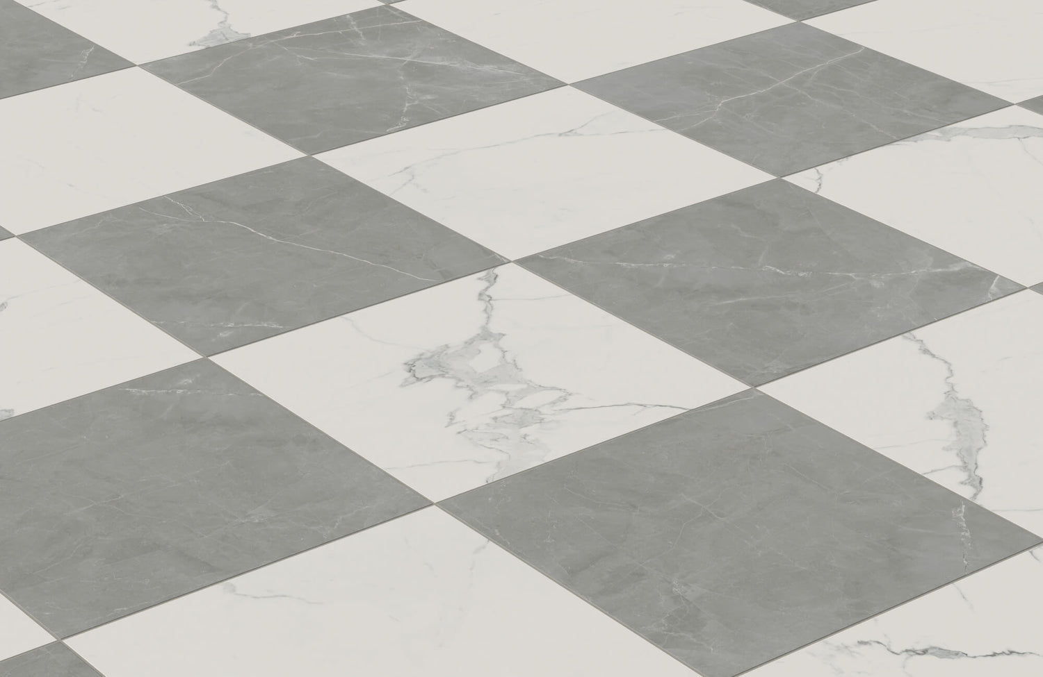
A strong example of this innovation in practice is the Leona 12x12 Checkerboard Matte Porcelain Tile in Calacatta and Amani Bronze, as shown in the picture above. This product showcases the power of digital printing to replicate the luxurious detail of Calacatta marble paired with the warm, earthen tones of Amani Bronze—two complex stone aesthetics brought together in a perfectly balanced checkerboard format. The depth and texture of each "stone" square are digitally rendered to evoke the richness of natural materials without the cost or maintenance demands of real marble.
Digital printing also supports sustainable manufacturing by reducing the need for physical templates and minimizing ink waste. Additionally, it allows for faster prototyping and shorter production cycles, enabling tile producers to respond quickly to market trends and designer demands. If you are seeking checkerboard tiles with the look of Calacatta marble, hand-scraped oak, or weathered concrete, digital printing delivers a level of aesthetic control that was once unimaginable, making it a cornerstone of modern tile innovation.

The Design Power and Popularity of Porcelain Checkerboard Tiles
Porcelain has emerged as the material of choice for checkerboard tiles, and for compelling reasons that extend beyond durability. This dense, vitrified ceramic offers exceptional strength, making it highly resistant to wear, moisture, and stains—key attributes for floors in kitchens, entryways, and busy areas. Additionally, it requires minimal maintenance and retains its appearance for decades without the need for sealing or refinishing, unlike natural stone alternatives.
Porcelain’s versatility has unlocked new possibilities in checkerboard design. Thanks to digital printing and precision cutting, manufacturers can produce tiles in a broad range of finishes, textures, and colors. Beyond the classic black and white, designers now experiment with contemporary palettes like slate and bone, olive and ivory, or even tone-on-tone variations that soften the contrast for a subtler, more integrated look.
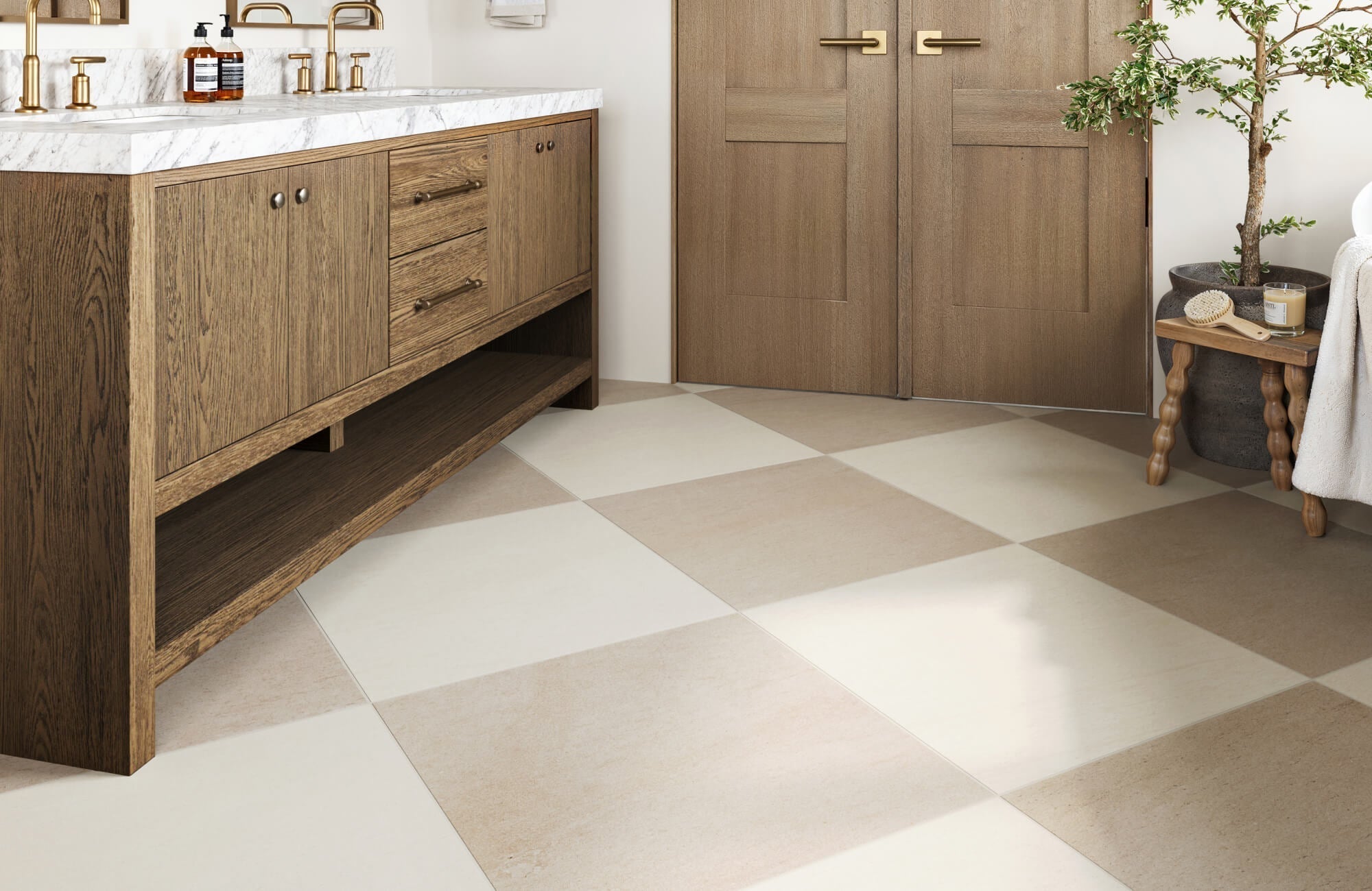
A perfect example is the Brody 24x24 Checkerboard Matte Porcelain Tile in Sand and Dune, as displayed in the picture above, which features warm, natural tones that offer a softer interpretation of the checkerboard pattern, ideal for neutral, earthy interiors or spaces that prioritize subtle elegance over stark contrast.
The adaptability of the pattern itself enhances its appeal. In minimalist and Scandinavian interiors, soft neutrals like sand and pale gray establish visual order without overwhelming the space. In contrast, bold pairings, such as emerald and white or navy and cream, are favored in eclectic or vintage-inspired interiors, where the checkerboard acts as a statement element. The pattern's innate rhythm also works well in open-concept layouts, naturally guiding flow while maintaining visual cohesion across zones.
Designers increasingly push boundaries by varying tile size, orientation, and finish. Diagonal layouts inject movement, while mixing matte and glossy finishes on alternating squares adds light interplay. Larger format tiles or elongated rectangles introduce a more contemporary feel, especially when used in entryways or dining spaces. These creative adaptations elevate the checkerboard from a static motif to a dynamic tool for spatial storytelling.
Today’s homeowners and designers are seeking materials that balance style, performance, and environmental responsibility, qualities that porcelain checkerboard tiles deliver exceptionally well. Their non-porous, hypoallergenic surface resists bacteria, mold, and staining, making them ideal for hygienic environments like kitchens and bathrooms. Furthermore, porcelain’s long lifecycle and low maintenance contribute to sustainable design goals by reducing material waste and replacement frequency.
For those drawn to more organic textures and muted palettes, the Palmer 12x12 Checkerboard Raw Porcelain Tile in White and Grey offers a matte, unpolished finish that captures a soft, tactile aesthetic while retaining all the performance advantages of porcelain. As design values shift toward timelessness, health-conscious materials, and functional beauty, porcelain checkerboard tiles remain a future-forward choice that aligns with both aesthetic and lifestyle demands.

Checkerboard Tiles in Commercial and Modern Architectural Design
Checkerboard patterns are increasingly being used to enhance commercial spaces and modern architecture. In education, hospitality, and retail environments, porcelain checkerboard tiles provide durability, ease of maintenance, and a polished visual identity. They also help organize spatial flow without the need for directional signage, making them both functional and decorative.
In contemporary architectural design, checkerboard tiles are no longer confined to the floor. Designers are applying them to accent walls, stair risers, and even building facades. Porcelain's weather resistance and UV stability make it a smart choice for exterior applications, where it maintains its color and structure despite environmental stress.
A standout example of this elevated approach is Edward Martin’s Leona 24x24 Checkerboard Matte Porcelain Tile in Calacatta and Amani Grey, as shown in the photo above. It demonstrates how refined materials and large-format design can elevate checkerboard installations in both interior and exterior commercial spaces. The pairing of cool Calacatta veining with the grounding grey tones creates a sophisticated contrast that feels both timeless and architecturally relevant, ideal for upscale lobbies, corporate reception areas, or gallery-style public environments.
To support effective design planning, Edward Martin also offers a powerful augmented reality (AR) tool that allows architects, designers, and clients to preview checkerboard tile patterns directly in their spaces. By visualizing scale, tone, and layout in real time, users can make confident material selections and layout decisions before installation begins—an especially valuable advantage when designing large-scale or busy environments where precision and impact are key.
Whether used subtly in reception areas or boldly in open-plan public zones, checkerboard tiles add rhythm and refinement. Their balanced geometry brings visual clarity to expansive spaces and contributes to the overall experience of architectural harmony.
Why Checkerboard Tiles Remain a Timeless Design Statement
Checkerboard tiles have endured across centuries because they offer a rare blend of aesthetic harmony and design adaptability. Rooted in historical significance yet fully at home in modern interiors, the pattern’s precise geometry and visual rhythm provide both structure and style. Whether rendered in natural stone, digitally printed porcelain, or custom finishes, checkerboard tiles consistently convey balance, sophistication, and intention. Their capacity to evolve with changing materials, formats, and color palettes ensures they remain not just relevant but essential to timeless and future-facing design.
If you're inspired to bring this classic pattern into your own space, but unsure how to tailor it to your layout, lighting, or style, Edward Martin’s expert design services are here to guide you. Our design team collaborates closely with homeowners, architects, and interior designers to craft checkerboard layouts that feel custom, cohesive, and contextually appropriate. From selecting the perfect tile combination to planning precise installation layouts, we help turn inspiration into elegant execution.
