


A stylish backsplash can transform a kitchen, but not every tile color makes life easy once the cooking starts. Between oil splatter, steam, and fingerprints, some hues will show every mark while others quietly keep messes out of sight. If you’re aiming for a kitchen that stays visually tidy without constant scrubbing, choosing the right backsplash color matters more than you might think.
In this guide, we’ll explore which ceramic tile shades are the most forgiving day to day. You’ll also learn how finish, texture, and lighting all affect how clean your backsplash really looks between wipe-downs.

Why Color Affects Perceived Cleanliness
Backsplash color isn’t just a design choice—it’s something you’ll live with every day. Some shades make messes pop, while others are better at hiding the usual splashes and fingerprints that come with cooking. Below, we’ll take a closer look at how different hues can affect the way your kitchen looks between cleanups.
Light vs. Dark Colors
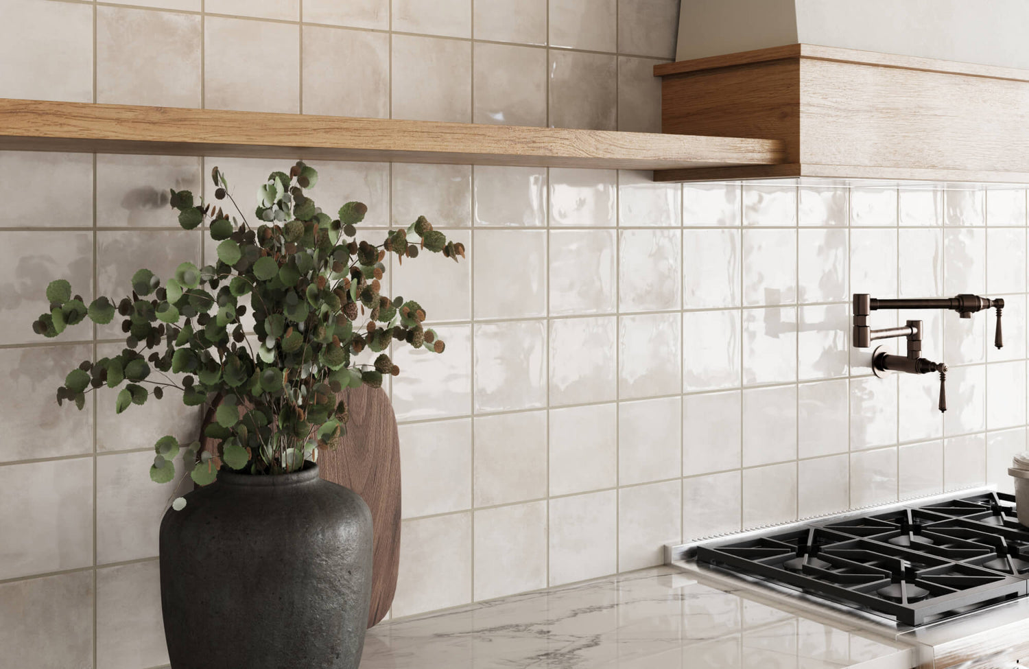
Light-colored tiles like white or soft cream, such as our Dani 1.6x5 Matte Ceramic Tile in Cream as seen above, often create a crisp and airy kitchen backdrop, but they’re also more likely to reveal splashes of tomato sauce, coffee, or oil. Even small marks can stand out sharply against a bright surface, especially under direct light. On the other hand, darker colors such as charcoal or espresso do a better job of concealing stains and dust, especially in corners or near cooking zones. However, they tend to show lighter residues, like soap streaks, water spots, or flour, more clearly than darker tones.
The best option often depends on the kind of mess your space sees most often. If you cook with oils or sauces regularly, a mid-to-dark tone may help reduce visual upkeep. But if water and steam leave marks frequently, a softer neutral may show less. Ultimately, neither extreme hides everything perfectly, so it’s worth weighing which type of mess is most common in your space.
Warm Tones vs. Cool Tones
Warm tones, think taupe, terracotta, or buttercream, can help soften the look of everyday grime by blending naturally with common food-related messes. Grease and smudges tend to blend into their golden or reddish undertones rather than standing out. These shades also tend to feel inviting, which can make occasional marks less noticeable in a busy family kitchen. However, depending on how rich or deep the warm tone is, they may still show dark spots or burnt-on splatter more easily.
Cool-toned tiles like pale blue, gray, or green can hide some debris well, especially in sleek, modern kitchens. That said, these tones often exaggerate warm-colored stains like oil, rust, or splattered sauces. They also tend to create more visual contrast with organic messes, which may draw more attention to crumbs or smears. If your kitchen lighting is bright and cool, some undertones may also amplify unwanted reflections that make even small marks stand out.
Midtones and Neutrals
Midtone hues such as greige, soft stone, or dusty olive often strike the best balance when it comes to perceived cleanliness. These colors aren’t so dark that they reveal every speck of dust, and not so light that they broadcast every bit of grime. Their subtle contrast can help soften the appearance of a mess while still maintaining a clean, modern look. These shades are especially forgiving in kitchens with fluctuating light throughout the day.
Neutrals are also versatile enough to match with most grout colors and surrounding finishes, reducing visual clutter. Whether matte or slightly glossy, they maintain a calmer surface appearance that doesn’t scream for constant cleaning. If your goal is to minimize the need to wipe down after every meal, neutrals and balanced midtones are often the most forgiving choices. They work well in both rustic and contemporary kitchens without showing every fingerprint or splash.

Glossy vs. Matte Finishes
When it comes to keeping a backsplash looking clean, the finish you choose can be just as important as the color. Glossy and matte tiles each handle smudges, splashes, and dust differently, affecting how often you’ll feel the need to wipe them down.
Pros and Cons of Glossy Tiles
Glossy tiles, as seen above with our Maisie 4x4 Glossy Ceramic Tile in Canvas, reflect light, which can help brighten your kitchen, but that same reflectivity makes fingerprints, water streaks, and grease splatter more visible. Any smudge on a high-gloss surface tends to stand out under both natural and artificial lighting, especially on darker tiles. However, the upside is that glossy finishes are typically smooth and sealed, making them easy to wipe clean with a damp cloth or sponge. Their slick surface doesn’t trap grime, so even stubborn food stains can be removed with minimal effort.
The real challenge lies in maintenance frequency rather than difficulty. If you don’t mind a quick daily wipe, glossy tiles can stay looking fresh with little elbow grease. But in households where mess builds up quickly or goes unnoticed for longer, this finish can highlight every spot, especially in areas behind the stovetop or sink. For some, that tradeoff is worth it; for others, it’s a constant visual reminder to clean.
Benefits of Matte or Satin Finishes
Matte and satin finishes offer a softer, less reflective surface that’s far better at disguising dust, light smudges, and minor splatter. Their muted appearance reduces glare, which helps hide fingerprints and water marks that would be instantly visible on glossy tiles. This makes matte options especially appealing for busy or open-concept kitchens where surfaces are always in view. The overall effect is more forgiving, even when things get messy during everyday cooking.
However, the downside is that matte finishes can be slightly more porous or textured, depending on the tile type. That means they may hold onto grease or cooking residue a little more easily, requiring a firmer wipe to stay clean. If you’re working with heavy oils or frying often, be sure to look for a sealed matte option that won’t absorb mess. In many cases, a satin finish offers a good middle ground—less glare, but still easy to clean.
What Works Best in Busy Spaces
In high-use areas where splashes, smudges, and streaks are part of everyday life, the best backsplash finish often comes down to balancing visual appeal with easy upkeep. Glossy tiles can be a solid option if you don’t mind frequent wipe-downs and like the crisp, polished look. They’re smooth to clean and typically resist staining, but they’ll also highlight fingerprints and splatter more quickly in well-lit rooms.
If you’d rather spend less time spot-cleaning, matte or satin finishes may be the better fit. Their softer surface helps diffuse light and mask day-to-day messes, especially in open-plan areas or rooms with strong directional lighting. For households where activity never really stops, a low-sheen finish in a forgiving tone can make a big difference. It keeps surfaces looking clean longer, even if life gets in the way of constant maintenance.

How Lighting Affects Perceived Cleanliness
Lighting does more than set the mood in your kitchen; it plays a big role in how clean your backsplash looks day to day. Depending on where the light’s coming from and how strong it is, even a spotless tile can suddenly show streaks or grease you didn’t notice before.
Natural Light vs. Artificial Light
Natural light is great for brightening up your kitchen, but it can also be unforgiving. Sunlight streaming in through a window tends to reveal every streak, splash, or smudge, especially on dark or glossy tiles. It shifts throughout the day, too, so what looks clean in the morning might seem a little off by mid-afternoon. That changing light can catch you off guard if your backsplash is prone to showing marks.
Artificial light gives you more control, but it still has its quirks. Bright, cool-toned bulbs can make grease splatter pop, while warm lighting might soften those flaws but highlight dust instead. The type of lighting you rely on most often, whether it’s overhead, under-cabinet, or ambient, can really influence which colors and finishes will feel low-maintenance in your space.
Direction and Intensity
Where your light hits the backsplash and how strong it is can make all the difference. A strong spotlight or under-cabinet fixture that hits the tile at an angle can exaggerate even the smallest flaw. Glossy finishes might reflect every fingerprint, while matte ones can reveal grease buildup in just the right light. It’s something most homeowners don’t realize until the tiles are already installed.
Softer or more diffused lighting usually hides small imperfections better, but go too dim and you might not notice grime until it’s built up. The trick is finding a balance that works with your tile, not against it. If your kitchen has bold lighting, it’s worth factoring that into your backsplash choices from the start. It can save you from constantly scrubbing surfaces that only look dirty.

Do Finish and Texture Matter as Much as Color?
While color often gets the spotlight, texture and surface finish can make just as big a difference in how clean a backsplash looks and stays. Here we’ll break down how the feel of a tile surface translates to visible mess, day-to-day upkeep, and overall practicality in the kitchen.
Smooth vs. Textured Surfaces
Smooth tiles tend to look cleaner simply because there’s less surface area for grime to cling to. A flat ceramic tile with minimal grooves makes it easier to spot splatter early and wipe it away quickly. In contrast, textured or heavily patterned tiles can mask small marks but may trap grease or crumbs in their ridges. That hidden buildup can become more noticeable over time, even if the tile appears forgiving at first glance.
For homeowners who want a “clean look” without constant upkeep, smoother tiles typically win out. Textured surfaces can work too, especially when paired with neutral colors that disguise spots. But be realistic, deep textures might mean extra scrubbing in the long run. If you’re looking for low-maintenance ease, the simplest surface often proves the most forgiving.
Easiest Surface Types to Wipe Down
When it comes to everyday cleaning, smooth ceramic or satin-finish tiles offer the least resistance. A quick swipe with a damp cloth is usually enough to clear away sauce splashes or water spots. These surfaces don’t hold onto residue as easily, which means less elbow grease for you after meals or prep.
Tiles with raised patterns, tumbled edges, or stone-like textures can require more effort to keep clean, even if they don’t look dirty at first. Grime can settle into small indentations and stay put without a good scrub. For kitchens that see daily use, stick with surfaces that clean up fast without fuss. It’ll save you time and make routine wipe-downs feel less like a chore.

Most Low-Maintenance Backsplash Color Options
Some colors make kitchen upkeep feel effortless, while others highlight every drop and fingerprint. This section focuses on the most forgiving backsplash shades for daily mess, without drifting into personal style or trend picks.
Creams, Beiges, and Mid-Toned Greys
These timeless neutrals strike a smart balance between clean aesthetics and practical upkeep. Creams and light beiges are warm enough to soften harsh light but muted enough to disguise minor food splatter or dust. Mid-toned greys, especially those with a slightly mottled or matte finish, offer similar benefits; they don’t shout for attention and don’t show every drop.
What makes these colors ideal is their adaptability. They blend well with different lighting and cabinet colors while masking everyday mess. If you want a backdrop that stays quietly clean-looking without needing constant polishing, this palette is worth considering. It’s functional without being too plain, which is a win in busy kitchens.
Soft Sage, Dusty Blue, or Speckled Tones
For those who prefer a bit of color without the cleaning stress, muted greens and blues add just enough personality while remaining low-fuss. Soft sage and dusty blue don’t amplify stains or grease marks like their more saturated counterparts. Their calming tone helps conceal uneven smudges under both natural and artificial lighting.
Speckled glazes or subtle patterns also do a great job of visually camouflaging small streaks and splashes. Instead of drawing attention to the mess, they absorb it into the design. These choices offer a little visual interest without becoming high-maintenance focal points. You get charm and practicality in one tile. For example, our Teagan 3x12 Glossy Ceramic Tile in Moss brings a soft, natural green tone that hides everyday smudges beautifully—ideal for kitchens that balance style with real-life use.
Colors to Avoid if You Hate Scrubbing
Some shades are beautiful but demanding. Pure white and solid black tiles tend to highlight every fingerprint, splash, and speck of dust. White shows off food stains and discoloration quickly, especially around cooking areas, while black reveals water spots and smudges almost instantly. Bright primaries or high-gloss bold hues can also exaggerate surface imperfections depending on the lighting. If you’re looking for an easy-going backsplash, these colors may require more frequent cleaning to maintain their crisp look. That doesn’t mean they’re off-limits; it just means they’ll ask a bit more from you day to day.
If you’re unsure which shade will work best in your space, our AR Tool lets you preview different tile options right on your kitchen wall using your phone. It’s a quick way to see how light, color, and finish interact with your real environment—before making a final call. For an even closer look, you can also order 4x4 high-quality samples and test how each tile handles splashes, fingerprints, and daily wear. It’s a simple step that can save you time, effort, and second-guessing in the long run.
Choosing a Low-Maintenance Backsplash
Choosing a ceramic backsplash color that stays visually clean isn’t just about aesthetics; it’s a decision that can make daily life easier. Whether you lean toward warm neutrals, muted midtones, or matte finishes that hide smudges, the right combination of hue and surface can reduce how often you feel the need to scrub. Factors like lighting, kitchen activity, and texture all work together to shape how clean your backsplash looks, even between wipe-downs.
If you’re unsure where to start, our design consultation service can help you weigh the practical pros and cons of different finishes and colors in your space. We’ll guide you through real samples, lighting impact, and upkeep expectations so your final choice looks great and feels effortless to live with.