


When choosing a blue backsplash, it's essential to balance hue, context, and practicality. For instance, deep “marine blues” like navy and indigo bring refined elegance and durability, especially when paired with nickel or brass accents. Meanwhile, smoky slate blues deliver a modern, neutral backdrop, perfect for complementing wood and light-toned surfaces.
In contrast, lighter blues, such as cerulean and sky, infuse small or airy spaces with a sense of openness and ease. Additionally, matte tiles diffuse glare for a soft, relaxed feel, while glossy finishes amplify light, adding vibrancy. Both tile types offer moisture resistance and low maintenance, making them ideal for durable styling. In this blog, we’ll unpack which blue tones perform best in backsplashes and how they harmonize with various materials, finishes, and decor styles.

The Psychology and Versatility of Blue in Home Decor
Blue is more than just a color; it shapes how we feel and shapes our entire décor narrative. So first, we’ll explore how blue’s calming effects support emotional well-being, and then look at its impressive flexibility across diverse design styles.
The Calming and Soothing Effects of Blue
Blue is widely acknowledged in color psychology for evoking serenity and reducing stress. For example, shorter-wavelength blues (around 470–490 nm) have been shown to lower heart rate and blood pressure, aligning with chromotherapy principles used in restorative environments. Lighter, pastel blues, such as sky and powder, harmonize with natural daylight, creating a sense of spaciousness and relaxation. Consequently, these tones are ideal for bedrooms and bathrooms, where they help foster tranquil atmospheres conducive to sleep and restoration.
On the other hand, deeper blues like navy or indigo maintain that soothing effect while adding a cocooning depth, perfect for reading nooks or entertainment rooms. These shades absorb light, creating introspective spaces without overstimulation.
Blue’s Adaptability to Various Design Styles
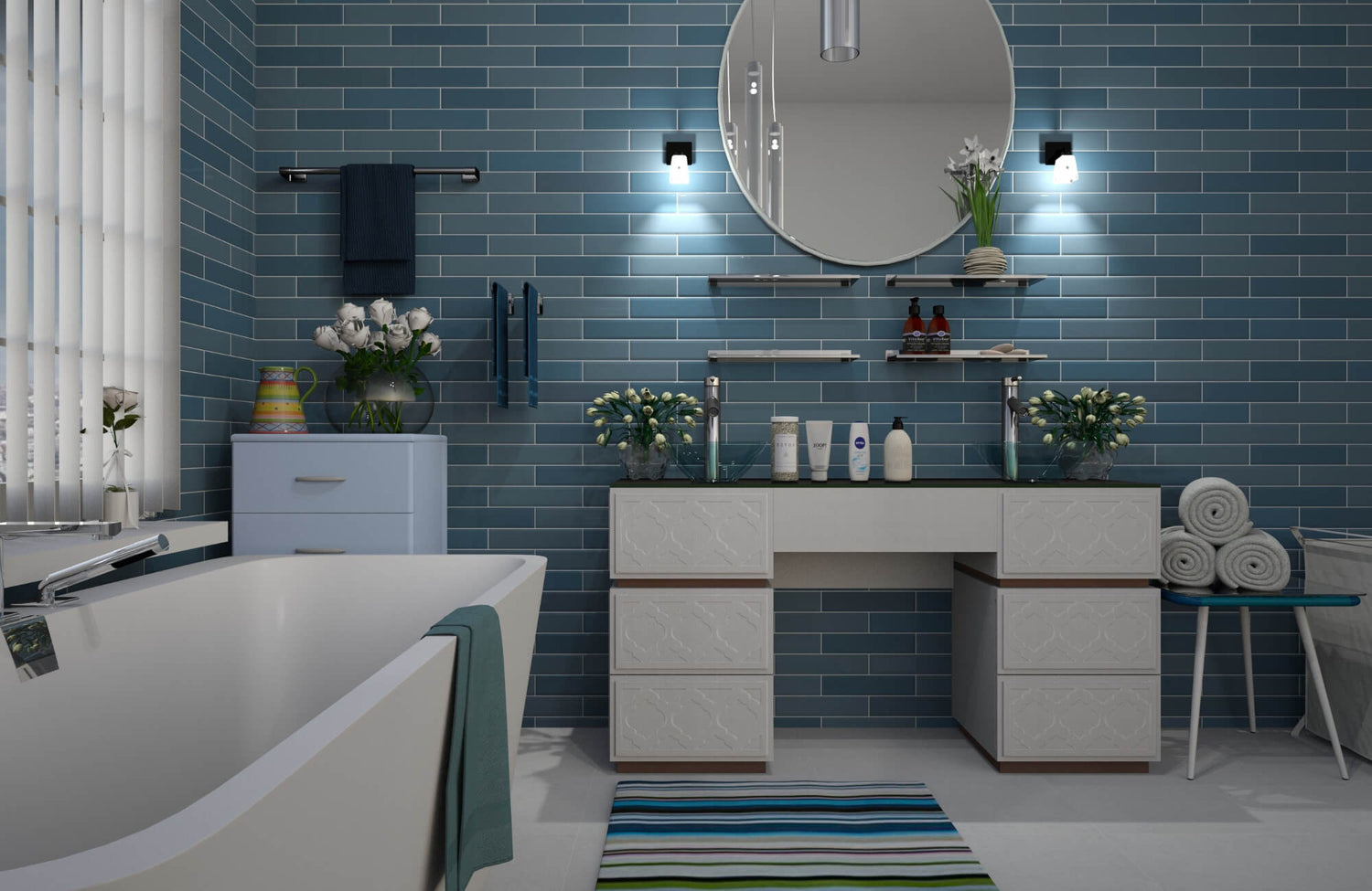
One of blue’s most compelling attributes is its stylistic versatility. In coastal or nautical interiors, bright cerulean and aqua tones echo ocean hues, especially when used in beadboard paneling or subway tile backsplashes, and pairing them with crisp whites or sandy neutrals enhances that seaside mood. By contrast, mid‑century modern or Scandinavian designs benefit from muted blues, such as slate or dusty denim, in matte finishes, which emphasize clean lines and quiet elegance. Meanwhile, richer, saturated blues, like navy-lacquered kitchen islands or velvet wingback chairs, add sophistication while bridging traditional detailing with contemporary silhouettes.
Moreover, selecting a glossy ceramic tile, such as Edward Martin’s Maisie 2.5×16 Glossy Ceramic Tile in Ocean, introduces a radiant visual focal point. As featured in the photo above, its reflective sheen and deep-toned surface beautifully complement stone countertops and woodgrain elements while amplifying light to make spaces feel brighter and more open. Furthermore, blue’s adaptability shines through material pairings: porcelain or glass mosaics bring iridescent accents, while glossy finishes provide polished contrast against organic textures like wood and stone.

Light Blue Shades
Blue’s lighter cousins bring both serenity and vibrancy into a space, enhancing mood while visually expanding the room. To see this in action, we’ll begin with the soft tranquility of sky and powder blues before diving into the playful charm of robin’s egg and aqua hues.
Sky Blue and Powder Blue
Sky blue and powder blue, usually between 180–210° on the HSV color wheel with high lightness (70–85%) and moderate saturation (20–40%), mirror the brightness of a clear sky. As a result, these shades reflect abundant ambient light, reduce contrast, and visually open up spaces. For instance, when applied in satin- or eggshell-finish paint, powder blue diffuses glare, creating a tranquil backdrop ideal for work–rest environments like home offices or nurseries. From a technical standpoint, powder blue’s lower chroma supports visual ease, while its cool hue level fosters a sense of calm associated with open-air atmospheres. Additionally, designers often accentuate perceived ceiling height by employing an ombré effect, beginning with deeper sky tones at the base and graduating upwards into lighter powder hues.
Moreover, incorporating Edward Martin’s Natasha 2×6 Matte Porcelain Tile in Ice enriches this scheme with tactile elegance. As shown in the image above, its soft matte finish complements the airy blue tones while delivering durability and low glare, perfectly pairing with light wood trims or white cabinetry to elevate both aesthetics and practicality.
Robin’s Egg Blue and Aqua
Robin’s egg blue and aqua imbue interiors with a playful vibrancy, blending blue with subtle green undertones for a refreshing twist. Specifically, robin’s egg blue, hovering around 190° hue and 30–50% saturation, brings a pastel-like clarity that enlivens spaces without overwhelming them. In semi-gloss finishes on cabinetry or accent walls, it provides crisp definition and a polished sheen ideal for modern or eclectic interiors. Conversely, aqua, boasting higher saturation (50–70%) and lightness (60–75%), injects energetic coolness, especially striking when bordered by white trim or natural wood elements.
Furthermore, in architectural details like wainscoting or beadboard, aqua’s greenish bias increases luminosity while maintaining calm, and aqua-tiled backsplashes, paired with stainless-steel hardware, can add spirited elegance without dominating the visual field.

Medium Blue Shades
Medium blues strike the perfect balance between richness and radiance, offering both subtle elegance and vibrant energy. With that in mind, let’s uncover how cerulean and sapphire bring timeless sophistication, then explore how cobalt and royal blue make bold, modern statements.
Cerulean and Sapphire
Cerulean and sapphire typically fall in the medium-light to medium range of lightness (40–60%) with moderate-to-high chroma (50–70%), striking a harmonious balance between depth and clarity. Specifically, cerulean, leaning toward the green spectrum at roughly 200–210° hue, infuses painted mouldings or accent walls with elegant airiness. In matte or eggshell finishes, it diffuses light softly while revealing architectural lines without glare, making it ideal for living rooms and formal dining areas. In contrast, sapphire, with a deeper hue near 220° and lightness of 45–55%, brings jewel-like richness. When applied in silk-effect paints, velvet upholstery, or lightly varnished porcelain wall tiles, sapphire adds tactile opulence while maintaining that refined mid-tone balance.
Cobalt Blue and Royal Blue
Moving on, cobalt and royal blue intensify the medium-tone palette with vivid saturation and striking presence. Cobalt blue, around 235° hue with chroma levels of 60–80% and lightness at 50–60%, delivers bold contrast without descending into darkness. When finished in glossy lacquer, whether on kitchen islands or accent furniture, it enhances specular reflectivity and creates a contemporary focal point. Meanwhile, royal blue, slightly darker (40–50% lightness) yet equally chromatic, brings a poised elegance. In satin wall panels or powder-coated features, it exudes confidence, pairing harmoniously with neutral grays and warm metals.
Furthermore, Edward Martin’s Maisie 2.5×16 Glossy Ceramic Tile in Cobalt takes this palette to the next level. As illustrated in the photo above, its elongated shape and radiant gloss capture and reflect light, creating striking focal points for backsplashes or vertical accents while reinforcing cobalt's vibrant energy. Additionally, its stain-resistant durability ensures enduring style and low-maintenance practicality.

Dark Blue Shades
Dark blues bring a sense of drama and refinement that can transform any space into a statement-making retreat. Let’s first explore the elegant depth of navy and midnight blue before moving into the jewel-toned allure of teal and deep turquoise.
Navy Blue and Midnight Blue
Navy and midnight blues fall into the lower range of lightness (10–30%) with moderate-to-high chroma (30–60%), producing an enveloping, elegant aesthetic. Take navy, for instance: its subtle gray undertones and matte or satin finishes anchor large surfaces, like paneled walls or cabinetry, by minimizing glare and emphasizing architectural details such as recessed panels and coffered ceilings. Moreover, this chromatic richness reduces light reflection, making navy ideal for serene environments like libraries or home theaters.
Conversely, midnight blue, with its near-black depth (~5–15% lightness) yet persisting blue nuance through specular reflection, introduces a luxurious intimacy when rendered in glossy lacquer or velvet upholstery. From a colorimetry perspective, these shades deepen further in dim lighting, highlighting the importance of layered and directional illumination to maintain their visual depth.
Enhancing this dramatic effect, Edward Martin’s Jaden 2.5×16 Glossy Ceramic Tile in Navy introduces a striking visual texture and elongated subway format. As featured in the photo above, its glossy surface captures light to reveal subtle shade variations and specular highlights, perfect for reinforcing the navy's refined elegance. Moreover, it delivers durable, stain-resistant performance ideal for high-moisture areas.
Teal and Deep Turquoise
Shifting focus, teal and deep turquoise fuse dark blue with green undertones to create jewel-like sophistication. Teal, typically 20–35% lightness and 40–60% chroma, mirrors the richness of malachite, especially in glossy ceramic or glass tiles that shimmer and subtly shift color under changing light. Additionally, metallic finishes, such as powder-coated hardware or decorative fixtures, amplify this luxurious depth with contemporary flair.
Meanwhile, deep turquoise, slightly higher in chroma (35–55%) yet equally rich in tone, shines on accent walls or fireplace surrounds. When executed in textured plaster or Venetian stucco, it creates multi-dimensional surfaces that dance with light and shadow, further enhancing visual intrigue. Plus, its green-leaning undertone provides a crisp counterpoint to dark wood or brass, and its textural qualities can even aid in sound diffusion, making it ideal for lounges or music rooms seeking both beauty and function.
Furthermore, to truly bring these tones into your space, the Edward Martin AR Visualization Tool lets you see tiles like teal or deep turquoise in real settings. Simply choose your favorite from the curated catalog and place it virtually using your device camera. Then, when you're satisfied, order real samples delivered to your door, helping you refine your choice with confidence.

Considerations for Choosing the Best Blue Shade
Choosing the right blue shade goes beyond just picking a favorite hue; it requires thoughtful consideration of light, color harmony, and material surface. With that in mind, let’s take a closer look at how lighting, complementary décor, and backsplash texture each contribute to crafting a truly stunning result.
Lighting
Lighting conditions profoundly affect how blue tones appear in a space. For instance, in north-facing or low-light rooms, cooler blues, like cerulean or powder, can seem flat or muted due to their reliance on daylight's higher color temperature. To address this, pairing these shades with warm-white artificial light (2700–3000K) adds a cozy glow. On the other hand, in sunlit south- or west-facing rooms, natural light can intensify undertones, cool blues may drift toward gray, while warmer tones like aqua or teal appear richer.
As shown in the photo above, glossy backsplash tiles, such as Edward Martin’s Olivia 4×16 Glossy Ceramic Tile in Dusty Blue, amplify this effect by reflecting light to create sparkle and depth. Conversely, matte or satin finishes diffuse light, minimizing glare and ensuring even color distribution. Finally, choosing light sources with a high Color Rendering Index (CRI ≥ 90) helps preserve the integrity of blue tones without distortion.
Complementary Colors and Existing Decor
Blue’s perceived hue and harmony depend heavily on its surrounding colors. Take, for example, complementary pairings: navy with terracotta-toned grout or warm brass hardware produces a striking contrast by leveraging the orange-blue relationship on the color wheel. Meanwhile, using analogous color schemes, like teal with green or sapphire with violet accents, yields a layered, harmonious palette. Additionally, balance saturation and value carefully: a medium-light baby blue backsplash with white cabinetry creates crisp visual clarity, while the same shade paired with oak cabinets produces a Scandinavian-inspired warmth. Moreover, tile dimensions and grout color matter: small cobalt mosaics with dark grout unify the color field, whereas larger-format tiles with white grout highlight individual units and introduce structure.
Materiality and Texture of the Backsplash
The surface and finish of your backsplash determine how a blue hue reads. Specifically, porcelain and ceramic tiles come in glossy, matte, or semi-matte versions, where glossy enhances saturation and reflection, and matte lowers glare and tones down intensity. In contrast, back-coated glass tiles offer high specular reflectivity, creating iridescent highlights influenced by angle and light, thanks to Fresnel reflection. Alternatively, natural stone like Azul Macaúbas marble or blue-hued porphyry presents organic veining and tonal depth; finishes such as honed, polished, or leathered allow control over sheen and texture.
Additionally, metal or metallic-finish tiles, such as powder-coated aluminum or copper alloys, add shimmer and a modern edge, though they can patina over time and may require sealing to preserve color integrity. Lastly, grout composition, whether epoxy, cement-based, or sanded, can subtly affect perceived vibrancy through color bleed and reflectivity.
Finishing Touches in Blue
Choosing the perfect blue backsplash goes beyond selecting a favorite shade; it’s about finding balance among color, material, and light. By considering factors like lightness, chroma, finish, and surrounding context, you'll create visual harmony that enhances your space aesthetically and functionally.
Ultimately, thoughtful shade selection aligned with your cabinetry, countertops, and lighting will result in a backsplash that stands the test of time. When you're ready, start with tile sampling or connect with Edward Martin for guidance tailored to your space.