


A well-chosen rug holds the quiet power to transform a room, not only through texture and pattern but through how it interacts with light and space. Far beyond its functional purpose, the right rug color can illuminate a dim corner, soften harsh shadows, and breathe openness into even the most compact interiors. Whether basking in the morning sun or glowing under evening lamplight, a light-enhancing rug also serves as a subtle yet striking anchor in the visual story of a home.
Selecting the ideal hue requires a balance of reflectivity, tonal harmony, and material finesse—all working together to heighten the ambiance without overwhelming it. This article explores the most effective rug colors to brighten a room, offering refined insight into color science, environmental pairing, and design harmony.

Color Reflectance and Its Role in Rug-Driven Brightness
To effectively brighten a room with rugs, it’s essential to understand how light interacts with color and material. The concept of reflectance, specifically, how much light is absorbed or bounced, plays a central role in shaping the perceived brightness of interior spaces.
Light Reflectance Value (LRV) in Rug Colors
Light Reflectance Value (LRV) indicates the percentage of light a surface can reflect, making it a crucial metric in choosing rug colors that brighten interior spaces. When rugs feature high LRV hues like alabaster, pale ivory, or pearl gray, they allow both natural daylight and artificial lighting to bounce effectively throughout the room. This light reflection also helps diminish shadows and creates a more expansive, open feel, especially useful in compact or poorly lit environments.
Additionally, using high-LRV rug colors for small spaces allows you to visually stretch the room without introducing harsh contrasts. These light-enhancing hues are particularly powerful on hard surfaces like wood or tile, where the rug serves as both a functional and aesthetic light diffuser. By integrating such colors strategically, even rooms with minimal windows can appear fresh, open, and welcoming.
Surface Texture and Fiber Composition
While color is vital, the surface material and texture of a rug significantly affect its ability to reflect or diffuse light. Rugs made from synthetic fibers like viscose, nylon, or polyester tend to have a smoother finish, enhancing reflectivity and giving rooms a brighter appearance. Flatweave or low-pile rugs made with these materials scatter light more uniformly than their denser wool counterparts, which can absorb light due to their matte surface and thickness.
Choosing rugs with a subtle sheen further supports light reflection, especially under directional lighting or in rooms with multiple illumination sources. Synthetic fiber rugs for light enhancement are also prized for their durability and ease of maintenance, making them ideal for busy zones. Their ability to marry functionality with brightness makes them a reliable option for spaces that require both form and performance.
Color Temperature and Environmental Interaction
A rug’s impact on brightness depends on how its tone aligns with the lighting temperature in the room. Cool-toned rugs such as icy gray or pale blue work in harmony with daylight-spectrum LEDs, reinforcing a crisp and fresh ambiance. Conversely, warm tones like cream or pale sand pair best with incandescent or warm-white lighting, enriching the natural glow and making the space feel more inviting.
This balance between rug color and light temperature ensures visual cohesion and prevents the jarring effect that can occur when tones clash. Using rugs that match light color temperature not only elevates room brightness but also supports the emotional atmosphere of the space. These subtle alignments contribute to a polished and comfortable interior, where brightness feels both intentional and effortlessly integrated.

Neutral Rugs and the Expansion of Visual Space
Neutral rugs offer a refined solution for enhancing a room’s perceived size and brightness. Their understated hues promote light flow and spatial continuity, making interiors feel cohesive and open without drawing attention away from key design elements.
Beige, Taupe, and Greige for Balanced Luminance
Colors like beige, taupe, and greige strike the ideal balance between warmth and reflectivity, helping to expand a room visually while maintaining a grounded aesthetic. These neutral rug shades for brightening minimalist interiors adapt easily to diverse decor styles, from rustic farmhouse to contemporary urban. Their gentle tones also create smooth transitions between surfaces, allowing natural and artificial light to circulate freely.
This light diffusion, in turn, reduces the presence of harsh shadows and enhances the perceived ceiling height and wall-to-wall width. Greige, a harmonious mix of gray and beige, is especially effective in fluctuating lighting conditions, maintaining consistent brightness throughout the day. When used in large open-plan areas, these rugs not only support functional zoning but also contribute to a bright, continuous flow.
The Role of Undertones in Ambient Illumination
Though neutral in name, these colors often carry subtle undertones that significantly influence how they interact with light. Warm undertones, like hints of red or gold, amplify the warmth of sun-drenched rooms, while cooler undertones, such as soft blues or greens, work best in spaces with limited natural light.
Understanding undertones in light-enhancing neutral rugs allows for intentional pairing with lighting schemes, wall finishes, and upholstery. When undertones align with their environment, they also create a seamless visual language that enhances both clarity and comfort. This strategy ensures that the brightness feels integrated, not superficial or overly stark. By being mindful of undertones, you can manipulate ambient illumination with a level of subtlety that’s both elegant and effective.
Layering with Complementary Accents
Layering neutral rugs with thoughtfully selected accents can significantly elevate their ability to brighten a space. Light-toned wood furniture, pale textiles, and soft metallic finishes, such as brushed brass or nickel, extend the reflective quality of the rug into the broader room. Instead of creating visual clutter, these accents enhance light movement and help define the room’s character without sacrificing its sense of openness.
Incorporating complementary accessories like cream throws or sandstone-colored cushions also adds texture and warmth while supporting the rug’s light-reflective foundation. Using layered textures that align chromatically with the rug results in a soft yet dynamic brightness that feels natural. In this way, complementary accents do more than decorate—they act as secondary reflectors that amplify the rug’s visual impact.

Pastel Rugs and Subdued Color Brightness
Pastel rugs bring a soft elegance to interiors by introducing subtle color without compromising overall brightness. Their muted, desaturated nature allows them to reflect light gently, creating a peaceful and visually open environment.
Soft Blues, Mints, and Blush Tones
Pastel rug colors such as powder blue, blush pink, and mint green offer a unique way to inject personality while preserving brightness. These tones are ideal for interiors seeking a calming, luminous quality, especially in spaces like bedrooms, nurseries, or spa-inspired bathrooms. Their soft hues also reflect ambient light evenly, helping maintain a sense of airiness and reducing visual congestion.
When paired with whitewashed wood floors or pale walls, pastel rugs further contribute to the perception of expanded space and enhanced light. In this way, pastel rugs help create interiors that feel both bright and serene, enhancing tranquility while preserving visual interest. Their gentle chromatic presence adds quiet charm and integrates effortlessly into both traditional and contemporary design schemes, ensuring a harmonious and light-filled aesthetic.
Exemplifying this effect is Edward Martin’s Lafferty Wool Blend Rug in Ocean, as shown in the photo above, combining a washed blue tone with a soft wool texture to create a foundation that’s both tranquil and light-enhancing. Its ocean-inspired hue introduces just enough color to elevate the room while maintaining the gentle reflectivity associated with pastels. The rug's tonal softness also allows it to distribute natural light gracefully across the floor plane, brightening the room without overwhelming it.
This makes it particularly suitable for light-centric interiors that favor a muted palette with subtle dimensions. Whether placed in a coastal-style space or a softly layered modern room, this Lafferty rug bridges brightness and softness with quiet sophistication. It underscores how pastel tones when paired with the right materiality, can become central to an interior’s luminous atmosphere.
Desaturation and Visual Weight Reduction
The low saturation of pastel rugs minimizes their visual weight, which in turn helps rooms feel lighter and more expansive. Unlike bold or dark colors that absorb light and draw focus downward, pastel tones keep the eye moving, contributing to an uninterrupted flow of illumination throughout the space. As a result, they become particularly effective in compact rooms or those with low ceilings, where every design choice must work in favor of openness.
In addition to their space-enhancing qualities, desaturated rugs improve overall brightness without becoming the dominant visual element, allowing other light-friendly features, such as mirrors or reflective surfaces, to take center stage. Their subtle presence supports an overall design language centered around clarity and simplicity. In environments where restraint and softness are key to the aesthetic, pastel rugs offer both beauty and function in perfect measure.
Integrating with Monochrome and Soft Palette Interiors
Monochromatic interiors benefit greatly from the introduction of a pastel rug, which offers gentle contrast and layered brightness. These rugs integrate easily into spaces dominated by whites, creams, and pale grays, where maintaining light consistency is paramount. When used alongside soft natural textures, such as bleached oak or organic linen, pastel rugs for bright modern decor complete the look with understated elegance. Their color presence is strong enough to prevent sterility, yet soft enough to preserve a bright and tranquil aesthetic. The key lies in maintaining tonal harmony while subtly shifting the visual dynamic. In this way, pastel rugs act as both a color anchor and a brightness enhancer.

Maximizing Light with White, Cream, and Ivory Rugs
White, cream, and ivory rugs offer the most direct path to maximizing light within a room. Their ability to reflect nearly all visible light makes them an unmatched tool for enhancing visual spaciousness and clarity.
Albedo Effect and High-Contrast Light Diffusion
The albedo effect explains how surfaces like white or ivory rugs reflect a high percentage of incoming light, dispersing it evenly across the room. This makes them ideal for creating an open, radiant environment, particularly in rooms with limited natural daylight.
By maximizing brightness, light-colored rugs are especially effective in hallways, compact apartments, or low-ceilinged spaces, where they help counterbalance architectural limitations. Their ability to diffuse both artificial and natural light also ensures the space feels vibrant and welcoming at any time of day. When paired with soft, matte surfaces, the effect becomes even more pronounced, as light bounces gently rather than glaring. The result is an atmosphere that feels both serene and functionally luminous.
Material Durability and Soil Resistance
While their bright appearance is visually desirable, light rugs must be chosen with durability in mind to ensure they retain their reflectivity over time. Materials like solution-dyed acrylic, performance polyester, and treated polypropylene offer excellent resistance to staining and fading. These fabrics are also especially important in busy zones or family-friendly environments where spills and wear are inevitable.
Opting for white or pale performance rugs ensures that you can maintain a clean, luminous aesthetic with minimal maintenance. These modern textiles combine visual appeal with practical resilience, helping the rug preserve its light-enhancing qualities despite frequent use. As a result, they offer a dependable foundation for sustaining brightness and elegance in active households.
Textural Enhancement without Light Absorption
Incorporating texture into light-colored rugs adds visual interest while preserving their reflective qualities, enriching a space without sacrificing brightness. A high-low pile in ivory or a looped cream Berber design, for instance, introduces depth and dimension without dulling the rug’s light-diffusing effect. These subtle variations interact gently with light and shadow, enhancing the room’s visual character without creating heaviness or visual clutter.
This makes textured light rugs especially useful in minimalist interiors, where contrast in materials takes precedence over bold color. When used thoughtfully, they provide both tactile appeal and a sense of spaciousness. Paired with complementary finishes, such as satin paint or brushed metal hardware, the result is a cohesive, softly luminous environment that feels intentionally layered and visually balanced.

Strategic Color Combinations and Contrast Control
The effectiveness of a light rug depends not only on its inherent qualities but also on how it interacts with its surroundings. Strategic color coordination and placement can significantly amplify a rug’s impact on room brightness.
Contrast Management with Wall and Floor Colors
To maximize a rug's light-enhancing capabilities, it should be surrounded by surfaces that support rather than absorb light. For instance, placing a cream rug on pale hardwood flooring and pairing it with soft gray or linen-colored walls creates a continuous flow of reflected light. In contrast, dark walls or floors can absorb the rug’s brightness and reduce its effectiveness.
Light-colored rugs that minimize visual contrast are particularly effective in bridging and harmonizing surrounding elements. By maintaining a consistent tonal palette across both horizontal and vertical surfaces, light can travel more fluidly throughout the space. This approach is especially beneficial in open-concept layouts or rooms with limited natural light, where every design element must work together to promote a cohesive and radiant atmosphere.
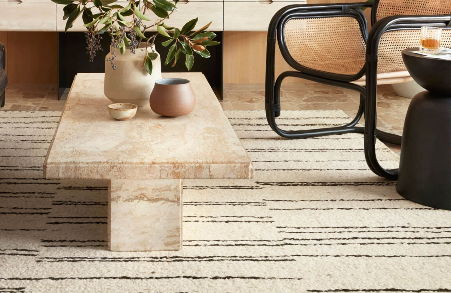
A perfect example of this principle can be seen in the styled space featuring our Pascal Polyester Face Rug in Indigo, as displayed in the picture above. The rug’s soft blue tone sits harmoniously atop a natural jute base, bordered by pale oak floors and surrounded by white paneling and soft neutral furnishings. The result is a seamless blend of color and contrast that allows light to diffuse fully across the room, visually expanding the space. The pale indigo hue also introduces just enough tonal variation to create interest while maintaining brightness. This balanced approach exemplifies how strategic color placement and surrounding tones can elevate a rug’s reflective impact. By integrating tonal layers that support rather than compete with the rug, the overall space feels open, airy, and effortlessly composed.
Directional Lighting and Rug Positioning
A rug’s placement in relation to light sources significantly impacts its ability to brighten a space. Positioning a pale or white rug near a window allows it to capture and reflect natural sunlight, helping that light reach deeper into the room. The same principle applies to artificial lighting—uplights or floor lamps aimed toward the rug can amplify its reflective properties and extend illumination.
Strategically positioning light-colored rugs also transforms the floor from a passive surface into an active element of the room’s lighting strategy. This approach is especially effective in long, narrow, or L-shaped layouts where light distribution can be uneven. With thoughtful placement, rugs move beyond decoration to become intentional tools for enhancing ambient brightness.
Accent Integration for Visual Balance
A room filled exclusively with light tones can feel flat or overly sterile, so well-chosen accents help ground the space while maintaining brightness. Introducing soft complementary hues, such as muted gold, dusty peach, or pale teal, adds dimension without introducing harsh contrast. Accent pairings with light-reflective rugs also enhance both aesthetic appeal and spatial clarity.
Using finishes like brushed metal, frosted glass, or textured ceramics further builds visual interest without disrupting the luminous quality of the rug. These accessories help anchor the design and provide focal points, ensuring the room feels curated rather than clinical. Ultimately, thoughtful accent integration supports a well-balanced, light-rich environment.
Creating Luminous Interiors Through Thoughtful Rug Design
The brightness of a room is never determined by lighting alone, as it is shaped by every surface that light touches and every color that reflects it. Rugs, when chosen with intention, become quiet collaborators in this orchestration, subtly guiding the mood, openness, and warmth of a space. From whisper-soft pastels to versatile neutrals and radiant whites, the right rug color can also elevate a room from shadowed to sunlit without altering a single fixture. It is this harmony between color, material, and placement that transforms interiors into places of clarity and calm. Through thoughtful selection, rugs become more than decor—they become instruments of light, breathing air and elegance into every corner.
For those seeking expert guidance in crafting luminous, cohesive interiors, Edward Martin’s personalized design services offer tailored solutions that bring each space to life. Whether you’re designing a serene retreat or a light-filled gathering space, our team is here to help. Contact us to begin your home transformation today!