The subway tile is one of the few surface materials that has remained in continuous use across residential and commercial interiors for more than a century without requiring reinvention. Its rectangular format, most commonly recognized in white glazed ceramic, is immediately identifiable, but the question of what actually makes a tile a subway tile goes further than its dimensions or its color. The format has origins that are more practical than aesthetic, and understanding where it came from helps explain why it has held its position in interior design long after the conditions that created it no longer exist. In this blog, we'll trace the subway tile from its beginnings in the New York City subway system through its defining characteristics, its evolution into a broad range of materials and applications, and what to consider when selecting one for your own space.

White glazed ceramic on the walls of a New York City subway station, the format that started it all.
Where The Subway Tile Began
The subway tile was born out of necessity rather than design intention. When the New York City subway system expanded in the late 19th century, engineers and architects needed a wall material that could handle the conditions of an underground transit environment, one that was hard, moisture-resistant, easy to clean, and capable of reflecting light in spaces that had very little of it. Glazed ceramic in a 3x6-inch rectangular format met all of those requirements, and the tile was adopted across the station walls where it remained in continuous use for decades.
How The Format Moved From The Station To The Home
The shift from transit infrastructure to residential interiors happened gradually through the mid-20th century as architectural taste moved toward cleaner, more functional surfaces. The subway tile's proportions, its familiar rectangular format, and smooth glazed face, translated naturally into kitchens and bathrooms, where the same practical qualities that made it work underground, resistance to moisture, ease of cleaning, and an ability to keep a space feeling bright, made it equally well suited to domestic use. Its association with order and clarity rather than decoration was part of what made it appealing to homeowners during a period when restraint and utility were becoming design values in their own right.
Why Affordability Accelerated Its Adoption
Beyond its practical qualities, the subway tile's accessibility in terms of cost played a significant role in how quickly it moved into residential settings. Glazed ceramic was an affordable material to produce and install, which meant the tile was available to a broad range of homeowners rather than limited to premium projects. That combination of low cost, strong performance, and a clean appearance that did not date quickly gave the subway tile a foothold in domestic interiors that more decorative or expensive materials could not match at the same scale. It was a surface that required no design justification beyond its own straightforward usefulness, which is a quality that has proven difficult to argue against regardless of the era.

The Maisie 2.5 x 16 Glossy Ceramic Tile in Canvas in a vertical stack draws the eye up the wall and gives this laundry room a surface that earns a second look.
What Actually Defines A Subway Tile
The subway tile is defined by more than its dimensions. Format, material, finish, color, and how the tile is laid all shape how a subway tile reads in a room, and each of those decisions carries a different visual and practical consequence worth understanding before making a selection.
How Format And Size Affect The Way A Subway Tile Reads
The original 3x6 inch rectangle remains the most recognized subway tile format, and its proportions have a specific visual logic behind them. The 1:2 ratio creates a horizontal emphasis that makes a wall feel wider and more grounded, which is part of why the format worked so well in the low-ceilinged corridors of the original subway stations. Contemporary variations, including elongated formats like 2.5x16 or 4x12, shift that ratio and change the character of the surface entirely. A longer tile draws the eye along its length, which in a vertical stack makes a wall feel taller, and in a horizontal run makes a room feel broader. The size also affects how the grout lines read from a distance. Smaller tiles produce a denser grid that adds texture and visual complexity, while larger formats create a calmer, more open surface where the tile itself rather than the pattern does most of the work.
Why Material Choice Changes More Than Just Appearance
Ceramic remains the most common material for subway tile and performs reliably in most residential applications, but porcelain, glass, stone, and marble each bring qualities that ceramic does not. Porcelain is denser and less porous than ceramic, which makes it more resistant to moisture penetration and better suited to floors, wet rooms, and commercial settings where the demands on the surface are higher. Glass introduces a translucency that no other tile material replicates, reflecting light from within the surface rather than just off it, which changes how a room reads in different lighting conditions. Stone and marble carry natural variation in their veining and surface that no two tiles share exactly, which gives an installation a material depth that manufactured finishes approach but rarely match. Each material also responds differently to grout color, cleaning products, and long-term wear, which means the practical and visual considerations are inseparable when choosing between them.
How Finish Determines The Way Light Behaves On The Wall
The finish of a subway tile is what controls the relationship between the surface and the light in the room, and that relationship shifts more dramatically than most people anticipate before seeing it in their own space. A glossy finish reflects light directly, which makes the surface appear brighter and gives the wall a presence that shifts throughout the day as the light source moves. In a room with limited natural light, a glossy tile can do meaningful work in keeping the space feeling open. A matte finish absorbs light rather than reflecting it, producing a quieter, more recessive surface that tends to disappear behind the room's other elements rather than contributing its own visual energy. Textured and embossed finishes occupy a middle position, catching light at their raised edges while absorbing it in the recessed areas, which creates shadow and depth on a surface that would otherwise read as flat.
What Color Does Beyond Setting The Tone
White remains the default subway tile color, not because it is the most interesting choice but because it is the most forgiving. A white tile works against almost any grout color, sits alongside almost any material palette, and reads consistently across different lighting conditions without shifting in tone the way more saturated colors can. Moving away from white introduces variables that are worth understanding before committing. Cool tones like blue-gray or sage read differently under warm artificial light than they do in daylight, often appearing greener or more neutral than they look on screen or in a showroom. Deep colors like black, navy, or forest green absorb light and bring the wall forward, which changes the spatial quality of the room. The color of the grout also plays into this significantly. A contrasting grout emphasizes every individual tile and makes the grid pattern a visible part of the design, while a grout that matches the tile closely produces a more continuous surface where the format registers without the lines drawing attention to themselves.
How Installation Pattern Changes The Character Of The Same Tile
The same tile installed in different patterns produces surfaces that feel categorically different from one another, which makes the layout decision as consequential as the tile choice itself. A standard horizontal running bond, where each row offsets by half a tile length, is the most familiar arrangement and produces a surface that feels ordered and calm without drawing attention to the pattern itself. A vertical stack emphasizes the height of the wall and gives the surface a more contemporary, considered quality that the horizontal offset does not carry. Herringbone introduces movement and craft, with the diagonal relationship between tiles creating a surface that reads as more complex and intentional from a distance. A straight stack with no offset produces the cleanest, most graphic result, where the grid is perfectly regular, and the tile format reads with complete clarity. Each of these layouts also interacts differently with the grout lines, making the choice of pattern and grout color decisions that are best made together rather than separately.
The vertical stack is one of the clearest examples of how layout changes the character of a tile without changing the tile itself. The cream glossy surface running floor to ceiling in a vertical stack in the laundry room above belongs to our Maisie 2.5x16 Glossy Ceramic Tile in Canvas, where the elongated format amplifies what a vertical arrangement does to wall height, drawing the eye upward along each tile's length rather than across the surface. The subtle shade variation inherent in its handmade character means no two tiles read identically, which gives the stacked grid a surface movement that a more uniform tile in the same layout would not carry. That combination of a directional format, an elongated proportion, and natural color variation produces a result that reads as considered from across the room and rewarding at close range.

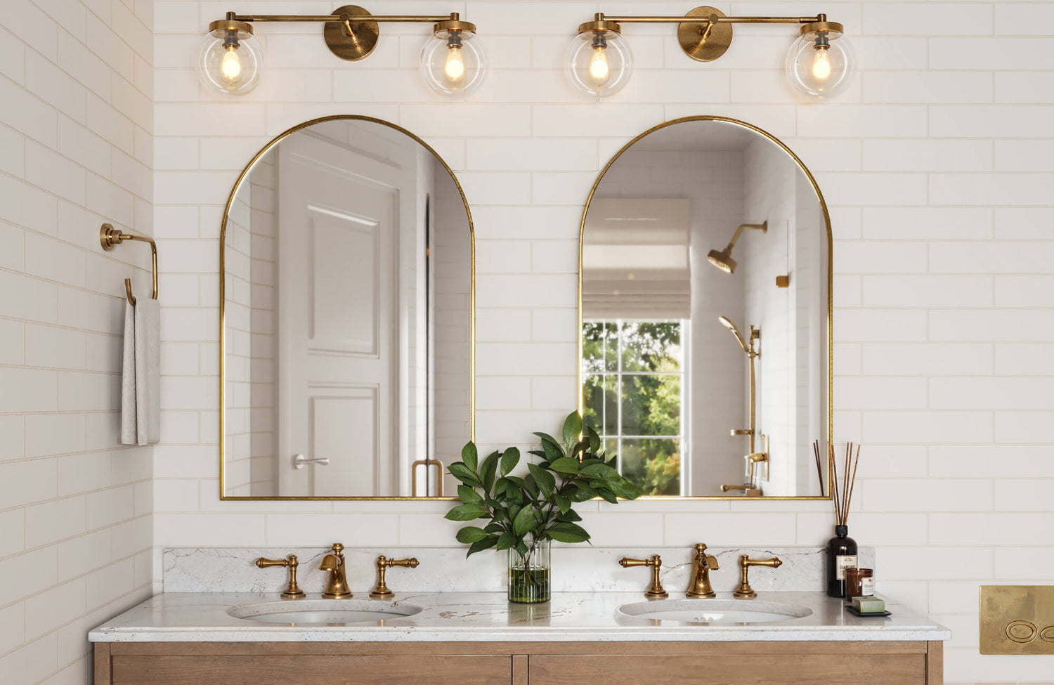
Brass hardware, gold-framed mirrors, and the Jaden 2.5 x 16 Glossy Ceramic Tile in Eggshell in a vertical stack show that the same format that worked in 1904 still looks this good today.
Why Subway Tile Has Stayed Relevant Across Every Design Era
The subway tile's continued presence in residential and commercial interiors is not the result of nostalgia or trend cycles. It holds its position because the qualities that made it useful in 1904 are the same qualities that make it a practical and considered choice today, and those qualities have only expanded as the material and format have evolved.
How The Format Adapts Across Completely Different Interior Styles
The rectangular subway tile has no strong stylistic allegiance, which is precisely what allows it to move between contemporary, traditional, industrial, and transitional interiors without feeling out of place in any of them. In a modern kitchen with flat-front cabinetry and minimal hardware, white subway tile in a running bond provides a clean, ordered surface that supports the room's restraint without adding visual noise. In a more traditional bathroom with paneling, warm wood tones, and period fixtures, the same format in a warmer white or a soft gray reads as considered and appropriate rather than anachronistic. That adaptability extends beyond aesthetic style into spatial application. Ceramic and porcelain subway tiles perform reliably as kitchen backsplashes, bathroom walls, shower surrounds, and fireplace surrounds, with the material choice determining the appropriate application rather than the format itself limiting where it can go.
What Makes Ceramic And Porcelain Hold Up In Demanding Environments
The durability of a glazed ceramic or porcelain subway tile comes from the firing process that produces it. The high-temperature kiln firing creates a surface that resists moisture, heat, staining, and the abrasive effect of cleaning products without requiring sealing or periodic treatment to maintain that resistance. In a kitchen, this means the backsplash stays consistent through years of cooking splatter, steam, and regular wiping. In a bathroom or shower, the tile's non-porous glaze prevents moisture from penetrating the surface regardless of how much water it is exposed to. Grout selection plays into the long-term performance of the installation as well. Epoxy grout resists staining and moisture absorption more effectively than standard cement grout, which matters most in wet areas where the grout lines are under sustained exposure. Specifying the right grout alongside the tile keeps the installation performing as intended across the full lifespan of the surface.
Why The Subway Tile Format Does Not Date The Way Other Trends Do
Most tile trends are defined by a specific visual quality, a color, a texture, or a finish that is closely associated with the moment it became popular. When that moment passes, the quality reads as dated rather than classic. The subway tile avoids this because its defining characteristic is proportion rather than decoration. The 1:2 rectangle is a resolved form with no excess, which means it does not carry the visual signature of any particular decade or design movement. A bathroom tiled in white subway tile in 1960 reads the same as one tiled in 2015, not because the context has not changed, but because the tile itself provides no information about when it was installed. That quality of being present without announcing itself is what makes it a foundation material rather than a featured one, and it is a quality that genuinely cannot be manufactured or applied to a more decorative tile after the fact.
How Price Point And Material Quality Relate In The Subway Tile Category
Subway tile spans a wider price range than its simple format might suggest, and the differences between price points are worth understanding before making a selection. Entry-level ceramic tiles are produced efficiently and offer solid performance for walls and backsplashes where the demands on the material are primarily aesthetic. Moving up in price, the clay body becomes denser, the glaze more consistent, and the dimensional tolerances tighter, which affects how cleanly the tiles align in an installation and how the grout lines read across the finished surface. Porcelain sits at a higher price point than most ceramics and delivers measurably better performance in terms of moisture resistance and surface hardness, which justifies the cost difference in wet rooms, floors, and commercial applications. The value of a subway tile is not simply in its purchase price but in how it performs and looks over the full life of the installation, which is a longer calculation than the per-square-foot cost alone.
Why Eco-Friendly Material Choices Are Worth Considering In This Category
The tile industry has expanded its range of sustainable options in recent years, and subway tile formats are available in recycled glass and reclaimed ceramic that reduce the demand for virgin raw materials without compromising on the finish quality or performance of the tile. Some manufacturers have also invested in production processes that lower kiln energy consumption and reduce waste during fabrication, which decreases the environmental cost of the tile before it even reaches the installation. For homeowners building or renovating with sustainability as a genuine priority rather than an afterthought, these options allow the material choice to reflect that commitment. The longevity of a well-made ceramic or porcelain tile also contributes to its environmental case. A surface that does not need to be replaced for decades generates considerably less material waste over time than one that requires periodic updating as its appearance degrades.

Deep green glossy subway tile wraps a curved kitchen island base, with the Jameson 8 x 48 Matte Porcelain Tile in Ash underfoot, keeping the floor from competing with it.
How The Subway Tile Has Evolved Beyond Its Original Form
The subway tile's format has remained consistent while everything around it has expanded. Material options, finish ranges, installation approaches, and applications have all broadened considerably from where the tile began, giving the same fundamental rectangle a far wider range of expression than its origins in a transit system would suggest.
How Customization Has Changed What A Subway Tile Can Be
The contemporary subway tile market offers a level of personalization that the original glazed ceramic 3x6 never anticipated. Hand-painted surfaces, metallic glazes, embossed relief patterns, and decal finishes are all available within the subway format, which means the tile can carry decorative intention rather than simply providing a neutral background. This shift from a purely functional surface to one that can reflect a specific point of view has made the format relevant to projects where the tile itself is a deliberate design choice rather than a default. The rectangular format remains the constant, but the surface that occupies it has expanded into territory that the original subway stations would not recognize.
The island wrapped in deep green tile in the kitchen above is one of the clearest examples of how far the subway tile format has moved from its origins. Our Celia 5x10 Glossy Ceramic Tile in Royal Green is designed to install as a single piece on flat surfaces, while its scored lines allow individual columns to be separated and applied around curved forms, which is how it wraps the curved island base shown here without breaking the continuity of the surface. The deep mineral green glaze sits against the marble countertop and warm wood cabinetry in a color relationship that could not be achieved with a standard ceramic format, and the vertical orientation of the tile draws the eye upward along the curved face rather than emphasizing its width. It is a tile that carries a specific design intention rather than simply providing a background, which is precisely what separates a considered material choice from a default one.
Where The Subway Tile Format Works Beyond The Backsplash
The kitchen backsplash and the bathroom wall are where most people first encounter subway tile, but the format carries into other applications with the same consistency it brings to those spaces. Larger format rectangular tiles used as flooring bring the same ordered, graphic quality of a subway tile installation to a horizontal surface, and porcelain's density makes it suited to the wear a floor experiences in ways that standard ceramic does not always match. Outdoor applications in frost-resistant porcelain extend the format to patios, pool surrounds, and exterior walls, where the material's resistance to temperature fluctuation and moisture keeps the surface performing through conditions that would compromise softer materials. Before specifying the tile for any application outside its standard wall use, confirming with the manufacturer that the specific tile is rated for that purpose ensures the installation performs as intended rather than failing prematurely under conditions it was not designed for.
What Premium Materials Bring To The Subway Tile Format
The subway tile format has moved well beyond its ceramic origins into materials that carry a different level of presence and cost. Marble and natural stone cut into subway proportions bring the variation, depth, and surface complexity of those materials into a format that installs with the same logic as a standard tile, which makes them accessible to projects that want the quality of stone without the complexity of large-format slab installation. Premium porcelain in large rectangular formats offers a refined alternative, with surface finishes that replicate the appearance of stone, concrete, or metal while delivering the performance consistency that natural materials cannot always guarantee. The result is a format that now spans from the most accessible ceramic to some of the most considered material choices available in residential tile, which is an unusual range for a shape defined by such a simple proportion.
How Current Design Directions Are Influencing Subway Tile Use
The most visible shift in how subway tile is being used currently is toward larger formats and quieter color palettes. Elongated rectangles in the 4x12, 3x12, and 2.5x16 range have gained significant traction because their proportions produce a surface that feels more considered and less generic than the standard 3x6, while still carrying the same fundamental logic of a rectangular tile in an ordered layout. Color has moved away from stark white toward warmer off-whites, soft greiges, muted greens, and deep neutrals that contribute a more specific tonal quality to a room rather than simply providing a neutral backdrop. Mixed material installations, where ceramic tile fields are punctuated by glass, metal, or stone accents, are also being used to introduce depth and variation into surfaces that would otherwise read as uniform.
Why Finish Combinations Produce More Resolved Results Than Single Finishes
Using more than one finish within the same tile installation is one of the more specific ways to introduce depth and distinction into a surface without introducing a second color or pattern. A matte field tile with a single row of glossy tile at the border creates a subtle but deliberate contrast that registers as crafted rather than accidental. A glossy tile field broken by a textured accent strip at a dado height gives the wall a horizontal reference that grounds the surface and draws the eye in a specific direction. The combination works best when the finish contrast is clear enough to read as intentional from a normal viewing distance, which usually means pairing finishes that sit at opposite ends of the reflectivity range rather than two that are close enough to look like a mismatch rather than a choice.
What Maintenance And Installation Considerations Are Worth Knowing Before You Commit
Standard ceramic and porcelain subway tiles in a running bond layout are among the most straightforward tile installations available, but that simplicity changes as the format, finish, or pattern becomes more complex. Tiles with relief textures or embossed surfaces require more careful grouting to ensure the recessed areas are filled without leaving excess grout on the raised faces, which can be difficult to remove once it sets. Rectified tiles, which are cut to precise dimensions after firing, require tighter grout joints and more careful substrate preparation to install correctly, but produce cleaner, more precise results than non-rectified alternatives. For maintenance, glazed surfaces clean easily with a damp cloth and a mild detergent, and the glaze itself requires no sealing. Grout lines are the more vulnerable element in any installation, and specifying a grout sealer appropriate to the environment at the time of installation reduces the ongoing maintenance required to keep the surface looking consistent.
Seeing How A Subway Tile Will Look In Your Space Before Installing It
Committing to a tile before seeing how it reads in the actual room, under your specific light conditions, and alongside your existing surfaces, is one of the more avoidable risks in a renovation decision. Edward Martin's augmented reality tool allows you to place subway tile options directly into a view of your space in real time, giving you a far more accurate sense of how the color, finish, and format will perform than a product image on a screen provides. Ordering physical samples alongside this process adds a tactile reference point that confirms how the glaze, the surface texture, and the color depth read in person before any installation decisions are finalized.

The Mara 2 x 10 Glossy Ceramic Tile in Black Cardamom stacked vertically behind a brass bridge faucet and open wood shelving shows what a considered tile selection looks like in a well-lit kitchen.
Making A Considered Subway Tile Selection For Your Space
The right subway tile decision comes from reading the room honestly before making any choice about color, material, or format. The characteristics of your space, how much light it receives, how it will be used, and what it already contains, are what determine which tile will perform well there, rather than simply look appealing in isolation.
How Room Conditions Should Shape The Selection
The amount of natural light a room receives is one of the most reliable starting points for narrowing a subway tile choice. In a kitchen or bathroom with limited daylight, a lighter color in a glossy finish keeps the surface from absorbing what little light is available and helps the room read as brighter than it would with a matte or deeply toned tile. In a larger, well-lit space, a darker color or a matte finish can absorb some of that light and bring the wall forward, which gives the room a more grounded and deliberate character. Tile size in relation to wall area also matters. A smaller format in a compact space creates a denser grid that can feel busy if the grout contrast is too strong, while a larger format on a small wall may not complete a full repeat before reaching a corner or edge. Evaluating the tile in the context of the actual room dimensions, rather than in a showroom or on a screen, produces a more reliable result.
How To Match Material To The Demands Of The Space
The function of the room determines which material is appropriate before the aesthetic conversation begins. In a shower, a wet room, or any application where the tile will be in sustained contact with moisture, porcelain is the more appropriate specification because its lower porosity prevents water absorption at the surface level in a way that standard ceramic cannot always guarantee. For a kitchen backsplash or a bathroom wall that sees splashing but not immersion, ceramic performs reliably and offers a wider range of color and finish options at a more accessible price point. Glass tile brings a reflective, light-distributing quality that neither ceramic nor porcelain replicates and suits applications where that quality is part of the design intent, though its installation requires more precise execution to avoid lippage and grout haze on the surface. Stone and marble-look porcelain occupy the higher end of the material range and suit spaces where the investment in the tile is proportional to the overall level of finish in the room.
What Routine Care Actually Requires For A Glazed Subway Tile
A glazed ceramic or porcelain subway tile is one of the lower-maintenance surfaces available for a kitchen or bathroom wall. The glaze itself is non-porous and does not absorb moisture, grease, or cleaning products, which means routine maintenance amounts to wiping the surface with a damp cloth and a mild detergent as needed. Abrasive cleaners and scouring pads should be avoided because they can scratch the glaze over time and dull a finish that would otherwise stay consistent for the life of the installation. The grout lines require more attention than the tile itself, as cement grout is porous and will absorb moisture and staining agents unless sealed. Applying a grout sealer at installation and reapplying it periodically, particularly in wet areas, keeps the grout lines from discoloring and reduces the effort required to clean them. Following the manufacturer's maintenance recommendations for both the tile and the grout ensures the installation continues to look as it did when it was first laid.
Choosing A Subway Tile That Holds Up As Well As It Looks
A subway tile that is well matched to the room it is installed in, in terms of material, format, finish, and color, requires very little justification beyond its own straightforward usefulness. It does not rely on trend or novelty to remain relevant because its appeal is built on proportion and performance rather than decoration. The format has proven this across more than a century of continuous use in both utilitarian and considered residential settings, and that track record is a more reliable indicator of longevity than any current design direction. The decisions that matter, material, finish, layout, and grout color, are ones that can be evaluated carefully and confirmed before any commitment is made.
If you are comparing subway tile options, materials, or finishes, or trying to determine how a particular format might work within your space, our Personalized Design Consultation can help bring clarity to the process. Our team can offer tailored guidance based on your room, your existing palette, and your project goals, helping you move forward with a choice that performs as well as it looks.