


Choosing the right rug color for your living room can feel like a big decision, and honestly, it is. The color of your rug grounds the space, ties furniture together, and sets the tone for how your living area feels. Whether you're starting from scratch or just refreshing your setup, the rug’s color plays a major role in making your space feel cohesive, inviting, and truly yours.
Let’s walk through what you need to know so you can feel confident, inspired, and excited about your choice.

Let Your Decor Do the Talking
Take a look around your living room; your furniture, wall art, and favorite accents are already pointing you in the right direction. Rather than thinking of your rug as a separate piece, treat it as part of the ongoing conversation in your space. The right rug color doesn’t just fit in; it also helps everything feel more connected, more complete.
Match Key Furniture Pieces
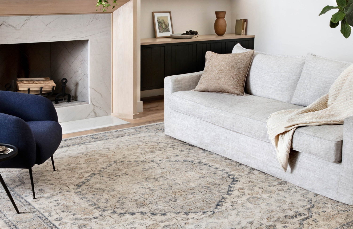
When you’re working with an existing color scheme, your major furniture pieces can serve as anchor points. If you have a leather camel-colored couch or rich walnut sideboard, a rug in warm tones like rust or muted saffron can subtly echo those features. These choices don’t just match; they reinforce the warmth already present in the room. On the other hand, if your furniture leans toward ash grey or sleek black, a cool-toned rug in slate or icy blue can also create a seamless flow.
That’s exactly what makes Edward Martin’s Pascal Polyester Face Rug in Rust / Multi such a natural fit in the space above. Its palette picks up on the warmth of the camel leather sofa while adding subtle dimension through its layered reds, faded blues, and golds. The result feels thoughtful and balanced, like the rug was chosen with the whole room in mind, not just the floor beneath it.
Balance with Contrasts
Though matching can create harmony, sometimes what your space truly needs is balance. In rooms filled with soft beige, ivory, or white tones, introducing a rug in a deeper shade can add much-needed depth and contrast. Think of how a navy or forest green rug looks beneath cream furnishings; it instantly grounds the space and gives it a more intentional, composed feel.
On the other side, when your furniture already makes a bold statement, like a mustard yellow armchair or a vibrant patterned sectional, a neutral-toned rug can bring visual calm. Shades like stone grey, soft taupe, or light oat provide a quiet foundation that helps everything else in the room breathe. It also keeps the space from feeling overstimulated and lets your standout pieces shine without overwhelming the design. In the end, it’s about creating a visual rhythm where everything feels in sync, not in competition.
Pull Accent Colors from Decor
This is where things start to feel more personal and a bit more fun. Take a closer look at the smaller details around your living room: maybe it’s a teal lamp on the side table, maroon velvet throw pillows, or an abstract print framed on the wall with soft blush and gold tones. These accents aren’t just decorative; they’re clues.
Pulling a color from one of these pieces and echoing it in your rug can instantly bring the room together. It creates a sense of intention, where every element feels connected rather than randomly placed. You’re not simply filling space; you’re also curating a look that flows naturally. And when that kind of cohesion is in place, the entire room feels warmer, more complete, and much more inviting.

Consider the Role of Natural Light
The way your space is lit throughout the day can dramatically influence how rug colors look. Natural light plays with texture and tone in subtle, often unexpected ways, so it’s important to consider how sunlight moves through your room. Understanding this also helps you choose a rug that looks just as good in the morning as it does in the evening.
South-Facing Rooms
If your living room faces south, you’re likely dealing with consistent, warm light throughout the day. That strong light can enhance warm undertones in your rug, sometimes making them look even warmer than they are. For that reason, cool-colored rugs, think ocean blues, misty greens, or soft greys, can help neutralize the glow and bring balance. These colors maintain their clarity under strong light and create a fresh, modern contrast without feeling stark.
For instance, Edward Martin’s Liddy Polyester Pile Rug in Ocean / Platinum, pictured above, is a great example of this setting. Its subtle mix of soft blue and cool platinum tones pairs beautifully with a sun-filled space, helping to balance the warmth without overwhelming it. The result is a light, refreshing atmosphere that softens the intensity of natural daylight while blending effortlessly with neutral furnishings. It shows how the right rug color can work with your lighting conditions to enhance the overall look and feel of the room.
North-Facing Rooms
North-facing rooms tend to receive soft, indirect light throughout the day, which can sometimes make colors appear muted or even flat. Instead of working against this natural lighting, it’s more effective to embrace it and build warmth through your rug choice. Richer tones like honey, burnt sienna, clay, or ochre can instantly add depth and warmth, helping the room feel more inviting and less shadowed. These colors carry visual weight and hold their character even in low-light conditions, creating a cozy, lived-in atmosphere that also feels grounded and comfortable from morning to evening.
Time-of-Day Shifts
It’s easy to fall in love with a rug under the bright, controlled lighting of a showroom, but once it’s in your home, the way it looks can change throughout the day. A cream rug that feels vibrant in the afternoon sun might appear slightly grey or muted by evening. That’s why it’s so important to test rug samples in your actual space before making a final decision. Try leaving them out for a full day and observe how the color reacts to shifting natural light, lamp placement, and evening shadows. These subtle changes can make a big difference, and understanding them upfront also helps you choose a rug that looks consistently beautiful from morning to night.

Think About Function and Foot Patterns
How you live in and move through your space should play a key role in choosing the right rug color. Your living room isn’t just for looks; it’s where everyday life unfolds. From casual conversations and playtime to coffee breaks and the occasional movie night snack mishap, the rug you choose needs to fit the way you use the room.
Light Colors Show Everything
There’s something undeniably elegant about a soft ivory or pale blush rug. These tones can make a room feel serene and spacious. But in practical terms, they’re better suited for spaces that see lighter use. If your household includes pets, kids, or guests who often forget their shoes, pale rugs will require extra upkeep. Their openness can amplify every mark or smudge. So, unless you’re committed to frequent cleanings or the rug is more decorative than functional, you might want to look toward more forgiving options.
That said, in the right setting, a pale rug can truly elevate the space. Edward Martin’s Georgette Polyester Pile Rug in Sand / Peach, as pictured above, is a perfect example. Its soft, airy palette adds a refined touch and enhances the room’s sense of lightness, making it ideal for a space designed more for relaxation than heavy daily use. It also shows how light-colored rugs can shine when matched with the right environment and lifestyle.
Darker Rugs Can Mask Mess
In busier households, rugs in deeper shades like espresso, navy, or dark grey can make all the difference. These tones do a great job of concealing everyday marks, whether it’s a small spill, pet hair, or the fine layer of dust that naturally builds up over time. For even more coverage, patterned rugs offer an added advantage by blending visual imperfections into their design, making them less noticeable.
What’s great about this approach is that you don’t have to sacrifice style for practicality. A dark, well-designed rug can still look polished while giving you peace of mind. So if your living room sees steady use, this kind of rug allows you to enjoy the space without constantly worrying about keeping it spotless.
Midtones for Balance
When you're aiming for something that feels balanced and versatile, midtone rugs are a smart choice. Not too light, not too dark, shades like slate blue, olive green, or weathered taupe offer a flexible foundation that suits a variety of lifestyles. These colors are soft enough to create a warm, inviting atmosphere, yet grounded enough to disguise everyday wear and minor blemishes.
What makes midtones especially appealing is their ability to work seamlessly across different design styles, whether your space leans rustic, modern, or somewhere in between. If you're looking for a rug color that adapts easily without fading into the background, a well-chosen midtone delivers just the right amount of presence and practicality.

Use Color to Set the Mood
While durability matters, color also plays a big part in shaping how your living room feels emotionally. Whether you're looking to energize the space, create a calming atmosphere, or make it feel warm and welcoming, the rug you choose can set the tone in subtle but meaningful ways.
Warm Tones Feel Cozy
Rugs in shades like terracotta, paprika, burnt orange, and copper instantly add warmth and intimacy to a space. These colors draw inspiration from natural elements, sunlight, clay, and fire, and have a grounding effect that encourages people to settle in and feel at home. If your room feels a little too sterile or wide open, a warm-toned rug can help anchor it and make it feel more connected. This approach also works well in traditional or bohemian interiors, where coziness and layered character take center stage.
Cool Tones Offer Calm
If your goal is tranquility, cool hues are the way to go. Shades like soft seafoam, foggy grey, or dusty blue allow your space to breathe and feel more open. These colors work especially well in modern or coastal-inspired rooms where the focus is on simplicity, calm, and natural light. Because they visually recede, cool-toned rugs can also make a room feel larger without sacrificing comfort. In addition, they pair effortlessly with materials like light woods, stone, and woven textures.
A great example is Edward Martin’s Hutchinson Polyester Face Rug in Marine / Peach, featured in the photo above. Its muted blue tones create a soothing backdrop, while the soft peach detail adds just enough warmth to keep the space from feeling too cold. It strikes a quiet balance, blending beautifully into a modern living room while still adding personality and depth.
Neutral Doesn’t Mean Boring
Neutrals are often seen as the “safe” choice, but they’re far from plain. A soft oatmeal wool rug or a greige flatweave can quietly elevate a room, acting as the subtle anchor that ties everything together. These shades don’t compete for attention, but they create balance and allow other elements, like artwork, lighting, or statement furniture, to stand out. To keep a neutral rug from feeling flat, lean into texture. Thick loops, organic weaves, or hand-knotted finishes can also add depth and interest, turning something understated into something truly refined.
Bold Colors Add Personality
If you’re looking to make a statement, bold-colored rugs are a powerful way to define your room’s character. Rich jewel tones like emerald, saffron, or magenta can bring energy and personality, turning the rug into a focal point that instantly draws the eye. In more minimal spaces, a vibrant rug adds interest without relying on lots of décor. To make the look feel intentional, try echoing the rug’s color elsewhere; a throw pillow, a piece of art, or even a small decorative object can also help tie everything together and create a cohesive, expressive space.

Anchor Your Layout with Strategic Color Use
Color does more than set the mood; it also shapes how you move through and experience a space. The right rug color can help define your layout, guide the eye, and bring a sense of balance and purpose to the room. Whether you’re working with an open floor plan or a smaller setup, thoughtful color placement can make the space feel more cohesive and well-designed.
Define Zones in Open Layouts
In larger living rooms or open-concept homes, rugs play a key role in creating visual separation. A cocoa-toned rug, for instance, can clearly distinguish a living area from a dining nook with a sage green rug, even when both sit on the same hardwood floor. These color choices help guide the eye and define the function of each space, bringing a sense of order without the need for walls. You’re not just decorating; you’re also shaping how the room works.
That idea comes to life with Edward Martin’s Lafferty Wool Blend Rug in Ocean, shown in the photo above. Its cool blue palette and structured pattern help anchor the seating area, creating a sense of definition without breaking the natural flow of the room. By contrasting subtly with the surrounding wood tones, the rug gives the space clarity and purpose, demonstrating how a well-chosen rug can organize and elevate an open layout.
Use Color to Expand or Ground
The color of your rug doesn’t just influence style; it can also change how a room feels in terms of space and scale. Light-colored rugs reflect more light, which can make smaller or enclosed areas feel brighter and more open. In contrast, darker rugs absorb light, creating a sense of intimacy and grounding that works especially well in rooms with tall ceilings or wide, open layouts. So, if your living room feels a bit boxed in or, on the other side, a little too vast, adjusting your rug color can subtly shift the balance. It’s a simple design choice that also makes a meaningful difference in the way the space comes together.
Connect Multiple Rugs Seamlessly
In shared or open spaces where you’re using more than one rug, keeping a sense of visual flow is key. The rugs don’t need to match exactly, but they should feel like part of the same conversation. For instance, a soft blush rug in one zone can pair beautifully with a deeper wine-colored rug in another, as long as the tones relate. This approach also helps the space feel connected rather than divided. To make it all come together, aim for a consistent undertone, whether that’s warm, cool, or neutral, so everything feels cohesive and thoughtfully layered, not randomly assembled.

Plan for Long-Term Flexibility
Once your space feels settled and visually grounded, it’s a good time to think ahead. Will this rug still work as your style changes or as the seasons come and go? Choosing a rug color that can evolve with your home also gives you the freedom to refresh your decor over time, without feeling limited or starting from scratch.
Stick with Neutrals for Versatility
If you love switching things up, whether it’s with the seasons or just on a whim, a neutral rug gives you that freedom. It acts as a flexible foundation, allowing you to experiment with bold accents, rotate in new textures, or even repaint the walls without worrying about color clashes. Choosing a neutral doesn’t mean your space will feel plain; it simply gives you more creative freedom to make changes without needing to rework the entire room.
Go Bold with Accessories Instead
Instead of making your rug the focal point, think of it as a grounded foundation that gives your accessories room to shine. A rug in a warm, earthy tone might seem subtle at first glance, but when layered with bold accent pieces, like emerald pillows or cobalt ceramics, it takes on a fresh, dynamic feel. This approach offers flexibility, allowing you to swap in seasonal or mood-based decor without needing to rethink your entire setup.
That’s exactly the strength of Edward Martin’s Pascal Polyester Face Rug in Spice / Cobalt, featured in the photo above. Its rich spice base and hints of cobalt create a warm, inviting canvas that works beautifully with both neutral furnishings and colorful accessories. Whether you're adding depth in the fall or brightness in the spring, this rug holds its place quietly while letting everything around it evolve.
Consider Seasonal Shifts
If you enjoy refreshing your space with the seasons, swapping out decor for the holidays, or embracing different looks in spring and fall, choosing a rug that can adapt is key. Earthy tones like sand, mushroom, or deep green work especially well because they strike a balance between warm and cool. Their versatility also makes it easy to layer in seasonal accents without clashing. In the end, it’s about selecting a rug that moves with you, effortlessly supporting whatever direction your style takes throughout the year.
Choosing the Right Rug Color for Your Living Room
Finding the best rug color for your living room isn’t about following trends; it’s also about choosing something that works for your space, reflects your style, and supports the way you live. By considering how light moves through the room, how the space functions, and how your decor comes together, you can land on a color that feels natural and intentional. Whether you're after warmth, calm, personality, or flexibility, there’s a rug color out there that brings it all together, and we’re here to help you discover the one that feels just right.
If you’re still unsure where to start or want a second opinion, we’re just a message away. Reach out to us anytime for guidance, or book a complimentary design consultation with one of our experts. We’d love to help you find the rug that fits your home and your life perfectly!