The kitchen backsplash is more than just a protective barrier against spills and splashes; it's a key design element that can influence the entire aesthetic and mood of your kitchen. Choosing the "best" color isn't just about trends, but rather understanding how different hues work with light, cabinetry, countertops, and your personal style. This guide will dive into considerations that explore the psychology of color, coordination with kitchen elements, lighting effects, and creative design ideas to help you choose a backsplash color that balances function and beauty.

The Psychology of Kitchen Hues
Color influences how we feel and interact with a space. In a kitchen, color choice can affect mood, energy, and even appetite. Choosing the right color family helps set the tone for your kitchen environment.
Warm Colors and Energy
Warm tones like reds, oranges, and yellows are not just visually appealing; they add energy and a sense of welcome. Red, often associated with passion and energy, can stimulate conversation and even appetite, making it a bold choice for a backsplash that encourages lively gatherings. Oranges, with their inherent warmth, evoke feelings of cheerfulness and comfort, ideal for creating a truly cozy culinary haven. Yellows, reminiscent of sunshine, can infuse a kitchen with optimism and brightness.
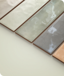
However, too much saturation can overwhelm a space, making it feel smaller or overly intense. Consider mustard for a touch of retro charm, burnt orange for sophisticated depth, or terracotta for an earthy, rustic feel. A perfect example is the Catalina 2x16 Matte Porcelain Tile in Clay from Edward Martin, as seen in the photo above, which offers a beautifully elongated form and rich terracotta-inspired tone that grounds the space with rustic charm while remaining refined and contemporary. Its matte finish softens the intensity, allowing it to pair effortlessly with wood tones, natural stone, or brass fixtures. These colors respond dynamically to light; natural sunlight will amplify their vibrancy, while warmer artificial lighting can enhance their inviting glow, transforming your kitchen into a truly welcoming heart of the home.
Cool Colors for Calm and Cleanliness
In contrast to the energetic warmth, cool colors offer a refreshing respite. Blues, greens, and purples, when applied to a kitchen backsplash, can transform the space into a tranquil sanctuary. Blues are inherently calming, evoking feelings of serenity and spaciousness, making a smaller kitchen feel more expansive. Greens, associated with nature and growth, bring a sense of freshness and balance, promoting a harmonious environment. The Mikayla 2.5x5 Glossy Ceramic Tile in Olive, for instance, offers a rich, earthy green with a refined sheen—perfect for achieving a modern yet nature-inspired look that instantly soothes and grounds a space.
Purples, especially softer lavender or muted amethyst shades, can introduce a touch of sophistication and creativity without overwhelming. These hues are perfect for those seeking a kitchen that feels open, airy, and conducive to a relaxed atmosphere. To avoid a sterile feel, incorporate cool colors through varying textures or by pairing them with warm wood accents. Imagine a seafoam green backsplash against light oak cabinets, or a dusty blue subway tile adding a subtle pop in a white kitchen. Cool colors can also subtly enhance kitchen productivity, as their calming effect may help reduce stress levels during cooking or meal preparation.
Neutral Narratives and Timeless Trends
For those who seek enduring elegance and versatility, neutral colors for a kitchen backsplash offer a timeless narrative. Whites, grays, beiges, and creams provide a sophisticated and understated backdrop that allows other kitchen elements, such as unique hardware, vibrant décor, or stunning natural wood cabinets, to truly shine. Whites, from crisp, brilliant white to soft off-white, create a sense of cleanliness and purity, reflecting light to make a kitchen feel brighter and more spacious. Grays, ranging from light silver to deep charcoal, offer a contemporary edge and incredible adaptability, pairing beautifully with both warm and cool palettes.
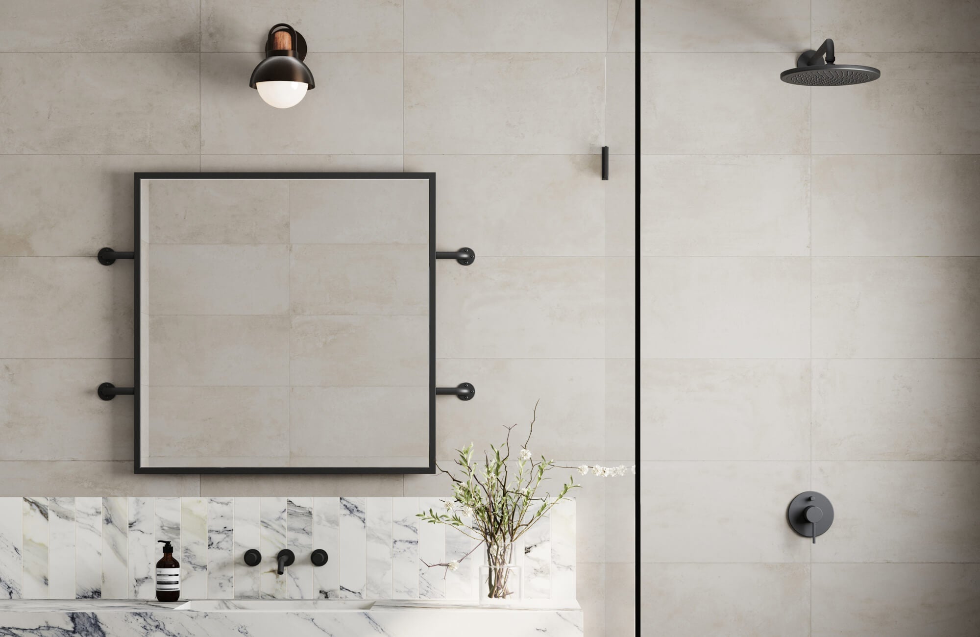
An elegant example is the Miley 4.5x9.1 Glossy Porcelain Tile in Frost, which brings a soft, cool-toned white with a refined glossy finish. Its elongated format adds a touch of modern sophistication while maintaining the calm, neutral character that complements nearly any style of kitchen.
Beiges and creams, on one hand, bring warmth and softness, creating a welcoming and comfortable ambiance without overpowering the space. Neutrals also work well when layered, combining different shades and textures within the same neutral family that adds depth and visual interest without needing more color. This helps maintain a clean, calm look, ensuring your kitchen remains stylish and serene for years to come.
Matching Backsplash Color With Kitchen Elements
Once you've explored color psychology, the next step is to ensure your backsplash complements your kitchen's permanent elements like cabinets, countertops, floors, and appliances.
Harmonizing with Cabinetry
The color of your kitchen cabinets often serves as the dominant visual element, making their hue a primary consideration when selecting a backsplash. For instance, kitchens boasting warm wood cabinets—like cherry, oak, or maple—pair well with backsplashes that share similar warm undertones. This could mean opting for cream, beige, or even subtle terracotta tiles to create a cohesive and inviting atmosphere.
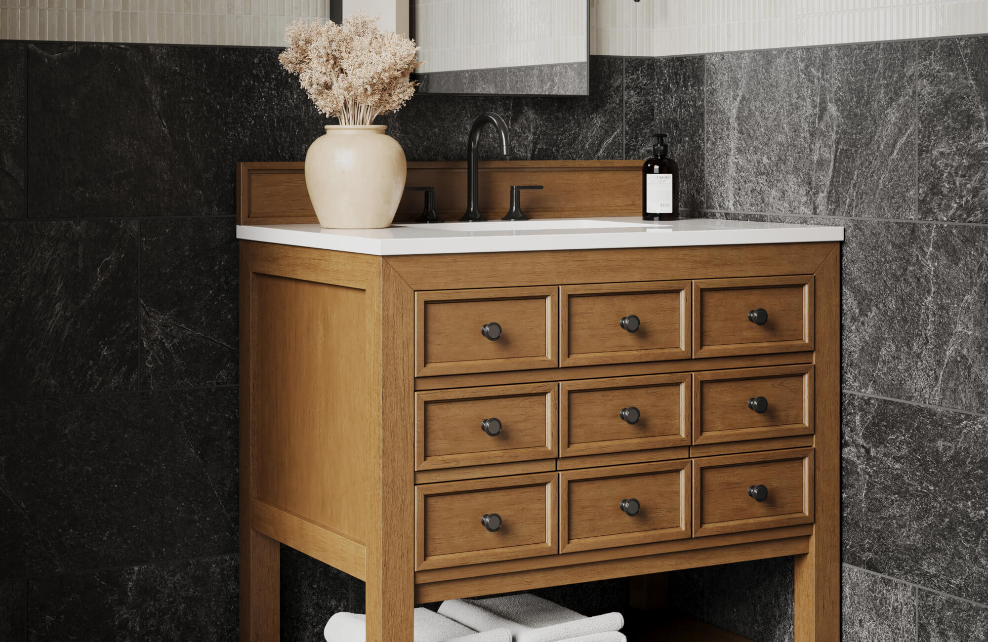
Conversely, if your kitchen features sleek, dark cabinets in shades of espresso or charcoal, a contrasting light backsplash in white, light gray, or soft neutrals can create a striking visual pop, preventing the space from feeling too heavy or enclosed. The Natasha 2x6 Glossy Porcelain Tile in Fog, shown in the photo above, is a perfect example; it offers a misty, cool-toned gray that effortlessly complements dark cabinetry while its glossy finish adds subtle dimension and light reflection, keeping the space airy and polished.
You can also use analogous colors, where backsplash and cabinet colors are adjacent on the color wheel (e.g., green cabinets with a blue-green backsplash), to achieve a seamless, flowing transition that feels inherently balanced. Beyond just color, the style of your cabinets also matters. A modern, minimalist kitchen with flat-panel cabinets suits a simple, solid-colored backsplash, while a more traditional space with intricate raised-panel doors works well with patterned or textured tile that echoes its classic charm.
Countertop Coordination
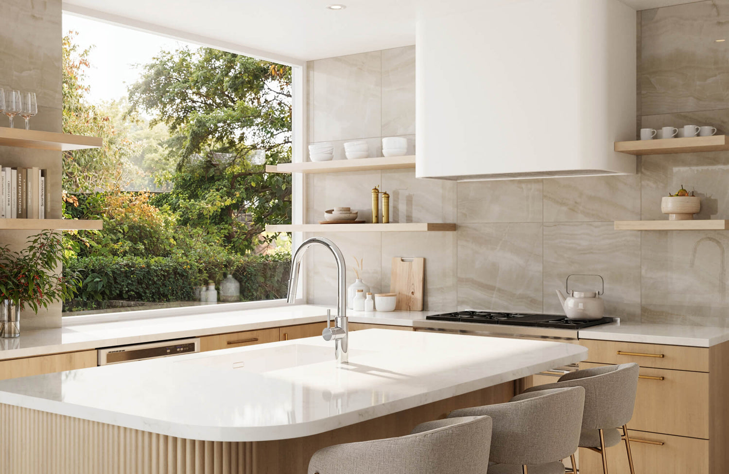
If your countertops feature a busy pattern, such as veined granite or marble with prominent movement, the best approach is often to select a subtle, solid-colored backsplash. This allows the countertop to remain the star of the show without visual competition, creating a sense of calm and sophistication. Our Maisie 4x4 Glossy Ceramic Tile in Canvas is a perfect fit in these scenarios with its soft, neutral tone and gentle gloss finish, providing just enough refinement to complement bold countertops while maintaining visual balance.
Conversely, if your countertops are a solid, uniform color—perhaps a sleek quartz or a classic laminate—you can add interest with color, texture, or pattern in your backsplash. For example, a white subway tile with contrasting grout or a textured ceramic tile in a complementary shade can add depth and personality to an otherwise understated countertop. Furthermore, always pay attention to the undertones of your existing countertop. If your gray countertop has blue undertones, a backsplash with a cool blue-gray hue will feel more harmonious than one with warm brown undertones. The golden rule here is to avoid competing patterns and colors; one element should take the lead, with the other playing a supportive role.
Floor and Appliance Pairing
While often overlooked, your backsplash should also complement your kitchen floor and appliances. Consider the warmth or coolness of your flooring; a dark, warm-toned wood floor works well with a backsplash that has similar warm notes, creating a grounded feel. Conversely, cool-toned tile flooring pairs better with cool-hued backsplash, establishing a consistent temperature throughout the space. Appliance finishes also present an interesting design challenge. Stainless steel, black, and white appliances each have their own visual weight and character. A well-chosen backsplash can tie these disparate finishes together. For instance, a light gray backsplash can beautifully complement stainless steel, while a white or black backsplash can extend the clean lines of white or black appliances. Think of your backsplash as the vertical connector between floor, cabinets, and countertops—it should help everything flow together visually throughout your kitchen.
How Light Affects Backsplash Color
Lighting, both natural and artificial, can significantly influence how a backsplash color looks in your kitchen. It's important to view color samples in your actual space and under your usual lighting before making a final decision.
Natural Light and Color Changes
Natural light can drastically affect how colors look throughout the day and across seasons. A kitchen with north-facing windows typically receives cooler, consistent light that may make colors appear more muted but true to tone. In contrast, a south-facing kitchen gets stronger, warmer light that can make colors appear brighter, intensify warm tones, or wash out lighter ones.
Morning and afternoon light can also bring out different undertones, while direct sunlight creates highlights and shadows that change the look of your backsplash. To make the best choice, test backsplash samples in your kitchen at different times of day. You can also use our augmented reality (AR) tool to visualize how your selected tiles will look in your actual space, helping you make a confident decision before installation.
Artificial Light and Color Temperature
Artificial lighting also affects how colors appear. Light bulbs have different color temperatures, measured in Kelvin, which influence how backsplash hues are perceived. Warm light, around 2700K to 3000K, enhances reds, oranges, and yellows, giving the kitchen a cozy feel. Cool light, between 4000K and 5000K, emphasizes blues and greens, making the space look crisp and clean.
Task lighting, especially under-cabinet lights, plays a key role in highlighting the backsplash. A well-placed strip of LED lighting can bring out the vibrancy and texture of your chosen tile, making it a true focal point. Layering different types of artificial lighting—ambient overhead lights for general illumination, task lighting for focused work, and accent lighting to showcase features allows you to control the mood and highlight your backsplash effectively at any time. Consider the overall lighting scheme when making your choice; a backsplash color that works well under warm light might clash under cool light, and vice versa.
Finish and Reflection
The finish of your backsplash affects how it interacts with light. Glossy finishes, such as glass or polished ceramic, reflect light and can help a kitchen feel more spacious and bright. Matte finishes absorb light, creating a softer, more understated look. They reduce glare and show the tile's true color without the distraction of reflections.
Textured tiles, like stacked stone or handcrafted ceramics, add visual depth by casting natural highlights and shadows. Highly reflective materials such as mirrored tiles or polished metals can amplify brightness and create a bold, modern effect. The finish you choose has just as much impact as the color itself in shaping the kitchen’s overall appearance.
Creative Backsplash Design Ideas
Beyond solid colors, your backsplash can become a canvas for design elements like pattern, texture, and mixed materials.
Patterns and Layouts
Tile patterns like herringbone, basketweave, and geometric designs can add visual interest without being overwhelming. A simple pattern, such as tone-on-tone or debossed texture, works well in minimalist kitchens by adding subtle detail. On the other hand, bold designs like Moroccan zellige or encaustic tiles in black and white can make the backsplash the standout feature in a more neutral kitchen.
You can also experiment with mixing tile shapes and sizes, like combining hexagons with squares, to create a custom layout. Classic options such as checkerboard or arabesque remain stylish, while modern choices like mosaics or large-format abstract tiles add a fresh look. These patterns help express your personal style and make your kitchen feel more custom.
Material and Texture Mixing
Backsplash color isn’t just about paint or glaze. It often comes from the texture and natural variation in the materials themselves. Natural stone like travertine or slate displays subtle color shifts in browns, grays, and creams, giving a rich, organic appearance. Likewise, wood backsplashes add warmth through visible grain patterns and knots that bring character to the space.
Metallic finishes such as copper, brushed stainless steel, and bronze reflect light in unique ways that affect how their color is perceived. Depending on the finish and lighting, they can add an industrial or warm touch. Grout color also plays a role in the overall effect. Dark grout with light tiles highlights the tile layout, while light grout with dark tiles creates a more seamless look.
Using a combination of these materials can enhance visual interest. For example, a strip of metal within a stone backsplash or mixing glass and ceramic tiles can add texture and depth. These thoughtful pairings create a design that feels layered and visually appealing without being too busy.
Accent Areas and Pops of Color
A backsplash can do more than protect your walls. It can serve as a design feature. Adding bold, colorful tiles above the stove or within a recessed space can highlight specific areas and break up a neutral palette. A mural-style backsplash with a pattern or scene adds personality and becomes a unique focal point.
You also don’t need to cover an entire wall to make a statement. A single section with vibrant tiles or an eye-catching design can stand out. If you enjoy DIY projects, tile paint, stencils, or decals offer easy ways to personalize your backsplash. These simple upgrades let you add creativity without a full renovation.
Adapting to Style Changes Over Time
Your backsplash color doesn’t need to be permanent. Choosing classic shades like white, gray, or stone tones gives you flexibility as styles change. These colors are easy to work around if you later update other parts of your kitchen.
If you prefer something more vibrant or trendy, consider options that are easy to refresh, like subway tile that can be painted or updated with peel-and-stick overlays. Just keep in mind that very bold or niche choices may not appeal to future buyers. Aim for a design that reflects your personality now but can evolve with your home over time.

Key Insights for Choosing Backsplash Color
Choosing the best backsplash color involves balancing design, practicality, and personal expression. You can use color psychology to guide the mood, coordinate with permanent fixtures like cabinets and countertops, and evaluate how lighting and finish affect color perception. Consider your kitchen’s overall style as well and think beyond solids by incorporating patterns or textures that reflect your personality.
Ultimately, your backsplash should do more than protect your walls—it should enhance your kitchen’s beauty and inspire you every day. Let it become a canvas that brings your kitchen to life, making it a true reflection of the heart of your home.


