


Choosing the best color for a backsplash isn’t simply about personal preference. It’s a strategic design decision that affects how a space looks, feels, and functions over time. The backsplash plays a crucial role in tying together cabinetry, countertops, appliances, and lighting, and it can either serve as a subtle backdrop or a bold focal point. Moreover, the right color choice should support easy maintenance, resist staining, and complement the architectural tone of the home.
In this article, we will explore five key aspects of choosing a backsplash color: how to achieve design cohesion, manipulate spatial perception, minimize maintenance, stay aligned with both trends and timeless palettes, and influence mood through color psychology. Understanding these principles will empower you to make a confident, well-informed decision that enhances both the beauty and practicality of your space.

Design Cohesion and Color Harmony
A backsplash acts as a visual connector, tying together the various materials and tones within a room. Choosing the right color helps the kitchen or bath feel cohesive, intentional, and well-designed. Achieving this balance depends on thoughtful color strategies and how those choices interact with surrounding surfaces.
Complementary vs. Analogous Color Strategies
Using the color wheel as a guide, complementary colors are those located opposite each other, such as blue-green and burnt orange or blue and warm gold. These combinations generate vibrant contrast and visual energy, making the backsplash a strong focal point. When working with complementary colors, designers often recommend a primary-secondary ratio to avoid visual imbalance. For example, allowing a bold backsplash to occupy 30% of the visual field while 70% remains neutral helps maintain control over the space.
Analogous color schemes, by contrast, utilize colors next to each other on the color wheel, like soft green, olive, and gold. This approach is more fluid and cohesive, ideal for creating a restful and elegant atmosphere. Analogous combinations are also particularly successful when layered with texture and tone variations to avoid monotony.
Using LRV for Balanced Illumination
Light Reflectance Value, or LRV, measures how much light a color reflects. It plays a pivotal role in making a space feel either open and bright or grounded and moody. High-LRV backsplash colors, such as creamy white or soft pearl gray, help reflect ambient and artificial light, which is especially important in small or windowless kitchens. They can reduce the need for additional lighting fixtures and visually expand the room.
In contrast, low-LRV tiles, like matte dark gray or dark green, absorb light and create a cozy, intimate environment. These are best used in spaces with abundant daylight or well-planned task lighting. Designers also often assess LRV values in combination with ceiling height, cabinetry finish, and lighting layout to determine the most effective backsplash tone.
Materials and Their Color Expression
Material selection influences how a given color is perceived. For example, glossy ceramic tiles intensify color saturation and highlight subtle surface textures. Matte porcelain, on the other hand, mutes colors slightly and offers a smoother, more modern appearance. Both materials are popular in contemporary interiors, but each offers a distinct visual outcome.
Natural stone tiles, such as marble or travertine, come with inherent veining and mineral variation. These organic details often determine or influence the surrounding color scheme. Calacatta marble with golden veining complements warm-toned cabinetry and brass hardware, while Carrara marble, with its cool gray veining, harmonizes with cooler color palettes and stainless steel finishes. Understanding how material and color interact ensures a seamless, elevated design.

Impact on Spatial Perception
Backsplash color plays a powerful role in how we perceive the size and depth of a space. The right choice can make a room feel more open and airy or more intimate and grounded, depending on the layout and lighting. With thoughtful selection, color becomes a subtle yet effective tool for influencing spatial perception and enhancing the way a space is experienced.
Expanding Small Spaces with Light Tones
Light-colored backsplashes visually open up compact areas by increasing brightness and reducing visual weight. Shades like ivory, pale gray, and sky blue reflect both natural and artificial light, which makes walls recede and ceilings feel higher. Glossy finishes such as polished ceramic or mirrored glass tiles amplify this effect further by scattering light and creating the illusion of depth.
In smaller kitchens, extending the backsplash to the ceiling or across entire walls creates a sense of visual continuity, helping the room feel larger and more open. Keeping the color palette consistent and steering clear of abrupt transitions or overly busy patterns further enhances this feeling of spaciousness and flow.
Creating Focal Points in Open Layouts
In large kitchens or open-concept homes, darker or bolder backsplash colors can define specific areas and add dimension. Rich hues like dark blue, dark gray, or rich green behind a range hood or island create a visual anchor. This effect can be enhanced by using textured or patterned tile, such as hand-glazed ceramic or metallic glass mosaics.
By carefully placing a striking backsplash color in a specific zone, you can guide the viewer’s eye and bring structure to open spaces. The goal is to create interest without overwhelming the overall design.
The Role of Grout Contrast
Grout color affects not only aesthetics but also spatial perception. High-contrast grout, like black lines between white tiles, emphasizes tile shape and layout, creating a strong graphic look. This technique is common in industrial or vintage kitchens where pattern and repetition are design features.
In contrast, a grout color that closely matches the tile, such as beige grout with sand-toned tiles, minimizes visibility and creates a seamless effect. This approach is popular in minimalist or Scandinavian-inspired spaces where subtlety and cohesion are prioritized. Grout can thus either highlight geometry or smooth out visual transitions, depending on the desired outcome.

Stain Resistance and Maintenance
While color and aesthetics are important, practicality plays an equally crucial role. A backsplash is a hardworking surface, constantly exposed to heat, moisture, and daily messes, so it needs to be easy to clean and built to last. The right combination of color and finish can make all the difference in keeping your space both beautiful and functional over time.
Camouflaging Daily Use
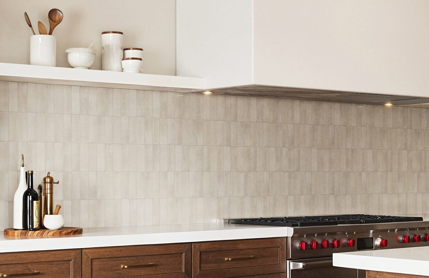
Some colors and finishes are more forgiving than others when it comes to hiding dirt, grease, and smudges. Light tiles, especially in white or cream, tend to highlight stains and require frequent wiping. Darker hues like matte black can also reveal fingerprints, dust, and soap residue.
Mid-tone colors, such as taupe, soft green, and muted blue, offer the most balanced performance. They conceal everyday messes without feeling too dark or too clinical. One excellent example is Edward Martin’s Natasha 2x6 Matte Porcelain Tile in Denim (displayed in the photo above), which blends the ease of maintenance with a soft, desaturated blue that introduces character without overwhelming the space. Its matte finish further aids in diffusing minor smudges and stains, making it an ideal choice for kitchens that see frequent use.
Tiles with tonal variation, like hand-crafted zellige or variegated porcelain, are particularly effective at masking minor imperfections, making them a practical and stylish choice.
Pairing Grout and Tile for Easy Cleaning
Grout lines are often the first area to show wear. White grout, while visually crisp, is prone to staining unless it’s sealed properly. For lower maintenance, many professionals recommend using a grout one or two shades darker than the tile. This approach reduces visible discoloration and keeps the installation looking fresh longer.
Epoxy grout is another excellent option for high-use kitchens. Unlike traditional cement grout, epoxy is non-porous, stain-resistant, and easier to clean. Though it comes at a higher price point, its durability and low maintenance make it a smart investment, especially in spaces that demand daily use.
Surface Finishes and Cleanability
The ease of cleaning a backsplash also depends on the tile’s surface texture. Glossy and glazed tiles are smooth, non-porous, and wipe down easily, making them ideal for high-splash areas like behind the stove or sink. They also resist staining and soap scum buildup, especially when paired with sealed grout.
Textured finishes, such as tumbled stone, 3D ceramic relief, or unglazed clay, may offer visual depth but can trap grime and moisture. These options should be used thoughtfully, either as decorative elements or in areas less prone to splashes. Regular sealing and gentle cleaning solutions are essential to preserve their look. For best results, always follow the manufacturer’s care and maintenance guidelines to ensure long-term durability and performance.

Trending and Timeless Color Palettes
Choosing a backsplash color that feels both fresh and timeless is essential for creating a space that stays stylish as trends evolve. Blending classic favorites with thoughtful updates allows for a design that’s both versatile and enduring, offering long-term appeal without sacrificing personality.
Classic Neutrals for Longevity
Neutrals like white, beige, and gray continue to dominate kitchen and bath designs due to their adaptability. They serve as a safe and elegant backdrop that allows for flexibility in other areas, such as hardware, wall paint, or textiles. White subway tile, in particular, remains a go-to for its clean lines and universal appeal.
Among these neutrals, gray has undergone a noticeable transformation, shifting from stark, industrial tones to warmer, more inviting variations like greige and dove gray. These softer shades blend effortlessly with both warm and cool finishes, offering a refined versatility that makes them a smart long-term choice as design trends continue to evolve.
The Enduring Appeal of Blue
Blue has carved out a permanent place in backsplash design because of its emotional range and visual versatility. Light blues, such as sky or powder, bring a calming, coastal atmosphere to the kitchen. These shades pair beautifully with natural wood or white cabinetry and are especially effective in homes near the water.
For a bolder yet equally enduring effect, medium and deeper shades like royal blue, metallic blue, and midnight blue bring a sense of richness and sophistication. These tones work effortlessly with finishes such as brushed nickel, polished chrome, and brass, offering depth without overwhelming the space. When used in patterns like herringbone or chevron, glossy navy tiles also add subtle drama and movement while maintaining a classic foundation.
For those seeking a vibrant yet timeless blue, the Mikayla 2.5x5 Glossy Ceramic Tile in Cerulean, as shown in the picture above, offers a striking option. Its rich blue surface adds depth and energy to a backsplash while retaining a refined elegance. The glossy finish enhances light reflection, making it ideal for both compact and open spaces where brightness and clarity are desired.
Blue’s timelessness makes it one of the few trend colors that also functions as a neutral in many designs.
Warm Earth Tones and Green Trends
Warm earth tones are making a comeback, inspired by the desire to bring natural, organic elements into interior spaces. Terracotta, burnt orange, golden yellow, and brick red create a sense of warmth and grounding. These tones are particularly effective in homes that embrace natural textures and handcrafted materials.
Green has also emerged as a dominant trend, offering a spectrum from soft sage to dark forest. Green is associated with balance, renewal, and calm, which makes it an ideal choice for both modern and rustic kitchens. When used in tiles with subtle texture or glazing, green also adds visual depth without overwhelming the space.
Balancing Bold Colors with Texture
When using bold backsplash colors, it’s important to introduce texture to soften their intensity. Vibrant tiles like emerald, plum, or mustard can feel overpowering if flat and uniform. However, using a handcrafted tile with surface irregularities, such as Moroccan zellige or faceted ceramics, allows light to interact with the surface in varied ways, reducing harshness.
Textural variation also makes bold colors more accessible in open-plan homes, where visual transitions must be smooth. Combining bold color with thoughtful texture provides a confident but grounded design statement.
To support confident decision-making and eliminate the guesswork of imagining how a tile will look in your own space, Edward Martin offers an intuitive augmented reality (AR) tool. This digital feature lets you virtually place tile options directly into your kitchen or bathroom using your smartphone or tablet, providing a real-time preview of color, pattern, and finish in context. Whether comparing neutrals or testing bold accents, the AR tool empowers you to visualize your final design with precision and peace of mind.

Psychological Influence and Mood Setting
Color is more than a visual choice; it influences mood, energy, and perception. In kitchens and bathrooms, where people spend significant time, selecting the right color can enhance not only the design but also how the space feels.
Creating Comfort with Warm Shades
Warm hues such as light orange, light brown, and beige evoke comfort, familiarity, and hospitality. These colors are ideal for homes where the kitchen serves as the central gathering space. Combined with soft lighting and natural materials like wood or stone, they create an environment that feels lived-in and welcoming. These tones also work well in traditional or Mediterranean-inspired kitchens, where warmth and craftsmanship are central to the design narrative.
Promoting Cleanliness and Calm with Cool Colors
Cool tones like pale green, light aqua, and soft gray convey a sense of cleanliness and calm. These are ideal for homeowners who want a light, uncluttered aesthetic. Cool colors also support focus and clarity, making them well-suited for task-heavy environments like food prep zones or laundry rooms. Their reflective quality can enhance natural light, further contributing to a fresh and open feeling.
Emotional Drama Through Monochrome
Monochromatic palettes can create either tranquility or intensity, depending on the shade. All-white backsplashes communicate purity and openness, especially when paired with clean lines and minimal detailing. Adding subtle texture, like beveled tile or marble veining, also prevents a sterile appearance.
On the opposite end, all-black or charcoal backsplashes suggest sophistication and drama. These are often used in modern kitchens where contrast is a defining feature. A standout example, as displayed in the picture above, is the Jaden 2.5x16 Glossy Ceramic Tile in Ink. This tile combines a deep, saturated black with a glossy finish that reflects light and enhances dimensionality. Its elongated form factor and polished surface also make it ideal for creating striking backsplashes that feel both bold and refined.
With the right lighting and finish, a monochrome backsplash can elevate the space without visual clutter.
Why Backsplash Color Matters More Than You Think
Choosing the best color for a backsplash involves balancing visual appeal, spatial dynamics, functionality, and emotional tone. A thoughtful approach considers not just what looks good today but what will continue to serve the space over time. Whether you opt for soft neutrals, deep blues, warm earth tones, or expressive textures, the right backsplash color can transform your kitchen or bathroom into a space that is not only beautiful but also enduringly practical and personal.
To make these important decisions easier and more confident, Edward Martin offers high-quality 4" x 4" samples across a wide range of finishes and tones. These generous sample sizes allow you to experience the true color, texture, and sheen of each tile in your own lighting and space, ensuring that your final selection aligns perfectly with your vision. Having a physical sample in hand removes the guesswork and brings clarity to a process that blends aesthetics with functionality.