


The perfect rug does more than soften a space—it anchors your interior with color, character, and intention. When thoughtfully chosen, rug colors that complement tile flooring, whether porcelain, ceramic, stone, or wood, elevate both comfort and style, creating a seamless blend of texture and tone beneath your feet. From the cool elegance of marble look porcelain to the earthy richness of terracotta or wood-grain finishes, every tile tells a story that the right rug can enhance.
Whether your home leans minimalist, coastal, or industrial, choosing the best rug color for your floors ensures a cohesive design that feels effortless and refined. In this article, you’ll find a curated path to selecting a rug that not only suits your aesthetic but harmonizes with your hard surface flooring.

Coordinating with Flooring Undertones and Finishes
Creating a seamless visual relationship between the rug and hard flooring begins with acknowledging the foundational role of undertones and surface finish. These characteristics influence the overall color direction of the rug, ensuring it complements or intentionally contrasts with the floor in a way that feels cohesive and deliberate.
Matching and Contrasting Color Temperature
To establish visual balance in a room, identifying the color temperature of your flooring is essential, as it guides your rug color selection toward either harmony or contrast. Cool-toned floors, such as soft gray, frost white, or silver, pair beautifully with rug shades like charcoal, indigo, or slate, reinforcing a clean and contemporary aesthetic. If your floor leans warm, featuring tones like terracotta, sand, honey, or natural wood, rug colors such as rust, ochre, or mocha naturally align, enhancing a sense of grounded warmth.
That said, contrast can also be highly effective when used with intention. Pairing a steel-blue rug with warm ivory tile or a clay-toned rug with pale wood introduces visual tension that adds depth and interest. When echoed in accent furnishings or décor, this color play becomes a subtle focal point. Whether your design leans toward tonal unity or bold contrast, maintaining a thoughtful temperature relationship prevents dissonance and ensures harmony.
Complementary Color Pairing with Veined and Patterned Flooring
Flooring that features dynamic visuals, such as marble look tile, terrazzo, natural stone, or wood with pronounced grain, often acts as a strong design element within the room. In these cases, selecting a rug that complements rather than competes helps maintain equilibrium. A helpful approach is to draw rug colors from existing veining or tonal details in the floor, such as picking up the warm gold accents in Calacatta marble or the smoky gray streaks in Pietra-style stone.
This subtle alignment reinforces a sense of visual continuity while allowing the floor to remain the primary feature. In spaces with ornate, speckled, or multicolor flooring, neutral rugs with minimal pattern and soft texture will help ground the room. Choosing a rug that reflects colors already present in the floor material turns it into a cohesive extension of the room’s overall palette and rhythm.
Surface Finish and Reflectivity Considerations
The sheen of your flooring, whether tile, stone, or finished wood, plays a significant role in how rug colors are perceived, making surface finish an important consideration. Glossy floors, with their reflective qualities, amplify both natural and artificial light, making rug colors like navy, emerald, or plum appear even more vibrant and saturated. On the other hand, matte or honed surfaces diffuse light gently, creating a softer backdrop that supports more subdued rug tones such as taupe, linen, or dove gray.
Coordinating the finish of your rug with the floor’s reflectivity is also key to achieving a unified look. For instance, high-sheen rugs may feel disjointed against matte flooring, while matte-fiber rugs tend to blend more naturally with less reflective finishes. When texture and sheen work together, the rug appears integrated rather than placed. This nuanced interplay between light, surface, and material significantly influences the atmosphere of the room and helps set the overall tone.

How Light Affects Rug Color
Light is a dynamic element that shapes how colors behave within a space, and its interaction with both rug fibers and hard flooring surfaces, such as porcelain, ceramic, stone, or wood, can significantly influence visual perception. Factoring in lighting conditions helps ensure that the rug maintains its intended tone, depth, and character throughout the day across various interior settings.
Natural Light Interaction with Different Flooring
In rooms with generous sunlight, the reflective properties of hard surfaces, particularly glossy porcelain, polished ceramic, or smooth stone flooring, can intensify or distort rug colors placed over them. Light-colored rugs such as cream, powder blue, or pale sage may appear washed out under direct sunlight when paired with pale flooring materials. Conversely, deeper hues like forest green, navy, or burgundy tend to retain their saturation and provide grounding contrast, helping anchor the space visually.
Wood flooring, especially when sealed with a satin or glossy finish, reflects natural light differently, producing warmer, diffused highlights that can soften the appearance of rug colors. Neutral rugs on honey, oak, or walnut wood floors often feel cozy and cohesive, particularly during golden hour. Because daylight shifts in tone and direction throughout the day, testing rug samples under multiple lighting conditions helps avoid unexpected changes in hue or intensity. A rug that visually adapts to changing natural light creates a more consistent and welcoming atmosphere.
Artificial Lighting Temperature and Its Effects
Artificial light, whether warm, neutral, or cool, further influences how rug colors interact with their surroundings, especially when paired with reflective or matte flooring materials. Under warm incandescent or LED lighting, earthy tones like sienna, camel, and rust appear richer and more enveloping, working particularly well with ivory, sand, or light wood flooring. These combinations enhance comfort and visual warmth in living and sleeping areas.
In contrast, cool-toned artificial lighting emphasizes cleaner, sharper tones such as navy, charcoal, or steel gray. On polished surfaces like ceramic tile, honed stone, or sealed wood, this can result in a sleek, modern aesthetic but may also flatten subtle rug variations. Flooring sheen plays a role as well—glossier finishes amplify light reflections, while matte textures diffuse it more evenly. Aligning your lighting temperature with both your rug palette and flooring material ensures a balanced and cohesive environment, especially during evening hours when artificial light takes over.
Shadow and Contrast Dynamics
As natural and artificial light moves throughout a space, it creates shadows that influence how rug colors are perceived, particularly when cast across textured, patterned, or high-contrast flooring. For instance, a solid-colored rug on dark stone or wood may appear uneven or patchy when certain areas fall into shadow, especially if the flooring has reflective qualities.
Rugs with tonal variation, such as variegated fibers, heathered weaves, or gradient patterns, help camouflage these inconsistencies by softening visual contrast. In contrast, high-pile or tufted rugs introduce their own shadow effects, contributing dimension but also requiring thoughtful placement to avoid uneven lighting zones. These subtleties become even more pronounced in open-concept layouts, where multiple light sources and surface types interact at once. By anticipating how light and shadow behave across your floor and rug, you can choose colors and textures that remain visually consistent throughout the day.

Choosing Colors by Room Function
Different rooms place unique demands on your rug in terms of both function and visual harmony, and the interaction between rug color and hard flooring, whether tile, stone, or wood, must support those needs without compromising design cohesion. Selecting rug colors that meet practical requirements while enhancing the overall palette ensures your rug performs beautifully and feels intentional within the space.
Kitchen and Dining Areas
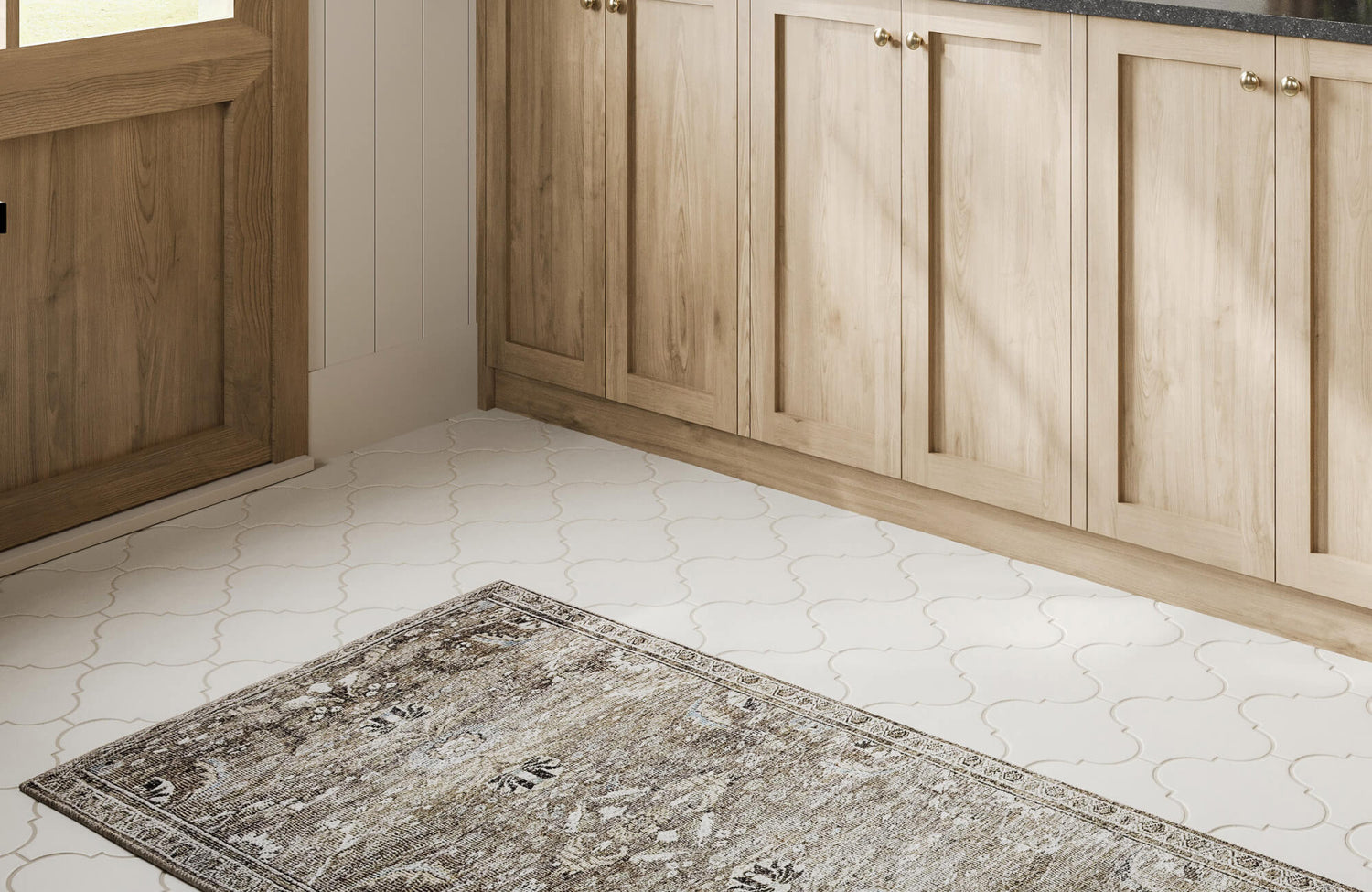
In spaces where daily activity and the potential for spills are common, rug color plays a practical role while still needing to coordinate with the floor beneath. Darker hues such as espresso, charcoal, or olive are especially effective in kitchens, as they conceal stains and food debris, particularly when placed over textured or stone-look tile or natural wood flooring. Performance materials like polypropylene or stain-resistant wool offer additional durability and retain their appearance after frequent cleaning. Mid-tone rugs that echo the undertones of the flooring, such as taupe with beige tile or graphite with gray stone, strike a balance between visual unity and resilience. Patterned rugs can also help mask everyday messes while adding depth and interest.
Edward Martin’s Hutchinson Polyester Face Rug in Graphite / Olive, as shown in the photo above in a warm, wood-accented kitchen, exemplifies this approach beautifully. Its muted tones and distressed pattern offer visual depth while blending effortlessly with the surrounding porcelain arabesque tile, natural wood cabinetry, and dark countertops. The low-pile construction and polyester face also ensure easy maintenance, making it highly suitable for culinary zones that experience regular use. This combination of performance and aesthetics makes the Hutchinson rug a smart, stylish choice for functional kitchen spaces.
Busy Entryways and Mudrooms
Entry points are transitional zones where form often follows function, but rug color still plays a vital role in anchoring the space visually. In these areas, which frequently feature durable, moisture-resistant flooring such as tile, ceramic, or sealed wood, rugs in dark earth tones or multi-tonal neutrals are effective in concealing dirt and wear. Speckled or patterned designs further camouflage debris brought in from outdoors, extending the life and appearance of the rug.
Colors like slate gray, iron oxide, or weathered brown not only ground the space visually but also offer long-term durability in active environments. As such, low-pile, tightly woven rugs paired with fade-resistant dyes perform best where foot movement is heavy and conditions may be wet or dusty. Choosing the right combination of color and material keeps the space both clean and cohesive from the moment someone steps inside.
Living and Sleeping Areas
In comfort-centered rooms like living areas and bedrooms, rug color takes on the task of mood-setting and spatial softening, especially when laid over flooring materials such as cool-toned tile, concrete, or hardwood. Light-colored rugs in shades like ivory, ash, or muted sage provide contrast and warmth, softening the appearance of hard surfaces and balancing visual weight. These tones are ideal for establishing calm zones and anchoring furniture groupings in open layouts.
Warm neutrals or desaturated colors, when layered over wood look tile, limestone-effect surfaces, or natural oak floors, enhance the cozy, restorative ambiance that these spaces call for. Materials such as wool, viscose, or plush cotton enrich the sensory experience with texture while maintaining visual harmony. A thoughtfully chosen rug in these settings not only adds comfort but also strengthens the connection between floor and furnishings, creating a space that feels both complete and grounded.

Matching Style and Aesthetic Themes
Interior design style serves as a visual roadmap when choosing rug colors, particularly when tile, stone, or wood flooring is a defining element of the space. Aligning the rug’s tone, texture, and material with the overall aesthetic helps maintain cohesion while enhancing the architectural integrity of the room.
Minimalist and Scandinavian Interiors
Minimalist and Scandinavian spaces rely on clean lines, restrained palettes, and abundant natural light, often incorporating light-toned tile or wood floors that mimic pale stone or bleached timber. In these settings, rugs in soft, muted hues such as ivory, pale gray, or greige blend seamlessly into the design, providing warmth without interrupting the visual stillness. Texture becomes more important than color contrast—flatweaves or looped wool rugs add dimension while preserving simplicity. In contrast, high-contrast or heavily patterned rugs can feel disruptive, detracting from the calm atmosphere these styles aim to achieve. Instead, opt for subtle tonal variations that echo the organic quality of the floor beneath.
As displayed in the picture above, the Liddy Polyester Pile Rug in Cream / Dove exemplifies these principles with quiet elegance. Its delicate geometric texture layers gently over the neutral palette, enhancing the space’s quiet rhythm while complementing the pale, wood look flooring. The low-profile polyester pile also adds refinement and comfort without disrupting the architectural clarity, making it a natural fit for both minimalist and Scandinavian interiors.
Modern Industrial Spaces
Industrial design celebrates raw materials and exposed structure, often incorporating concrete look tile, dark stone, or weathered wood flooring as foundational elements. Rug colors in tones such as iron gray, oxidized copper, or deep rust reinforce this aesthetic, adding tactile contrast and visual warmth. Similarly, coarse textures like jute, sisal, or flatwoven wool complement industrial finishes while softening the hard edges of the space. Introducing a rug in a desaturated warm tone, like clay, tobacco, or charcoal, can also temper the starkness and introduce a sense of lived-in comfort. Layering rugs or selecting distressed finishes further enhances this balance between utilitarian grit and intentional design. The result is a rich interplay of texture and tone that grounds the room in understated sophistication.
Coastal and Mediterranean Design Themes
Coastal and Mediterranean interiors typically feature flooring that resembles driftwood, tumbled stone, or hand-glazed terracotta, setting the tone for breezy, sun-kissed spaces. Rugs in shades like seafoam, sandy beige, soft coral, or pale turquoise echo the natural surroundings and reinforce the relaxed elegance of these styles. Natural textures, such as braided jute, cotton flatweaves, or low-pile wool, further align with the casual, earthy vibe. In addition, subtle coastal motifs, faded geometrics, or washed-out stripes add character without overwhelming the room’s openness. When layered over warm, sun-washed floors, these rugs contribute to an airy palette that reflects light and captures the feel of oceanfront living. The goal is to create a space that feels grounded in nature while maintaining a sense of ease and simplicity.

Ensuring Durability and Longevity
Durability is just as important as design when choosing a rug color for hard flooring surfaces, especially in areas exposed to daily wear, sunlight, or fluctuating environmental conditions. Selecting colors and materials that withstand regular use ensures your investment maintains both visual appeal and long-term functionality.
Colorfast Materials and Fade Resistance
Rugs placed in sunlit spaces or busy areas must be able to retain their color despite ongoing exposure to UV light and frequent cleaning. Materials such as solution-dyed nylon, olefin, or polyester are specifically engineered for colorfastness, with pigments embedded at the fiber level to resist fading over time. These types of rugs also maintain their vibrancy even when laid over reflective tile or polished stone flooring, which can intensify light exposure. While natural fibers like wool or cotton offer aesthetic richness, they may require UV protection or strategic placement away from direct sunlight to avoid discoloration. Choosing a rug designed to handle varying light conditions helps preserve both the rug and the surrounding floor’s appearance. This level of foresight supports design consistency and extends the life of your interior palette.
Soil Concealment and Wear Patterns
In busy areas, rug color selection should balance beauty with practicality by helping conceal everyday dirt, dust, and signs of wear. For instance, mid-tone rugs crafted from mottled or multicolored yarns perform especially well, naturally disguising imperfections that solid light or dark rugs may accentuate. Similarly, abstract patterns, marled textures, or tonal gradients provide additional camouflage while allowing the flooring beneath, whether tile, wood, or stone, to act as a sophisticated visual base. Lighter rugs may brighten the space but can require more frequent upkeep, while very dark rugs may highlight lint or pet hair. A balanced choice, such as a taupe rug over ivory tile or a heathered gray rug on darker flooring, combines function with polish.
Our Micah Wool Blend Rug in Natural / Graphite, as featured in the image above, illustrates this principle. Its heathered texture and ivory-lined pattern offer graphic interest while subtly concealing daily debris and wear. The wool blend construction ensures long-lasting durability, while the dark graphite base adds visual weight and soil resistance, making it a standout choice for active living spaces that demand both performance and elegance.
Compatibility with Rug Pads and Tile Finishes
To protect both rug and flooring, it’s essential to pair your rug with the correct underlayment, especially when working with surfaces like tile, stone, or sealed wood that vary in texture and sheen. Natural rubber rug pads provide excellent slip resistance and cushioning without leaving residue, making them ideal for use over smooth or glossy floors. In contrast, PVC-based pads should be avoided, as they can cause staining or adhesive breakdown over time, particularly under rugs with dark or dyed backings. For light-colored floors, ensure the rug’s dye is colorfast and won’t transfer under heat or humidity. Matching the rug’s texture and pad to the floor finish not only enhances safety and comfort but also protects the visual integrity of both elements. These thoughtful adjustments contribute to a longer-lasting, more cohesive flooring system.
Choosing the Ideal Rug Color to Complement Porcelain Tile Flooring
A well-chosen rug becomes more than an accessory—it serves as a visual bridge between soft textiles and the natural character of your flooring, whether it's tile, stone, or wood. When color, tone, and texture are thoughtfully aligned, the entire space gains harmony, depth, and a sense of quiet sophistication. From sunlit kitchens to serene bedrooms, each rug contributes meaningfully to the story your interior tells. With the right color choice, your rug enhances not only the surface beneath it but also the atmosphere that surrounds it.
For tailored guidance, Edward Martin’s design services are available to help you select rugs that beautifully coordinate with your porcelain tile. Connect with our team through the Contact Us page to begin creating a space that feels as intentional as it looks!