


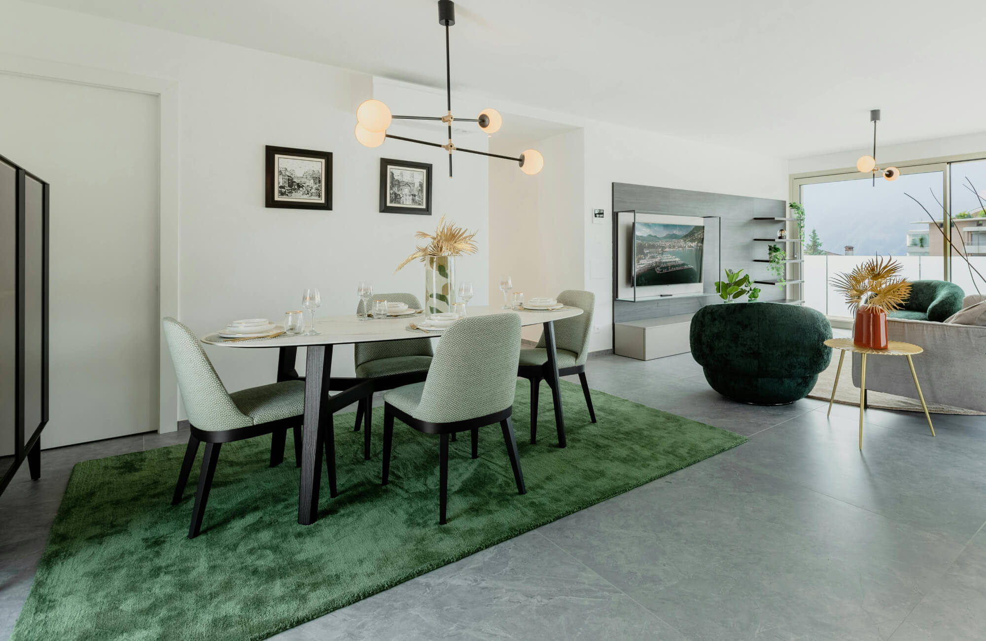
When designing a kitchen, every choice, from countertops to cabinet pulls, affects both aesthetics and maintenance. But few surfaces take as much daily abuse as your backsplash. Between simmering sauces, coffee splatters, and oil mist, the backsplash silently bears the brunt of kitchen life.
If you’ve ever tired of scrubbing tomato stains off glossy white tile or noticed every single fingerprint on a black backsplash, you’ve likely wondered: what color ceramic tile is best for hiding food splashes? The short answer: mid-tones with natural variation and the right finish are your best friends. The long answer, explored below, shows why color, pattern, texture, and even grout all influence how forgiving (or not) your backsplash will be.

Mid-Tones and Earth Tones
When it comes to choosing a backsplash color that hides everyday mess, mid-tones and earth tones strike the perfect balance between beauty and practicality. These shades blend warmth and depth, naturally concealing splashes while complementing nearly any kitchen style.
Warm Beiges, Taupes, and Greiges
If you want timeless appeal and low maintenance, few choices rival warm neutrals. Beiges, taupes, and greiges (a mix of gray and beige) provide a neutral backdrop that harmonizes beautifully with both warm and cool palettes.
As shown in the image above, Edward Martin’s Cleo 2x6 Glossy Ceramic Tile in Bone brings this balance to life, echoing natural kitchen tones like wood, stone, and metal. Tomato sauce on beige tile blends better than you’d expect, and water spots or flour dust don’t stand out as harshly as they do on stark white.
These hues lend a soft, cozy feeling to kitchens without overpowering other design elements. Pairing beige subway tile with brushed brass fixtures or white cabinetry creates an upscale, welcoming look. For even better camouflage, choose slightly varied beige or taupe tones within the same family, tiles with subtle marbling or shading add depth that hides stains remarkably well.
Muted Greens and Soft Grays
For homeowners who want a touch of color while keeping maintenance manageable, muted greens and soft grays offer a perfect balance.
Muted greens, think sage, olive, or eucalyptus, have an organic calmness that feels both modern and timeless. They’re excellent at masking water spots and oil because their undertones mimic natural materials like herbs and stone.
Soft grays provide a contemporary yet forgiving canvas. Unlike bright whites, gray tiles don’t showcase every splash of red sauce or dark smudge. Light- to mid-gray tones with warm undertones, such as “greige” or mushroom, are especially easy to maintain.
Pair muted greens with butcher block counters for an earthy look, or combine gray tiles with quartz for sleek modern appeal. Either way, these shades subtly conceal imperfections while adding sophistication.
Earthy Terracottas and Muted Browns
Terracotta and muted brown tiles are gaining popularity again, especially in kitchens that embrace warmth and a handcrafted aesthetic. Their natural pigment variation not only hides splashes but also adds beautiful visual depth and character.
Terracotta tones mimic natural clay and soil, which are inherently forgiving. They conceal dried sauce, grease, and even dust better than almost any other hue, making them both practical and timeless. These shades are stunning in Mediterranean, rustic, or eclectic kitchens, pairing beautifully with copper accents and wooden cabinetry for an inviting, grounded look.
For easier upkeep, opt for sealed ceramic or porcelain versions of terracotta. Real clay tiles can be more porous unless properly sealed, so a modern alternative ensures durability without losing that earthy charm.

Why Solid White and Solid Black Are High-Maintenance
While mid-tones make life easier, the same can’t be said for the extremes. Solid white and solid black tiles may look timeless in photos, but in a real, working kitchen, they reveal every smudge and splash, demanding far more upkeep than most homeowners expect.
The Solid White Dilemma
White tiles look pristine, until they don’t. Every bit of residue, from spaghetti sauce to coffee, stands out immediately, and even water droplets dry into visible mineral marks. You’ll find yourself wiping your backsplash multiple times a week to keep it looking fresh, and over time, even gentle cleaning can dull glossy finishes or stain grout lines.
While white tile brightens small kitchens beautifully, it can quickly lose its sparkle if not meticulously maintained. If you adore white, consider an off-white or a white tile with subtle veining, like marble-look porcelain. These small shifts soften contrast and make splashes far less glaring.
The Unexpected Solid Black Challenge
Many homeowners assume black tile will hide dirt, but it often does the opposite. Dark surfaces reveal lighter debris such as flour, salt, or soap scum, and grease spots or fingerprints catch the light, making them surprisingly visible.
Under kitchen task lighting, glossy black tiles tend to amplify streaks, so even a freshly cleaned backsplash can look smudged. For a more forgiving dark option, try charcoal, slate gray, or espresso brown. These shades still offer depth and sophistication while disguising splashes far better than jet black.
How to Make These Colors Work If You Must
If you’re set on black or white, strategy matters. A white tile with light gray veining or a black tile with a matte or brushed finish helps break up the visual uniformity that tends to highlight stains. In the image above, Edward Martin’s Julianna 4x12 Glossy Ceramic Tile in Carrara demonstrates how subtle veining softens contrast while maintaining a classic, elegant feel.
Smaller tile formats or mosaics can also make a difference, the added grout lines and variation reduce the impact of individual splashes. Lighting also makes a big difference. Diffused, indirect light minimizes glare and reflections that often accentuate residue on glossy surfaces. With these thoughtful design tweaks, you can enjoy the beauty of extreme light or dark tiles without the constant upkeep.

How Pattern and Variation Outperform Solid Color
If you love the clean look of solid tile but not the constant cleaning it requires, there’s a smart middle ground. Introducing pattern and tonal variation can disguise stains and splashes effortlessly, adding texture and movement that keep your backsplash looking fresh.
The Unbeatable Power of Variegation
Variegated tiles, with natural color shifts, speckles, or marbling, break up the visual field and beautifully camouflage dirt and splashes. Our eyes are drawn to contrast, so on a solid tile, even a single drop of sauce becomes a focal point. On a variegated surface, like Edward Martin’s Olivia 4x16 Glossy Ceramic Tile in Dove shown in the image above, those same imperfections blend seamlessly into the pattern.
Stone-look porcelain, hand-glazed ceramics, and wood-look tiles are all great examples of organic variation. Each creates a lively, low-maintenance surface that feels both practical and artful. If you love handmade charm, artisan-glazed ceramic tiles are a perfect choice, their subtle tone fluctuations and imperfect finishes turn splatters into part of the visual texture rather than a cleaning emergency.
Using Multi-Toned Mosaics
Mosaic tiles combine multiple shades or finishes within one surface, offering some of the best camouflage you can get. They scatter light, reduce visible smudging, and make color variations feel intentional. Even after cooking mishaps, the surface looks dynamic rather than dirty, giving your backsplash a lively, dimensional quality.
Mosaics also offer incredible design flexibility. They come in countless materials, ceramic, glass, or mixed media, with color combinations that range from soft neutrals to bold contrasts. For easy maintenance, choose smooth-faced mosaics that wipe clean effortlessly, and avoid deeply textured pieces near the stove where grease can collect.
Choosing a Subtle Decorative Pattern
If you prefer a more traditional tile format, consider incorporating a subtle geometric or decorative pattern. Tone-on-tone designs, like white-on-cream arabesques or soft gray herringbone, create gentle movement without overwhelming the space, adding quiet sophistication to your kitchen.
These understated patterns keep your backsplash elegant while naturally disguising minor stains between cleanings. They also help anchor your kitchen’s overall style, adding depth and personality to a space that’s both functional and beautifully designed.

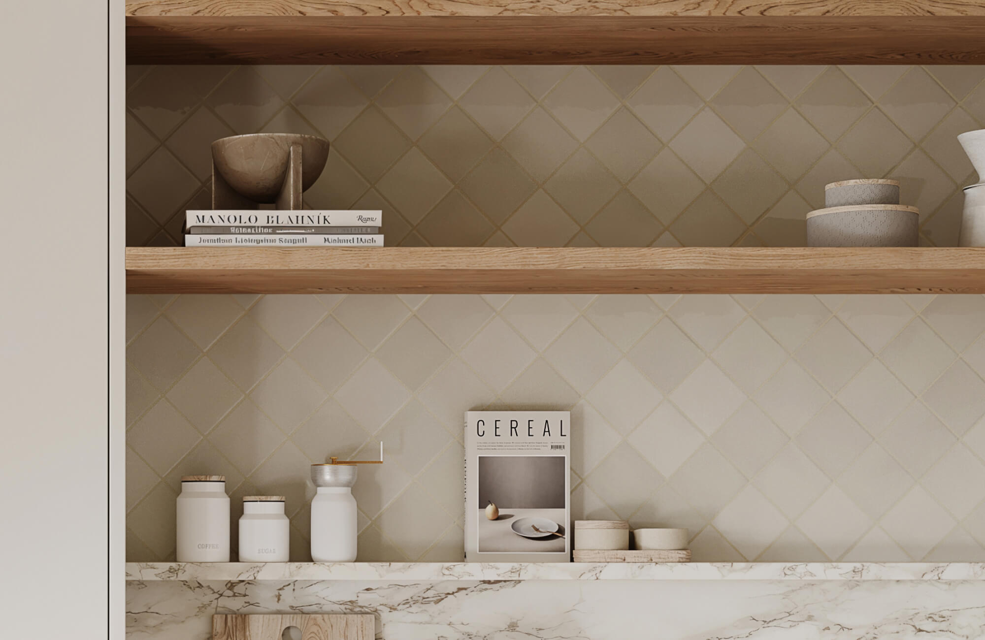
The Critical Role of Tile Finish and Texture
Of course, color and pattern aren’t the only factors that affect how forgiving your backsplash will be. The tile’s finish and texture can completely change how light interacts with the surface, and how visible those pesky food splashes become.
Matte vs. Glossy Finishes
Each finish comes with its own strengths. Glossy tiles reflect light beautifully, enhancing brightness and creating a sense of cleanliness, but they can highlight every splash and fingerprint, especially in darker colors.
Matte tiles, like Edward Martin’s Marsden 3x10 Matte Ceramic Tile in Clay featured in the image above, scatter light to reduce glare and make smudges far less noticeable. For busy kitchens, matte or low-sheen tiles generally win for practicality. Their subtle texture hides day-to-day messes while maintaining a refined, modern look.
A Satin Finish
If you want light reflection without the high maintenance of gloss, consider satin-finish tiles.
Satin tiles feature a soft luster that brightens the room without amplifying splashes. They’re easier to wipe down than matte tiles and far more forgiving than glossy finishes.
This balanced sheen pairs well with most color families, from warm neutrals to soft greens, making it a go-to for designers aiming for both beauty and durability.
A Warning on Highly Textured or 3D Tiles
While sculptural or 3D tiles look stunning in design magazines, they can be a real challenge to maintain near cooking zones. Grease and sauce tend to collect in crevices, leading to tedious scrubbing and extra upkeep.
To strike a balance between beauty and practicality, consider using these tiles as accents, perhaps behind a coffee bar, open shelving, or another low-splash area, rather than as your main backsplash. For everyday functionality, choose low-relief textures that still offer visual dimension but remain easy to clean.

Why Your Grout Color Is the Real Maintenance Culprit
Even with the perfect tile choice, there’s one detail that often undermines an otherwise low-maintenance design: the grout. The wrong grout color (or material) can highlight stains and grime faster than any tile ever could, making it the silent troublemaker of kitchen upkeep.
Why White Grout Is a Kitchen's Worst Enemy
White grout may look crisp on day one, but in a working kitchen, it quickly becomes a maintenance trap. It easily absorbs pigments from sauces, oils, and even cleaning agents, and within weeks it can start to appear yellowed or dingy. Once stained, white grout is notoriously difficult to restore to its original color without heavy scrubbing or even regrouting.
If your heart is set on a lighter grout, opt for a stain-resistant epoxy formula and make sure it’s sealed thoroughly from the start. This small precaution can go a long way in keeping your kitchen looking fresh and polished.
Matching Grout to Your Tile
A grout color that closely matches your tile is not only visually seamless but also highly forgiving. Similar tones create a continuous surface that minimizes dirt and discoloration, helping your backsplash look cleaner for longer.
The image above features Edward Martin’s Ellie 2.5x8 Matte Ceramic Tile in Smoke, a perfect example of how coordinating grout and tile tones can create a cohesive and elegant finish. Pair beige tiles with light taupe grout or gray tiles with medium-gray grout to subtly hide stains and reduce cleaning frequency. Matching grout also helps small kitchens feel larger by reducing visual breaks and maintaining a smooth, unified appearance.
The High-Performance Grout Solution
Today’s epoxy and urethane grouts offer game-changing performance, resisting moisture, stains, and bacteria, making them ideal for backsplashes near sinks and stoves. Unlike traditional cement-based grout, these advanced formulas don’t require frequent resealing and maintain their color integrity for years.
With this upgrade, you can confidently choose lighter grout tones without worrying about premature discoloration. While epoxy or urethane grout may cost more upfront, it dramatically reduces maintenance and keeps your kitchen looking polished for the long run.
Your Perfect Low-Maintenance Backsplash
The ideal backsplash balances beauty, practicality, and longevity. While style trends shift, one truth remains: the best tile color for hiding food splashes lies in the middle ground.
To make the selection process easier, Edward Martin’s Augmented Reality (AR) Visualization Tool lets you see exactly how different tiles will look in your own kitchen before you commit. Once you’ve found a design you love, you can order tile samples directly from Edward Martin to experience the texture, color, and finish in person. Together, these tools take the guesswork out of design, helping you move confidently from inspiration to installation.