


Few patterns have shown the staying power of the checkerboard. From the marble floors of Renaissance halls to the diner kitchens of mid-century America, it has moved through design eras without losing its essential quality — a graphic clarity that gives any surface it covers a sense of order, intention, and visual life.
What makes certain checkerboard color combinations genuinely timeless is not that they follow trends but that they transcend them. The right pairing carries its own logic: enough contrast to create rhythm, enough restraint to feel resolved, and enough flexibility to work within almost any design language. Understanding those pairings and the materials, layouts, and surrounding choices that allow them to perform at their best is what makes the difference between a checkerboard floor that feels considered and one that simply fills a space.

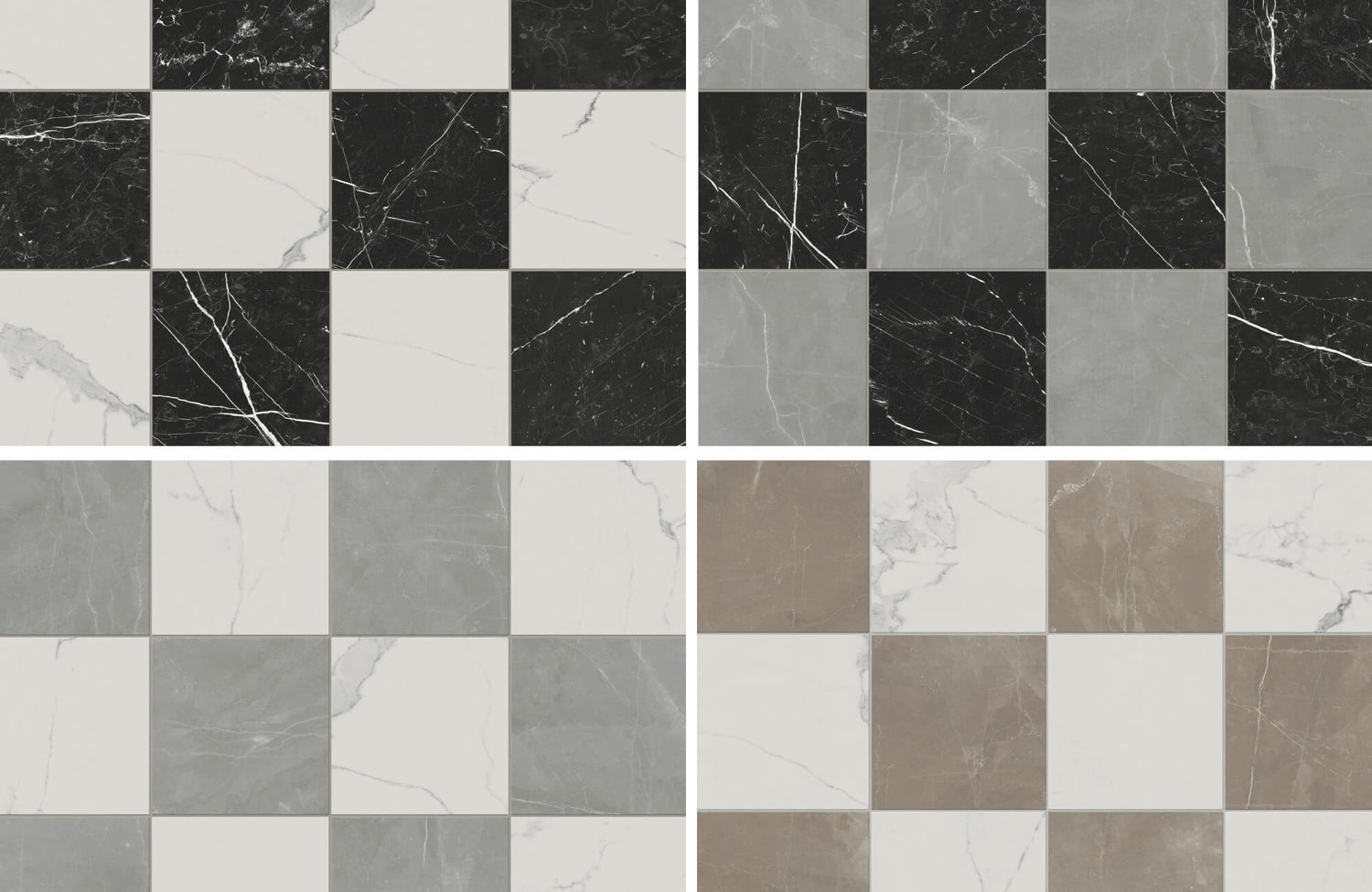
Leona 24x24 Checkerboard Matte Porcelain Tile in Marfil and Amani Bronze reintroduces the checkerboard pattern with timeless beige and earthy tone contrast, linking its historic appeal to a more refined, modern entry
A Brief History of Checkerboard Tile Patterns
The checkerboard's longevity is not accidental. It has endured because the underlying logic of the pattern, namely its alternating contrast that creates rhythm, order, and visual movement, is genuinely architectural, not merely decorative.
Ancient Influence and Early Architecture
The checkerboard appears among the earliest architectural traditions we know. In ancient Egyptian and Roman structures, contrasting tiles in marble and terracotta were cut and laid to create geometric patterns that organized expansive interiors like temples, courtyards, and gathering halls. The visual effect was functional as much as aesthetic: the pattern directed movement through space, projected authority, and reinforced a sense of balance and duality that carried symbolic weight in these cultures. Its use in busy public spaces also proved its durability, a quality that would prove equally relevant across the centuries that followed.
Renaissance and Victorian Design Revival
The Renaissance brought the checkerboard back into aristocratic interiors, elevating it from the functional to the ceremonial. Grand halls and stately corridors were laid with black and white marble in dramatic alternating patterns that communicated both refinement and formality. By the Victorian period, checkerboard flooring had become a defining element of entryways and parlors; precise in placement, varied in scale, and understood as a mark of geometric sophistication and craft. What had once signified balance now also spoke to opulence, framing interiors with a timeless confidence that still reads clearly in traditional design today.
Mid-Century Modern and Retro Resurgence
The mid-twentieth century reinterpreted the checkerboard entirely. Freed from its classical associations, it appeared in kitchens, diners, and cafes, spaces of casual daily life rather than formal ceremony. Color expanded beyond black and white to include vivid, saturated tones. Materials became more accessible. The pattern also proved it could carry a completely different energy — playful, energetic, approachable — while retaining the essential quality that had always made it effective: contrast creating clarity and movement. A pattern rooted in antiquity became, without contradiction, completely contemporary.

Leona 24x24 Checkerboard Polished Porcelain Tile in Calacatta and Nero Marquina brings a stunning marble look, with a timeless black and white contrast that gives the entry elegance and dramatic impact
Timeless Checkerboard Tile Color Combinations
The color pairings that have endured across centuries share a common quality: they are balanced rather than simply bold. Contrast alone does not make a combination timeless. It is the relationship between the two tones, the way each makes the other more visible without competition, that gives a checkerboard palette its lasting clarity.
Black and White
No pairing more completely distills the logic of the checkerboard than black and white. The contrast is absolute, the geometry reads immediately, and the palette carries a neutrality that allows the room around it to take almost any direction: colorful accents, restrained minimalism, warm natural materials, or cooler contemporary finishes. Black and white checkerboard tile does not impose a design sensibility; it establishes a visual foundation that adapts to one. In a dramatic foyer, it projects confidence. In a minimal bathroom, it creates graphic precision. In a classic kitchen, it anchors the room with clarity and ease.
Beige and Cream
For those drawn to warmth and restraint, beige and cream offer a softer interpretation of the checkerboard that preserves its rhythm without its drama. The minimal contrast between these tones creates a surface that is quietly patterned rather than boldly graphic, defining the space without dominating it. Traditional interiors with wainscoting, wood trim, and collected furnishings settle naturally against this understated palette. The result is a floor that feels elevated, layered, and genuinely livable, cozy without sacrificing elegance.
Gray and White
Gray and white bring the checkerboard into a cooler, more contemporary register. The tone-on-tone effect creates a clean, restrained surface suited to minimalist and modern interiors where order and simplicity define the design language. The contrast between the two shades adds quiet dimension without pulling focus from the architectural lines, materials, and fixtures that the room is built around. Paired with matte black hardware, polished concrete, or glass details, gray and white checkerboard tile feels resolved and current without feeling trend-dependent.
Black and Gray
For those who want the structure of strong contrast with a slightly softer presence, black and gray offer a more subdued interpretation of the classic pairing. The combination retains the visual weight and depth of black and white but introduces a muted sophistication that suits contemporary interiors, home offices, powder rooms, and entryways where the goal is atmosphere rather than graphic impact. Alongside brushed metal accents, dark woods, and matte finishes, black and gray checkerboard tile reads as quietly moody and polished.
Terracotta and Ivory
Terracotta and ivory bring a warmth and organic character to the checkerboard pattern that more graphic pairings cannot replicate. The sunbaked depth of terracotta alongside the softness of ivory creates an atmosphere reminiscent of Mediterranean floors and farmhouse kitchens: grounded, tactile, and full of material life. The contrast is soft enough that the pattern feels relaxed rather than sharp, giving the room structure without formality. This combination carries an enduring appeal precisely because it is rooted in natural materials and color rather than design trends.
Navy and White
Navy and white bring a higher-contrast, more contemporary energy to the checkerboard while remaining versatile enough to suit a wide range of interiors. The depth of navy introduces richness and presence; white keeps the pattern light, fresh, and visually engaging. Together, they create a pairing that can read nautical, preppy, or architectural depending on what surrounds it. In mudrooms, hallways, and kitchens, navy and white checkerboard tile balances character with practicality, strong enough to define the space, resolved enough to live with every day.
Retro-Inspired Color Pairings
Beyond the classical neutrals, retro-inspired pairings offer more expressive interpretations of the checkerboard that remain balanced and structured rather than merely bold. Muted olive and dark green, soft taupe and earthy red, and navy blue alongside a deeper tone show how checkerboard tile can move beyond standard contrast while preserving the pattern's underlying visual logic. These palettes are particularly well-suited to kitchens, bathrooms, laundry rooms, and creative interiors where color is used to create a memorable design moment.
Edward Martin’s Merrick 8 x 8 Checkerboard Matte Porcelain Tile in Ambient White and Acoustic Amber offers a warm, lively interpretation of this approach. The amber's yellow-orange depth adds energy and character, while the ambient off-white keeps the arrangement fresh and easy to style alongside wood cabinetry, brass accents, or neutral walls. Nostalgic in spirit, but never dated in application.

Leona 12x12 Checkerboard Polished Porcelain Tile in Calacatta and Amani Grey brings a durable, polished finish that suits moisture-prone bathrooms while adding soft contrast underfoot
Choosing the Right Materials and Locations for Checkerboard Tiles
Color establishes the character of a checkerboard installation. Material and placement determine how well it performs and how long it lasts. The most considered installations make both decisions with equal care.
Kitchen Floors
The kitchen is one of the most natural settings for checkerboard tile. The pattern provides visual structure that complements cabinetry of almost any character, from traditional painted wood to minimal contemporary frames. For kitchen floors, porcelain is the preferred material: its density and water resistance make it well-suited to the spills, movement, and daily use that cooking spaces require. For kitchen walls and backsplashes ceramic provides an equally polished result with a lighter weight more suited to vertical applications.
Bathrooms
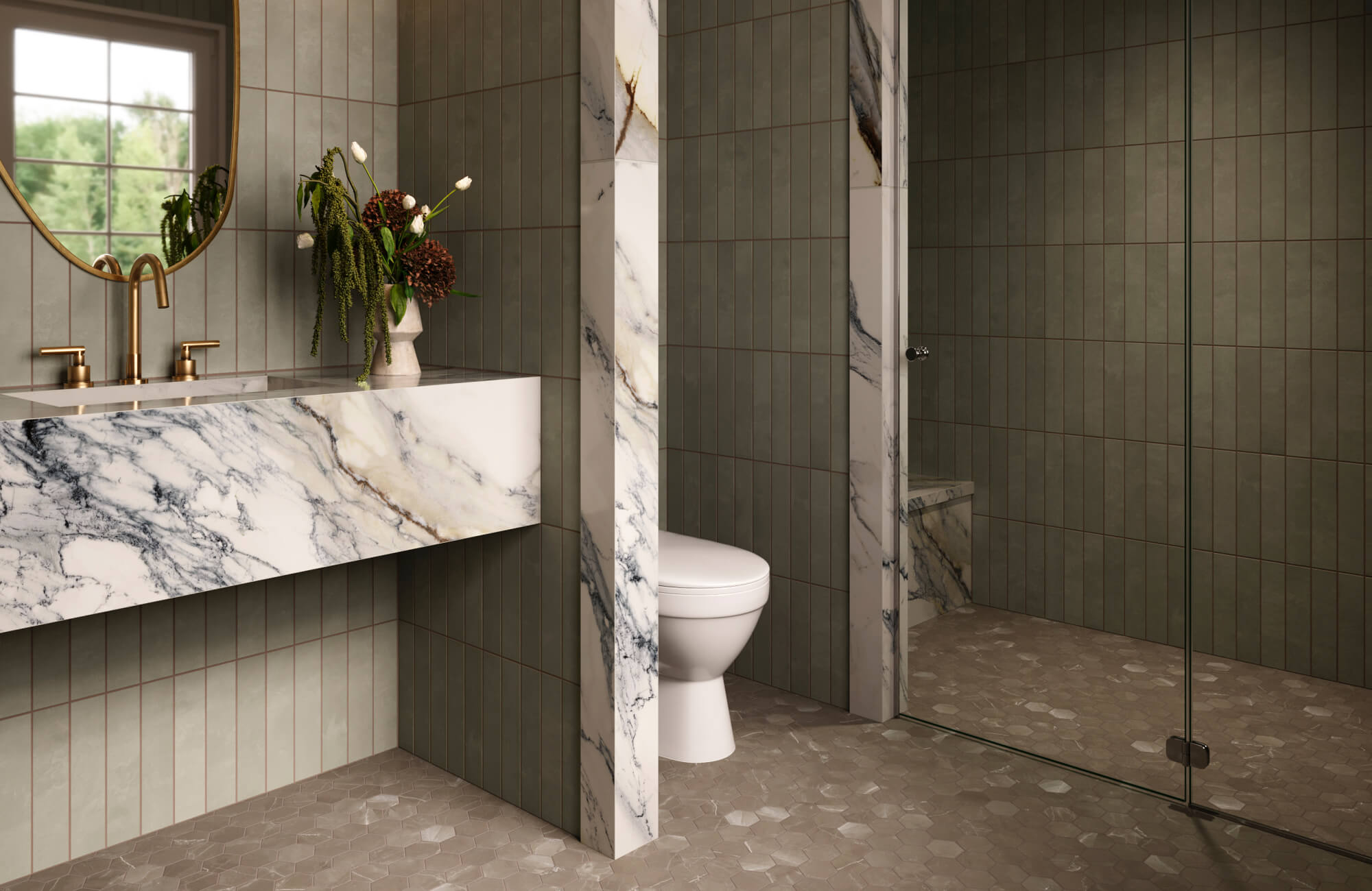
In bathrooms, checkerboard tile does more than decorate; it structures. The alternating pattern can visually define zones within a space, separating the vanity from the tub or shower without relying on walls or dividers. For bathroom floors and wet areas, porcelain is again the preferred choice: denser, more water-resistant, and better suited to the conditions of a functioning bathroom. Edward Martin’s Leona 12x12 Checkerboard Polished Porcelain Tile in Calacatta and Amani Grey, shown above, demonstrates this application well. Its soft marble tones and polished surface reflect light to visually expand the space while the porcelain construction ensures the finish holds over time.
For bathroom walls, ceramic provides more design flexibility and a lighter weight appropriate for vertical use. In powder rooms and smaller feature spaces, glass checkerboard tiles can be used on accent walls for their reflective quality and contemporary character, though glass is better suited to decorative use than busy surfaces, and requires more careful installation and maintenance.
Entryways and Mudrooms
Entryways and mudrooms are among the strongest settings for checkerboard tile. The pattern communicates order immediately, a considered choice that sets the tone for the rest of the space. Its geometry also has the practical advantage of visually absorbing scuffs and everyday wear that a plainer surface would make more visible. For these busy spaces, porcelain is the recommended material, particularly in darker or more contrasting colorways that maintain their character under regular use. A great example is the Palmer 12x12 Checkerboard Matte Porcelain Tile in Natural and Grey, which brings soft beige and muted gray together in a format well suited to transitional areas that need both style and resilience.
In spaces with classical architecture or heritage-inspired design, natural stone checkerboard tiles, such as marble and limestone, can add tactile depth and a sense of material history that manufactured tiles approach but rarely fully replicate. Natural stone requires more attentive maintenance, including regular sealing, but in the right setting, its character justifies the care.
Outdoor Patios and Sunrooms
Beyond interior applications, checkerboard tile can extend a space's design language into covered outdoor areas — patios, sunrooms, and sheltered porches where the pattern introduces a European-inspired order that feels both structured and relaxed. For outdoor use, porcelain is essential: its nonporous surface and weather resistance allow it to hold up through seasonal changes without the maintenance demands of natural stone. Softer tone variations, such as ivory and terracotta, can echo the surrounding natural landscape, creating a sense of continuity between the interior and the garden.
If you want a clearer sense of how your checkerboard tile choices will look in your setting, Edward Martin's augmented reality (AR) tool lets you preview patterns and color combinations right in your space. It’s a simple way to explore design possibilities and make confident decisions before bringing your vision to life.

Palmer 12 x 12 Checkerboard Matte Porcelain Tile in White and Grey creates a balanced base that softens contrast and helps the kitchen’s warm cabinetry and dark countertops feel more cohesive
Smart Choices That Enhance Color Combinations
Color is the first decision in a checkerboard installation, but tile size, layout direction, and grout are what determine how that color reads in the finished room. Each variable shifts the energy and scale of the pattern in ways that can be subtle or transformative.
Diagonal Placement
Rotating a checkerboard pattern to a diagonal orientation introduces movement and visual length that a standard grid does not provide. The angled layout draws the eye across the floor rather than anchoring it at the nearest grout line, which makes spaces feel longer and more expansive, particularly useful in narrow hallways, compact kitchens, and smaller bathrooms where additional perceived depth is welcome. Diagonal placement also carries a slightly more custom, tailored quality; it signals a deliberate design decision rather than a default installation, adding elegance without requiring a more complex tile or a different color palette.
Large Tiles
Larger checkerboard squares, 18 x 18 inches or more, reduce the number of grout lines across a surface, which creates a cleaner, more expansive result that reads as contemporary rather than retro. This format suits open-plan spaces where visual flow and simplicity define the design. Edward Martin’s Blair 24x24 Checkerboard Polished Porcelain Tile in Volakas White and Oniciata Beige demonstrates this quality: its oversized format and polished marble look finish create an airy, refined surface that works naturally in both minimalist and transitional interiors. Scale alone can give a classic pattern a completely different presence.
Shaped Tiles
The checkerboard's essential logic, alternating contrast creating rhythm, does not require a square format to be effective. Shaped tiles introduce a more decorative and dimensional interpretation of the same visual principle. A distinctive silhouette, such as the templar shield form of the Aslan 2 x 8 Porcelain Tile Shield Checkerboard in Calacatta and Imperial, preserves the classic light-and-dark contrast of checkerboard tile while adding architectural movement and a more ornamental character. This approach suits feature walls, backsplashes, bathroom floors, and entryways where the checkerboard effect is wanted but a more distinctive design identity is also desired.
Grout Color and Line Width
Grout is a design decision with real consequences for how the finished installation reads. A grout tone that closely matches the tile allows the colors to dominate and the transitions to recede, creating a more unified, softened surface. A contrasting grout sharpens the geometry, defines each tile individually, and gives the pattern a stronger visual rhythm and graphic presence. Grout line width also carries its own effect: thin lines create a more refined, considered finish; wider lines emphasize the graphic structure of the design and give the pattern more visual weight. Neither approach is universally preferable. The right choice depends on whether the design calls for the tile surface to feel seamless or to read as deliberately patterned.

The white and earthy tones of Leona 12 x 12 Checkerboard Matte Porcelain Tile in Calacatta and Amani Bronze tie the warm wood vanity, soft wall tile, and brass accents together with balanced contrast
Pairing Checkerboard Tiles with Other Design Elements
The checkerboard's visual strength comes from its geometry, but that same quality means that what surrounds it shapes how the finished space feels. The most resolved checkerboard interiors are those where the surrounding elements have been chosen to work with the pattern rather than alongside it.
Wood Tones
Wood tones introduce a natural counterbalance to the checkerboard's graphic precision. Whether pale oak cabinetry or deep walnut furniture, the organic variation in grain and warmth softens the visual structure of the pattern and gives the room a more grounded, livable quality. Beige and cream, gray and white, and terracotta and ivory checkerboard combinations all relate particularly well to wood, sharing enough warmth or restraint to allow both elements to coexist without competing. Beams, open shelving, and wood-framed mirrors draw the eye upward and add depth, a gentle architectural layering that prevents a graphic floor from making the room feel flat.
Metallics
Metallic finishes add refinement and specificity to a checkerboard installation, helping the overall design feel more considered rather than simply well-tiled. Brass hardware, light fixtures, and mirror frames alongside cream, beige, or warm-toned checkerboard combinations create a layered, classic elegance that avoids feeling overly traditional. Chrome and matte black accents sharpen the aesthetic alongside gray and white or black and white tiles, reinforcing the graphic precision of the pattern with finishes that share its clarity. Used with restraint, metallics function as punctuation within the room, adding presence without disrupting the visual order the checkerboard creates.
Rugs and Soft Goods
In larger spaces, the checkerboard's natural symmetry can feel dominant without softening elements to balance it. A well-chosen rug placed over the tiled floor in a dining room, hallway, or living area breaks up the grid, defines specific zones within an open layout, and introduces the tactile warmth that a hard surface alone cannot provide. Warmer checkerboard pairings, such as beige and cream or terracotta and ivory, are particularly receptive to layering with natural fiber rugs, earthy textiles, and muted woven patterns. Cooler palettes like gray and white, navy and white respond well to velvets, linens, and layered neutrals that preserve the palette's clarity while softening its edges. Cushions, curtains, and upholstery in complementary tones complete this balance, ensuring the room feels as comfortable to be in as it is to look at.
These Checkerboard Colors Endure Because They Are Resolved, Not Simply Striking
What makes checkerboards genuinely timeless is not that they are bold or beautiful in isolation. It is that they carry an internal logic that holds across materials, scales, and design eras. Each pairing strikes a balance between contrast and restraint that allows the checkerboard pattern to do what it has always done best: create order, visual rhythm, and a sense of intention that makes a space feel genuinely designed. Applied through quality materials, supported by considered layout choices, and given room to breathe alongside wood, metal, and textile elements that complement rather than compete, these combinations remain as relevant in a contemporary bathroom or entryway as they were in a Victorian parlor or a Roman courtyard.
If you’re inspired by the timeless appeal of checkerboard tile but aren’t sure where to begin, our design services are here to help. From selecting the right color palette to curating layouts that suit your space and style, our team will work closely with you to create a cohesive look that feels both intentional and enduring.