


Checkered tiles are more than just a design choice—they are a cultural icon found in everything from flooring and walls to fashion and game boards. Their distinctive pattern has stood the test of time, carrying a rich history and a variety of names depending on context and style.
In this guide, we’ll explore the different names associated with checkered tiles, their historical significance, and how their variations impact interior aesthetics. Whether you’re incorporating them into your home or exploring their origins, learning about the proper terminology can elevate your design choices and appreciation for this timeless look.

The Most Common Name: Checkerboard
The term "checkerboard" reigns supreme as the most widely recognized and understood name for checkered tiles. Its dominance reflects a fascinating interplay between function, history, and cultural familiarity. Let's dive deeper into the origins and nuances of this ubiquitous term.
A Game of Origin
The etymology of "checkerboard" points directly to its association with the classic strategy game of checkers. The term likely emerged sometime between the late 16th and early 17th centuries, coinciding with the rise of checker games in Europe and North America. Early versions of the game utilized boards with squares of contrasting colors, often black and white, to differentiate between player positions. As the game gained popularity, the term "checkerboard" became ingrained in everyday language, serving as a readily understood reference point for the checkered squares used not only in the game but also in other contexts.
Beyond the Game
While the game of checkers provided the initial spark, the term "checkerboard" transcended its gaming roots to become a universal term for any arrangement of alternating squares. This broad application reflects the inherent versatility of the checkered pattern itself. From the functional use on floors and walls to decorative applications in textiles and fashion, the checkered design offered a simple yet visually striking way to add pattern and interest. The familiarity with "checkerboard" from the game world made it a natural and easily understood term for this broader application.
The Power of Simplicity
Part of the enduring appeal of "checkerboard" lies in its simplicity and clarity. The term is self-explanatory, readily conveying the essence of the pattern – squares alternating in color. This straightforwardness makes it universally accessible, regardless of cultural background or language. Unlike some technical terms for checkered patterns like "tessellation," "checkerboard" avoids any sense of esotericism, making it readily understood by anyone encountering the pattern.
Variations Within the Norm
Despite the dominance of "checkerboard," subtle variations in terminology exist depending on regional dialects or specific applications. Here are a few examples:
Chequered
This term, particularly common in British English and some Commonwealth countries, is essentially synonymous with "checkerboard." It emphasizes the checkered nature of the pattern, offering a slightly different nuance compared to the game-centric "checkerboard."
Dames Board
A less common but historically significant term, "dames board" specifically refers to a game board with a checkered pattern used for checkers or draughts. This term predates "checkerboard" in some regions and offers a glimpse into the early association of checkered patterns with strategy games.
Chessboard
Similar to "checkerboard," the term "chessboard" is often used to describe a pattern of alternating squares. While primarily associated with the game of chess, this term has also been applied to floor and wall designs that feature the classic black-and-white square arrangement.
A Timeless Term
All things considered, "checkerboard" remains the undisputed champion when it comes to naming checkered tiles. Its clear origins in the game of checkers, coupled with its straightforwardness and broad applicability, solidify its position as the most widely recognized and understood term for this timeless design element. Whether gracing a game board, a kitchen floor, or a fashion statement, the term "checkerboard" continues to bridge the gap between function, history, and everyday life.

Checkered vs. Harlequin
While the term "checkerboard" might be the go-to for any pattern of alternating squares, a nuanced distinction exists between a true checkerboard and a specific tile arrangement called "harlequin." Understanding these differences goes beyond mere terminology; it delves into the realm of visual perception and the impact of pattern orientation on the overall aesthetic.
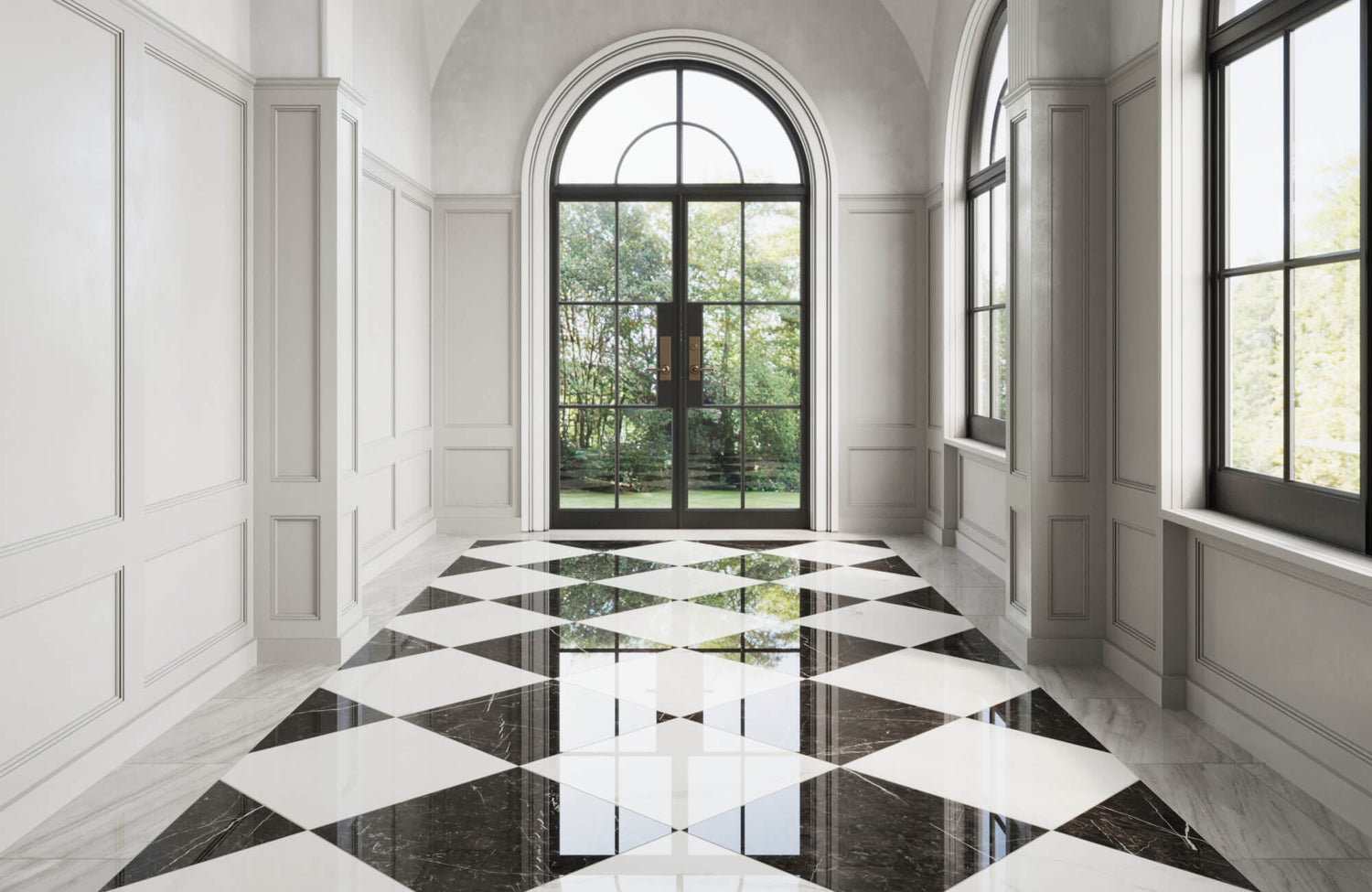
The Orderly Checkerboard
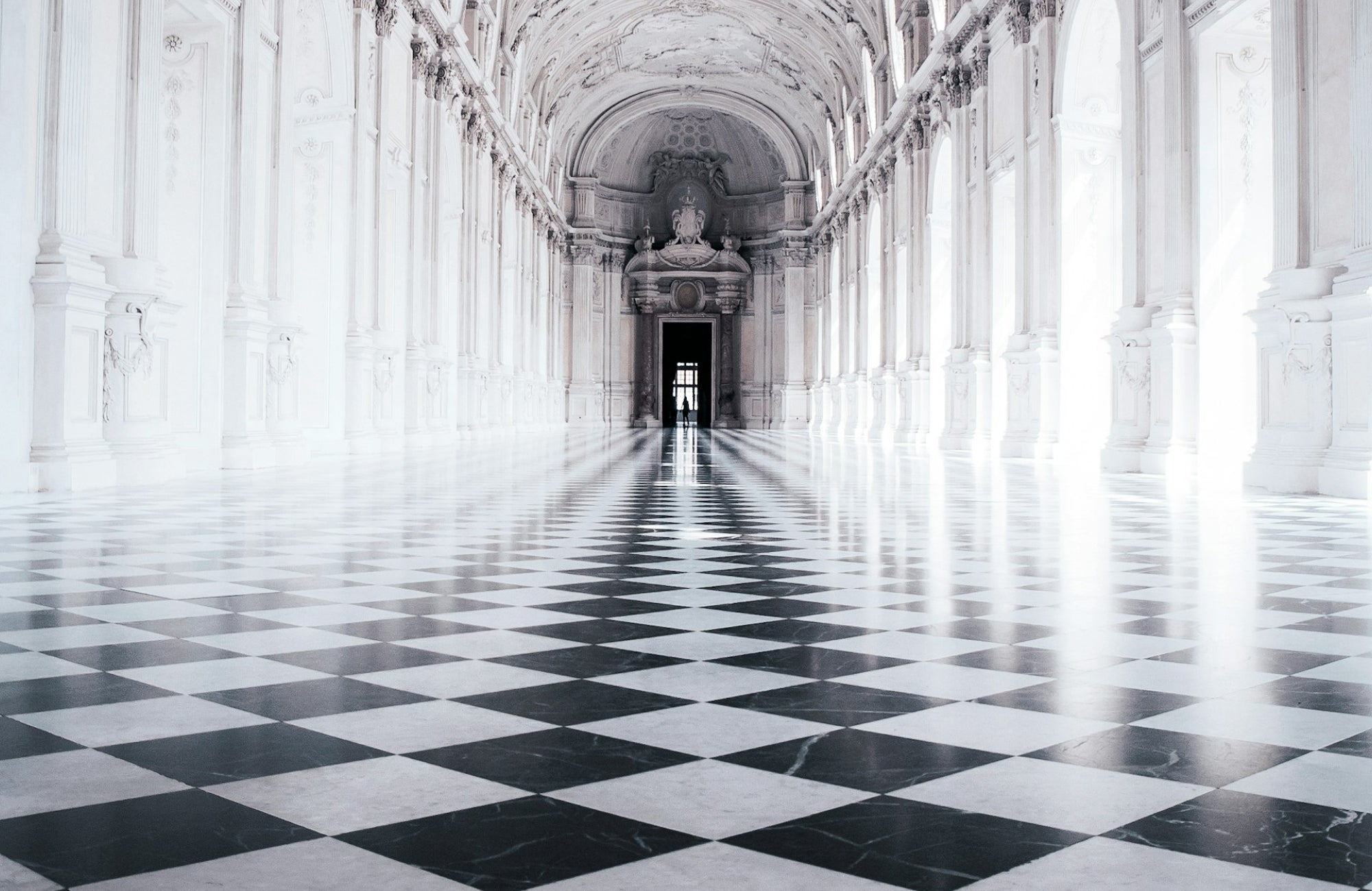
The classic checkerboard pattern features squares laid in a straight grid, with all sides perfectly aligned to the walls. This creates a sense of order, regularity, and stability. The viewer's eye naturally follows the horizontal and vertical lines formed by the squares, fostering a feeling of calmness and balance. This orderly arrangement is particularly well-suited for traditional and formal settings, where clean lines and a sense of symmetry are desired.
The Dynamic Harlequin
The harlequin pattern, on the other hand, takes the basic principle of alternating squares and injects a dose of dynamism. Here, the squares are installed diagonally, creating a diamond shape when viewed from a particular angle. This shift in orientation disrupts the orderly grid of the checkerboard, introducing a sense of movement and playfulness. The eye follows the diagonal lines, creating a more dynamic visual experience. The resulting pattern is often described as energetic, lively, and perfect for spaces seeking a more contemporary or whimsical feel.
In some variations, this diagonal layout is further enhanced with a contrasting border. For example, larger white marble tiles laid diagonally and framed by smaller square black tiles are often described as a bordered harlequin or framed checkerboard pattern. This approach adds definition to the space while emphasizing the geometric layout, making it a popular choice for entryways and statement floors.
Beyond the Initial Glance
The distinction between checkerboard and harlequin goes beyond the initial visual impression. The way the pattern interacts with light and space also plays a significant role. The straight grid of the checkerboard can create a strong sense of directionality, particularly in larger rooms. This can be visually beneficial in narrowing down a long hallway or grounding a spacious room. However, in smaller spaces, the emphasis on horizontal and vertical lines might make the space feel more cramped.
On the other hand, the diagonal layout of the harlequin pattern can add a sense of spaciousness to a room. The eye naturally follows the diagonal lines, creating an illusion of a larger area. This can be particularly helpful in opening up smaller spaces or adding a touch of dynamism to narrow hallways. However, in very large rooms, the diagonal lines might create a sense of disorientation if not balanced with other design elements.
These differences highlight how checkerboard and harlequin patterns can shape a space. Whether you prefer the structured elegance of a checkerboard or the dynamic energy of a harlequin, choosing the right pattern ensures your design feels intentional and well-balanced. If you require further assistance or a tailored approach, we offer expert design services to help you navigate these choices and ensure that your space is as impactful as you envision.

Beyond Black and White
Checkered tiles transcend the black and white dichotomy, offering a vast color palette to suit any design vision. Modern design embraces bold experimentation and subtle elegance, allowing you to create a space that reflects your personality. From vibrant hues that energize a room to calming neutrals that evoke a sense of tranquility, the possibilities are endless.
Classic Combinations
Our exploration of checkered tiles begins with two enduring color combinations that offer both elegance and versatility. These pairings provide a solid foundation for your design scheme, allowing you to build upon them with furniture, decor, and personal touches.
Grey and White
Grey and white checkered tiles, like our Leona 12x12 Checkerboard Matte Porcelain Tile in Calacatta and Amani Grey, provide a sleek, contemporary look while maintaining versatility in design. The neutrality of grey allows for easy coordination with various furniture and decor styles, making it a practical yet stylish choice. Lighter shades also create a sense of openness and airiness, while darker tones introduce depth and sophistication. To enhance the overall aesthetic, consider incorporating a mix of matte and gloss textures, adding dimension and visual interest to the space.
Black and Beige
Black and beige checkered tiles, like our Leona 12x12 Checkerboard Matte Porcelain Tile in Marfil and Nero Marquina, offers a sophisticated alternative to stark black and white, adding warmth without sacrificing elegance. The beige tones soften the bold contrast of black while maintaining a sense of formality, making this combination suitable for both modern and traditional spaces. To create more depth and dimension, consider incorporating textured black tiles or adding a checkered border around a beige-colored center. This thoughtful approach enhances the overall aesthetic while keeping the design balanced and visually striking.
Earthy Inspiration
For a natural and grounded feel, consider colors like brown, beige, and terracotta. These warm tones create a sense of comfort and work well in spaces inspired by nature. Brown and beige checkered tiles with subtle variations in shade add a touch of texture and mimic the look of natural stone. Terracotta, meanwhile, adds a vibrant warmth, perfect for creating a Mediterranean-inspired space. You can further enhance the natural aesthetic by pairing these colors with natural materials like wood furniture and woven rugs.
Pops of Color
Don't be afraid to inject some personality with bold and vibrant colors. A checkered pattern with a pop of color, like red, blue, or yellow, can create a statement piece and energize a space. Use contrasting colors for a high-impact look, or choose complementary tones for a more harmonious feel. For a truly playful approach, consider using a checkerboard pattern with multiple contrasting colors. This can be particularly effective in a children's playroom or a creative workspace.
Subtle Sophistication
For a more subdued and sophisticated look, consider incorporating muted tones like sage green, dusty rose, or navy blue. These colors provide a refined elegance while maintaining a sense of balance within the space. When used in a checkered pattern, muted hues introduce visual interest without overpowering a minimalist design. To enhance the effect, pairing them with metallic finishes can add a touch of understated luxury, creating a timeless and polished aesthetic.
Color Theory in Play
Understanding basic color theory is essential for crafting a cohesive and visually appealing checkered tile design. One key principle is the use of complementary colors, which sit opposite each other on the color wheel. This pairing, such as blue and orange or black and white, creates a high-contrast effect that makes a bold visual statement. However, it’s important to maintain balance—too much contrast can feel overwhelming, especially in larger areas. By carefully selecting the intensity and proportion of each color, you can achieve a dynamic yet well-balanced aesthetic.
For a softer and more seamless look, analogous colors—which sit next to each other on the color wheel—offer a harmonious alternative. Shades like navy, teal, soft blue or beige, taupe, and warm brown create a sense of flow and unity within a space. When applied to a checkered pattern, these colors provide subtle depth without feeling too bold or jarring. Whether aiming for striking contrast or gentle cohesion, understanding color relationships allows you to design a space that aligns with your desired mood and overall aesthetic.
Beyond Solid Colors
The world of checkered tiles extends beyond simple solid colors, offering a range of creative possibilities. Patterned tiles, featuring geometric designs or floral motifs, introduce additional depth and complexity to a checkered arrangement. These intricate patterns can bring a sense of movement and uniqueness, making them ideal for statement floors or accent walls. When used thoughtfully, they can also add a striking contrast to minimalist spaces or seamlessly blend into more eclectic interiors.
Another approach to elevating checkered designs is incorporating gradient tiles, which create a dynamic transition between hues. This subtle shift in color adds dimension and softness, preventing the pattern from feeling too rigid. Whether opting for a gradual fade or a bold ombré effect, gradient tiles allow for a more customized aesthetic. Ultimately, selecting the right color variation should align with the overall mood of the space while complementing existing décor for a balanced and cohesive look.

Material Matters
The beauty of checkered tiles lies not just in their pattern but also in the vast array of materials they come in. Each material offers unique properties, aesthetics, and considerations, making the choice an integral part of the design process.
Marble
Marble checkered tiles are the epitome of luxury and classic beauty, offering a timeless elegance that enhances both traditional and formal settings. Their natural veining patterns create a one-of-a-kind look, adding depth and sophistication to any space. However, due to its porous nature, marble requires proper care, including regular sealing, to protect against stains and moisture damage. While it is a significant investment, its durability and refined appeal make it a worthwhile choice for those seeking an elevated and enduring design.
Vinyl
Vinyl tiles offer a budget-friendly and low-maintenance way to achieve a classic checkered pattern, making them a practical option for various spaces. Available in a wide range of colors, patterns, and textures, modern vinyl tiles can mimic the look of stone or wood while remaining significantly more affordable. Their lightweight design and straightforward installation process also make them ideal for DIY projects, offering an easy way to refresh a space without professional help. However, vinyl tiles may not match the longevity of more durable materials and can show signs of wear over time, especially in heavily used areas.
Ceramic and Porcelain
Ceramic and porcelain checkered tiles strike the perfect balance between durability, versatility, and affordability, making them a go-to choice for many homeowners. With a wide selection of colors, patterns, and finishes, these tiles offer endless design possibilities. They can also replicate the look of marble, wood, or even metal, providing a stylish yet budget-friendly alternative to higher-end materials. On top of that, their glazed surface enhances ease of maintenance, making them especially well-suited for kitchens, bathrooms, and other heavily used areas.
Beyond the Basics
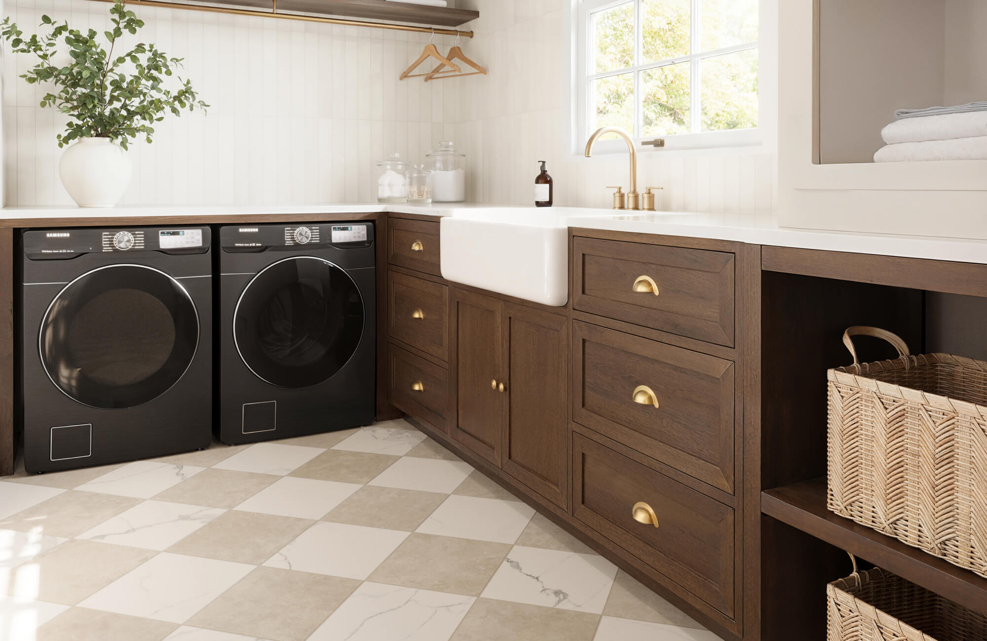
When selecting a material for your checkered tiles, it’s important to consider how they will perform in different environments. For moisture-prone spaces like bathrooms and laundry rooms, water-resistant materials such as ceramic or porcelain offer the best durability. In areas where safety is a priority, opting for textured surfaces or specific tile finishes can enhance slip resistance, reducing the risk of accidents. Additionally, maintenance requirements vary—natural stone demands more care and sealing, while vinyl is easier to clean but may require more frequent upkeep.
Sustainability is another key factor when choosing checkered tiles, especially for eco-conscious homeowners. Opting for tiles made from recycled content or locally sourced materials can help reduce environmental impact without compromising on style. Many manufacturers now offer sustainable options that balance aesthetics with responsible sourcing, making it easier to create a stylish yet environmentally friendly space. By keeping these factors in mind, you can ensure that your checkered tiles not only enhance your design but also meet the practical needs of your home.

Beyond the Classic Application
While checkered tiles are a classic flooring choice, their versatility extends far beyond traditional uses. Their ability to add visual interest, pattern, and a touch of personality makes them a valuable tool in the interior designer's toolbox.
Walls
Checkered tiles can also create striking visual interest on walls, adding depth and personality to any space. Whether used as a bold statement or a subtle accent, these tiles bring unique character to any room.
Accent Walls
A checkered tile accent wall can instantly transform living rooms, entryways, or even bedrooms, becoming a focal point that draws the eye. High-contrast colors enhance the boldness of the pattern, while a monochromatic palette offers a sleek, modern appeal. This design approach creates depth and movement, making the space feel more dynamic and visually engaging.
Powder Rooms and Bathrooms
Smaller spaces like powder rooms and guest bathrooms can benefit from the playful energy of a checkered tile wall, turning a compact area into a standout feature. This pattern disrupts the monotony of plain walls, introducing a stylish and unexpected element that elevates the overall design. To ensure both style and functionality, choosing waterproof materials like ceramic or porcelain maintains durability without compromising aesthetics.
Backsplashes
Backsplashes serve a dual purpose—not only do they protect walls from splashes, but they also provide an opportunity to enhance a room’s overall aesthetic. With checkered tiles, you can introduce a bold design element that adds both character and visual intrigue.
Kitchen Backsplashes
A checkered tile backsplash can instantly energize your kitchen, making it a focal point that enhances the surrounding décor. Classic black and white checkerboard tiles offer a timeless appeal, while vibrant colors can be used to complement the cabinetry and inject personality into the space. For a contemporary touch, consider using subway tiles in a checkered pattern to achieve a modern yet structured look. Matte or glossy finishes can further enhance the style, allowing you to tailor the backsplash to match your kitchen’s ambiance.
Bathroom Backsplashes
A checkered tile backsplash can also add elegance and dimension to a bathroom, whether through subtle neutrals or bold, contrasting hues. A monochromatic palette of grey or beige tiles creates a calming, spa-like atmosphere, while a playful mix of blue and white evokes a fresh, nautical-inspired design. For added texture, incorporating patterned or textured tiles within the checkered layout can bring depth and an extra layer of sophistication to the space.
Creative Applications
Checkered tiles offer a design versatility that goes far beyond walls, backsplashes, and countertops. Whether used as a bold focal point or a subtle accent, they can elevate a variety of spaces with their classic yet dynamic appeal. Below are some creative ways to incorporate checkered tiles into your home and outdoor areas.
Fireplace Surrounds
A checkered tile surround can transform a fireplace into a captivating design feature, adding depth and character to the room. Whether you opt for a classic black-and-white pattern for a vintage-inspired look or a modern neutral palette, checkered tiles create an eye-catching contrast against the warmth of the fire. For a bolder statement, consider mixing textures or using high-gloss finishes to reflect light and enhance the room’s ambiance.
Shower Floors
Small checkered tiles can introduce both personality and function to a shower floor, offering a visually interesting surface that enhances the bathroom’s aesthetic. Choosing slip-resistant materials, such as matte-finish porcelain or textured ceramic, helps improve safety without compromising on style. To maintain a seamless and polished look, coordinating the checkered floor with matching grout can create a cohesive and sophisticated feel.
Furniture Accents
Checkered tiles aren't just for floors and walls—they can also be used to elevate furniture pieces with a distinctive and artistic touch. Incorporating them into tabletops, ottomans, or cabinet doors adds a unique detail that enhances existing décor. For a vintage or rustic appeal, consider pairing checkered tile furniture with wood or metal accents to create a visually balanced design.
Outdoor Patios
Bringing the checkered pattern outdoors can add a stylish and inviting atmosphere to patios, porches, or garden walkways. Weather-resistant tiles, such as porcelain or stone, ensure durability while maintaining their bold visual impact. For an added design element, mixing earthy tones like terracotta and beige can create a warm, Mediterranean-inspired look that blends seamlessly with outdoor landscaping.
Designing with Checkered Tiles
Checkered tiles offer endless possibilities for creating visually striking and timeless designs. However, achieving the right balance requires thoughtful planning and attention to detail. Below are key design considerations that can help you make the most of checkered tiles in any space.
Consider Scale
The size of the tiles should be proportionate to the space to ensure a well-balanced look. Smaller tiles work best for walls, backsplashes, and accent areas, adding intricate detail without overwhelming the room. In contrast, larger tiles are ideal for flooring and countertops, creating a more open and seamless appearance. To enhance the overall design, consider mixing tile sizes for added depth and visual interest.
Balance the Boldness
Checkered patterns naturally draw attention, so it’s important to balance their boldness with neutral tones or simpler design elements. A black-and-white checkerboard can serve as a dramatic statement, while softer color variations like beige and grey create a more understated elegance. For a modern touch, pairing checkered tiles with solid-colored walls and minimalistic decor can achieve a clean and sophisticated look.
Play with Grout Lines
The grout color and width can significantly impact the final aesthetic of your checkered tile design. Matching the grout color to the tiles creates a more seamless and cohesive look, while contrasting grout lines emphasize the individual squares, adding definition and texture. For a contemporary feel, opting for darker grout with light-colored tiles can add a sleek, high-contrast effect.
Lighting Matters
The way light interacts with checkered tiles plays a key role in shaping the overall ambiance of a space. Natural light enhances subtle variations in color and texture, bringing out the depth and dimension of the tiles. Meanwhile, strategically placed artificial lighting can add warmth and create a more inviting atmosphere. Additionally, glossy tiles amplify brightness by reflecting light, making a room feel more open, whereas matte finishes diffuse light for a softer, more refined aesthetic.
By considering these design elements, you can maximize the versatility of checkered tiles and create a space that feels both stylish and well-balanced. Whether you prefer a bold, high-contrast look or a subtle, refined pattern, thoughtful planning ensures a timeless and visually appealing result.

The Psychology of Checkers
The enduring appeal of checkered tiles transcends mere aesthetics. These geometric patterns tap into fundamental psychological principles, influencing our perception of space, evoking emotions, and triggering memories. Understanding the psychology of checkers can elevate them from a design element to a powerful tool for creating specific moods and atmospheres in your space.
Order and Stability
The most fundamental element of the checkered pattern is the grid. Our brains are wired to seek order and predictability, and the regular arrangement of squares in a checkerboard pattern activates this innate human need for structure. This sense of order translates into a feeling of:
Balance
The perfect symmetry of the grid creates a sense of visual equilibrium. This can be particularly calming in busy spaces with a lot of visual stimuli. In homes or offices, a balanced pattern helps reduce visual chaos and promotes a sense of organization.
Stability
The predictability of the repeating squares fosters a sense of security and grounding. This can be beneficial in busy areas like hallways or entryways. A stable, structured design can also make a space feel more anchored and well-defined.
Clarity
The clear distinction between the squares provides a sense of visual clarity, making it easier for the eye to navigate the space. This is especially useful in large, open areas where a strong pattern can create a sense of direction and structure.
Playfulness and Dynamism
While the grid promotes order, the checkered pattern also holds the potential for dynamism. This is particularly true when considering:
Contrasting Colors
Using bold and contrasting colors within the squares breaks up the visual monotony of a single-tone checkerboard. This adds vibrancy and excitement, making the pattern more engaging and dynamic. The interplay of contrasting hues not only enhances the overall aesthetic but also draws attention to the design itself.
Diagonal Placement
Moving away from the traditional straight grid layout and installing tiles diagonally can further enhance the pattern’s liveliness. This shift disrupts the structured predictability of a checkerboard, introducing a playful and energetic quality. The diagonal arrangement also creates a sense of movement, adding a contemporary edge to any space.
The Emotional Impact of Checkers
The psychology of checkers extends beyond visual perception. These patterns can evoke emotions and trigger memories, shaping the overall mood of a space.
Nostalgia
Checkered patterns are often linked to classic games like checkers and draughts, making them a familiar and comforting design choice. Seeing these recognizable squares can bring back childhood memories and evoke a sense of nostalgia. This emotional connection can help create a warm and inviting environment, perfect for cozy living spaces or retro-inspired interiors.
Stimulation
The alternating squares—especially when using bold, contrasting colors—can be highly stimulating to the eye. This energetic quality makes checkered patterns an excellent choice for areas where focus and engagement are key, such as playrooms, workspaces, or creative studios. The pattern’s dynamic nature keeps the mind engaged while adding visual excitement to the space.
Luxury
When crafted from high-end materials like marble or slate, checkered patterns can instantly elevate the sophistication of a room. Their structured layout combined with premium finishes creates a timeless, upscale look that works beautifully in formal settings. Whether used in entryways, dining areas, or statement walls, these luxurious checkered tiles bring an air of refinement and elegance.
By understanding the psychological effects of checkered patterns, you can make informed design decisions that create the desired atmosphere in your space. To truly envision how these patterns will transform your environment, try our cutting-edge Augmented Reality (AR) tool, which allows you to visualize your chosen tiles in your own space and experiment with different styles before making a final decision.
The Lasting Appeal of Checkered Tiles
Checkered tiles have remained a design favorite for generations, seamlessly blending history, functionality, and style. Whether in classic black-and-white or bold, modern variations, their versatility makes them a go-to choice for both traditional and contemporary interiors. Beyond flooring, their influence can be seen in everything from architecture to fashion, proving their timeless appeal.
Understanding the different names, styles, and materials of checkered tiles allows you to make informed design choices that enhance both aesthetics and functionality. Whether you're drawn to their nostalgic charm or looking to add a fresh, modern touch, checkered tiles offer endless possibilities. If you're ready to incorporate them into your space but need expert guidance, our team is here to help you find the perfect fit!