


Checkerboard flooring isn’t just a nostalgic nod to the past, it’s a design statement making a powerful comeback in today’s most stylish interiors. Once reserved for grand European estates and retro American kitchens, this bold pattern is now being reinterpreted with fresh intent. Think oversized tiles in muted tones, eco-conscious materials like terrazzo and porcelain, and color combinations that break the black-and-white mold.
With advancements in digital glazing, edge rectification, and slip-resistant technology, checkerboard floors are no longer limited by tradition. They’re adaptable, high-performing, and ready to elevate everything from modern lofts to boutique commercial spaces. In this blog, we’ll explore how this timeless pattern is being reimagined and how Edward Martin helps you bring it to life with precision, innovation, and style.

The Enduring Appeal of Checkerboard Floors
To truly appreciate the checkerboard floor’s lasting impact, it helps to understand both where it comes from and why it resonates so deeply. From centuries-old origins to the subtle ways it shapes how we perceive space, there’s more behind this iconic pattern than meets the eye.
A Look Back at Checkerboard History
The checkerboard pattern has an extensive and culturally rich lineage, dating as far back as ancient Egyptian architecture. Archaeological evidence reveals that early iterations of this motif were carved into stone flooring and wall tiles, not only as decorative elements but also as symbolic representations of balance and duality. Centuries later, during the Renaissance in 15th-century Europe, checkerboard floors gained prominence as a hallmark of refined architectural design. Italian palazzos, particularly in Florence and Venice, frequently featured alternating black and white marble tiles arranged in perfect symmetry, an homage to classical geometry and the philosophical ideals of order.
As time progressed, the motif migrated through different periods and design languages. In 18th- and 19th-century France, checkerboard patterns adorned grand foyers and château kitchens, often rendered in encaustic cement tiles. Meanwhile, the Victorian era in England embraced ceramic checkerboards in both public buildings and domestic interiors, valued for their clean lines and low-maintenance qualities. By the mid-20th century, checkerboard flooring experienced another cultural resurgence, this time in American diners and suburban homes, typically using vinyl or linoleum with high-gloss finishes. Each revival introduced new materials and contexts, further embedding the checkerboard into the global design lexicon.
The Psychology of Pattern and Contrast
Beyond its historical gravitas, the enduring allure of checkerboard floors can be attributed to deep-rooted psychological and visual principles. From a cognitive standpoint, humans are naturally drawn to symmetry, which provides a sense of stability and order. Checkerboard patterns, highly structured, repetitive, and rhythmic, satisfy the brain’s preference for organization amidst visual complexity. This geometric clarity grounds a space, often acting as a visual anchor that balances more eclectic or asymmetrical design elements.
Moreover, contrast exerts a strong visual influence. The stark interplay between black and white, in particular, activates the brain’s edge-detection mechanisms, essential for visual perception. This heightened engagement lends checkerboard floors a striking sense of drama and dimensionality, making spaces feel both expansive and organized. In modern applications, designers are leveraging chromatic theory to reimagine the pattern: soft pairings like taupe and cream create warmth, while bold combinations such as navy and ochre inject personality and energy. These palettes are often tailored to evoke emotion, guide spatial flow, or align with branding in commercial settings.

Exploring Modern Tile Materials for Checkerboard Designs
As checkerboard floors make a striking return, material selection is central to both style and performance. From traditional craftsmanship to cutting-edge innovation, today’s options offer more ways than ever to tailor this classic pattern to your space.
Porcelain and Ceramic Checkerboard Options
Porcelain and ceramic tiles remain the most accessible and versatile materials for checkerboard designs, favored for their durability, cost-effectiveness, and expansive design range. Porcelain, a subtype of ceramic tile, is manufactured from denser clay and fired at higher temperatures, resulting in low water absorption rates (less than 0.5%) and exceptional mechanical strength. As a result, porcelain is an excellent choice for busy areas such as kitchens, entryways, and commercial spaces where resistance to abrasion and impact is essential.
In addition to their durability, technological advances such as inkjet printing have revolutionized the visual possibilities of both ceramic and porcelain tiles. Designers can now choose from matte, gloss, or lappato (semi-polished) finishes, with surface textures that mimic materials like concrete, terrazzo, or even wood grain. This flexibility allows checkerboard patterns to seamlessly bridge traditional aesthetics and contemporary design. Moreover, porcelain’s ability to maintain color consistency throughout the tile body (in full-body or through-body formats) ensures long-term visual integrity, even in spaces subject to heavy wear.
A standout example of this innovation is Edward Martin’s Leona 12x12 Checkerboard Polished Porcelain Tile in Calacatta and Amani Bronze, which merges the timeless sophistication of marble with the durability and low maintenance of porcelain. Featured in a contemporary dining setting, this tile’s soft tonal contrast and polished surface add warmth and elegance, making it a versatile foundation for a wide range of interior palettes.
Meanwhile, ceramic tiles, though slightly more porous, are well-suited for lighter-use environments. Their ease of cutting and lighter weight make them ideal for vertical applications, such as checkerboard backsplashes or bathroom feature walls. For more intricate layouts or retrofitting within existing spaces, ceramic tiles offer creative flexibility without compromising visual impact.
Natural Stone Checkerboard Statements
For those desiring unmatched authenticity and luxury, natural stone tiles such as marble, limestone, and granite bring depth, texture, and timeless sophistication to checkerboard designs. Honed or polished finishes in classic pairings like Nero Marquina and Carrara Bianco continue to evoke a sense of old-world opulence, often used in grand foyers, formal dining rooms, or high-end commercial spaces.
Each natural stone tile is inherently unique, with veining and tonal variation that adds organic visual complexity. Unlike manufactured materials, no two tiles are identical, giving checkerboard layouts a dynamic, textured appearance. However, natural stone requires careful planning and maintenance. Because calcium-based stones like marble and limestone are sensitive to acids and moisture, using impregnating sealers and pH-neutral cleaners is critical to maintaining their appearance.
From an installation standpoint, premium-grade stone tiles offer tighter dimensional tolerances, which help reduce lippage and create a cleaner, more precise grid. When paired with rectified edges and carefully chosen grout lines, stone checkerboards can achieve a monolithic effect, visually seamless, bold, and refined.
Alternative Materials for a Modern Twist
Expanding beyond traditional surfaces, designers are increasingly embracing alternative materials that challenge the conventions of checkerboard flooring. Luxury vinyl tile (LVT), for example, presents a highly resilient, budget-friendly solution for residential remodels and rental properties. With high-definition prints and built-in underlayment, LVT convincingly replicates natural stone or encaustic tile and is easy to install thanks to click-lock mechanisms.
Similarly, concrete tiles, especially handmade or artisanal varieties, are gaining popularity for their contemporary matte finishes and subtle texture. These tiles offer a modern, grounded aesthetic and boast thermal mass properties that make them ideal for radiant heating applications. Moreover, they often include natural pigments throughout the body of the tile, ensuring color consistency even with surface wear.
Eco-conscious property owners may also explore innovative materials like recycled glass or terrazzo-look composites. These tiles incorporate post-consumer content to create striking checkerboard effects that align with sustainable design principles. Perfect for LEED-certified projects, they offer style without compromising environmental responsibility.
For more experimental or high-concept spaces, metallic or resin-based tiles introduce futuristic flair. Whether used in accent zones or small-format checkerboards, their reflective qualities can manipulate spatial perception, making a compact bathroom feel expansive or adding a dramatic edge to a modern powder room. However, it’s important to consider slip resistance and durability ratings when specifying these materials for busy or wet areas.

Rethinking Color Palettes Beyond Black and White
While black and white will always have their place, checkerboard flooring has evolved far beyond this classic contrast. By experimenting with color, designers are unlocking new moods, styles, and spatial effects that give this timeless pattern a fresh, contemporary edge.
Embracing Monochromatic Checkerboard Schemes
Monochromatic checkerboard floors utilize varying shades of a single hue to create a more nuanced, textural visual experience. Instead of relying on stark contrast, this approach replaces black and white with tonal variations, such as light and dark grey, beige and taupe, or even two tones of slate blue, achieving a layered depth that feels both sophisticated and subtle. This design technique is especially effective in minimalist or transitional interiors, where maintaining a cohesive and calming color story is a top priority.
On a technical level, this strategy draws upon value contrast (lightness versus darkness) rather than hue contrast, allowing the pattern to enhance structure without dominating the visual field. As a result, monochromatic checkerboards are ideal for open-plan layouts, where flooring must flow harmoniously across living, dining, and kitchen zones. Tiles that combine surface texture or contrasting finishes, such as matte paired with semi-polished in the same color, can further distinguish pattern elements without relying on overt color changes.
Additionally, this restrained checkerboard style pairs beautifully with large-format tiles (24"×24" or larger), where the scale of the pattern becomes an intentional design element. Frequently seen in Scandinavian-inspired homes and modern hospitality spaces, monochromatic checkerboards bring a sense of visual calm and architectural precision.
Introducing Bold and Unexpected Color Combinations
In contrast to the quiet sophistication of monochrome, bold checkerboard palettes embrace vivid color to energize interiors and reflect personality. Designers are increasingly experimenting with saturated combinations such as emerald and blush, cobalt and ochre, or terracotta and teal, color pairings that inject flair into boutique retail settings, powder rooms, and eclectic kitchens. These palettes rely on chromatic contrast rather than tonal values, delivering eye-catching results that anchor a room with graphic strength.
When working with such bold hues, it’s important to consider color relationships on the color wheel and their psychological impact. Complementary colors (those opposite on the wheel) generate high-energy tension, while analogous colors (neighbors on the wheel) offer a vibrant yet cohesive effect. For instance, a coral and mustard checkerboard delivers warmth and vitality without overwhelming the space, particularly when paired with neutral furniture or finishes.
From a material standpoint, bold checkerboards benefit from vivid glazes on ceramic tiles or pigmented encaustic cement tiles, both of which offer a rich depth of color. Designers should ensure these finishes are tested for lightfastness and chemical resistance, particularly in bright, sunlit spaces or moisture-prone environments, to preserve the vibrancy over time. Furthermore, grout choices have a strong impact: whether matched for subtlety or contrasted for definition, they influence how crisp or diffused the pattern appears.
For those seeking a bold look with earthy restraint, Edward Martin’s Brody 24x24 Checkerboard Matte Porcelain Tile in Sand and Smoke offers a compelling balance. Featuring large-scale squares in warm ivory and smoky taupe, it brings drama without harsh contrast. Its matte surface and generous dimensions, as demonstrated in the lounge setting above, create a grounded yet statement-making floor, perfect for modern interiors that favor mood and texture.
Soft and Neutral Checkerboard for Subtle Sophistication
While bold and monochrome schemes command attention, soft neutral checkerboards offer an elegant alternative that blends seamlessly into a wide range of design aesthetics. Pairings like sand and ivory, beige and cream, or sage and light grey create gentle visual movement while maintaining a sense of calm. These colorways avoid the dominance of high-contrast patterns yet still deliver the architectural clarity that checkerboard flooring is known for.
This approach is particularly well-suited to residential spaces such as bedrooms, mudrooms, and spa-inspired bathrooms, areas where serenity and subtle beauty are key. Many soft-toned tiles are available in natural materials like limestone or travertine, which bring organic variation and depth without visual noise. Alternatively, porcelain tiles designed to mimic these stones offer a more durable, low-maintenance option for busy or commercial environments.
To maximize the elegance of neutral checkerboards, you can use rectified tiles with tight grout joints and tone-matched grout to preserve the floor’s clean geometry. These quiet yet structured floors pair effortlessly with tactile elements like woven textiles, pale wood finishes, and matte metallic accents.

Modern Layout Variations and Design Integrations
As checkerboard flooring moves beyond its classic roots, layout and placement have become powerful tools for creative expression. By rethinking scale, direction, and flow, designers are transforming this familiar pattern into something refreshingly modern and uniquely personal.
Playing with Scale and Tile Size
One of the most transformative tools in modern checkerboard design is scale. Traditionally associated with 12"x12" tiles, the checkerboard pattern takes on entirely new personalities when adapted to different tile sizes. For example, large-format tiles, such as 24"x24", 30"x30", or even larger, create a bold, architectural statement that emphasizes spaciousness and clean geometry. These oversized installations are particularly well-suited to open floor plans, where fewer grout joints enhance continuity and visual flow.
Conversely, smaller tiles like 6"x6" or mosaic formats can be used to create finely detailed checkerboard effects that bring intimacy and texture to compact areas. These formats excel in spaces such as powder rooms, mudrooms, or shower floors, where tighter patterns can add tactile charm without overwhelming the space. In heritage renovations, small-scale encaustic or porcelain tiles maintain historical integrity while benefiting from modern manufacturing standards.
Furthermore, varying scales within a single home can reinforce spatial hierarchy and define purpose. For instance, using large-scale checkerboards in communal zones and smaller ones in private or transitional areas creates a sense of rhythm and intention. However, to ensure visual harmony, changes in tile size should always be accompanied by consistent grout width and precise alignment.
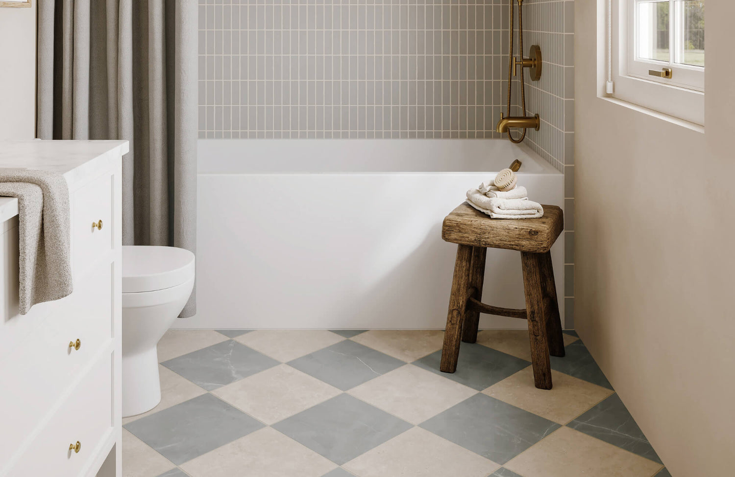
Diagonal and Offset Checkerboard Patterns
Beyond size, changing the direction of the checkerboard pattern can dramatically shift how a space feels and functions. The diagonal checkerboard, angled at 45 degrees, introduces movement and draws the eye outward, often making narrow or compact spaces feel more expansive. This orientation is particularly effective in entryways, galley kitchens, and hallways where flow and elongation are key.
That said, diagonal layouts require meticulous planning. To maintain symmetry, installers often begin from the center of the room and work outward, and due to the angled cuts at the edges, a slightly higher waste factor should be anticipated. Still, the payoff is visual sophistication and unexpected elegance.
A strong example of this execution is Edward Martin’s Palmer 12x12 Checkerboard Matte Porcelain Tile in White and Grey above. Used diagonally in a transitional kitchen, this combination of cool grey and warm white adds soft contrast and dimension, while the 12x12 format offers the flexibility needed for precision cuts and clean grout lines.
For a more casual, modern vibe, offset checkerboard patterns offer a compelling alternative. By staggering rows, either by half or a third of a tile, designers break up the rigid grid and introduce a more fluid, organic rhythm. Offset layouts are especially appealing in boho-inspired interiors where a softer structure is desired. Additionally, mixing finishes like matte and gloss within an offset layout can enhance depth and tactile interest without adding visual clutter.
Integrating Checkerboard Flooring Throughout the Home
While once reserved for standalone statements, checkerboard flooring is now being embraced as a cohesive design element across entire homes. Integrating the pattern into multiple rooms requires careful attention to visual flow, functionality, and contextual tone. For instance, a striking checkerboard in the foyer can establish a design theme that subtly echoes in a kitchen or bathroom, perhaps through a variation in color or tile scale. This creates a sense of continuity without feeling overly repetitive.
In open-plan layouts, checkerboard patterns offer an elegant way to delineate functional zones, such as distinguishing the dining space from the living area, without erecting physical barriers. Paired with ceiling treatments or lighting changes, this strategy reinforces spatial transitions while keeping the overall design cohesive and open.
To simplify the design process, Edward Martin’s Augmented Reality (AR) Visualization Tool offers a user-friendly way to preview tile selections in real-time. By tapping “View in Your Space,” you can superimpose chosen checkerboard tiles into your actual rooms using a mobile device. This added layer of interactivity helps visualize scale, pattern direction, and light interaction, making layout decisions more informed and intuitive. Once a favorite is selected, physical tile samples can be delivered, bridging the gap between digital planning and hands-on confidence.
Moreover, designers are now incorporating transitional techniques, where checkerboard patterns gradually shift into other layouts, such as herringbone or parquet, between rooms. Using border tiles or color modulation, these transitions maintain cohesion while enhancing visual intrigue. Even utilitarian spaces like laundry rooms, walk-in closets, and covered patios are getting checkerboard makeovers, transforming often-overlooked zones into stylish and energizing areas.
To ensure professional-level results, consistency in technical specs, such as tile thickness, edge profiling, and substrate preparation, is essential. Factors like slip resistance, thermal compatibility (for radiant heating), and the strategic placement of expansion joints must all be addressed to preserve the floor’s performance and aesthetic over time.

Styling Your Space Around Checkerboard Floors
Designing around a checkerboard floor means striking the right balance between boldness and cohesion. With the right furniture, textures, and accents, you can elevate the pattern without letting it overpower the space.
Furniture Considerations for Checkerboard Spaces
The structured, high-contrast geometry of checkerboard flooring sets a foundational rhythm in a room, which should be taken into account when selecting furniture. To support rather than compete with this visual structure, streamlined furniture silhouettes work best, especially those with clean lines, open bases, and minimal ornamentation. Mid-century modern, Scandinavian, and contemporary pieces are particularly well-suited, as their leggy, elevated forms allow more of the floor pattern to remain visible, preserving the clarity of the layout.
Beyond form, materiality is equally essential. Wood tones, ranging from natural oak to deep walnut or painted finishes, can soften the tile’s formality and introduce organic warmth. For cohesion, furniture legs should subtly contrast with the tiles beneath them. For instance, brass or matte black bases add visual punctuation without overpowering the checkerboard. In addition, upholstered furniture in solid, textured fabrics like bouclé, linen, or velvet brings a tactile layer that complements the flooring while allowing the pattern to remain a focal point.
When working with colored or patterned checkerboard tiles, it’s helpful to reference the secondary or tertiary tones in the floor when choosing furniture finishes or upholstery. This color echo anchors the palette and creates harmony. However, avoid overly ornate carvings or heavily patterned fabrics, which can clash with the geometric discipline of the tile.
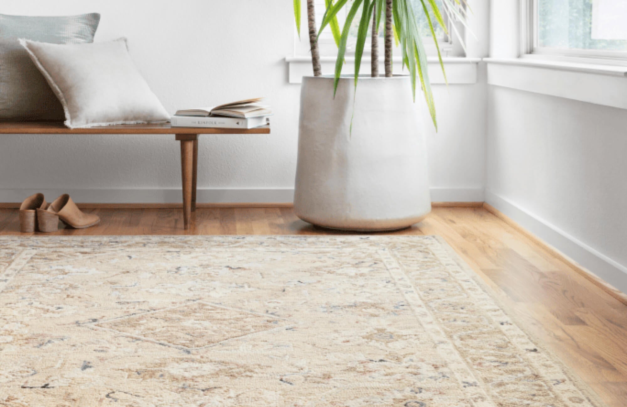
Rug Placement and Layering on Checkerboard
Once furniture is selected, rugs offer another layer of opportunity, both to soften the space and elevate its design without diminishing the impact of the checkerboard. When layering rugs over patterned tile, proportion and transparency are key. Opt for rugs that frame rather than cover the floor design, such as medium-sized area rugs or runners with open borders that reveal the underlying pattern.
To balance the grid-like precision of the tiles, natural fiber rugs like jute or sisal introduce welcome texture and warmth. Their neutral tones ground the space while allowing the floor to shine. In dining areas, it’s important to select rugs large enough to accommodate fully pulled-out chairs, maintaining both function and visual balance.
From a practical perspective, transparency and pile height also matter. Low-pile or flatweave rugs prevent tripping hazards and allow lighter checkerboard tiles to subtly show through. Open-weave styles or Moroccan-inspired lattice patterns can also work well, echoing the geometry without directly competing with it.
For those who prefer less traditional layering, consider irregularly shaped options like cowhides or sheepskin throws. Their organic contours break up the rectilinear layout of the checkerboard, adding softness and visual contrast without diminishing the floor’s structure.
Wall Colors and Accent Decor to Enhance Checkerboard
Just as rugs and furniture define the floor plane, wall treatments and accent decor complete the spatial composition. These elements should either harmonize with the checkerboard’s palette or introduce complementary contrast that feels intentional and refined. For black-and-white patterns, walls in warm neutrals, such as beige, cream, or taupe, soften the contrast and introduce balance.
When the checkerboard involves color, walls painted in complementary or analogous hues help create design continuity. For instance, dusty pink or clay-toned walls beautifully enhance terracotta-based floors, while soft greys or muted greens pair elegantly with cooler tones like navy or slate. In these cases, matte or eggshell finishes are ideal for diffusing light and adding understated depth.
To elevate bold contrasts, Edward Martin’s Leona 24x24 Checkerboard Matte Porcelain Tile in Calacatta and Nero Marquina offers a striking yet sophisticated update. Its marble-look finish infuses bathrooms and entryways with drama and refinement. In the example shown above, neutral plaster walls and brass fixtures counterbalance the pattern’s intensity, showcasing how thoughtful styling can frame even the boldest designs with elegance.
When selecting accent decor, consider the geometry of the floor. Mirrors, sconces, and artwork should align with or complement the grid. Round or asymmetrical mirrors can soften angular lines, while grid-based gallery walls reinforce the rhythm of the checkerboard. Finishes like aged brass, chrome, or brushed nickel can act as visual connectors between warm and cool tones. Finally, minimalist decor, like sculptural planters, open shelving, or curated decorative objects, adds vertical interest without visual clutter. Leaving intentional negative space on both walls and floors allows the checkerboard pattern to breathe and maintain its impact within the overall design.
Timeless Pattern, Modern Possibilities
Checkerboard floors may have centuries-old roots, but their latest revival proves they’re anything but dated. With today’s expanded tile materials, fresh color combinations, and versatile layouts, this timeless pattern now adapts to nearly any setting, from bold commercial designs to quiet residential spaces. Whether you’re looking to make a dramatic entrance or subtly define zones throughout your home, checkerboard tiles offer both structure and creativity in one compelling format.
If you’re ready to bring this iconic style into your space, our team at Edward Martin is here to help. From tailored tile suggestions to layout planning, we’ll guide you toward a solution that reflects your design goals and fits your everyday needs. Contact us today to start planning your next project with confidence.
