


Checkerboard floors bring timeless charm and striking character into any space. Their bold contrast and iconic geometry make them instantly memorable, but that same visual strength can sometimes feel overpowering, especially if the surrounding elements aren't thoughtfully considered.
You're in the right place if you're wondering how to calm the pattern without losing its charm. In this article, we'll walk you through the design-smart techniques to help your checkerboard floors feel intentional, not overwhelming. From color palette refinements to layout tweaks, this guide is packed with practical, stylish strategies to make your space feel balanced and refined.

The Psychology Behind Checkerboard Floors
The sharp contrast of colors and patterns on checkerboard floors has a significant psychological impact on the human eye. The alternating squares create a sense of movement and energy, engaging the eye and making the room feel dynamic and lively. However, this dynamism can easily become overwhelming if not managed carefully, especially in smaller or more enclosed spaces where the bold pattern might dominate the room.
The way light and shadow interact with checkerboard floors can further amplify their visual intensity. Dark squares tend to recede, while lighter squares seem to advance, creating depth and a three-dimensional feel. Although this can be visually interesting, it may also contribute to a sense of chaos or disorientation if the room lacks balance in other design elements. This is especially true in smaller spaces where a busy pattern can make the room feel cramped.
The choice of colors used in checkerboard patterns significantly affects the room’s overall mood and energy. High-contrast color schemes, such as black and white, create drama and impact. While this can be effective in certain spaces, it may overwhelm rooms with limited natural light. In such cases, softer, muted tones or more subdued color combinations can help create a calming and welcoming environment. Understanding these psychological effects enables anyone designing a space to make informed choices that align with their aesthetic goals and desired atmosphere.
Now that we understand the psychological impact of checkerboard floors, it's crucial to explore how we can harness this energy and movement in a balanced way that doesn’t overwhelm the space.

Grounding the Pattern Through Design
Checkerboard floors can make a bold statement, but without the right balance, they can also overwhelm a room. It’s important to thoughtfully coordinate the surrounding design elements to keep the pattern feeling intentional and refined, not chaotic. Color, texture, furniture scale, and proportion all play a role in creating a harmonious space.
Adjusting the Color Palette
Color plays a foundational role in how busy your checkerboard floor feels. If you're working with stark black and white, the floor will command attention, whether you want it to or not. To soften the effect, we recommend experimenting with toned-down pairings like warm grays, ivory, or taupe. These combinations still offer contrast, but they’re gentler on the eyes.
Using a tone-on-tone palette, such as cream and beige or light grey and soft charcoal, can reduce visual tension while maintaining the geometric charm. This gives the checkerboard layout a more relaxed presence in the room and helps it blend more organically with your overall design.
A great illustration of this subtle palette approach is shown in the photo above, where Edward Martin’s Palmer 12x12 Checkerboard Raw Porcelain Tile in White and Grey achieves a graceful balance between sophistication and restraint. Its soft grey and off-white tones work in harmony to create a checkerboard floor that feels refined yet grounded. Rather than commanding the entire scene, the pattern enhances the setting by quietly complementing the surrounding natural textures and muted furnishings. This thoughtful color pairing allows the space to feel open and inviting while preserving the timeless appeal of the checkerboard layout.
Choosing the Right Furniture
Once your floor is established, the next step is styling the space around it. Oversized, heavily carved furniture can easily clash with a checkerboard floor. Instead, think in terms of lines and silhouettes. Streamlined pieces in modern or mid-century styles work beautifully here. They provide structure without creating extra competition for the eye.
Open-frame chairs, minimal wood tables, and glass elements are ideal choices. They can add a function without introducing bulk. Choosing furniture with simple legs or subtle hardware allows the checkerboard floor to shine in the background, not fight for attention.
Consider Scale and Proportion
We often see rooms where the checkerboard layout works in theory but feels cramped or jarring in practice. Why? Because the scale of the furniture and the size of the tile aren’t in sync. If your checkerboard tiles are large but the furniture is petite and scattered, the floor will end up overwhelming everything.
To avoid this, make sure your furniture fills the space comfortably without overloading it. Open-leg sofas and tables can create visual lightness, letting the grid of the floor breathe. When everything’s proportional, checkerboard tiles, furnishings, and even ceiling height, the result is effortlessly balanced.

Introducing Pattern Variation
Varying how a checkerboard floor is laid out can make a significant difference in how bold or subtle it feels. By rethinking tile size, orientation, and visual breaks, you can create a more relaxed and inviting atmosphere without losing the character of the pattern.
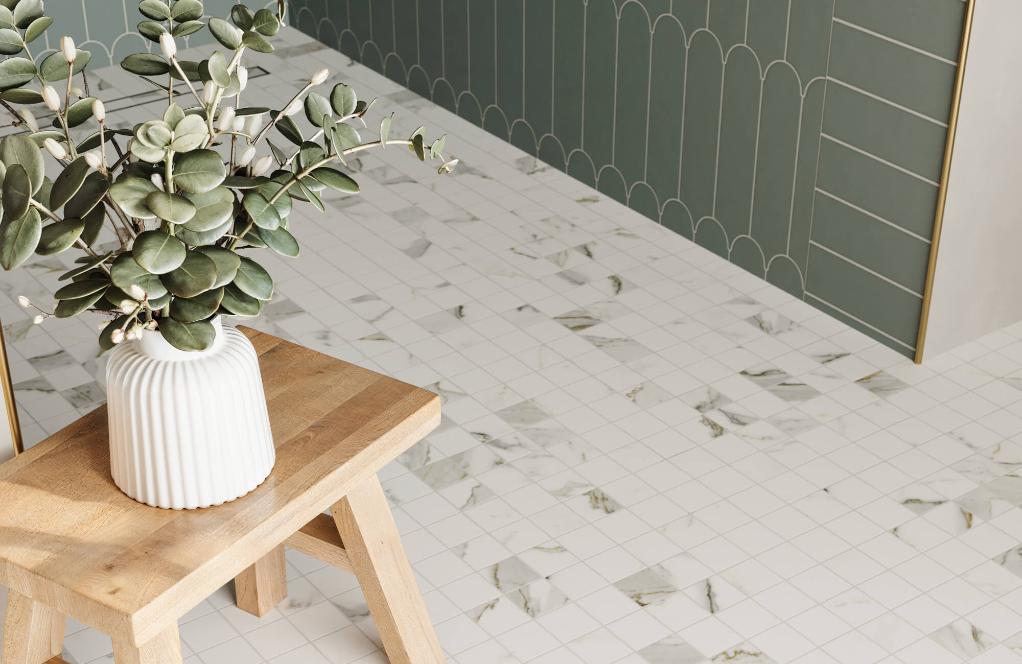
Change Tile Size or Orientation
Tile size has a direct impact on how strong a checkerboard pattern feels. Smaller tiles create a denser, busier effect, while larger ones allow for more breathing room and a sense of openness. If you're just beginning your tile journey, consider upsizing the squares. A 24x24 checkerboard layout, like Blair, feels more expansive and less visually intense compared to the tighter rhythm of a 12x12 format.
Orientation also plays a key role in softening the floor’s impact. Rather than sticking with a straightforward grid, shifting the layout to a diagonal pattern introduces gentle movement and flow, which helps the room feel more relaxed.
A great example of this approach is the serene bathroom above, where Edward Martin’s Brody 24x24 Checkerboard Matte Porcelain Tile in Sand and Dune creates a look that’s both refined and calming. Its large tile size laid diagonally softens the pattern and opens up the space. Paired with warm, earthy tones, the checkerboard feels subtle and supportive, ideal for a setting where relaxation and simplicity are the focus.
Break Up the Pattern
Even if your checkerboard floor is already installed, there are still effective ways to reduce its visual dominance. By introducing elements that interrupt the continuous grid, like area rugs, floor mats, or thoughtfully arranged furniture, you can create moments of visual pause that help ground the space. For instance, placing a neutral rug beneath a coffee table draws the eye inward, softening the pattern’s intensity and adding definition to the room’s layout.
This technique is also useful in transitional spaces such as entryways or dining areas, where defining specific zones can help the pattern feel more intentional. Rather than trying to cover the floor completely, the goal is to create natural breaks that ease the eye and restore balance within the room.

Lighting and Natural Elements
Lighting also plays a critical role in how a checkerboard floor is perceived. By adjusting lighting and incorporating natural elements, you can create a more balanced and harmonious environment, allowing the bold pattern to shine without overwhelming the room.
Embrace Natural Light
Natural light changes everything. When sunlight streams into a room with checkerboard flooring, it softens the contrast and reveals the finer details of the tile’s design. If your space allows, keep windows clear of heavy treatments and opt for sheer curtains that filter light gently while maintaining privacy.
This diffused light helps break up the pattern’s intensity and allows subtle shadows to shift across the surface, adding warmth and depth to the room. For anyone planning a renovation, it’s worth considering how window placement and natural light cycles shape the feel of the space.
A beautiful example of this effect can be seen in the bathroom above, where Edward Martin’s Leona 12x12 Checkerboard Matte Porcelain Tile in Calacatta and Amani Grey benefits from generous sunlight pouring through floor-to-ceiling windows. Soft marble veining and a muted matte finish respond beautifully to the light, highlighting the tile's elegant contrast without overwhelming the space. Together, these elements create a room that feels open, calming, and effortlessly refined.
Use Layered Artificial Light
Natural light certainly helps soften bold flooring, but artificial lighting is equally important, particularly in rooms that receive little to no sunlight. Relying solely on overhead fixtures often casts harsh shadows that exaggerate the checkerboard pattern, making it feel more intense than intended.
To counterbalance this, incorporate a variety of light sources throughout the space. Table lamps, wall sconces, and under-cabinet lighting offer a softer, more diffused glow that gently offsets the floor’s geometry. Opting for warm-toned bulbs helps ease the contrast between dark and light tiles, contributing to a calm, cohesive ambiance. Dimmers can further enhance this effect by giving you full control over the light’s intensity, allowing you to adapt the mood and functionality of the space throughout the day.
Add Plants and Organic Decor
Incorporating natural elements is a simple yet highly effective way to bring softness and balance to a checkerboard floor. The crisp lines and repeating geometry can sometimes feel rigid, but nature has a way of easing that visual tension. Greenery, especially plants with large, expressive leaves, introduces a sense of calm while adding texture and movement to the space. Options like fiddle-leaf figs, peace lilies, or trailing pothos are particularly effective at softening hard edges and breathing life into the room.
For added visual interest, try placing a tall plant in an unused corner or hanging planters near a window to draw the eye upward. These organic shapes also naturally contrast with the angular layout of the tiles, creating a more dynamic and layered environment. To reinforce a grounded, soothing atmosphere, consider incorporating natural accessories like woven baskets, rattan planters, or wooden stools, each adding warmth and subtle texture without overpowering the space.

Visual Anchoring and Focal Points
When a checkerboard floor starts to dominate the room, shifting the visual focus can help restore balance. A well-placed focal point naturally draws the eye away from the floor and invites attention upward or across the space. This might be a large abstract painting centered above a console table, a gold-framed mirror catching soft natural light near a window, or a sculptural pendant light suspended over a dining table. Even architectural features like an arched built-in bookcase or a stone-clad fireplace can also serve as anchors that guide the eye and establish a visual destination.
For instance, in the living room above, visual hierarchy is carefully orchestrated through thoughtful layering. The fireplace takes center stage, flanked by symmetrical wall art and accessorized with tall candlesticks and sculptural décor. A rounded mirror subtly reflects light while directing attention upward, balancing the strong checkerboard pattern underfoot.
The ceiling’s exposed beams echo the floor’s geometry without competing with it, while the warm palette of neutrals and wood tones keeps the overall mood grounded and cohesive. This kind of composition allows the checkerboard floor to support the room’s design instead of overpowering it, creating a space that feels intentional, relaxed, and beautifully layered.
To make the design process easier and more intuitive, our AR tool lets you try different tile designs in real time to see how colors, patterns, and textures work together in your space. It’s a simple way to explore complementary layouts or accent features that enhance your checkerboard floor, without the guesswork.

Choosing the Right Tile Finish to Soften the Look
The finish of your tile plays a subtle but powerful role in how a checkerboard floor is perceived. From matte to polished surfaces, the right finish can either tone down the pattern or make it feel more pronounced, affecting the look and atmosphere of the space.
Matte vs. Polished Finishes
Light interacts uniquely with different tile finishes, and that subtle shift can have a big impact on how your checkerboard floor is perceived. Matte checkerboard tiles absorb light, resulting in a softer, more muted appearance that naturally reduces contrast. On the other hand, polished checkerboard tiles reflect light, which enhances the definition between squares and gives the floor a brighter, more dynamic presence.
If you're going for a calm, refined look, matte finishes are a great choice. They can help diffuse harsh reflections and work well with soft lighting and textured materials. Polished finishes, while elegant and bold, are best suited for larger rooms where their reflective quality adds sophistication without overwhelming the design.
Function and Feel
When it comes to checkerboard flooring, the material’s function and surface texture can significantly affect how the pattern performs in daily life. Matte porcelain tiles are especially well-suited for checkerboard layouts because they offer durability without demanding attention. Their non-glossy finish helps tone down the contrast between alternating tiles, allowing the pattern to feel soft and grounded rather than sharp or overpowering. These checkerboard tiles resist stains, handle wear with ease, and maintain their appearance over time, making them a smart, low-maintenance option for active spaces.
For those who prefer a more refined look with a hint of natural stone character, marble look porcelain brings both style and practicality. In a checkerboard layout, the gentle veining of these tiles adds subtle texture without disrupting the rhythm of the pattern. The finish also offers just enough surface variation to catch the light in a muted way, striking a thoughtful balance between elegance and everyday comfort.
Bringing Balance to Bold Floors
Checkerboard floors don’t need to overpower a room to make an impression. With the right combination of design elements, balanced lighting, well-scaled furniture, soft color palettes, and thoughtful layering, you can create a space that feels visually striking and comfortably grounded. These strategies allow you to highlight the charm of checkerboard patterns without letting them dominate, whether you’re refreshing an existing space or planning a new one from the ground up.
If you're ready to find the perfect tile to complement your design goals, we're here to help. From selecting finishes to exploring personalized samples, we’ll guide you every step of the way. Contact us to start designing a space that feels as balanced as it looks!
