


The right rug color does more than complete a room; it transforms it. Whether you're refreshing a space or designing from scratch, your rug sets the tone, enhances the atmosphere, and quietly anchors the entire layout. But with so many hues and trends to consider, making the best choice can feel more like a guessing game than a design decision.
This article takes out the guesswork. From the emotional impact of color to the practical ways rugs shape space and movement, you'll uncover how each shade plays a role. Whether you're aiming for calm, energy, or timeless elegance, the following insights will help you choose a rug color that feels as good as it looks and that lasts beyond passing trends.

The Psychological Power of Rug Colors
Color shapes mood, perception, and even behavior. Rugs, being large and central decor elements, have a profound impact on the emotional tone of a room. Understanding how color psychology applies to your rug selection will help you choose hues that support the atmosphere you’re aiming to create.
The Energetic Spectrum of Warm Colors
When you want to energize a space and make it feel alive, warm colors offer an immediate boost. Shades like scarlet, amber, and terracotta naturally stimulate conversation and movement, making them a smart choice for areas where people gather. A bold rug in fiery red or copper can also command attention and spark liveliness, instantly transforming an otherwise neutral space into one that buzzes with energy.
That said, you don’t need to go bright to feel the benefits. Softer warm tones such as peach or goldenrod bring the same sense of welcome and warmth, just in a gentler way. Rugs like our Georgette Polyester Pile Rug in Desert / Multi feature layered warm hues like sand, clay, and soft rust, that create movement without overwhelming the room. Perfect for living or dining spaces, it invites connection and comfort while introducing a radiant, sun-washed energy that feels timeless and inviting.
The Soothing Influence of Cool Tones
Cool tones offer a sense of retreat, inviting you to slow down and breathe. Whether it’s the soft embrace of powder blue or the tranquil hush of sage green, these shades help anchor a room in calm. In spaces where rest and relaxation matter most, such as bedrooms, study areas, or even quiet entryways, cool-colored rugs create a visual sigh of relief.
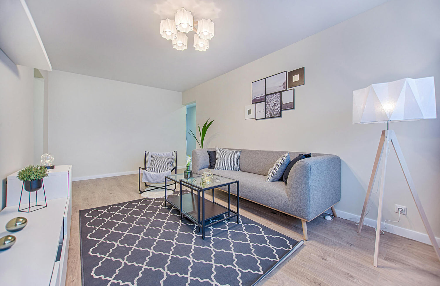
Darker, cool tones can deepen that experience. Navy or emerald adds a layer of sophistication and stillness, especially when paired with natural textures or minimal décor. For example, our Liddy Polyester Pile Rug in Graphite / Pearl, shown in the image above, offers a serene charcoal tone, which is commonly associated with balance and clarity that gently grounds a room without overpowering it. Even when used in small doses, these colors bring a sense of collected ease that’s hard to replicate with other palettes. If you’re looking to cultivate focus or encourage a reflective mood, cool hues are a subtle yet powerful tool.
Strategic Color Application Beyond Basic Hues
Choosing the right rug color isn’t only about picking a single shade. It’s also about how that color interacts with everything around it. By applying color theory, you can use complementary, analogous, or monochromatic schemes to evoke depth or harmony. A rug doesn’t just sit beneath your feet; it weaves into the broader narrative of your space.
Lighting, undertones, and material also shift how a color behaves. A dusty rose may feel romantic in daylight but muted under warm bulbs, while a gray-blue might lean green in certain shadows. Paying attention to these subtleties ensures that your rug not only looks good but feels right in its environment. When you approach color with intention, your rug becomes a statement that echoes your emotional goals for the room.

Choosing Rug Colors by Room Use
Different rooms call for rugs that do more than look good—they need to enhance functionality and elevate mood. By aligning your rug’s color with how each space is used, you create rooms that feel intentional and effortlessly cohesive.
Rug Hues for Busy Zones
In areas that experience constant use, like hallways, foyers, and entrances, rug colors need to work overtime. Deep, grounding shades such as espresso, navy, and charcoal are ideal because they naturally hide dirt, debris, and signs of wear. You can push this even further with richly patterned designs. Medallions, geometrics, or distressed motifs don’t just add visual interest; they subtly disguise footprints, scuffs, or spills that would otherwise stand out.
Building on that practicality, the beauty of using darker tones and intricate patterns is that they’re as stylish as they are functional. Take, for instance, our McGowan Polyester & Polypropylene Pile Rug in Moss / Sand, featured in the photo above. Its earthy olive-gray tone and softly textured pattern lend an organic feel while standing up to the demands of busy areas. Placed in an elegant foyer like the one shown, it grounds the space with warmth and character, offering resilience without sacrificing refinement. If you want a space that always looks polished, even during the busiest days, these hues offer the perfect foundation.
Stain-Concealing Colors for Dining Areas
Dining spaces come with their own set of challenges, where spills and splashes are simply part of the experience. Rug colors in these areas need to be forgiving yet visually harmonious. Earthy hues like sienna, ochre, and umber bring warmth to the room while naturally concealing food stains. When combined with multicolored or speckled patterns, these shades help draw the eye away from imperfections and keep your space looking put-together.
What makes this approach so effective is its blend of form and function. The right rug complements your dining table and chairs without becoming too precious to use. A marbled or abstract design can even become a conversation piece, serving as both backdrop and focal point, while handling everyday mishaps with quiet resilience.
Soothing Tones for Restful Bedrooms
Your bedroom should feel like a refuge, and rug color plays a key role in shaping that peaceful atmosphere. Soft pastels such as blush, lavender, and sky blue gently lower the visual temperature of the space. These shades invite you to unwind, making it easier to transition from the chaos of the day to restful stillness. When paired with plush textiles and layered bedding, the result is a space that nurtures rest and calm.
These tranquil tones also support versatility. Whether your bedroom leans minimalist or luxurious, pastel rugs create a quiet base that enhances everything around them. With every step, you’re reminded that this room is meant to restore, not energize. And that subtle emotional shift is exactly what makes these hues so impactful.
Mid-Tone Rugs for Dynamic Living Spaces
In living rooms where functionality and style intersect, mid-tone or neutral-toned rugs strike the right balance. Shades like denim blue, olive green, and stone gray offer enough depth to anchor your layout while remaining flexible as your décor evolves. These hues can adapt seamlessly to seasonal changes, whether you're adding bold summer accents or cozy winter layers.
Mid-tones also lend a sense of grounded calm without being too dominant. A perfect example is our Haverford Polyester Pile Rug in Bronze / Oat, which blends soft taupe and bronze tones to create a warm, versatile base. It ties together various textures and colors without overshadowing them, making it an ideal centerpiece for any living space where balance, comfort, and style come together. When your rug sits at the center of it all, a well-chosen neutral tone ensures it always feels just right.

Harmonizing with Existing Decor
Your rug doesn’t have to spark a complete redesign. It can quietly unify everything you already love. When chosen thoughtfully, its color becomes the connective thread that elevates the room’s overall harmony and visual flow.
Employing the 60-30-10 Rule for Chromatic Harmony
One of the most effective ways to ensure visual balance is by following the timeless 60-30-10 rule. This guideline helps distribute color in a way that feels intentional and aesthetically pleasing. Your rug can serve as the 30% or even the 10%, playing a supportive yet transformative role. In a space dominated by neutral tones, such as beige walls and sage-green upholstery, a burgundy or deep plum rug acts as a sophisticated bridge, adding contrast without clashing.
This method works particularly well when the rug offers a thoughtful mix of hues. Depicted in the photo above, our Georgette Polyester Pile Rug in Clay / Navy, for instance, combines earthy clay with a deep navy base, bringing just enough warmth and richness to complement an existing palette without overwhelming it. Rather than competing with other elements, this rug enhances them, completing the room like a final brushstroke on a canvas.
Deriving Color Cues from Existing Textiles and Art
Your current décor holds all the inspiration you need. Look closely at the colors in your throw pillows, drapery, or wall art. These details can guide your rug choice in a way that feels organic. By echoing those tones in the rug, you weave visual connections that make the space feel cohesive rather than pieced together.
This technique is especially useful when your room already has a strong character. Instead of overwhelming it with a bold new focal point, your rug can act as a subtle reinforcement of what's already working. A rug that picks up the dusty pink in a floral print or mirrors the navy from a patterned cushion helps tell a more unified story across your space.
Subtly Echoing Metal and Wood Finishes in Rug Undertones
Even the undertones of your rug can quietly reinforce the room’s character. Warm finishes like brass, bronze, or cherry wood are beautifully complemented by rugs with golden, rust, or caramel undertones. On the other hand, cooler finishes such as brushed nickel, chrome, or gray-washed wood pair best with rugs that lean toward icy sage, dove gray, or soft lavender.
These subtle echoes don’t need to be obvious to be effective. In fact, it’s the quiet alignment between tones that elevates the overall design. When your rug’s undertone reflects the room’s finishes, it blends in seamlessly, creating an understated sense of unity. It’s a detail most might not consciously notice, but it’s one that makes the entire space feel expertly put together.

Creating Visual Interest Through Placement and Contrast
How your rug interacts with flooring, natural light, and architectural elements can transform the mood and perception of a room. Placement and contrast don’t just shape style; they influence how a space feels, flows, and functions.
Creating Definition Through Floor Contrast
When it comes to clarity in a room’s layout, contrast between the rug and flooring makes all the difference. A deep-toned rug against pale wood or tile creates immediate definition, visually anchoring the space and signaling purpose. This technique works especially well in areas where you want to draw attention to a specific function or gathering point, such as a sitting area or reading nook.
Our Hutchinson Polyester Face Rug in Burgundy / Khaki, illustrated above, shows this effect beautifully. Its rich burgundy palette layered with soft khaki undertones creates a warm contrast against lighter hardwood floors, defining the space with both elegance and intention. The subtle yet detailed pattern also adds texture and depth, helping the rug stand out while enhancing the natural flow of the room. When contrast is used with care, every element feels purposeful, and the entire space gains clarity and cohesion.
Enhancing Spatial Flow with Pattern and Direction
A pattern can direct the way your eye moves through a room. Rugs featuring linear patterns like stripes, herringbone, or chevron can elongate tight spaces or subtly guide attention toward key architectural features. Whether you want to highlight a fireplace, a window with a view, or a standout piece of furniture, directional designs create a sense of motion and rhythm.
This movement not only enhances the room’s flow but also makes it feel more dynamic and thoughtfully composed. Even in smaller areas, the right pattern can shift perception, adding visual depth, stretching proportions, and helping the space feel larger or more intentional without any physical changes.
Bold Rugs in Open-Concept Spaces
In open-concept homes where walls don’t define each room, your rug becomes a crucial tool for establishing boundaries. A bold or vividly patterned rug placed beneath a dining table or sectional couch, for instance, instantly carves out a distinct zone, signaling a functional area without the need for partitions.
This method keeps the space visually open while still providing structure. It helps each area serve its purpose while maintaining an overall flow. The contrast in style, color, or pattern between rugs in adjacent zones can also create a pleasing visual transition, letting one space blend into the next without losing identity. With the right placement, your rug becomes both anchor and guide, keeping your open layout feeling balanced and beautifully connected.

Rug Colors That Shift Perception of Space
Rug color actively alters how a room feels in terms of size, shape, and ambiance. With a thoughtful approach to color, you can visually manipulate space to better suit your needs and mood.
Light-Colored Rugs for Spatial Amplification
If you're working with a compact or dimly lit room, a light-colored rug can open it up almost instantly. Shades like ivory, soft beige, or pale gray reflect natural and artificial light, creating a sense of airiness that lifts the entire space. The eye also reads these hues as expansive, allowing the floor to recede slightly and give the impression of more square footage.
This effect is especially powerful in spaces with low ceilings or limited windows. A light rug helps blend the floor into the surroundings, turning it into an extension of the walls rather than a visual boundary. Whether you’re designing a studio apartment or a snug guest room, these colors make the area feel less confined and more breathable.
Dark Rugs for Intimate Enclosures
On the opposite end of the spectrum, dark rugs are your ally when you want to add intimacy and grounded comfort. Deep colors like charcoal, espresso, or navy absorb light, making large or lofty rooms feel more contained and enveloping. This creates a sense of warmth that draws you in, making even expansive spaces feel more human and approachable.
In more traditionally segmented rooms, dark rugs can be just as transformative. A piece like our Georgette Polyester Pile Rug in Spice / Indigo, depicted in the picture above, demonstrates how rich, moody tones can bring soul and texture to smaller spaces like entryways or sitting areas. Its blend of inky blue and warm spice tones adds depth and character, making the space feel instantly more personal and layered. The result is a quietly cocooned atmosphere, perfect for areas where you want to slow down, settle in, and enjoy a sense of intentional calm.

Navigating Trends Without Losing Timelessness
Rug colors shift with style movements, just like wall paint or furniture fabrics. The key is knowing how to embrace what’s current without locking yourself into a look that quickly feels outdated. With the right approach, you can enjoy fresh trends while keeping your space grounded and enduring.
Smaller Rugs for Low-Commitment Style
If you’re drawn to a trending hue but hesitant to commit fully, smaller rugs offer the ideal testing ground. A 3x5 rug or a hallway runner in a bold color gives you a pop of freshness without overwhelming your space or your budget. These compact rugs are also easy to swap out and can be repositioned or layered as your tastes evolve.
Entryways, bathrooms, and accent corners are perfect spots for these design experiments. They allow you to enjoy the energy of trending colors in doses that feel fun rather than risky. Should the trend fade, you can rotate the piece elsewhere or replace it without disrupting your entire color scheme.
Harmonizing Trendy Shades with Timeless Foundations
To create a space that evolves gracefully, look for rugs that blend trendy accents into a classic base. A neutral rug, such as beige, ivory, or soft gray, infused with threads of a fashionable hue, adds just enough visual interest to feel current. For example, hints of burnt orange woven into a taupe background can bring seasonal flair without taking over the room.
This approach also keeps your core palette stable, allowing you to swap out surrounding accents like throw pillows or artwork without needing a full redesign. It’s a way to enjoy the best of both worlds: the freshness of a trend and the confidence of timeless design.
Opting for Versatile Variations of Popular Hues
Trendy colors don’t have to be loud to feel relevant. Often, a more muted or nuanced version of a popular shade delivers the same visual appeal with far more staying power. Instead of bright teal, opt for dusty turquoise. Rather than neon pink, consider a soft rose blush. These toned-down alternatives bring subtle sophistication that can carry through multiple seasons and style updates.
This kind of versatility also makes your space feel elevated rather than reactionary. You still get the satisfaction of tapping into what’s new, but in a way that feels mature and adaptable, not impulsive. It’s a smart strategy for building a look that lasts.
Cultivating Seasonal Variety Through Rug Rotation
One of the simplest ways to keep your space visually fresh without sacrificing long-term appeal is through seasonal rug rotation. Use lighter, brighter tones during spring and summer to create an open, airy feel, then switch to richer, deeper colors in fall and winter to invite warmth and comfort.
This practice extends the life of each rug while letting you respond to changes in mood, light, and temperature throughout the year. It also helps you enjoy a broader range of colors and styles over time, without the pressure to choose one look and stick with it. With thoughtful rotation, your rugs become part of a dynamic, evolving design story that never feels stagnant.
How to Choose With Confidence
Choosing the best rug color begins with understanding your space—how it feels, functions, and flows. It’s not just about what’s popular or what matches your sofa. It’s also about using color to shape emotion, balance practicality, and enhance the story your space tells. With thoughtful coordination, a touch of creativity, and attention to purpose, your rug becomes more than decor. It becomes a defining feature that ties your space together with style and lasting impact.
If you’re still unsure where to begin or need help refining your vision, our team is here to support you. Whether you’re selecting from our curated rug collections or seeking personalized guidance for a unique project, we’re just a message away. Reach out to us with your questions, ideas, or design goals. We’re ready to help you choose with clarity and confidence.