The checkerboard pattern, with its classic black and white squares, has long been a staple in interior design. Its stark contrast creates a visually striking focal point, while its geometric structure lends itself to various design styles. However, the traditional black and white palette has often limited its application. What if we dared to break the mold? Can we truly mix and match colors with checkerboard tiles, or is this a design faux pas waiting to happen? In this article, we’ll explore the world of color theory, design principles, and practical considerations to answer this intriguing question. By introducing a spectrum of colors, we open up a world of possibilities for personalization and creativity.
Exploring the Checkerboard Pattern and Its Impact on Design
Before we go over the exciting color combinations you can apply to your checkerboard pattern, let’s first examine its historical significance and key design elements, revealing why it remains a timeless and versatile choice in design.
The Psychology of Black and White
The checkerboard, a stark juxtaposition of black and white squares, is a potent visual tool. Black, often associated with power, formality, and sophistication, can also evoke feelings of mystery and depth. White, conversely, symbolizes purity, innocence, and clarity. It provides a stark contrast that makes the black pop, enhancing visual impact. Together, these colors create a dynamic tension that can be both stimulating and calming, depending on the context.
Psychologically, the checkerboard can influence perception in several ways. The high contrast between the squares can create optical illusions, making the pattern appear to move or change. This visual stimulation can be engaging and attention-grabbing. Moreover, the repetitive nature of the pattern can induce a hypnotic effect, potentially leading to feelings of relaxation or focus.
The Checkerboard’s Role in Design History
The checkerboard pattern has a rich history, dating back to ancient civilizations. Early examples can be found in textiles, ceramics, and architecture. In ancient Egypt, for instance, checkerboard motifs adorned tombs and artifacts, suggesting their significance in religious and cultural contexts. Fast forward to the Renaissance, and the checkerboard resurfaces in artistic and decorative applications. Its geometric precision aligned with the period’s fascination with order and symmetry. The pattern also continued to be popular throughout subsequent centuries, finding its way into fashion, interior design, and product design. Today, the checkerboard remains a versatile design element. It can be incorporated into both minimalist and maximalist aesthetics, offering endless possibilities for creativity. From bold, graphic patterns to subtle accents, the checkerboard continues to captivate and inspire.
Key Design Elements of a Checkerboard
A checkerboard is defined by its square shape, which provides stability and balance with its equal sides, contributing to the overall symmetry of the pattern. The equal proportions of these squares create harmony and rhythm, ensuring the pattern's visual impact and recognition. Finally, the contrast between alternating black and white squares enhances visibility and dynamism, making the checkerboard pattern both striking and effective in creating optical illusions and psychological effects.
Color Theory as Foundation for Mixing
Color theory is the science and art of understanding how colors work together. It’s the backbone for artists, designers, and anyone who wants to create visually appealing compositions. Let's dive into the fundamental concepts.
Basic Color Theory Concepts
Basic color theory revolves around four fundamental concepts that are key to mastering color use in design. The first is hue, which refers to the pure color itself, such as black, blue, or green, and is the basic name we give a color. Saturation, also known as chroma or intensity, represents the purity or vividness of color; a highly saturated color appears bright and intense, while a desaturated color seems dull or muted. Value is the term used to describe the lightness or darkness of a color—adding white to a color increases its value, creating a lighter tint, while adding black reduces its value, resulting in a darker shade. Lastly, temperature classifies colors as either warm or cool; warm colors like red, orange, and yellow evoke energy and excitement, while cool colors like blue, green, and purple are often linked to calmness and serenity. Together, these elements form the foundation of color theory, helping you effectively mix colors and create the desired mood or visual impact in your work.
Color Harmonies
Color harmonies refer to combinations of colors that are visually pleasing and work well together in design. Several common types of color harmonies include complementary colors, which are opposite each other on the color wheel, like red and green or blue and orange; these pairs create high contrast and vibrant visual excitement.
Analogous colors are those adjacent to each other on the color wheel, such as blue, green, and yellow-green, resulting in harmonious and soothing color schemes. Triadic colors involve three colors that are evenly spaced on the color wheel, like red, yellow, and blue, or orange, green, and purple, offering a vibrant and dynamic visual appeal. Lastly, monochromatic color schemes use different variations of a single hue, differing only in saturation and value, to create a sophisticated and elegant look. By experimenting with these various color harmonies, designers can craft a wide range of visual effects and set the desired mood for their projects.
Color Psychology
Color psychology delves into how different colors influence human emotions and behaviors, revealing how each hue can evoke specific feelings and sensations. For instance, red is linked to energy, passion, and excitement, often stimulating appetite and increasing heart rate. Orange brings about enthusiasm, creativity, and warmth, and is associated with happiness and optimism. Yellow symbolizes joy, optimism, and energy, and can stimulate mental activity and draw attention. Green represents growth, harmony, and balance, often connected to nature and relaxation. Blue conveys calmness, trust, and reliability, though in large amounts, it may evoke sadness or loneliness. Purple is associated with luxury, creativity, and wisdom, with connections to spirituality and mystery. By understanding these psychological effects, you can select colors that align with your message and set the desired tone in your designs. Combining this knowledge with fundamental color theory concepts, you’ll be well-prepared to experiment with color mixing and create visually compelling and emotionally resonant compositions.

Exploring Color Combinations and Breaking the Mold
Color theory provides a solid foundation, but the true artistry lies in how we break free from its constraints and experiment with color combinations. Let’s delve into various color schemes and explore how to push the boundaries.
Analogous
Analogous colors sit side-by-side on the color wheel, creating harmonious and soothing palettes. Although traditionally known for their calming effect, these schemes can be infused with energy by varying the saturation and value of the colors. For example, combining a soft pastel green with a vibrant teal and a deep emerald green creates a dynamic yet cohesive checkerboard look. To add depth and interest, introduce a contrasting accent color from outside the analogous scheme. A pop of red or orange can invigorate a green-based checkerboard palette, while a touch of purple can elevate a blue-based one.
Complementary
Complementary colors are opposite each other on the color wheel, creating high contrast and visual excitement. Although bold and striking, these schemes can be overwhelming if not handled carefully. To soften the impact, try desaturating one of the colors or using it as an accent. Another approach is to introduce a neutral color like black, white, or gray to balance the intensity. For instance, pairing a vibrant red with a deep navy blue and off-white creates a sophisticated and modern checkerboard look.
For a softer interpretation of contrast, neutral pairings can also achieve a balanced and elegant checkerboard effect. Edward Martin’s Leona 24x24 Checkerboard Matte Porcelain Tile in Calacatta and Marfil offers a refined example by combining marble-inspired white tones with warm beige hues. As shown in the image above, this subtle contrast works beautifully in kitchens with light cabinetry, natural wood accents, and brass fixtures, creating a timeless checkerboard floor that adds visual interest without overpowering the space.
Triadic
Triadic color schemes involve three colors equally spaced on the color wheel, offering a balanced and energetic checkerboard composition. To prevent the scheme from feeling chaotic, choose one color as the dominant hue and use the other two as accents. Alternatively, experiment with different shades and tints of the triadic colors to create a more subdued look. Incorporating neutrals can also help to ground the scheme and prevent it from feeling overwhelming.
Monochromatic
Monochromatic color schemes use variations of a single hue, creating a sense of unity and sophistication. Although often associated with minimalist designs, monochromatic palettes in a checkered layout can be surprisingly versatile. To add depth and interest, play with texture and pattern. Combine different shades and tints of the same color to create a visually engaging composition. Introducing a complementary color as a small accent can also add a touch of unexpected drama.
Experimenting with Unexpected Color Pairings
Exploring unexpected color pairings can lead to some of the most exciting and dynamic checkerboard designs. Although traditional color schemes provide a reliable foundation, breaking the rules and experimenting with unconventional combinations can create visually stimulating effects. For instance, combining analogous colors with their complementary counterparts results in a rich and complex palette. A split complementary scheme, where a base color is paired with the two colors on either side of its complement, offers harmony with a touch of vibrancy. A tetradic approach, using four evenly spaced colors on the color wheel, yields bold and intricate palettes.
Additionally, considering color analogies, where you pair colors with shared undertones like blue greens with orange-reds, can open up new creative possibilities. Since color perception is subjective, trust your instincts, embrace experimentation, and enjoy the creative process of discovering unique and unexpected color combinations for your checkerboard tiles.

Making Design Considerations Work
The beauty of a checkerboard lies not just in its simplicity but in its execution. Several factors come into play to ensure that the design translates seamlessly into a space.
Finding the Right Balance in Scale and Proportion
The size of the checkerboard squares relative to the room's dimensions is crucial. Too small, and the pattern can appear busy or insignificant; too large, and it might overwhelm the space. A general rule of thumb is to consider the room's scale and purpose. For instance, larger checkerboard tiles might suit a spacious living room, while smaller checkerboard tiles could be ideal for a bathroom or kitchen. Proportion is also important. The ratio of black to white squares can influence the overall feel of the space. A more balanced ratio can create a sense of harmony, while a skewed ratio can introduce drama or asymmetry.
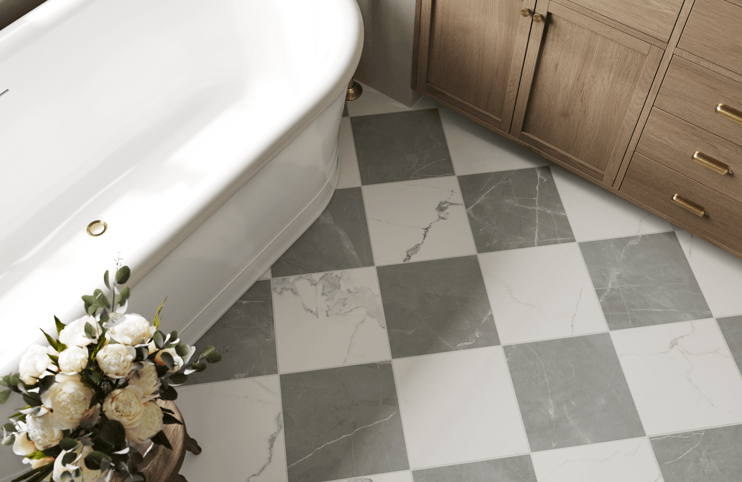
A great example of this balance is the Chantel 24x24 Checkerboard Polished Porcelain Tile in Dolomite and Imperial, which features large 24×24 squares that allow the checkerboard pattern to feel elegant rather than busy. As shown in the photo above, the generous tile scale works beautifully in open areas like entryways and stair landings, where the pattern can flow naturally across the floor. The off-white and gray marble-inspired tones also create a refined contrast that adds visual interest while maintaining a sophisticated and spacious look.
Exploring Pattern Variations Beyond the Classic Square
Although the classic square checkerboard pattern is a timeless choice, exploring different shapes can introduce a fresh and distinctive character to a space. Rectangles, for example, can create a sense of movement and dynamism, making them ideal for hallways or accent walls. Hexagons also provide a unique and visually engaging alternative, adding a touch of modern sophistication to any setting. For a truly bespoke look, custom shapes—whether irregular or organic—can infuse a space with a playful or artistic flair. By experimenting with these pattern variations, you can elevate your design and infuse your space with new energy and style.
Grout Color
The color of the grout can significantly influence the overall appearance of the checkerboard. A contrasting grout color can emphasize the pattern and create a bold statement, while a matching grout color can create a seamless and understated look. Also, consider the color palette of the room when choosing grout color. A neutral grout can help to ground the design, while a colored grout can add a pop of interest.
Styling the Space and Bringing it All Together
The checkerboard pattern offers great versatility, enhancing various design themes when styled thoughtfully. To achieve a cohesive look, start with furniture that has clean lines and simple forms, allowing the checkerboard to stand out. Incorporate contrasting colors or textures in your furniture as well to add visual interest.
In addition, accessories should align with the checkerboard's color scheme; for instance, black and white artwork or cushions with geometric patterns can enhance the overall design. A neutral wall color can provide a subtle backdrop, while a bold accent wall in a complementary color can add a dramatic touch. Balancing these elements will help you create a visually stunning and functional space that showcases the checkerboard pattern effectively. Edward Martin’s augmented reality (AR) tool can be instrumental here, allowing you to visualize how different furniture styles and color schemes will interact with the checkerboard pattern in your space, ensuring that every detail aligns with your design vision.

Practical Tips and Inspirations
Ready to transform your space with custom checkerboard tiles? Whether you're diving into a DIY project or considering professional help, exploring creative designs and practical tips can elevate your project and enhance your home's aesthetic.
Creating Custom Checkerboard Tiles
For DIY enthusiasts, creating custom checkerboard tiles can be a rewarding endeavor. You can start by painting plain ceramic or porcelain tiles with a checkerboard pattern using stencils for clean lines. Alternatively, arrange small glass or ceramic mosaic tiles to form your design, allowing for flexibility in color, shape, and size. For a distinctive touch, use epoxy resin to create tiles with embedded objects or three-dimensional effects. Be sure to seal your DIY tiles to ensure durability and protection, particularly if they’ll be placed in busy areas.
When to Hire Experts
Although DIY projects offer personal satisfaction, professional installation may be preferable in certain situations. For large-scale projects covering extensive areas, intricate patterns, or irregular shapes, experts bring the precision and specialized tools needed. If you're working under a tight deadline, hiring professionals can save time and reduce stress. Additionally, materials like natural stone in large format often require specific installation techniques. To avoid expensive mistakes, it's always a good idea to consult with a tile installer, as they can provide valuable guidance on material selection, design options, potential challenges, and other tile concerns.
Showcase Successful Color Combinations
The classic black and white checkered pattern offers timeless elegance, ideal with minimalist or vintage decor. Bold combinations, like red and white or turquoise and orange, create a playful, energetic vibe. For a calming effect, choose neutral tones such as gray and beige or taupe and cream. Alternatively, try unconventional pairings like pink and green or purple and orange for a whimsical touch. The success of your checkerboard design depends on how well it complements the room's overall aesthetic, including its color palette, furniture style, and desired mood.
A standout example is pairing Isabel 6x6 Matte Porcelain Tile in Rust with Isabel 6x6 Matte Porcelain Tile in Cream, which creates a warm, balanced checkerboard that feels both grounded and inviting. As shown in the picture above, the earthy red tone introduces depth, while the grayish beige tile brightens the composition, preventing the pattern from feeling too heavy. Together, they form a harmonious contrast that enhances architectural elements like built-in benches, shower floors, or accent platforms, giving the space a curated, design-forward look.
Elevating Design with Checkerboard Patterns
Checkerboard patterns are more than just a classic design choice—they're a versatile and dynamic element that can transform any space. From exploring basic color theories to experimenting with unexpected color pairings and pattern variations, these techniques offer a wealth of creative possibilities. Whether you're considering DIY projects or styling your space, the checkerboard design provides an opportunity to infuse personality and flair into your interiors. Embrace the art of color and pattern, and let your imagination guide you to a visually striking and uniquely personalized space.
For those looking to refine their vision even further, professional guidance can help bring these ideas together seamlessly. Edward Martin’s design services offer expert support in selecting the right tile combinations, layouts, and finishes to suit your space and style. With personalized recommendations and thoughtful design insights, you can confidently transform checkerboard concepts into a cohesive and beautifully executed interior.


