


Blue backsplash tiles do more than add color; they transform kitchens into brighter, more visually engaging spaces. Whether used in compact layouts or open-concept designs, blue, especially in glossy or glass finishes, reflects light effectively, making smaller or dimly lit areas feel more open and energized. From one end of the spectrum to the other, vivid cobalt mosaics and soft sky-blue subway tiles bring both clarity and calm to the heart of the home.
Beyond aesthetics, blue tiles are also highly functional. Moisture-resistant, low-maintenance, and available in a range of finishes, such as matte porcelain and crackle glaze, they adapt seamlessly to a variety of styles, from modern to coastal. With that in mind, this article will explore how blue backsplashes enhance light, unify kitchen design, and elevate everyday spaces.

The Psychology of Blue and Its Influence on Perception
Understanding how different shades of blue influence mood and spatial perception can help you create a kitchen that feels both balanced and intentional. From airy pastels to rich, moody tones, each variation brings its own unique energy and visual effect, making color selection as impactful as layout or lighting.
Light Blue Shades
One effective approach involves using light blue tones like powder blue and pastel cerulean, which reflect more ambient light due to their high luminance and low saturation, helping compact or dim kitchens feel more open. These hues, often associated with sky and water, evoke freshness and mental clarity, qualities especially suited to busy kitchen environments. Additionally, their cool, receding nature creates a visual sense of spaciousness, while pairing well with reflective materials like glass or chrome to amplify brightness.
Deep Blue Hues
On the other end of the spectrum, deeper blues such as navy or indigo introduce richness and depth, absorbing more light to create a cozy, elegant feel. Psychologically linked to stability and calm, they make compelling statement elements, particularly as backsplashes that contrast lighter surfaces or metallic accents. Moreover, these hues perform well with layered lighting, allowing their tonal complexity to shine in both task and ambient settings.
For a sleek, modern take on deep blue, Edward Martin’s Olivia 4x16 Glossy Ceramic Tile in Dusty Blue delivers a luminous finish with subtle tonal variation. As shown in the photo above, its reflective surface enhances brightness while providing visual depth, ideal for contemporary spaces craving both polish and personality.

Tile Finishes and Light Reflection
While color sets the mood, it’s the tile finish that truly defines how light moves through your kitchen. Depending on whether you choose a high-shine surface or a more muted texture, the effect on brightness, depth, and overall ambiance can be remarkably different.
Glossy and Polished Tiles
To maximize light reflection, glossy finishes are an excellent choice. They brighten kitchens and create a sense of spaciousness, especially valuable in smaller or enclosed layouts. These finishes, achieved through high-temperature firing or glass-like glazing, yield smooth, mirror-like surfaces with high light reflectance values (LRVs).
In addition, materials like glazed ceramic, glass, and polished porcelain enhance both natural and artificial lighting while contributing to a modern, sleek aesthetic. They're particularly ideal for backsplashes, thanks to their easy-to-clean, stain-resistant surfaces. However, their slipperiness and potential for glare require thoughtful lighting placement, making them less suited for flooring.
Matte and Textured Tiles
In contrast, matte and textured finishes absorb and diffuse light, offering a softer, more grounded atmosphere. Achieved through minimal glazing or techniques like sandblasting and etching, these surfaces feature lower LRVs, making them effective for reducing glare and controlling ambient brightness.
Moreover, textured tiles, such as tumbled stone and hand-crafted ceramics, introduce depth through subtle shadowing and surface variation, particularly when paired with directional lighting. They also offer improved slip resistance, making them a smart choice for floors or kitchens with a rustic or organic design sensibility.
Striking a perfect balance between aesthetics and function, Edward Martin’s Natasha 2x6 Matte Porcelain Tile in Denim demonstrates the versatility of matte finishes. As shown in the photo above, its deep blue hue and velvety surface gently diffuse light, adding warmth and character to both contemporary and traditional kitchens.

Integrating Blue Backsplashes with Kitchen Elements
To make a blue backsplash truly shine, it needs to work in harmony with the surrounding elements, not stand apart from them. By thoughtfully coordinating with cabinetry, countertops, and lighting, you can create a kitchen that feels seamless, intentional, and visually dynamic.
Complementing Cabinetry and Countertops
Initially, effective pairings often stem from color theory. Light blue tiles work seamlessly with white or pale gray cabinets to maintain an airy, serene feel. Conversely, deeper blues contrast beautifully with warm woods or off-white tones, adding both depth and visual interest.
In terms of materials, the relationship between finish and surface texture is equally important. Glossy blue tiles naturally complement polished countertops like quartz or marble, while matte or hand-glazed options pair well with butcher block or honed granite, creating a more grounded, artisanal look. Designers frequently rely on waterfall countertops or integrated backsplashes to visually bridge materials and reinforce flow.
Beyond color and material, scale and layout further influence the design. Linear tiles can echo the directionality of wood grain, reinforcing clean lines, while mosaics or geometric tiles introduce movement and texture. Finally, grout choice, whether matched or subtly contrasted, can either soften transitions or add definition, depending on the desired outcome.
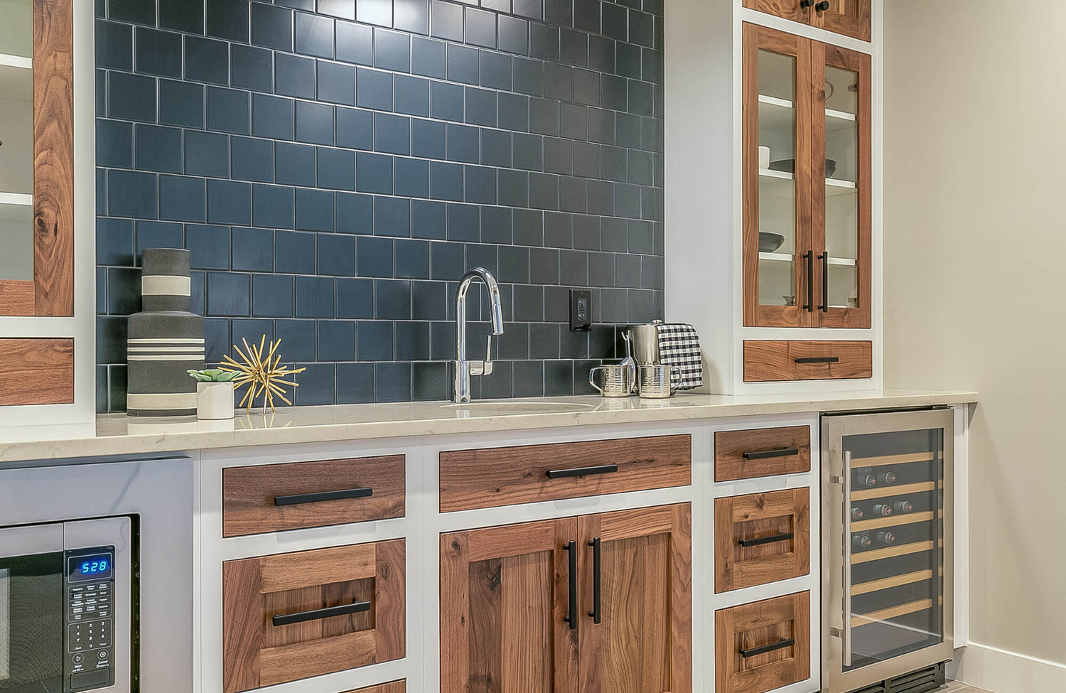
For those drawn to rich contrast, Edward Martin’s Reagan 5x6 Matte Porcelain Hexagon Tile in Navy offers a bold yet refined option. Its deep blue tone anchors lighter countertops and warm wood cabinetry, while the geometric shape adds subtle texture and a contemporary edge. To achieve a look similar to the kitchen in the reference photo, consider combining the Navy tile with its complementary Reagan variants in Fog (gray) and Cloud (white), a trio that captures the same balanced, modern palette with visual depth and dimension.
Strategic Lighting
Lighting also dramatically affects how blue tones are experienced. Under-cabinet LEDs in a neutral white (around 4000K) enhance color clarity, especially with cooler blues, while highlighting texture in finishes like crackle glaze and handcrafted ceramics.
In addition to task lighting, ambient solutions, such as recessed or track fixtures, help evenly distribute illumination and reduce unwanted shadows. Meanwhile, directional lighting like pendants or downlights adds dimensionality by casting highlights and enhancing the depth of darker tiles.
To fine-tune mood and function, dimmable systems provide adaptability throughout the day. Bright, crisp light brings out the vibrancy of pale blue tiles during daytime use, while lower evening settings can enrich deeper tones, making the kitchen feel warm and inviting in open-concept spaces.

Expanding Brightness with Blue Accents
Once your blue backsplash sets the tone, bringing that color into other parts of the kitchen can make the entire space feel more cohesive and thoughtfully styled. With just a few well-placed accents, you can echo its impact while adding layers of personality and charm.
Blue Utensils and Textiles
As a starting point, small blue accents, like utensils, towels, and area rugs, provide a simple yet effective way to reinforce your backsplash palette. Lighter shades such as azure or cornflower can brighten and energize a space, while deeper tones like navy add contrast and a sense of grounding. These pieces do double duty, serving as both decorative accents and flexible styling tools that can evolve with the season or your mood.
Furthermore, textiles in reflective or textured weaves, like waffle-knit or cotton-linen blends, bring tactile softness while subtly enhancing ambient light. A patterned rug or a strategically placed dish towel contributes both color and texture. For a more permanent touch, enamel-coated hardware in coordinating blue hues can extend the palette into cabinetry, especially in transitional or eclectic kitchens that thrive on layered materials.
Open Shelving with Blue Dinnerware
In addition to soft goods, open shelving offers a curated platform to showcase blue tones through dinnerware. Repeating hues across plates, bowls, and mugs helps establish visual rhythm and continuity, particularly when set against neutral cabinetry. Whether you opt for light blue ceramics with dark wood or deeper hues paired with white oak, the key is contrast and thoughtful composition.
To elevate the display further, intersperse glass jars, metallic accents, or small plants to add texture and variety. Adjustable lighting can also highlight the glaze and form of each piece, transforming everyday items into artful focal points that enhance both style and function.
For those inspired by the mosaic backsplash aesthetic, Edward Martin’s Palmer 2x2 Matte Porcelain Mosaic Tile in Ocean Blue delivers a playful yet refined alternative. Its small-format design and ocean-toned palette bring visual rhythm and color cohesion, ideal for echoing curated dinnerware on open shelving. To achieve a similar aesthetic to the one shown above, consider combining Palmer’s variants in Blue and Natural (white) for a balanced, tone-on-tone mosaic effect that feels both bright and inviting.

Maintenance and Longevity
Keeping your blue backsplash looking vibrant over time isn’t just about wiping it down; it’s about knowing how to care for the materials and details that make it stand out. From the tile surface to the grout lines, each component contributes significantly to maintaining that fresh, polished look.
Cleaning Techniques for Different Tile Materials
As a first consideration, different tile materials require different care strategies. Ceramic and porcelain are among the easiest to maintain thanks to their non-porous, glazed surfaces. Regular cleaning with a pH-neutral solution and a soft cloth or sponge is sufficient. Importantly, avoid acidic products, which can damage the glaze over time.
Glass tiles, known for their high reflectivity, benefit from ammonia-free glass cleaners or diluted dish soap. A non-abrasive cloth will prevent micro-scratches, and drying with a lint-free towel helps preserve their glossy finish.
Natural stone, such as marble or slate, is more porous and reactive. Use only pH-balanced stone cleaners and avoid harsh substances. Additionally, routine sealing is essential to protect against stains and fading.
To maintain vibrancy, spot cleaning high-use areas like cooktops and sinks, along with weekly full-surface care, prevents residue buildup and keeps your backsplash looking its best. For optimal results, always refer to the manufacturer’s care and maintenance guidelines, as specific requirements may vary by material and finish.
As a practical and stylish example, Edward Martin’s Reagan 5x6 Matte Porcelain Hexagon Tile in Teal offers durability with minimal upkeep. Its non-porous, matte surface resists staining and moisture, while its geometric format adds depth without complicating cleaning. When maintained with pH-neutral products, it delivers long-term performance with visual appeal.
Grout Care and Sealing
Just as important as tile maintenance, grout is essential to preserving your backsplash’s visual continuity. However, because grout is porous, it’s prone to staining if not properly cared for. To keep it looking clean and uniform, use a mild alkaline cleaner and a soft-bristle brush regularly, steering clear of harsh or acidic substances that can degrade its structure.
For long-term protection, apply a penetrating sealer to cementitious grout at least once a year, more often in high-moisture zones. While epoxy grout is naturally more resistant, it still benefits from routine cleaning to prevent surface buildup.
When it comes to appearance, grout color selection matters. Light or neutral tones, such as gray or pale blue, can enhance visual harmony but may require more frequent cleaning. Colored grout sealers are a useful option, offering added protection while refreshing faded lines without the need for full re-grouting.
To help visualize how grout tones and tile styles will look in your own kitchen, Edward Martin’s AR Visualization Tool offers a highly intuitive solution. After selecting your favorite tile, simply tap “View in Your Space” to overlay it onto your room using your mobile device. This immersive experience allows you to experiment with layout, lighting, and color combinations before committing. Once you find the right fit, ordering a sample brings the look one step closer to reality.
In short, consistent care across both tile and grout, combined with smart visualization and sampling tools, ensures your blue backsplash stays vibrant, functional, and beautifully integrated for years to come.
Blue Backsplashes as a Luminous Design Element
A blue backsplash is more than a stylistic feature; it’s a design decision grounded in how color, material, and light interact. When thoughtfully executed, it becomes a central element that enhances brightness, harmony, and the overall character of your kitchen.
To bring that vision to life, consider exploring Edward Martin’s curated tile selections, where expert craftsmanship meets enduring quality, perfect for kitchens that demand both beauty and function.