


Checkerboard floors, long admired for their distinctive rhythm and timeless elegance, are once again a focal point in interior design conversations. With a rich history and surprising versatility, these bold patterns evolve beyond their classical roots to suit modern tastes and spaces. Whether incorporated in a historic home restoration or a minimalist apartment refresh, checkerboard floors can offer a compelling blend of structure, character, and style.
In this article, we’ll explore their design evolution, color applications, spatial impact, and practical considerations, equipping you with everything you need to know before committing to this iconic look.

The Resurgence of Checkerboard Floors in Interior Design
Checkerboard flooring has been used in architectural design for centuries, with its earliest appearances found in ancient Roman mosaics. These patterns, symbolizing symmetry and order, were later embraced by Renaissance-era Europe, where grand entryways often featured marble tiles laid in contrasting hues. Over the years, checkerboard designs made their way into Victorian parlors, Art Deco foyers, and mid-century kitchens, adapting to each era’s unique aesthetic.
While the trend briefly declined during the minimalism boom of the late 20th century, it is now firmly back in favor. This revival stems from a growing preference for personalized, expressive interiors. As homeowners move away from uniform spaces and embrace eclectic decor, checkerboard floors offer the bold yet grounded visual identity many seek. They work beautifully in entryways, kitchens, bathrooms, and even patios, especially when rendered in updated finishes such as honed porcelain or matte ceramic. The pattern’s ability to balance classical influence with contemporary edge has also made it a favored choice among both traditionalists and trendsetters.

Exploring Color Possibilities and Psychological Impact
Checkerboard flooring is no longer confined to black and white. Designers and homeowners alike are exploring a full spectrum of colors that dramatically influence the atmosphere and function of a space. Understanding how various palettes impact mood, perception, and style is key to unlocking the pattern’s true design potential.
Why Black and White is Just the Beginning
Although black and white remains the most iconic checkerboard combination, new colorways are opening doors to more customized and emotionally resonant interiors. For instance, soft tonal palettes such as dove gray and pearl can introduce a sense of calm sophistication, while bolder pairings like emerald and blush inject playful vibrancy. These expanded options allow the checkerboard pattern to transition smoothly into a range of design aesthetics, from Scandinavian minimalism to maximalist bohemian.
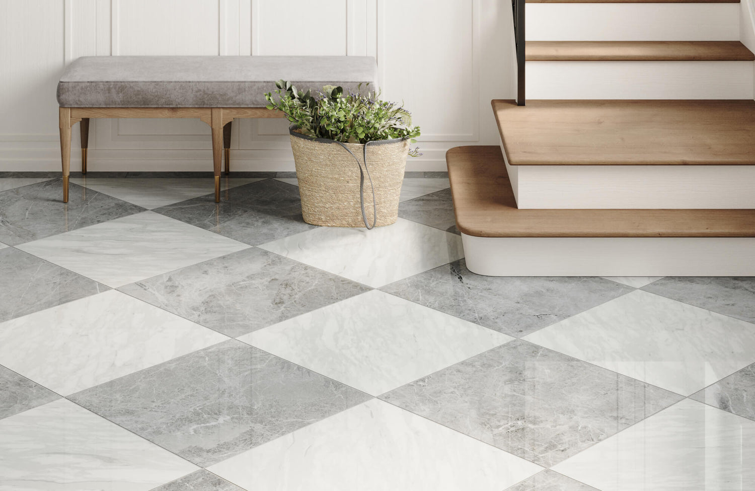
A perfect example of how subtle shifts in color can elevate the checkerboard look is Edward Martin’s Palmer 12x12 Checkerboard Raw Porcelain Tile in White and Grey, as shown in the picture above. This tile features a muted contrast that softens the visual tension typically associated with high-contrast schemes, making it ideal for patios, garden dining spaces, or indoor-outdoor transitions. In the image, the tile's matte finish and gentle grey tones pair effortlessly with natural wood furnishings and lush greenery, creating a setting that feels both refined and relaxed. This approach demonstrates that even within a traditional black-and-white framework, there is room for nuance, texture, and environmental harmony.
Advancements in material technology have also made these colors more accessible and durable. Digital printing, for example, enables precise replication of hand-painted ceramic finishes or natural stone textures, while new glaze techniques enhance how colors appear under different lighting conditions. Moreover, a glossy surface can make hues appear richer and more reflective, whereas matte textures offer a subdued, tactile quality that feels grounded and modern.
The Role of Color Psychology in Pattern Design
Color psychology plays a significant role in how checkerboard flooring shapes an environment. Warm tones like terracotta, amber, and rust can create a cozy and welcoming ambiance, making them ideal for dining areas or social spaces. Conversely, cooler shades such as sage, slate, and lavender tend to foster tranquility and focus, which works well in bedrooms or bathrooms.
Moreover, subtle pastels like mint green and blush pink evoke a nostalgic, vintage charm that aligns well with retro or coastal themes. Research in environmental psychology has shown that color intensity and temperature not only influence emotional well-being but also affect spatial perception. Darker colors can make a room feel more intimate, while lighter hues tend to visually expand a space. For this reason, color selection in a checkerboard layout should consider not just aesthetic preference, but also room size, natural lighting conditions, and the intended psychological effect.

Designing a Cohesive Space with Checkerboard Flooring
Checkerboard flooring makes a strong visual statement, but its full impact is realized only when it harmonizes with the space around it. From tile scale to color coordination, every element must work in unison to create a design that feels intentional and balanced.
Choosing the Right Tile Scale and Layout Strategy
Tile size and pattern orientation are critical when designing with checkerboard layouts. In smaller areas like powder rooms or laundry spaces, small-format tiles (such as 5x5 inches) offer a more intricate and intimate grid. On the other hand, larger tiles, like 24x24 inches, can open up a room, reduce grout lines, and provide a clean, modern visual that aligns well with expansive, open-plan designs.
Also important is how the tiles are laid. A traditional straight-set layout reinforces symmetry and formality, while a diagonal placement introduces energy and movement, especially effective in corridors or transitional zones. The choice between these layouts should consider not just visual preferences, but also architectural lines, ceiling height, and the intended focal points of the room.
Coordinating the Surrounding Decor Elements
Because checkerboard floors draw the eye immediately, everything around them must be thoughtfully selected to either complement or contrast without competing. Neutral wall colors, like cream, soft taupe, or muted green, create a calm backdrop that allows the flooring to take center stage. Incorporating natural materials such as oak cabinetry, stone countertops, and woven textiles can also soften the geometric structure of the pattern, grounding the space in warmth and texture.
A refined example of this approach is seen with the Leona 24x24 Checkerboard Matte Porcelain Tile in Calacatta and Amani Grey, which pairs a marble look finish with a muted checkerboard layout. As displayed in the photo above, the combination of soft veining and balanced grey tones brings a sense of calm sophistication to the room while still maintaining visual interest. The tile’s subtle variation in pattern also works seamlessly with sleek black furnishings, warm brown velvet chairs, and expansive windows, creating a dining area that feels both elevated and inviting. The result is a masterclass in how checkerboard flooring can anchor a design without overwhelming it, especially when paired with clean lines and an intentional mix of textures.
To help visualize how different checkerboard tile styles, scales, and color palettes will look in your own space, Edward Martin offers an intuitive augmented reality (AR) tool. This feature allows you to preview tile patterns in real-time using your mobile device, making it easier to assess how the flooring interacts with your room’s lighting, furnishings, and overall layout before making a final decision. Whether you're experimenting with layout direction, comparing tones, or evaluating how the pattern complements adjacent materials, the AR tool also provides clarity and confidence as you plan your design.

Expanding Checkerboard Design to Other Surfaces
The checkerboard motif isn’t limited to flooring as it has found new relevance in walls, textiles, and even exterior spaces. When thoughtfully integrated, these applications can reinforce design continuity and add personality in creative ways.
Creative Uses on Walls, Rugs, and Accessories
Checkerboard patterns are increasingly being used on vertical surfaces such as kitchen backsplashes or feature walls. A checkerboard backsplash in glazed ceramic, for instance, can serve as a lively alternative to subway tiles while maintaining a timeless appeal. In bathrooms, half-height tile walls or checkerboard-patterned wallpaper offer a sophisticated nod to vintage styling without overwhelming the room.
A beautiful illustration of this is Edward Martin’s Ellie 5x5 Matte Ceramic Tile in Tan. As displayed in the photo above, the tile is used to create a warm, understated checkerboard effect in a shower wall installation. Its soft, matte finish and muted neutral palette bring a calm, spa-like serenity to the space while maintaining the visual structure that makes checkerboard patterns so compelling. Eliie’s light brown and off-white tones blend harmoniously with brass fixtures and minimalist accessories, resulting in a bathroom that feels both modern and inviting. This demonstrates how the checkerboard motif, when scaled down and rendered in earth tones, can serve as a subtle yet impactful design choice.
Textiles are another option that offers a low-commitment way to explore the motif. Rugs in checkerboard designs add instant character to living rooms and bedrooms, while throw pillows, bed linens, and window treatments allow the pattern to echo subtly throughout a space. These soft touches can be swapped out seasonally or layered with other patterns for a more eclectic feel.
Outdoor Applications and Environmental Considerations
Checkerboard designs are also making their way outdoors, especially in patios, terraces, and garden walkways. Using materials like slip-resistant porcelain or sealed concrete, homeowners can replicate the checkerboard effect in open-air environments without sacrificing safety or durability. For instance, alternating pavers with artificial turf or gravel not only creates a visually dynamic space but also promotes better drainage and requires less maintenance.
When designing an exterior checkerboard, material choice is key. Tiles must be frost-proof in cold climates and UV-resistant in sunny ones to prevent cracking and fading. Porcelain tile is particularly well-suited for outdoor use due to its low water absorption rate, exceptional durability, and resistance to temperature fluctuations, making it a reliable choice for patios, terraces, and walkways. Moreover, incorporating expansion joints and laying tiles on proper substrates like compacted gravel or concrete ensures longevity and structural stability.

Key Advantages and Practical Limitations
Checkerboard floors offer compelling design advantages, but they also present a few practical challenges. Understanding both sides of the equation ensures you make a decision that aligns with your aesthetic goals and everyday lifestyle.
Design Benefits and Visual Functionality
One of the most notable advantages of checkerboard flooring is its ability to define and energize a space. The strong visual contrast adds depth and movement, often making rooms appear larger than they are. This effect is particularly beneficial in narrow hallways, small bathrooms, or galley kitchens. Moreover, checkerboard tiles work across a broad range of design styles, whether you’re channeling French country charm with terracotta and cream or leaning into Art Deco glamour with black and gold marble.
Their timeless quality is another asset. Unlike hyper-trendy patterns that may feel dated after a few years, checkerboards remain relevant because of their historical roots and adaptable nature. When paired with classic materials and finishes, they can easily transition through changing decor trends.
Practical Considerations for Durability Maintenance and Market Appeal
One of the key advantages of choosing porcelain checkerboard tiles is their non-porous surface, which makes them highly resistant to stains, moisture, and wear. This feature significantly simplifies upkeep, as spills remain on the surface and are easily cleaned, making porcelain an ideal material for kitchens, bathrooms, and busy zones. With just routine sweeping, occasional mopping using a pH-neutral cleaner, and following the manufacturer’s maintenance recommendations, these floors can maintain their bold visual impact for years with minimal effort.
However, it’s important to recognize that high-contrast patterns naturally highlight dirt and debris more than solid-colored flooring. Grout lines, especially those in light or white tones, can also be prone to discoloration over time, though sealing can help protect against staining. This makes the material choice and installation process all the more important.
Precision during installation is another critical factor. Misalignment in a checkerboard layout is immediately noticeable and can compromise the entire design. For this reason, professional installation is strongly recommended, particularly when using large format or natural stone tiles. Finally, while checkerboard floors can be a powerful design statement, they may not appeal to every potential homebuyer. If resale value is a major concern, consider using the pattern in temporary elements like rugs or peel-and-stick vinyl tiles rather than in permanent installations.
By weighing these factors carefully and choosing quality materials like non-porous porcelain, homeowners can enjoy the aesthetic benefits of checkerboard floors while minimizing long-term maintenance challenges.
Timeless Design with Modern Impact
Checkerboard floors offer a rare blend of historical charm and modern versatility, making them a compelling option for homeowners seeking both style and substance. Whether rendered in black and white marble or colorful matte porcelain, they provide a bold foundation upon which a cohesive and expressive space can be built. Their ability to complement both classic and contemporary interiors also ensures they remain relevant through evolving trends. With the right design choices, checkerboard floors don't just enhance a room; they define it.
To make the design process even more seamless, Edward Martin also offers a tile sample request that allows you to experience the look and feel of your chosen materials firsthand. By ordering samples directly to your home, you can evaluate color accuracy, texture, and quality in your actual lighting conditions before committing to a full installation. This extra step brings added confidence to your selection process and ensures your final design is as functional as it is beautiful.