


Checkered tiles do more than cover your floors; they set the tone for the entire room. Whether you're working with timeless black and white or leaning into bold colors, this classic pattern instantly adds energy and structure to a space. When paired thoughtfully with the right wall paint, it can bring out the best in both elements and create a beautifully balanced look.
In this guide, we’ll share five simple, effective tips to help you coordinate your checkered floors with wall color. These ideas are meant to inspire, whether you’re going for something soft and subtle or bold and high-contrast. With a few smart choices, you can create a space that feels both cohesive and full of personality.

Tip #1: Harmonizing Colors
Let’s begin with the foundation of any successful design: color coordination. Whether you’re selecting wall paint to go with your checkered tiles or choosing tiles based on an existing wall color, creating a sense of harmony is key. A monochromatic palette, using lighter and darker shades of the same hue, can help a room feel calm and cohesive while still offering visual depth. This strategy works particularly well in spaces where you want the pattern to feel soft and unified rather than too bold.
Another option is to draw out one of the tile’s accent colors and repeat it on the walls. For instance, if your checkered flooring includes warm tones like terracotta or tan, similar to our Leona 12x12 Checkerboard Matte Porcelain Tile in Marfil and Amani Bronze, using a matching hue on the walls creates a balanced and connected feel. This approach allows your wall color and tile to support each other without competing for attention. With thoughtful coordination, the room feels pulled together and naturally inviting.

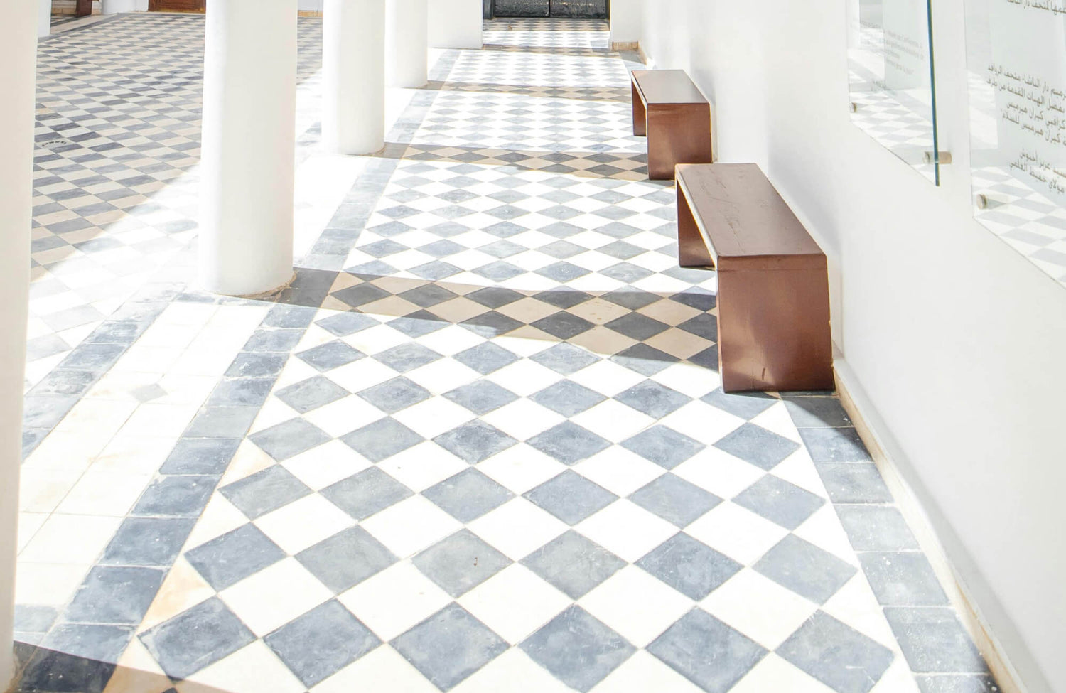
Tip #2: Balance with Neutral Tones
Pairing checkerboard tiles with soft neutral paint colors is one of the easiest ways to create balance in a room. Shades like creamy white, soft grey, and light beige offer a calm and versatile backdrop that lets your floor make a statement without overwhelming the space. Creamy whites reflect light beautifully and add warmth, soft greys bring a subtle sophistication, and light beige creates a cozy, lived-in feel that works in many styles.
This thoughtful color pairing helps highlight the elegance of tiles like our Leona 24x24 Checkerboard Matte Porcelain Tile in Calacatta and Amani Bronze, as seen above. The neutral walls allow the checkerboard design to remain the focal point, while the overall palette stays clean and cohesive. It’s a timeless combination that feels effortless yet refined, perfect for entryways, living areas, or anywhere you want a polished look with lasting charm.

Tip #3: Embrace Boldness
If you're aiming to create a dramatic, high-style look, bold wall colors can be a powerful complement to your checkered floors. Rich shades like deep navy, emerald green, burgundy, or espresso pair beautifully with neutral-toned tiles, adding contrast and personality. Each color brings something unique to the space, for instance, navy offers depth and mystery, while emerald introduces a touch of luxe. Burgundy adds warmth and character, and espresso grounds the room with a cozy, elegant feel.
To strike the right balance, we recommend pairing these bold hues with subtle checkerboard tiles like our Chantel 24x24 Checkerboard Polished Porcelain Tile in Dolomite and Imperial. The light and earthy tones give just enough contrast to support saturated wall colors while maintaining a sleek, modern base. You can also carry the color through with accents like pillows, vases, or lighting to tie the look together beautifully. This mix of boldness and balance creates a space that feels both sophisticated and inviting.

Tip #4: Max Out Your Maximalist Vibe
If your style leans bold and expressive, checkerboard tiles offer the perfect base for a playful, high-energy space. One way to lean in is by using color theory to select wall paints that either complement or contrast with your floor tiles. For example, pairing your walls with the brighter tones found in the tile pattern creates a vibrant backdrop that feels cohesive and lively. On the other hand, choosing opposing shades on the color wheel helps the checkerboard pop, turning your flooring into a bold focal point.
This approach works especially well in rooms where you want to highlight personality, think creative studios, eclectic kitchens, or statement entryways. It’s all about letting the contrast and color shine while making sure the entire space still feels balanced. With thoughtful coordination, every element works together to create a visually rich and character-filled room. For this style, consider checkerboard tiles in expressive combinations like blush and forest green or mustard and slate to amplify the drama and creativity.

Tip #5: Create a Balanced Space
When working with bold patterns like checkered tiles, balance is key to creating a visually pleasing room. Start by considering the size of your space and how prominently the tile is featured; often, a softer wall color is enough to let the floor take the lead. If your checkerboard tile covers a large area or uses a high-contrast pairing, neutral or muted wall paint can tone things down and help the space feel grounded. On the other hand, when the checkered pattern is used in moderation, deeper or more saturated wall colors can add richness without overpowering the room.
Lighting is another important factor that can shift how both tiles and paint colors are perceived. Natural light enhances brightness and reveals subtle undertones, while artificial lighting can make hues feel warmer or cooler depending on the bulb type. As you complete your design, don’t overlook the supporting details; elements like textured rugs, statement furniture, or wall art can help tie everything together and bring added dimension to the overall look.
Get Customized Design Assistance
Inspired to try this style but not sure how to begin? Our team of tile experts at Edward Martin is here to help with personalized guidance every step of the way. Whether you need help choosing the right samples, measuring your space, or planning your layout, we’ll work with you to create a design that feels just right for your home.
You can also explore your ideas using our augmented reality (AR) tool, which makes it easy to visualize how your tile selections will look in your space before making any commitments. It’s all part of our design service, which is simple, flexible, and tailored to you. Just fill out the form to get started, and we’ll reach out to help bring your vision to life.

Frequently Asked Questions
Before you dive into your next project, here are some quick answers to common questions about checkerboard flooring and paint coordination. From design inspiration to upkeep tips, these insights will help you plan with clarity and confidence.
1. Can checkerboard flooring be used in any room?
Yes, checkerboard flooring is incredibly versatile and works well in kitchens, bathrooms, hallways, and living spaces. It brings a bold visual rhythm that fits both classic and modern interiors. With the right material and color palette, it can adapt to almost any room.
2. How do I choose the right size of checkered tiles for my space?
Tile size should reflect the scale of your room. Large-format tiles suit open, expansive spaces, while smaller tiles work better in compact areas. Getting the proportions right helps maintain balance and visual flow.
3. Where can I find inspiration for designing with checkered floors and wall paints?
Look through home design blogs, magazines, and social platforms like Pinterest and Instagram. These sources offer real-life examples of color combinations and layouts. You’ll also find creative tips for pairing tile patterns with wall tones.
4. How do I maintain my checkerboard tile flooring?
Regular sweeping or vacuuming helps prevent dirt buildup. Use a mild, pH-neutral cleaner and avoid harsh chemicals to protect the tile’s surface. Follow the manufacturer's care guidelines to keep your floor looking sharp.
5. Is DIY installation feasible for checkerboard floors and wall paint?
DIY is possible with the right tools, patience, and a good layout plan. However, keeping the pattern aligned can be tricky without experience. For best results, consider hiring a pro to ensure clean lines and a lasting finish.
